Touring multivariate data
SISBID 2025
https://github.com/dicook/SISBID
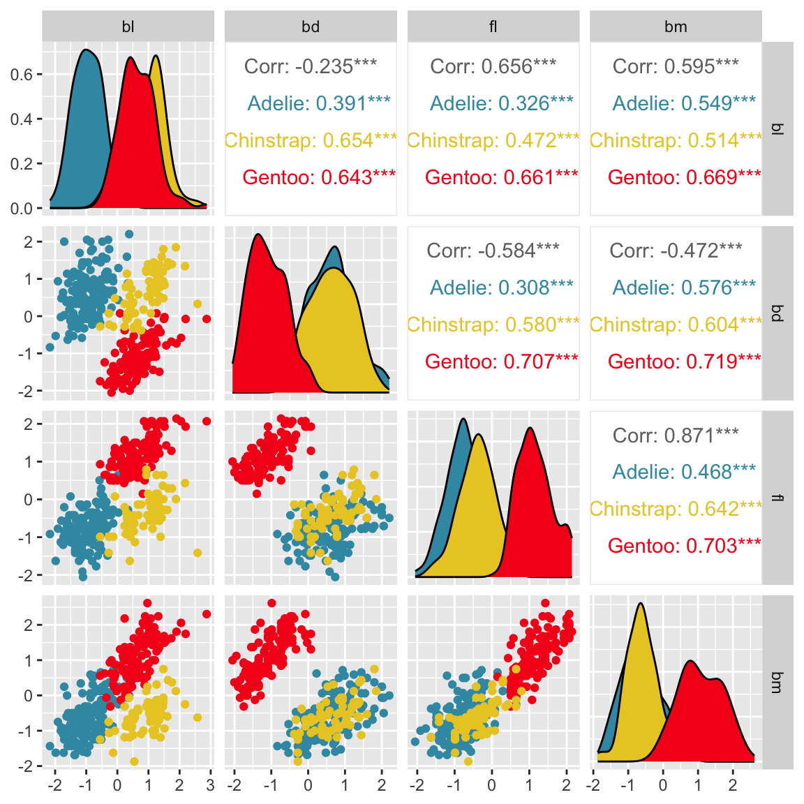
Pairwise plots
What don’t you see?
Unless you have tours, you’ll never know 🫣
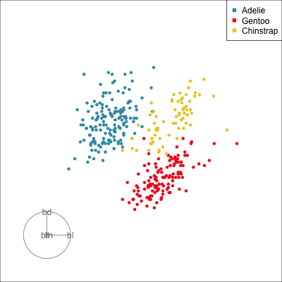
Our first tour
What patterns do you see?
# Run the tour
animate_xy(penguins_std[,2:5],
           col=penguins_std$species,
           axes="off",
           fps=10)
What new things do we learn?
- The separation between clusters is larger and
- there are a few more unusual penguins.
What did you see?
- clusters ✅
- outliers ✅
- linear dependence ✅
- elliptical clusters with slightly different shapes ✅
- separated elliptical clusters with slightly different shapes ✅
Which shows better separation?
What is a tour?
- a movie of low-dim projections
- constructed to come close to showing all possible low-dim projections
- a grand tour is a space-filling curve in the manifold of low-dim projections of high-dim data spaces.
\({\mathbf x}_i \in \mathcal{R}^p\), \(i^{th}\) data vector
\(F\) is a \(p\times d\) orthonormal basis
\(F'F=I_d\), where \(d\) is the projection dimension.
The projection of \({\mathbf x_i}\) onto \(F\) is \({\mathbf y}_i=F'{\mathbf x}_i\).
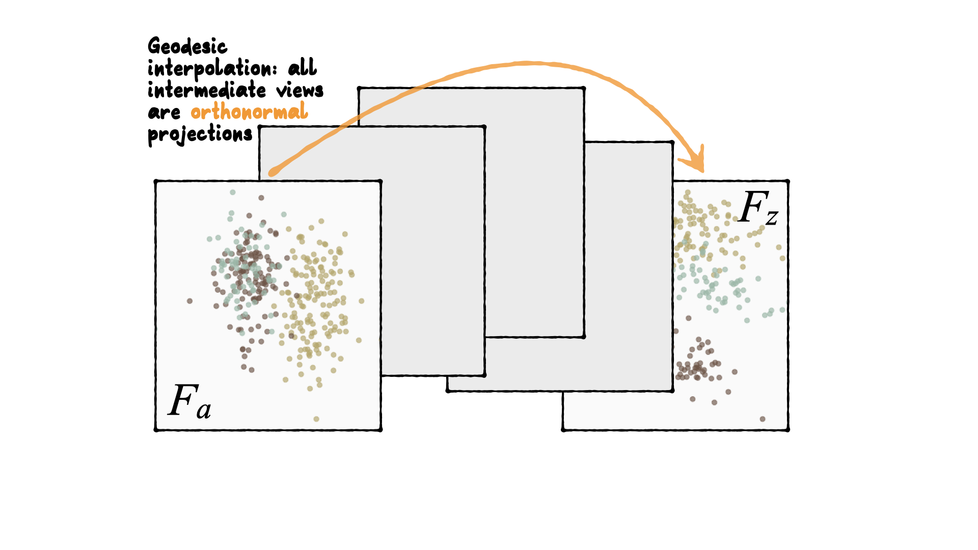
Tour is indexed by time, \(F(t)\), where \(t\in [a, z]\). Starting and target frame denoted as \(F_a = F(a), F_z=F(t)\).
The animation of the projected data is given by a path \({\mathbf y}_i(t)=F'(t){\mathbf x}_i\).
Geodesic interpolation b/w planes
Tour is indexed by time, \(F(t)\), where \(t\in [a, z]\). Starting and target frame denoted as \(F_a = F(a), F_z=F(t)\).
The animation of the projected data is given by a path \({\mathbf y}_i(t)=F'(t){\mathbf x}_i\).
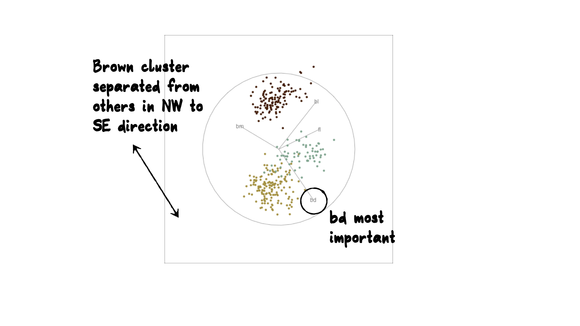
Reading axes - interpretation
Length and direction of axes relative to the pattern of interest
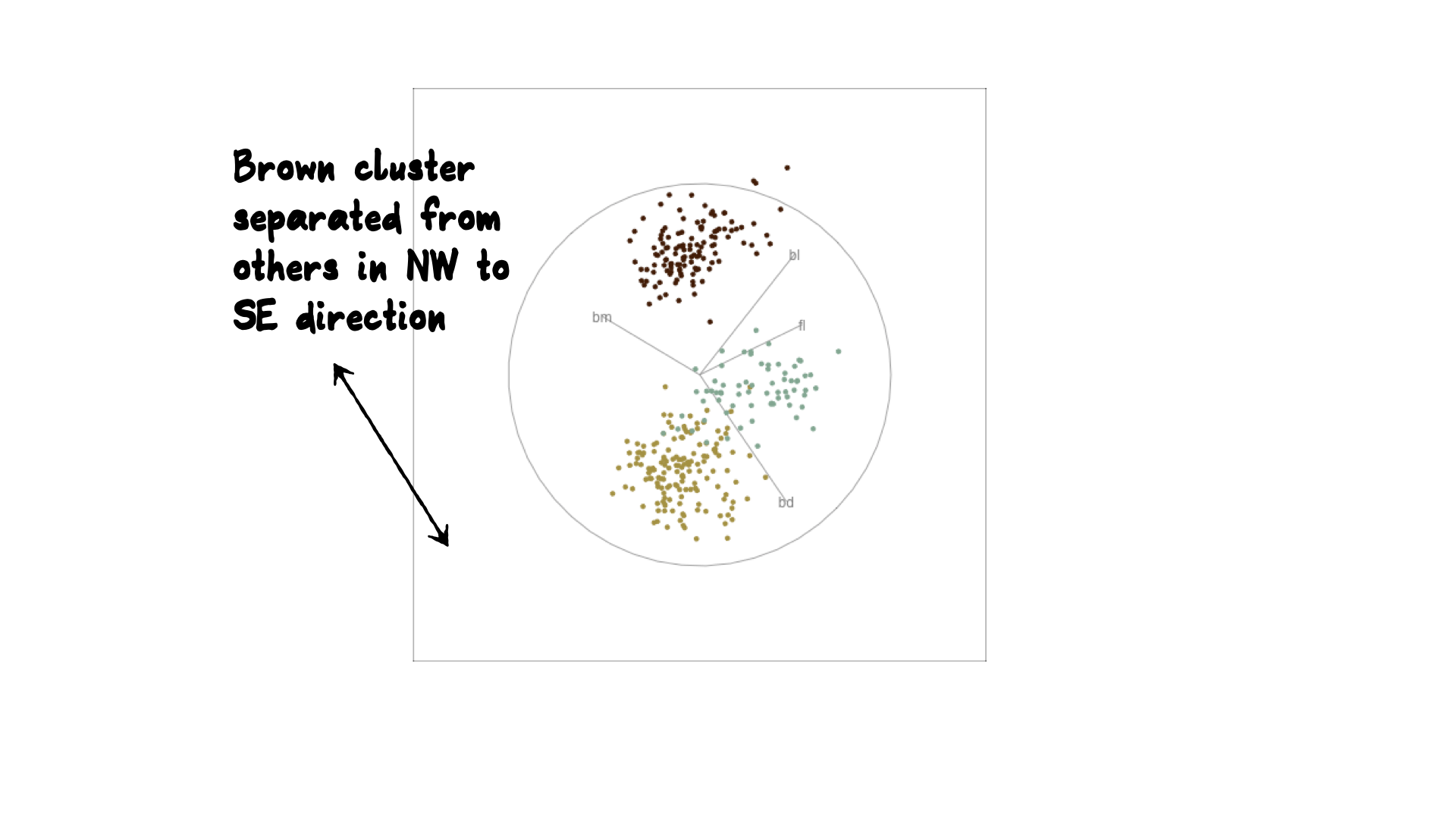
Reading axes - interpretation
Length and direction of axes relative to the pattern of interest
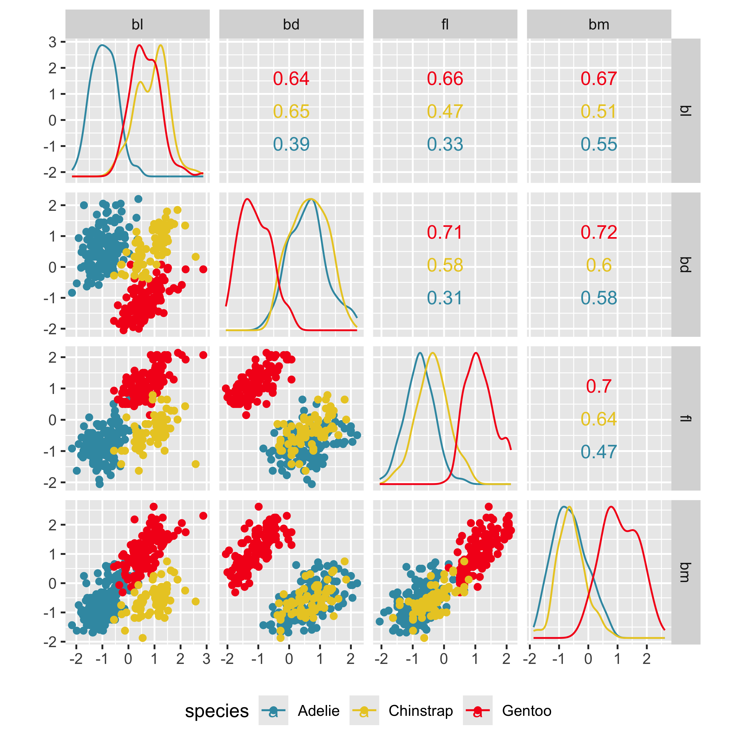
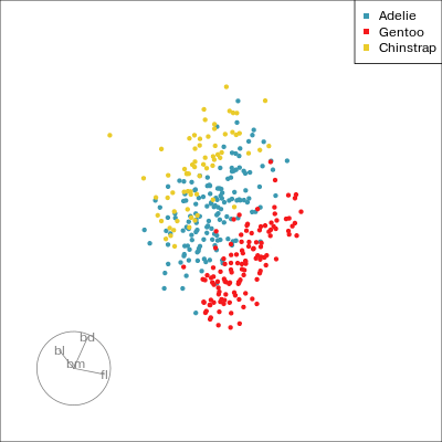
Understanding a tour
Understanding the projections
ggplot(penguins_std,
   aes(x=fl, y=bd,
       colour=species)) +
  geom_point(alpha=0.7, size=2) +
  scale_colour_discrete_divergingx(palette = "Zissou 1") +
  theme(aspect.ratio=1,
legend.position="bottom") 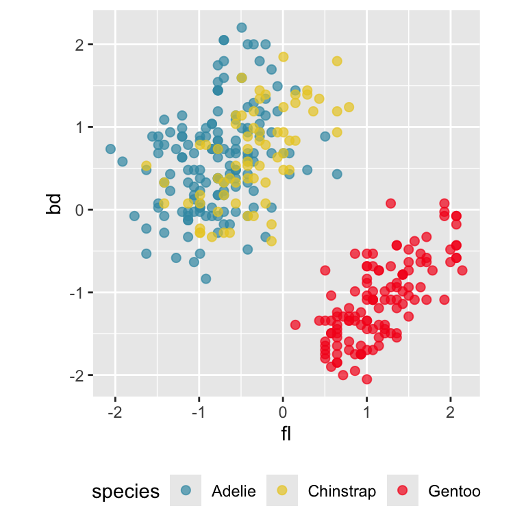
Gentoo from others in contrast of fl, bd
ggplot(penguins_std,
   aes(x=bl, y=bm,
       colour=species)) +
  geom_point(alpha=0.7, size=2) +
  scale_colour_discrete_divergingx(palette = "Zissou 1") +
  theme(aspect.ratio=1,
  legend.position="bottom")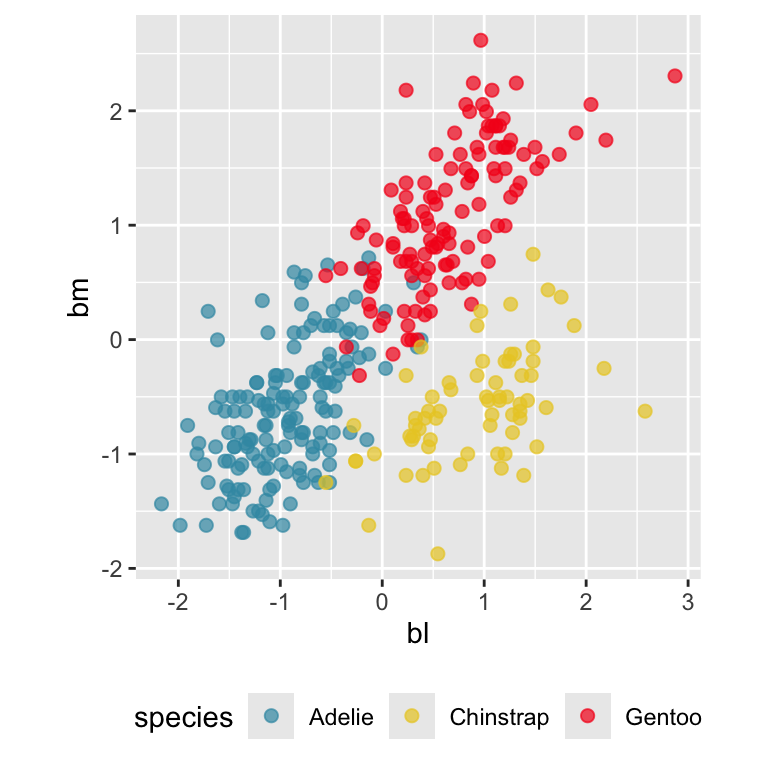
Chinstrap from others in contrast of bl, bm
Difficulties in making interpretations
- There may be multiple and different combinations of variables that reveal similar structure. ☹️
- This is due to association between variables in the multivariate data.
- The tour can help to discover these, too. 😂
Other tour types
- guided: follows the optimisation path for a projection pursuit index.
- little: interpolates between all variables.
- local: rocks back and forth from a given projection, so shows all possible projections within a radius.
- dependence: two independent 1D tours
- frozen: fixes some variable coefficients, others vary freely.
- manual: control coefficient of one variable, to examine the sensitivity of structure this variable. (In the
spinifexpackage) - slice: use a section instead of a projection.
- sage: transform a 2D projection, to avoid data piling.
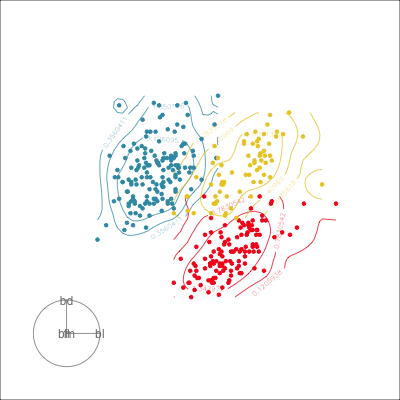
Guided tour
New target bases are chosen using a projection pursuit index function
\[\mathop{\text{maximize}}_{F}~g(xF) ~~~\text{ subject to } F \text{ being orthonormal}\]
holes: This is an inverse Gaussian filter, which is optimised when there is not much data in the center of the projection, i.e. a “hole” or donut shape in 2D.central mass: The opposite of holes, high density in the centre of the projection, and often “outliers” on the edges.LDA/PDA: An index based on the linear discriminant dimension reduction (and penalised), optimised by projections where the named classes are most separated.
Grand
Might accidentally see best separation
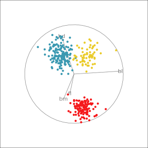
Guided, using LDA index
Moves to the best separation
Manual tour
- start from best projection, given by projection pursuit
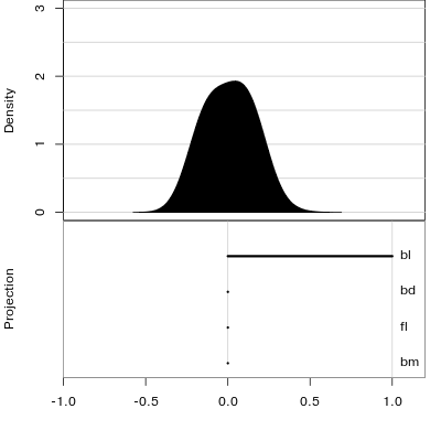
bdcontribution controlled- if
bdis removed from projection, Gentoo separation disappears bdis important for distinguishing Gentoo
# Check contribution of bl,
# change mvar to switch variables
animate_xy(penguins_std[,2:5],
           radial_tour(as.matrix(best_proj), mvar = 2),
           col = penguins_std$species)
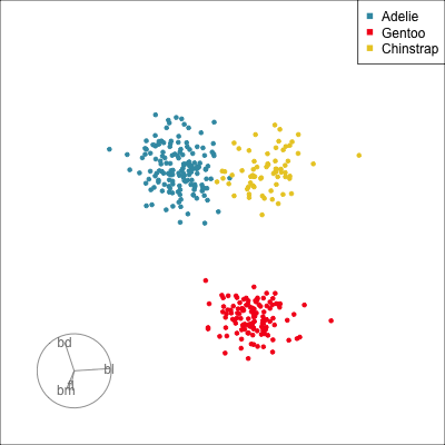
Manual tour
- start from best projection, given by projection pursuit
blcontribution controlledblis important for distinguishing Adelie from Chinstrap
Local Tour
Rocks from and to a given projection, in order to observe the neighbourhood
Geometric shapes with slice tour
Solid 4D sphere
library(geozoo)
sphere2 <- sphere.solid.random(p=4)$points %>% as_tibble()
animate_slice(sphere2, axes="bottomleft")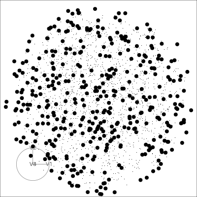
Hollow 4D sphere
sphere1 <- sphere.hollow(p=4)$points %>% as_tibble()
animate_slice(sphere1, axes="bottomleft", half_range=0.6)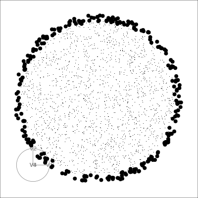
Geometric shapes with slice tour
4D Torus
torus <- torus(p = 4, n = 5000, radius=c(8, 4, 1))$points %>% as_tibble()
animate_slice(torus, axes="bottomleft", half_range=0.8)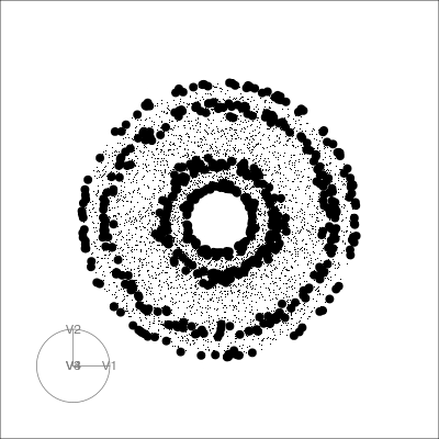
4D Hollow Cube
cube1 <- cube.face(p=4)$points %>% as_tibble()
# Slicing needs data to be on a standard scale
cube1_std <- cube1 %>%
  mutate(across(where(is.numeric),  ~ scale(.)[,1]))
animate_slice(cube1_std, axes="bottomleft")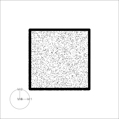
PCA tour
Compute PCA, reduce dimension, show original variable axes in the reduced space.
penguins_pca <- prcomp(penguins_std[,2:5],
                       center = FALSE)
penguins_coefs <- penguins_pca$rotation[, 1:3]
penguins_scores <- penguins_pca$x[, 1:3]

animate_pca(penguins_scores, pc_coefs = penguins_coefs, col=penguins_std$species)render_gif(
penguins_scores, grand_tour(),
display_pca(pc_coefs = penguins_coefs,
col=penguins_std$species,
axes="bottomleft"),
"slides/images/penguins2d_pca.gif",
frames=100, width=400, height=400)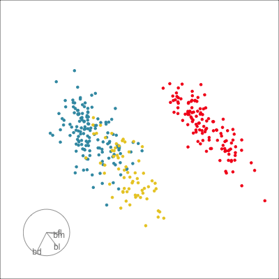
Projection dimension and displays
1D projections displayed as a density
animate_dist_cl(penguins_std[,2:5],
                half_range=1.3)
Density contours overlaid on a scatterplot
animate_density2d(
  penguins_std[,2:5],
  col=penguins_std$species, axes="bottomleft")
Your turn
Using the sample code from the tour package, check how many clusters are in the example data.
library(tourr)
data(flea)
?animate_xy
# On a Mac, start quartz window with:  quartz()
# On windows, start X11 window with:   X11()

animate_xy(flea[, 1:6])
# RStudio graphics windows: may want to reduce frame rate
animate_xy(flea[, 1:6], fps=10)

# Also
animate_xy(flea[, -7], col = flea$species)
animate_xy(flea[, 1:6], tour_path = guided_tour(lda_pp(flea$species)), col=flea$species)
Saving and sharing: Animated gif
render_gif(
  penguins_std[,2:5],
  grand_tour(),
  display_xy(
    col=penguins_std$species,
    axes="bottomleft"),
  gif_file="slides/images/penguins2d.gif",
  frames=100,
  width=400,
  height=400
)
Saving and sharing: single frame
Draw it with ggplot, and possibly pass to plotly.
load(here::here("data/p_tour_path.rda"))
penguins_pcti <- interpolate(
  penguins_pct, 0.2)
f27 <- matrix(
  penguins_pcti[,,27],
  ncol=2)
p27 <- render_proj(
  penguins_std[,2:5],
  f27,
  obs_labels=
    penguins_std$species)
Resources
- Cook and Laa (2025)
- Emerson et al (2013) The Generalized Pairs Plot, JCGS, 22:1, 79-91
- Natalia da Silva: PPForest and shiny app.
- Wickham et al (2011) tourr: An R Package for Exploring Multivariate Data with Projections, tourr R package
- Schloerke et al (2016) Escape from Boxland, the web site zoo and geozoo R package
- Spyrison and Cook (2020). spinifex: Manual Tours, Manual Control of Dynamic Projections of Numeric Multivariate Data.
- Stuart Lee liminal: tools to do linked brushing between tours and PCA/tSNE/PDS views
 This work is licensed under a Creative Commons Attribution-NonCommercial-ShareAlike 4.0 International License.