Making a mess again - with the data
SISBID 2025
https://github.com/dicook/SISBID
Warmup
Turn the french_fries data from wide format into a long format with variables type and rating.
# A tibble: 6 × 9
  time  treatment subject   rep potato buttery grassy rancid painty
  <fct> <fct>     <fct>   <dbl>  <dbl>   <dbl>  <dbl>  <dbl>  <dbl>
1 1     1         3           1    2.9     0      0      0      5.5
2 1     1         3           2   14       0      0      1.1    0
3 1     1         10          1   11       6.4    0      0      0
4 1     1         10          2    9.9     5.9    2.9    2.2    0
5 1     1         15          1    1.2     0.1    0      1.1    5.1
6 1     1         15          2    8.8     3      3.6    1.5    2.3
What would you like to find out about the french fries data set?
Put your questions in the chat!
What would we like to know?
- Is the design complete?
- Are replicates like each other?
- How do the ratings on the different scales differ?
- Are raters giving different scores on average?
- Do ratings change over the weeks?
Each of these questions requires a different summary of the data.
Pivot french fries to long
# A tibble: 6 × 6
  time  treatment subject   rep type    rating
  <fct> <fct>     <fct>   <dbl> <chr>    <dbl>
1 1     1         3           1 potato     2.9
2 1     1         3           1 buttery    0
3 1     1         3           1 grassy     0
4 1     1         3           1 rancid     0
5 1     1         3           1 painty     5.5
6 1     1         3           2 potato    14
Pivot long to wide
Examples:
- Are replicates like each other?
- compare rep 1 to rep 2 values
- How do the ratings on the different scales differ?
- compare ratings across scales
- Are raters giving different scores on average?
- compare ratings across raters
- Do ratings change over the weeks?
- compare ratings week-by-week
Comparing ratings: different weeks
Note the use of the backtick for variable names with special characters or numbers.
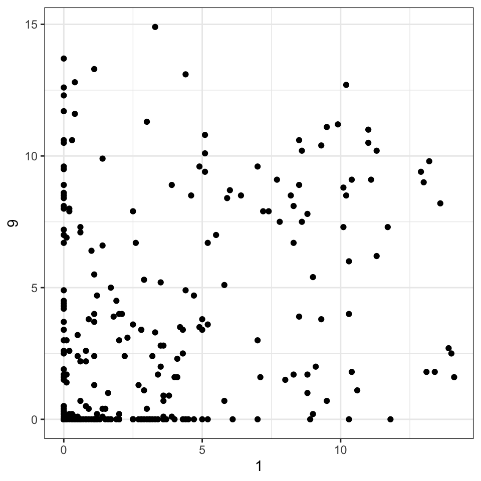
Your turn: Are the replicates similar?
Goal: Plot the replicates against each other using a scatterplot.
- Convert the data into long form
- Get the replicates spread into separate columns by replicate.
- Make the plot.
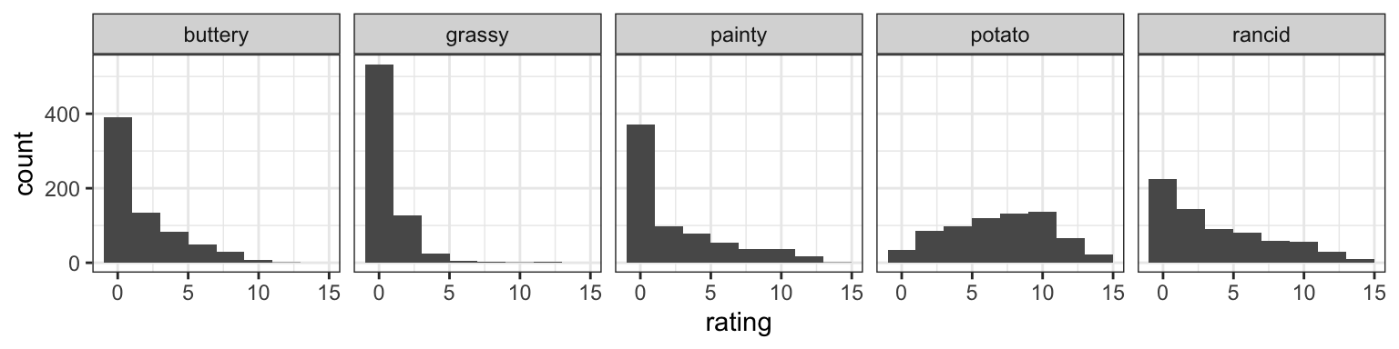
Are ratings similar across scales?
- Scales: potato-y, buttery, grassy, rancid and painty?
- Pivot into long form, plot with
facet_...(~scale).
# A tibble: 6 × 6
  time  treatment subject   rep type    rating
  <fct> <fct>     <fct>   <dbl> <chr>    <dbl>
1 1     1         3           1 potato     2.9
2 1     1         3           1 buttery    0
3 1     1         3           1 grassy     0
4 1     1         3           1 rancid     0
5 1     1         3           1 painty     5.5
6 1     1         3           2 potato    14
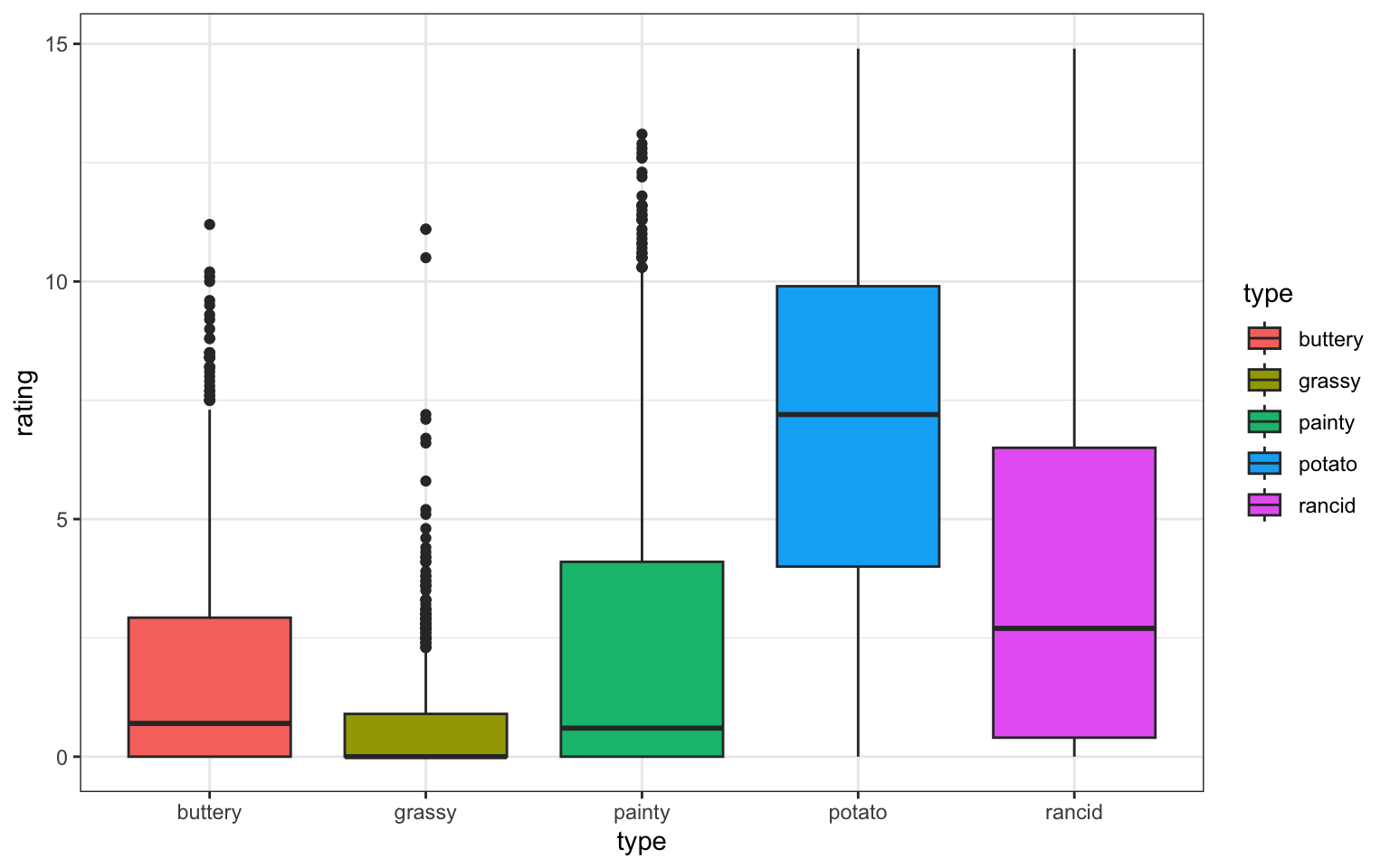
Are ratings similar across scales?
Side-by-side boxplots
Your turn: Correlation b/w scales?
Create a wide form of the data by type of scale.
cor allows you to create a correlation matrix.
Run ?cor to look up how to get rid of NA values in the result.
Draw a scatterplot of two scales with the highest (positive or negative) correlation value.
Ratings by week
Use the long form of the data and plot:
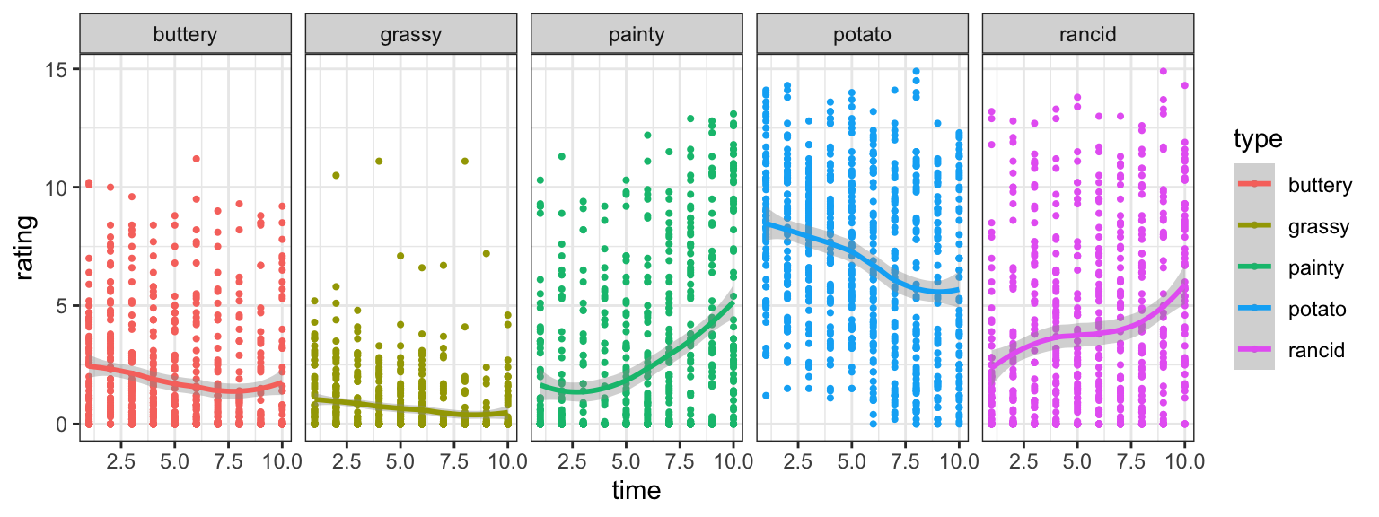
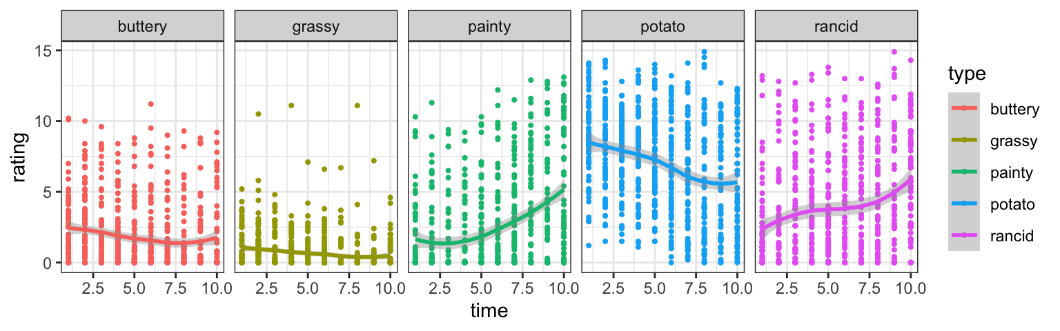
Your turn: Ratings by time & scale?
- Find a linear model describing the average rating by week (time) and type of scale as shown below.
- Which form of the dataset should we use?
- Challenge: can you plot the fitted lines from the model?
 This work is licensed under a Creative Commons Attribution-NonCommercial-ShareAlike 4.0 International License.