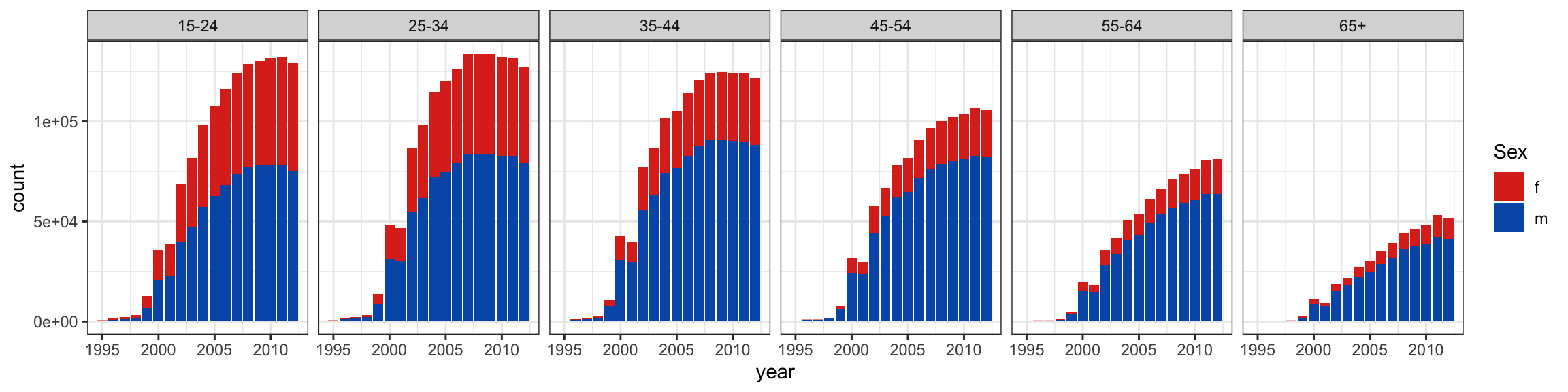
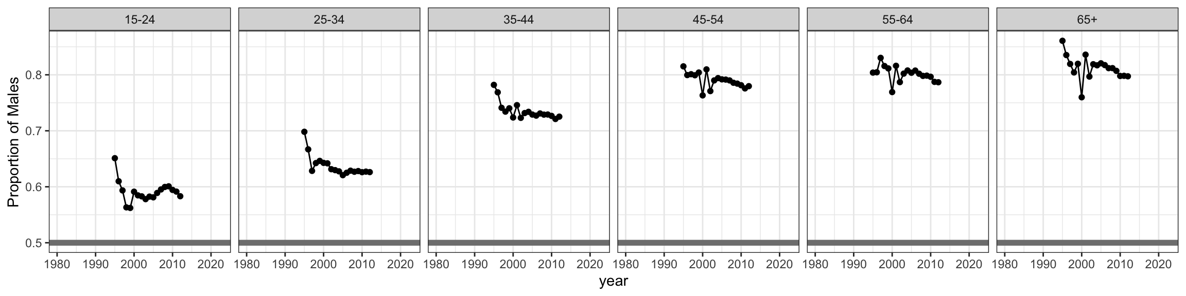
What do we learn about the data that is different from the previous plot?
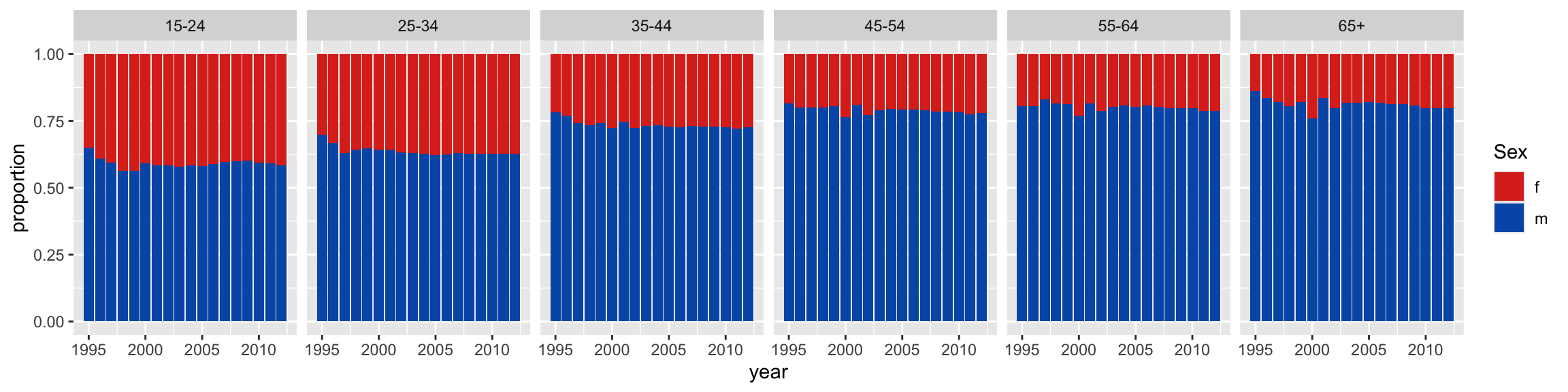
What is easier and what is harder or impossible to learn from this arrangement?
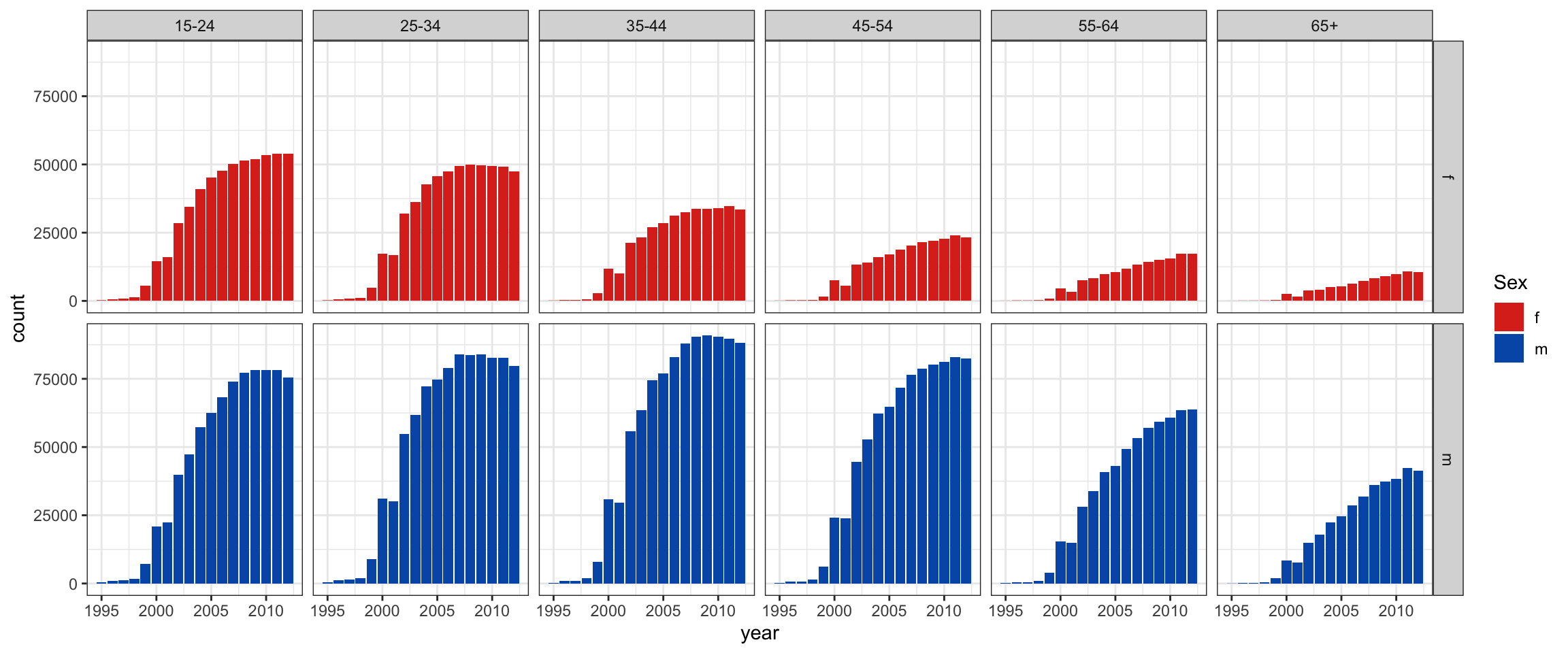
Separate plots
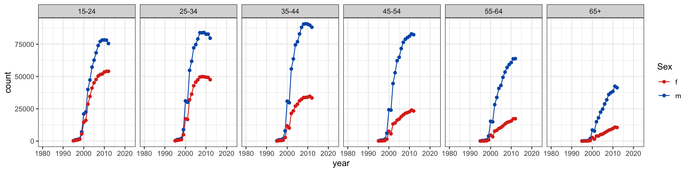
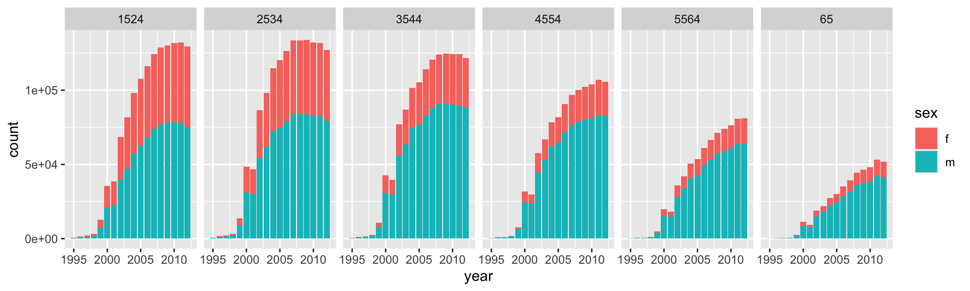
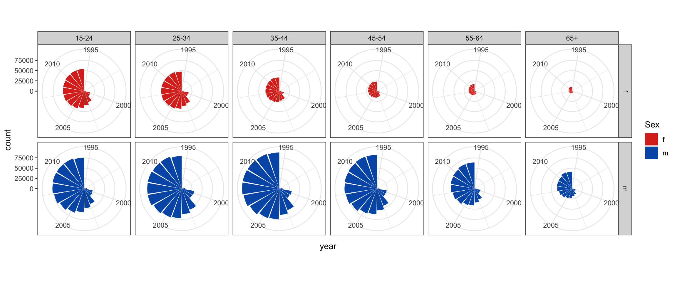
# Make separate plots for males and females, focus on counts by categoryggplot(tb_us, aes(x=year, y=count, fill=sex)) +geom_bar(stat="identity") +scale_fill_manual("Sex", values =c("#DC3220", "#005AB5")) +facet_grid(sex~age_group) +theme_bw()
Make a pie
# How to make a pie instead of a barchart - not straight forwardggplot(tb_us, aes(x=year, y=count, fill=sex)) +geom_bar(stat="identity") +facet_grid(sex~age_group) +scale_fill_manual("Sex", values =c("#DC3220", "#005AB5")) +coord_polar() +theme_bw()
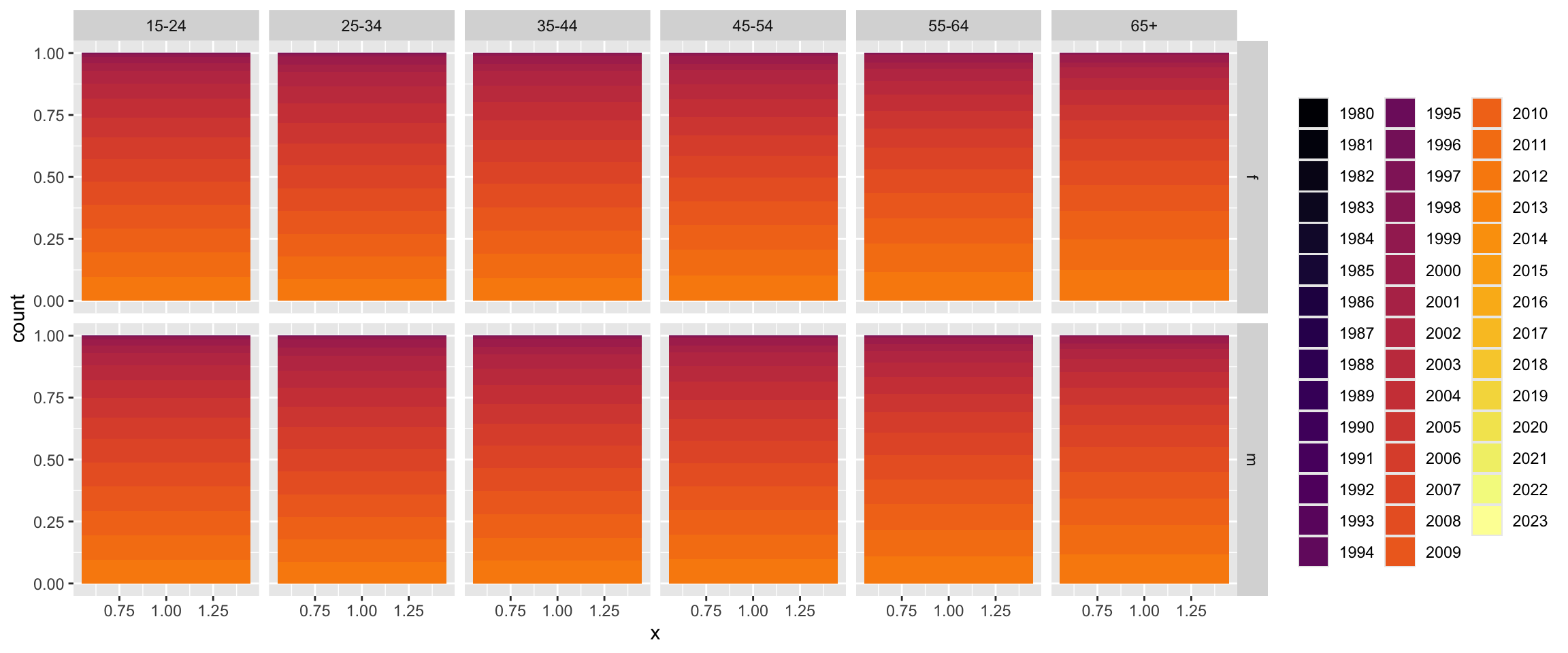
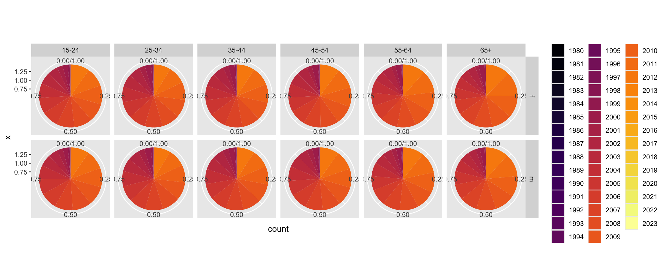
# Step 1 to make the pieggplot(tb_us, aes(x =1, y = count, fill =factor(year))) +geom_bar(stat="identity", position="fill") +facet_grid(sex~age_group) +scale_fill_viridis_d("", option="inferno")
Pie chart
# Now we have a pie, note the mapping of variables# and the modification to the coord_polarggplot(tb_us, aes(x =1, y = count, fill =factor(year))) +geom_bar(stat="identity", position="fill") +facet_grid(sex~age_group) +scale_fill_viridis_d("", option="inferno") +coord_polar(theta ="y")
🔮 👽 👼 TWO MINUTE CHALLENGE
What are the pros, and cons, of using the pie chart for this data?
Would it be better if the pies used age for the segments, and facetted by year (and sex)?

 This work is licensed under a Creative Commons Attribution-NonCommercial-ShareAlike 4.0 International License.