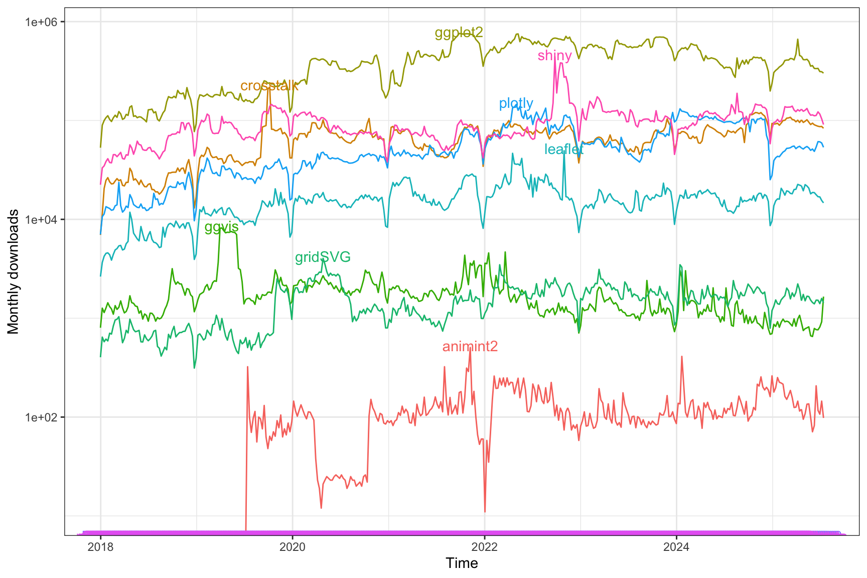
SISBID 2025
https://github.com/dicook/SISBID
crosstalk
: that’s what shiny is based on - we will look into shiny laterplotly
: interactive javascript graphics (maintained Carson Sievert)leaflet
: (RStudio) allows to make interactive maps. Has been picking up users and has developed a stable user base.ggvis
: both static and interactive graphics, work on it has stalled … (Wickham)animint2
: interactive, linked graphics with ggplot2 syntax (Toby Hocking)rCharts
, rbokeh
, gridSVG
, epivizr
, cranvas
previous approaches to packages with interactive graphicsThe plotly
package in R has two interfaces:
ggplot2
plots and adding interactive elementsPlotly creates interactive plots with javascript.
Not all ggplot2
geoms are supported in plotly, but when they are, they just work out of the box
plotly
uses elements of crosstalk
to provide additional interactivity, such as linked highlighting
txh_shared <- highlight_key(txhousing, ~year)
p <- ggplot(txh_shared, aes(month, median)) +
geom_line(aes(group = year)) +
geom_smooth(data = txhousing, method = "gam") +
scale_x_continuous("", breaks=seq(1, 12, 1),
labels=c("J", "F", "M", "A", "M", "J",
"J", "A", "S", "O", "N", "D")) +
scale_y_continuous("Median price ('00,000)",
breaks = seq(0,300000,100000),
labels = seq(0,3,1)) +
facet_wrap(~ city)
gg <- ggplotly(p, height = 750, width = 900) %>%
plotly::layout(title = "Click on a line to highlight a year")
# install.packages("tsibble")
# install.packages("tsibbletalk")
# install.packages("feasts")
library(tsibble)
library(tsibbletalk)
library(feasts)
tourism_shared <- tourism |>
as_shared_tsibble(spec = (State / Region) * Purpose)
tourism_feat <- tourism_shared |>
features(Trips, feat_stl)
p1 <- tourism_shared |>
ggplot(aes(x = Quarter, y = Trips)) +
geom_line(aes(group = Region), alpha = 0.5) +
facet_wrap(~ Purpose, scales = "free_y") +
theme(axis.title = element_text(family="Helvetica"),
axis.text = element_text(family="Helvetica"),
legend.title = element_text(family="Helvetica"),
legend.text = element_text(family="Helvetica"))
p2 <- tourism_feat |>
ggplot(aes(x = trend_strength, y = seasonal_strength_year)) +
geom_point(aes(group = Region)) +
xlab("trend") + ylab("season") +
theme(axis.title = element_text(family="Helvetica"),
axis.text = element_text(family="Helvetica"),
legend.title = element_text(family="Helvetica"),
legend.text = element_text(family="Helvetica"),
plot.title = element_text(family="Helvetica"))
The shared data objects from crosstalk
make linking between plots easier!
highlight
allows to make modifications in how highlighted values are presented in plotly. Read through the parameter details in ?highlight
.dynamic
is set to FALSE
by default. Turn it to TRUE
. What is the effect?gganimate
(Lin-Pederson) allows to make and save animations: gganimate cheat sheet
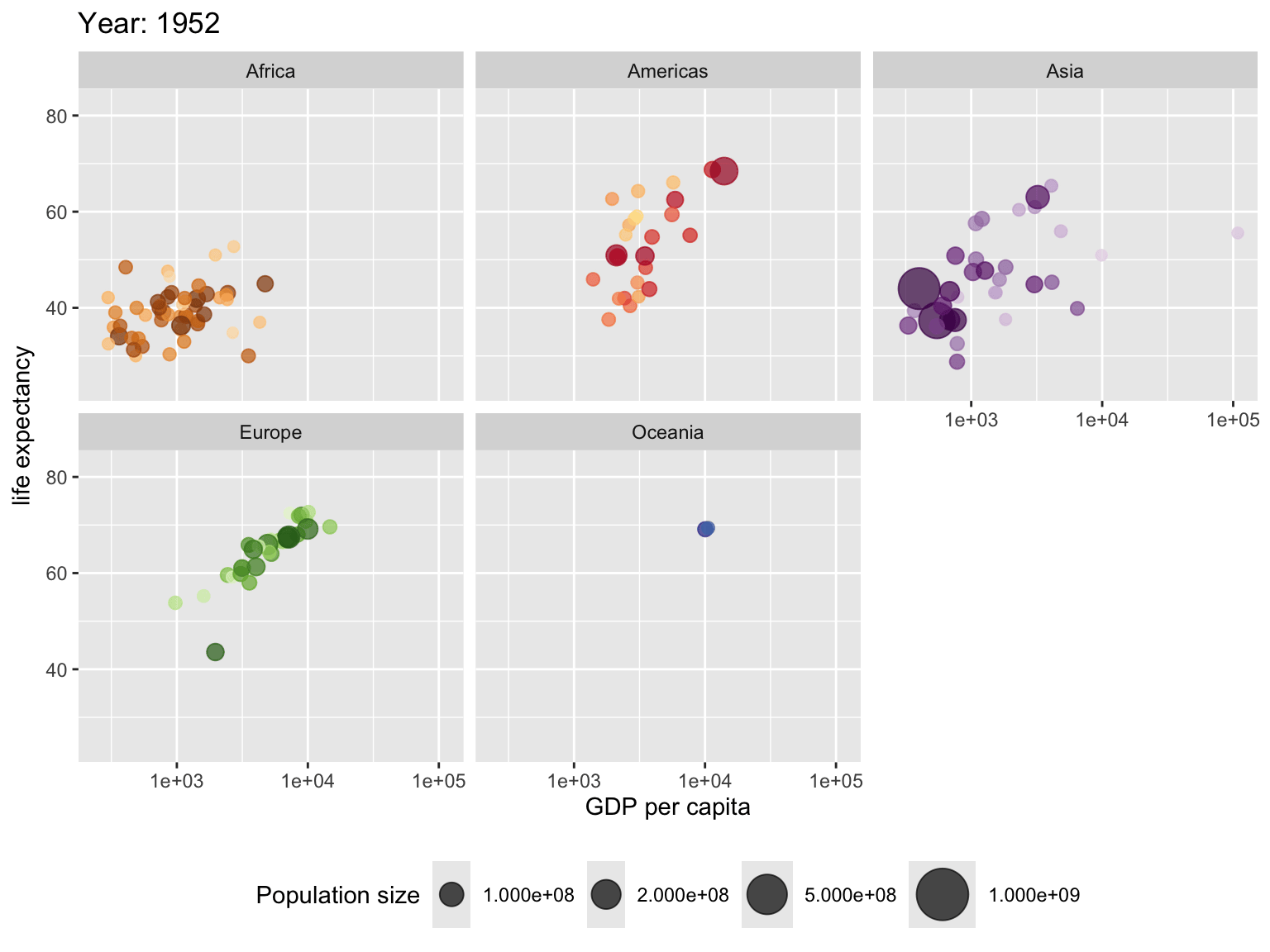
Countries are colored manually by country_colors
(hue shows continent, saturation is individual country)
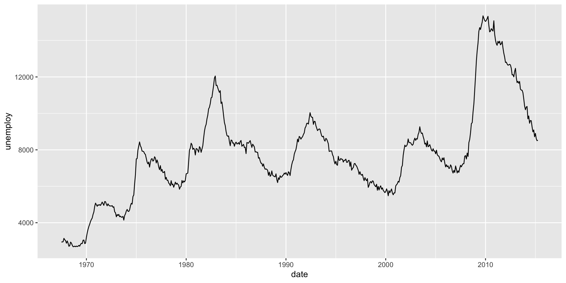
gganimate
Thanks to Mitch O’Hara Wild for the example
Using the the datasaurus dozen, again, we first pass in the dataset to ggplot
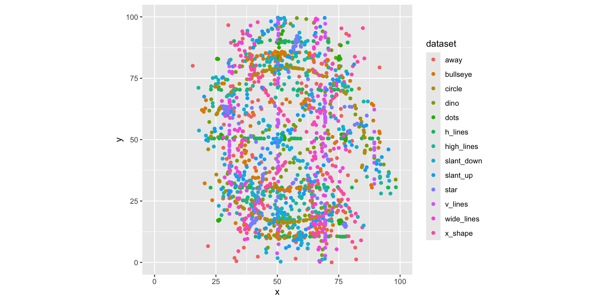
For each dataset we have x and y values, in addition we can map dataset to color
Trying a simple scatter plot first, but there is too much information
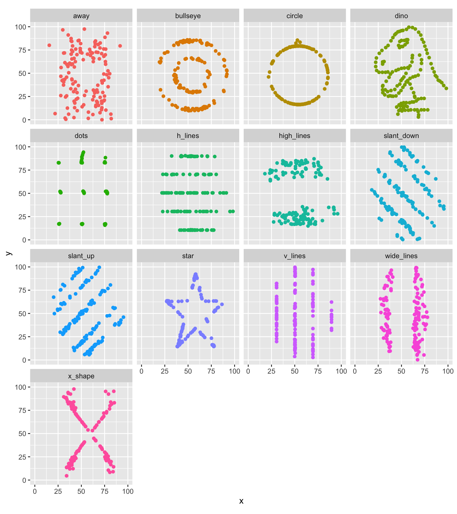
We can use facets to split up by dataset, revealing the different distributions
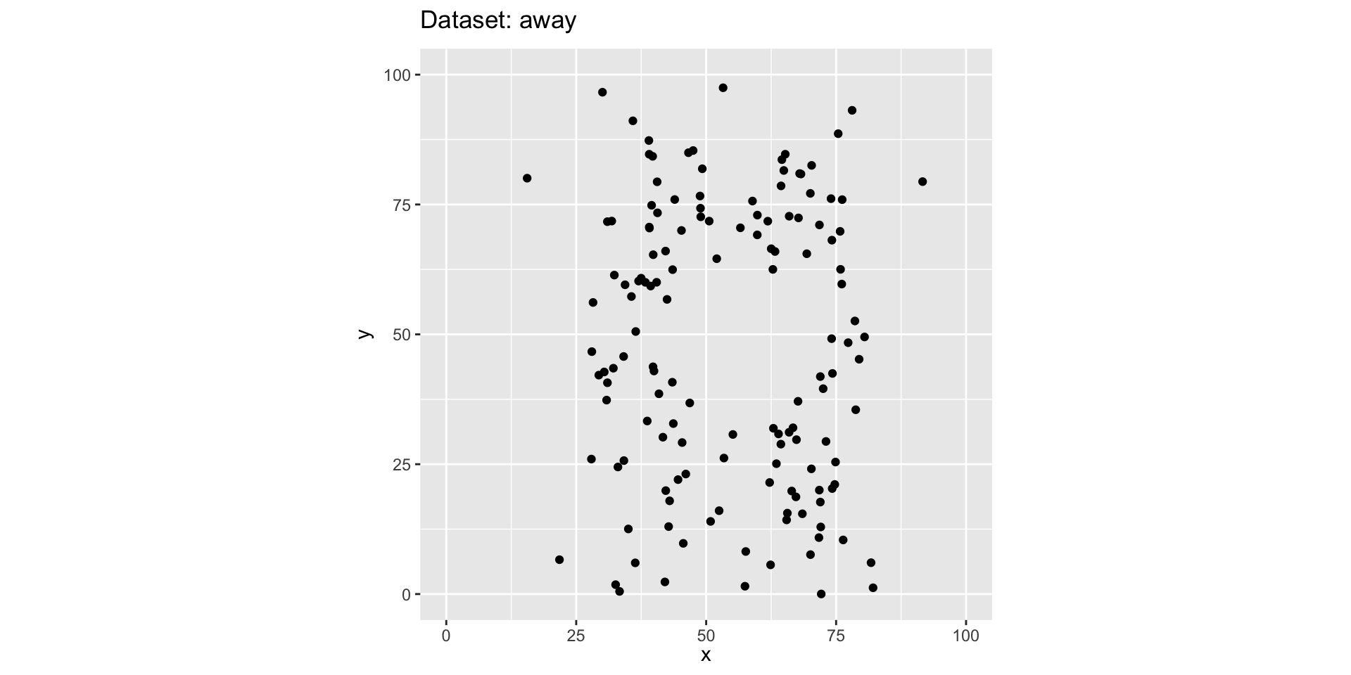
We can just as easily turn it into an animation, transitioning between dataset states!
The datasaurus_dozen
data set is part of the R package datasauRus
.
transition_states
drives the animation. It has values 2 and 3. What do these values mean? Read up on their meaning and change them.We control plot movement with (a grammar of animation):
transition_*()
define how the data should be spread out and how it relates to itself across time.view_*()
defines how the positional scales should change along the animation.shadow_*()
defines how data from other points in time should be presented in the given point in time.enter_*()
and exit_*()
define how new data should appear and how old data should disappear during the course of the animation.ease_aes()
defines how different aesthetics should be eased during transitions.The gapminder example from the beginning has the static part shown below
Add animation parts! adding transition_time(year)
results in the visualisation from the start.
What other animation are helpful? What views do you want to set? Maybe a shadow looks interesting?
ggplot(gapminder, aes(gdpPercap, lifeExp, size = pop, colour = country)) +
geom_point(alpha = 0.7) +
scale_colour_manual(values = country_colors) +
scale_size("Population size", range = c(2, 12), breaks=c(1*10^8, 2*10^8, 5*10^8, 10^9, 2*20^9)) +
scale_x_log10() +
facet_wrap(~continent) +
theme(legend.position = "bottom") +
guides(colour = "none")
This work is licensed under a Creative Commons Attribution-NonCommercial-ShareAlike 4.0 International License.