# A tibble: 6 × 3
  sex   age   count
  <chr> <chr> <dbl>
1 m     15-24  4893
2 m     25-34  8149
3 m     35-44  5302
4 m     45-54  2493
5 m     55-64  1099
6 m 65+ 669Visual perception and effective plot construction
SISBID 2025
https://github.com/dicook/SISBID
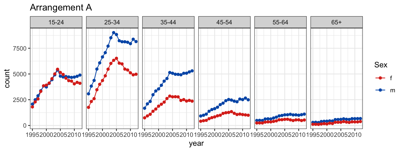
TWO MINUTE CHALLENGE 🔮 👽 👼
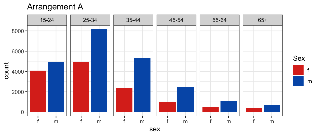

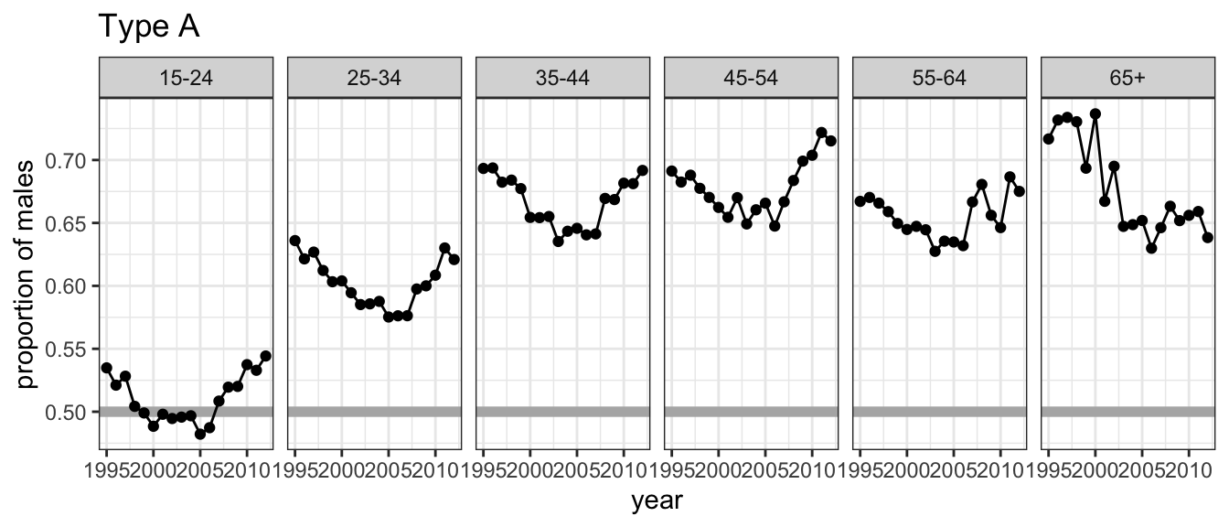
At which age(s) are the counts relatively similar across sex?
Which plot makes this easier? What do we learn from each? What’s the focus? What’s easy? What’s harder?
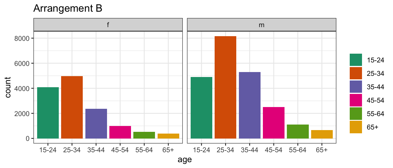
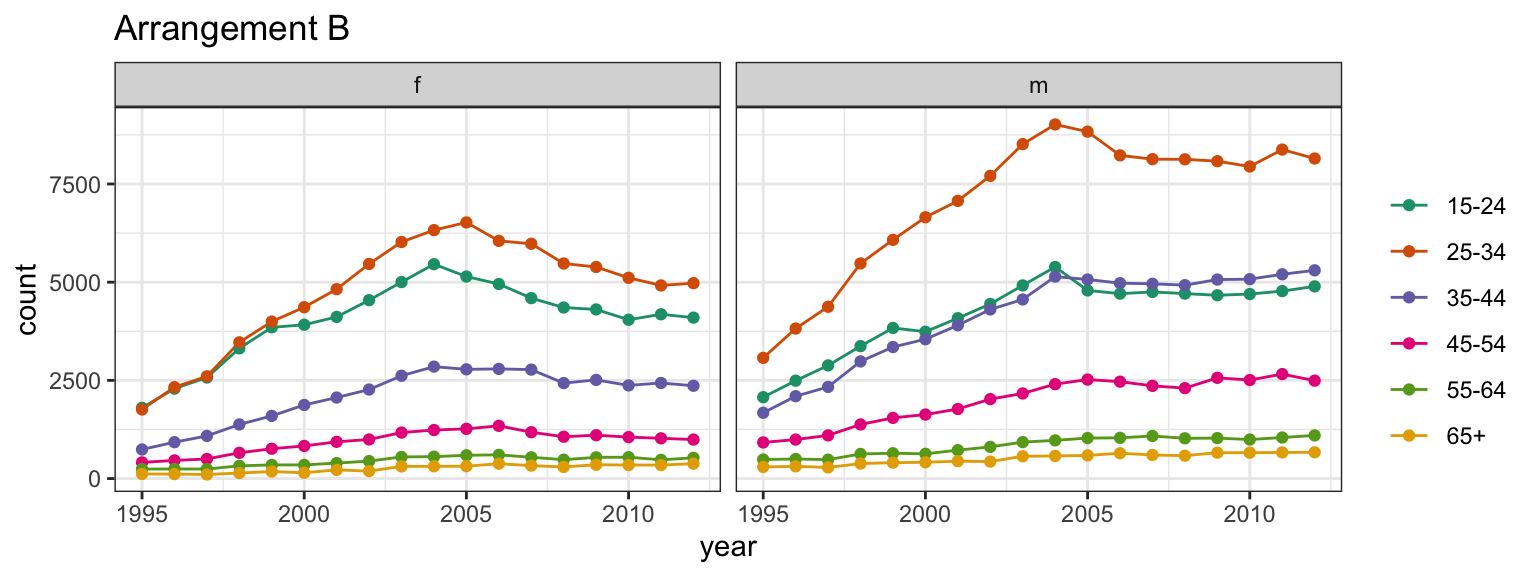
TWO MINUTE CHALLENGE 🔮 👽 👼
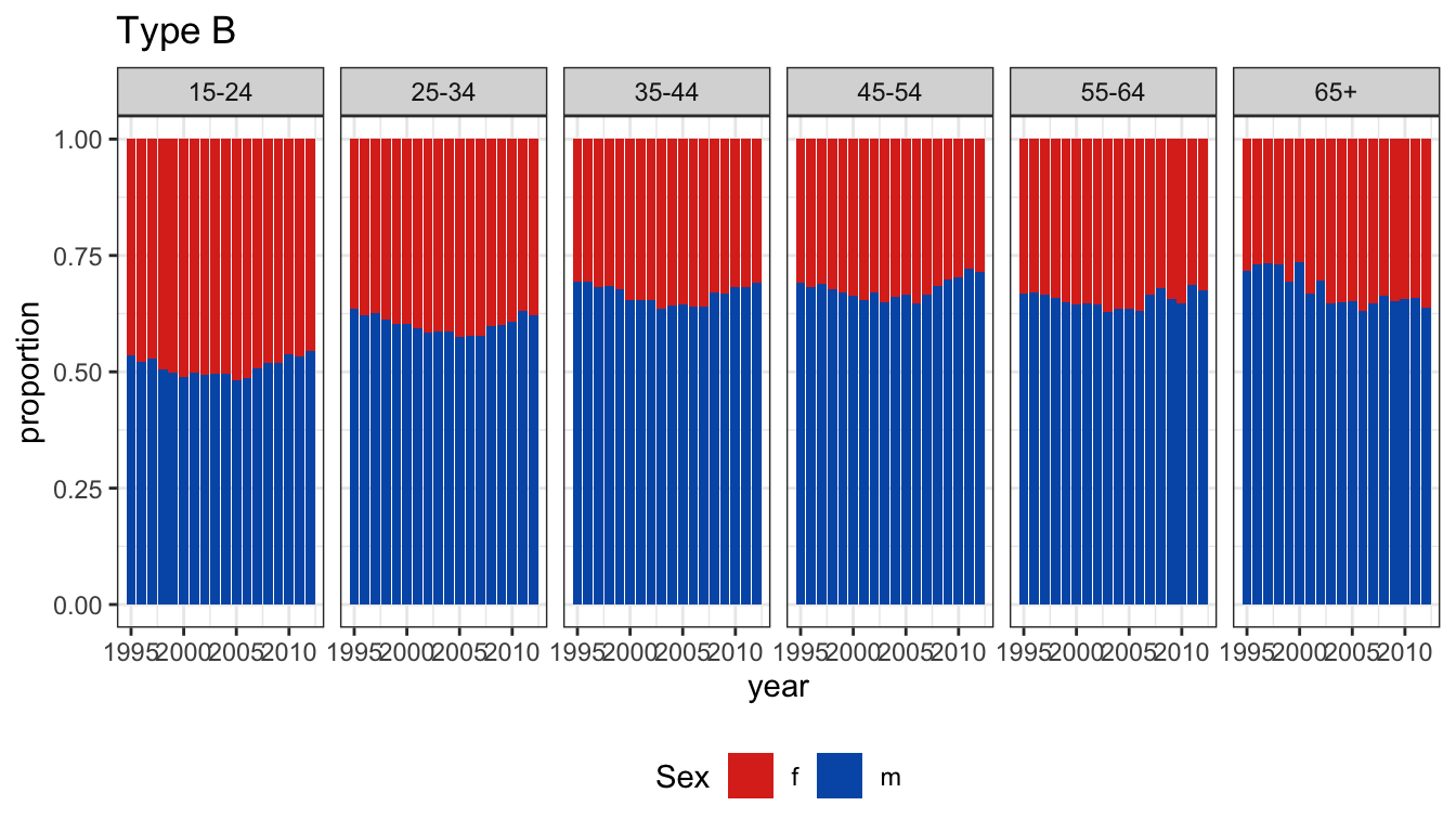
Write out a question that would be easier to answer from arrangement B.
Go to www.menti.com and use the code 2979 2396.

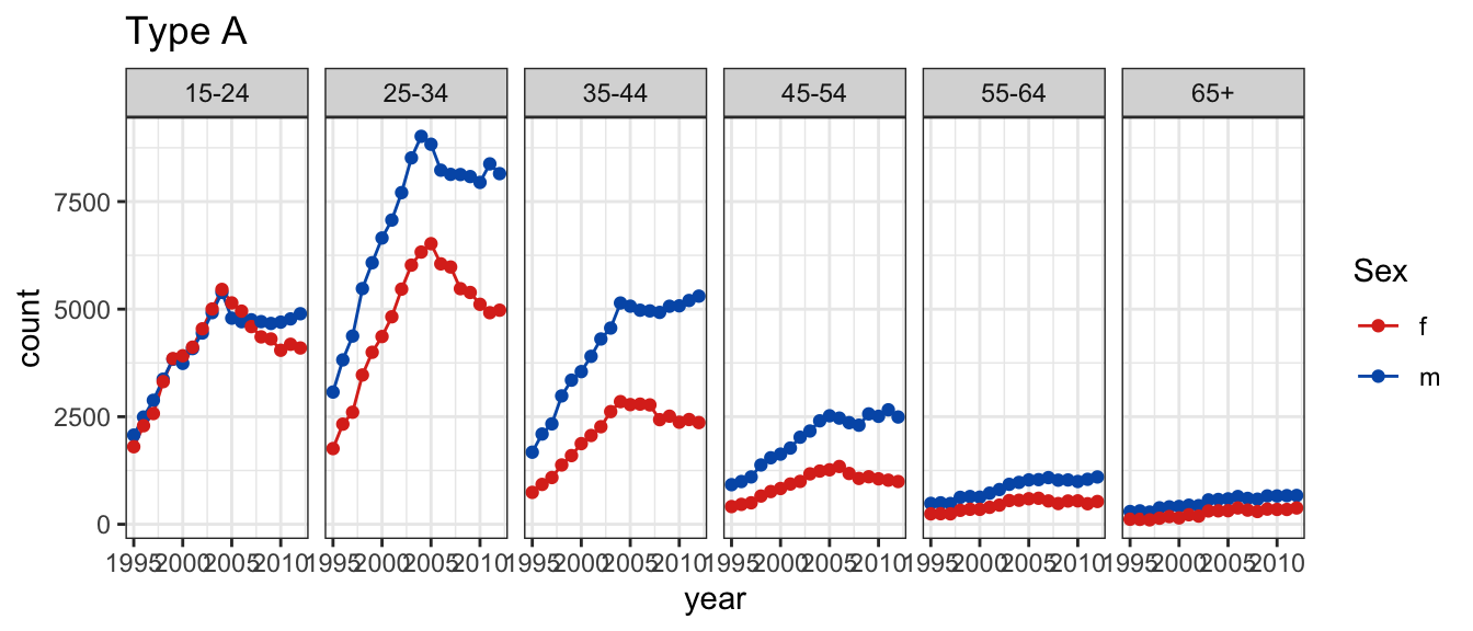
TWO MINUTE CHALLENGE 🔮 👽 👼


Which type of plot makes it easier to answer
Is the trend for females generally decreasing over time?
01:50
TWO MINUTE CHALLENGE 🔮 👽 👼
What are the pros and cons of each way of displaying the same information? Should specific limits on axes be made?
Should the limits of the y axis in plot A include 0 (zero)?
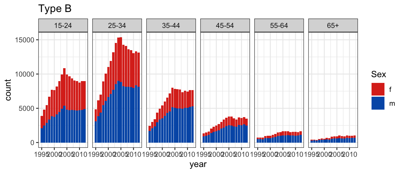
00:30
TWO MINUTE CHALLENGE 🔮 👽 👼
Plot A shows the proportion as a line plot.
Plot B shows stacked bars scaled to 100% for females and males.
Is there an age effect in the proportion of incidence by gender? Is there a temporal trend in the proportions?
01:05
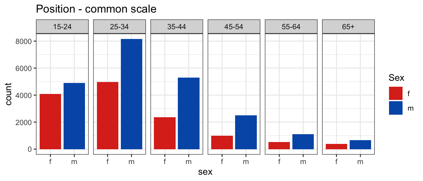
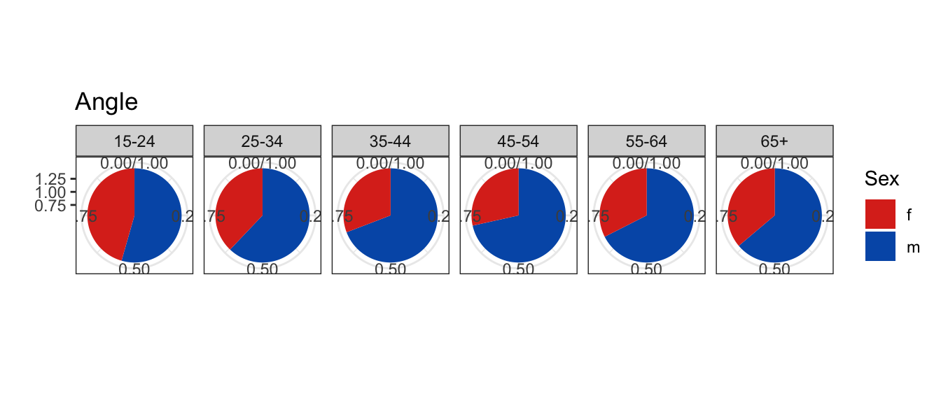
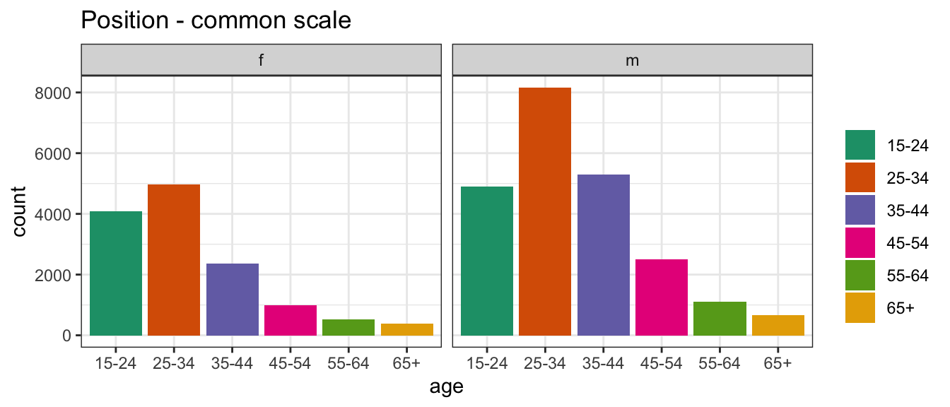
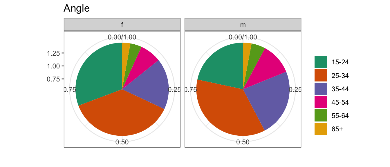
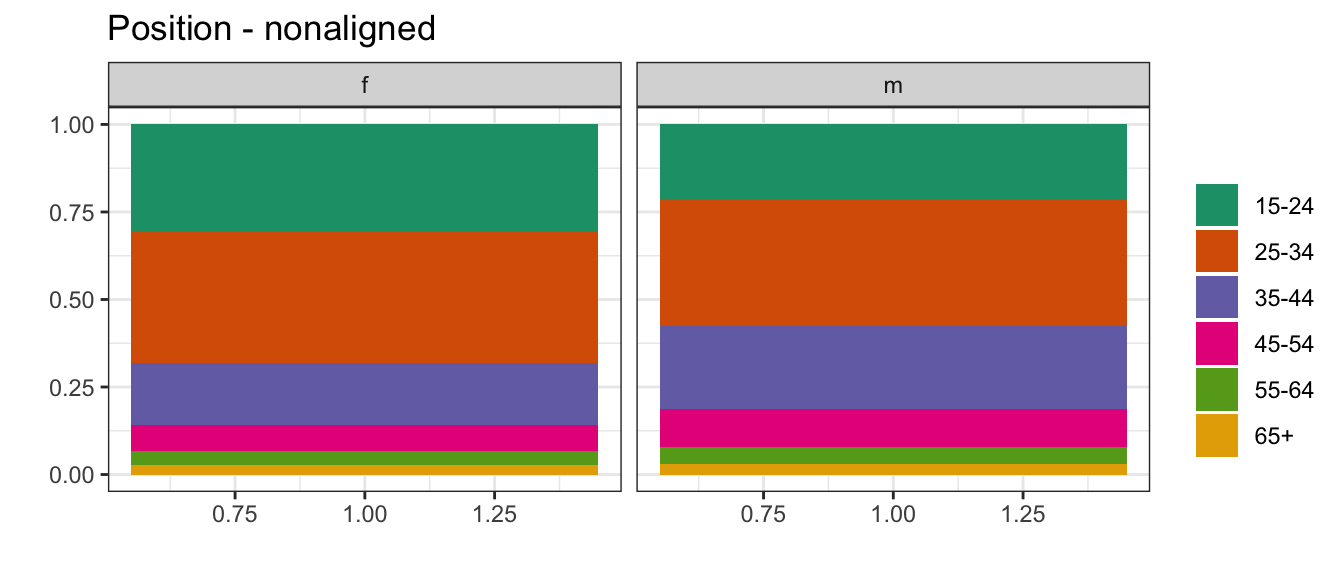
Hierarchy of mappings
- Position - common scale (BEST)
- Position - nonaligned scale
- Length, direction, angle
- Area
- Volume, curvature
- Shading, color (WORST)
(Cleveland, 1984; Heer and Bostock, 2009)
TWO MINUTE CHALLENGE 🔮 👽 👼
Come up with a plot type for each of the mappings.
- Position - common scale (BEST)
- Position - nonaligned scale
- Length, direction, angle
- Area
- Volume, curvature
- Shading, color (WORST)
(Cleveland, 1984; Heer and Bostock, 2009)
01:40
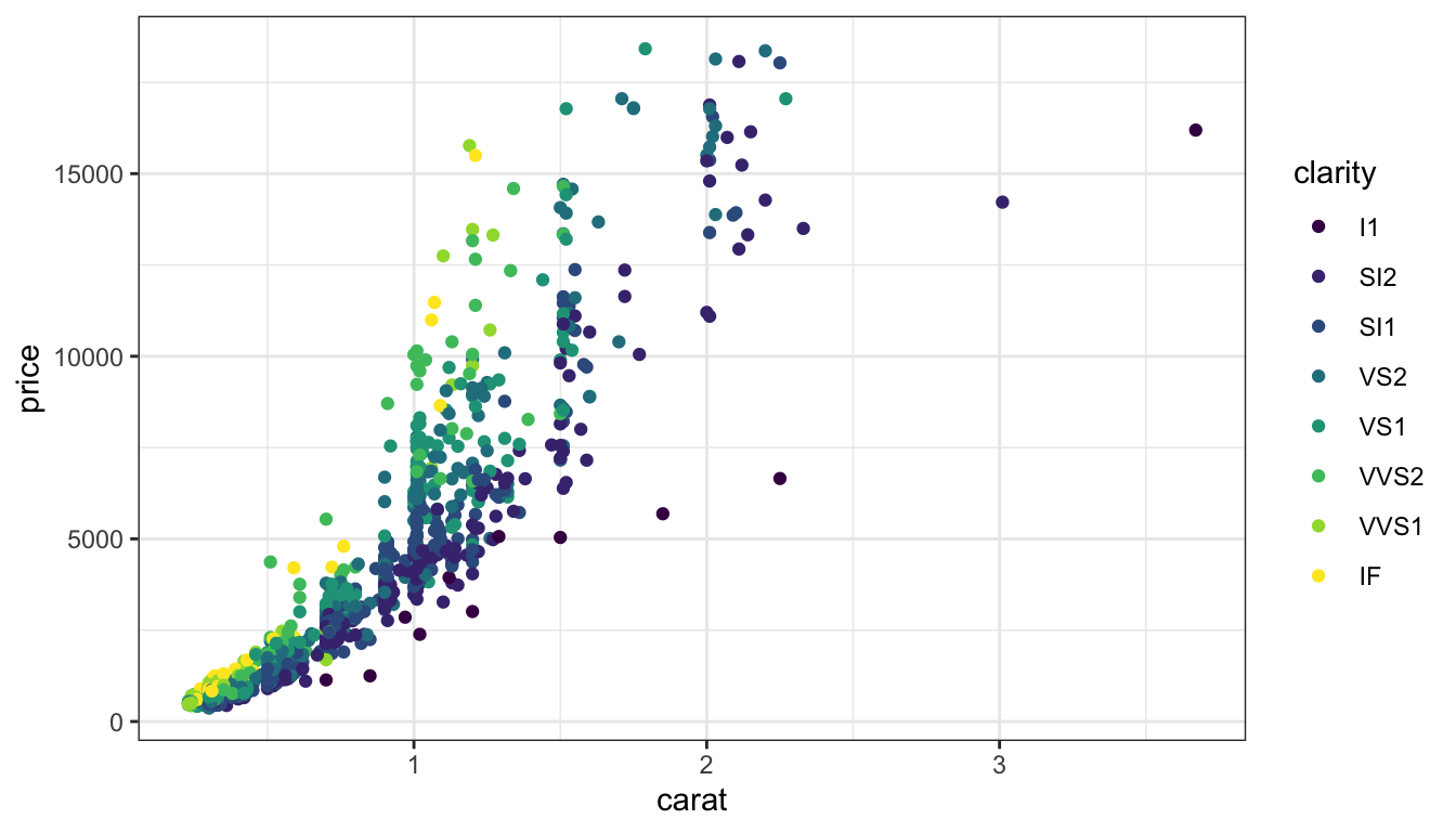
Color palettes
- Sequential,
- Diverging,
- Qualitative
Color Brewer annotates palettes with attributes.
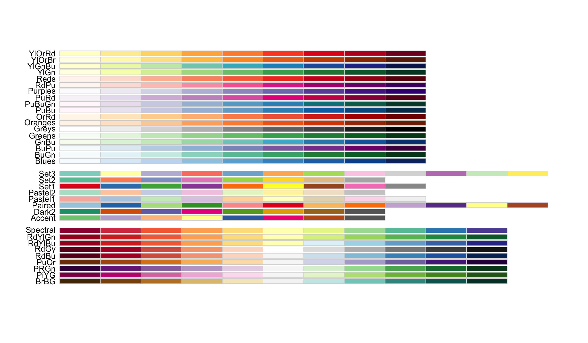
Sequential
Sequential
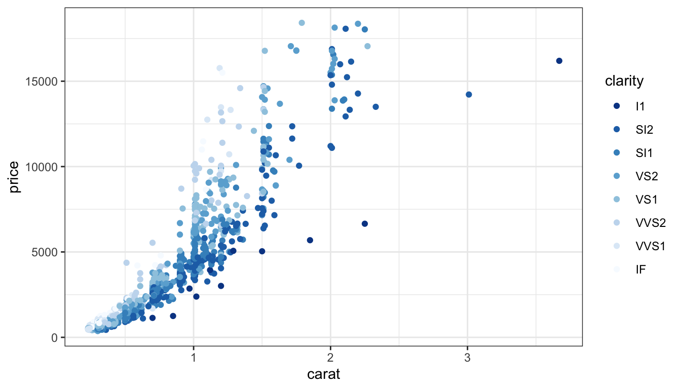
Default brewer sequential scale, blues.
Focus is on the dark blue.
Diverging
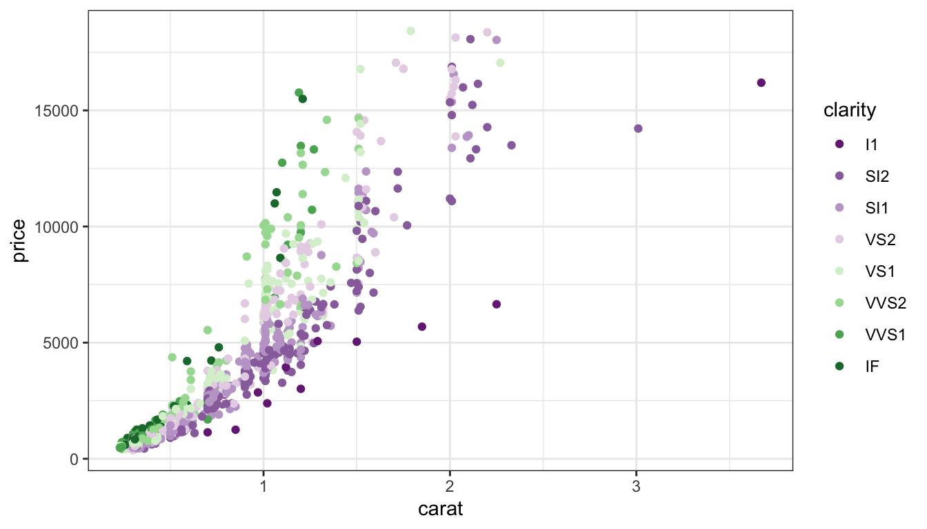
- Emphasize both ends, high AND low
- De-emphasize middle
Qualitative
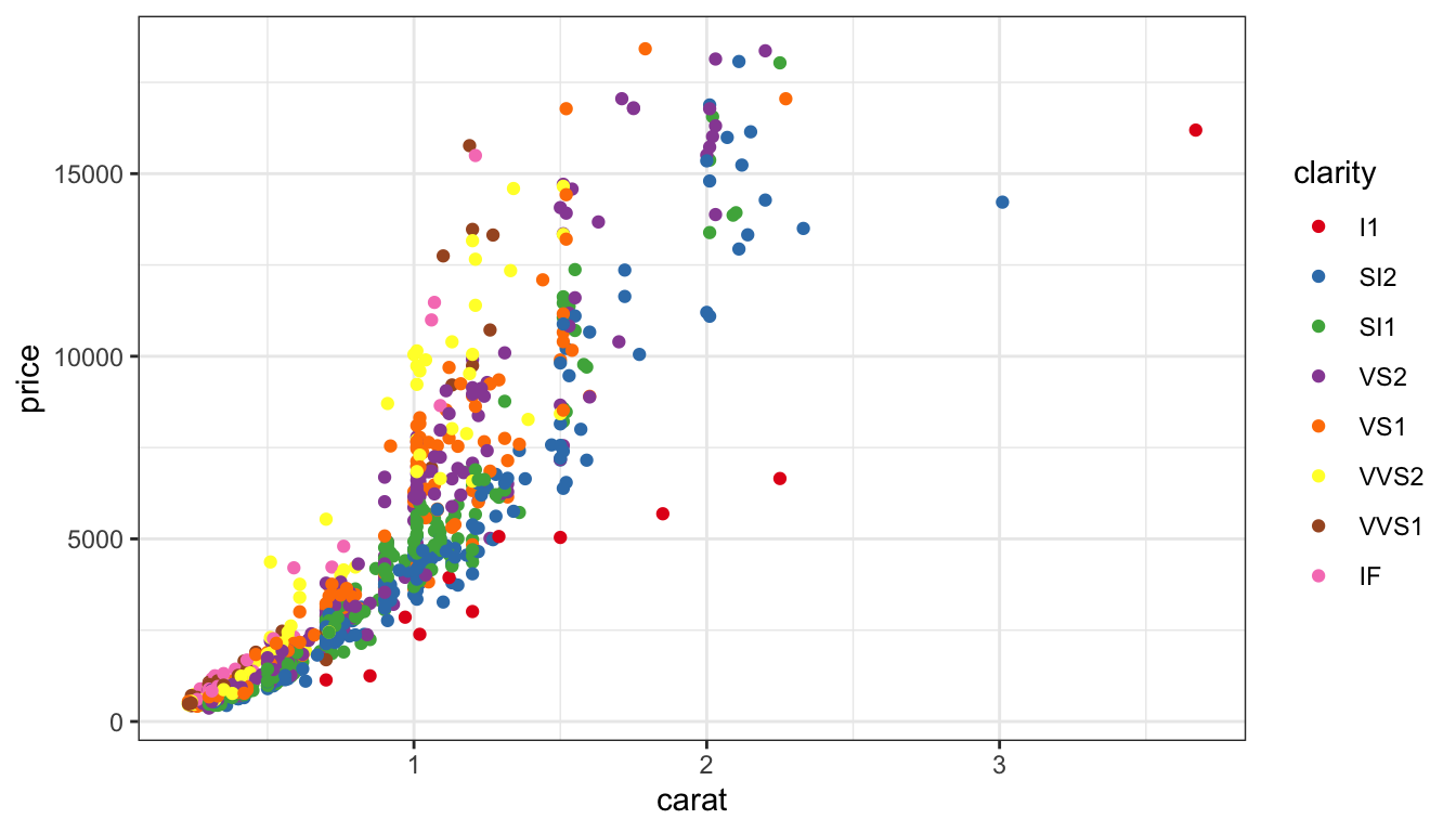
Map qualitative variables to most differentiated set of colors.
It’s possible to have too many colours to perceive differences.
Color blind Simulation
Original colours
Color blind view
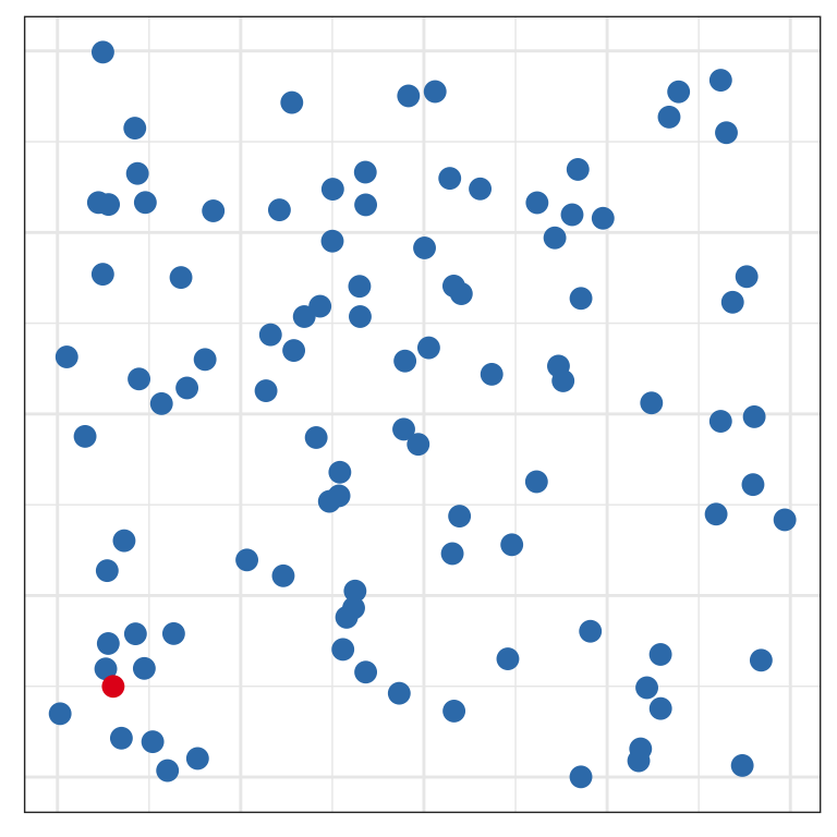
Pre-attentive
Can you find the odd one out?
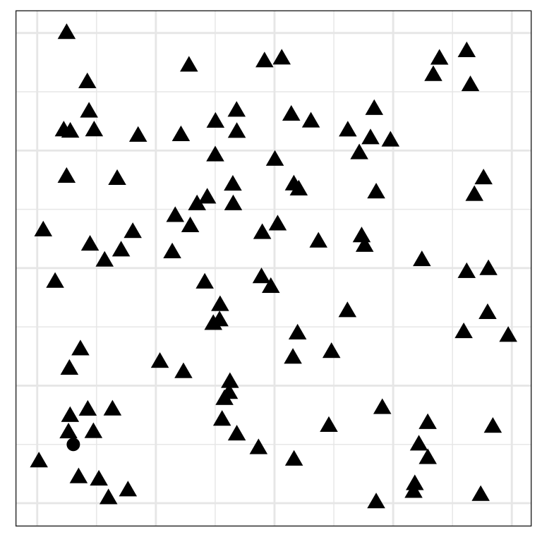
Pre-attentive
Is it easier now?
Proximity
Place elements that you want to compare close to each other. If there are multiple comparisons to make, you need to decide which one is most important.
Mapping and proximity
Same proximity is used, but different geoms.
- Which is better to determine the relative ratios of males to females by age?
Mapping and proximity
Same proximity is used, but different geoms.
Which is better to determine the relative ratios of ages by sex?
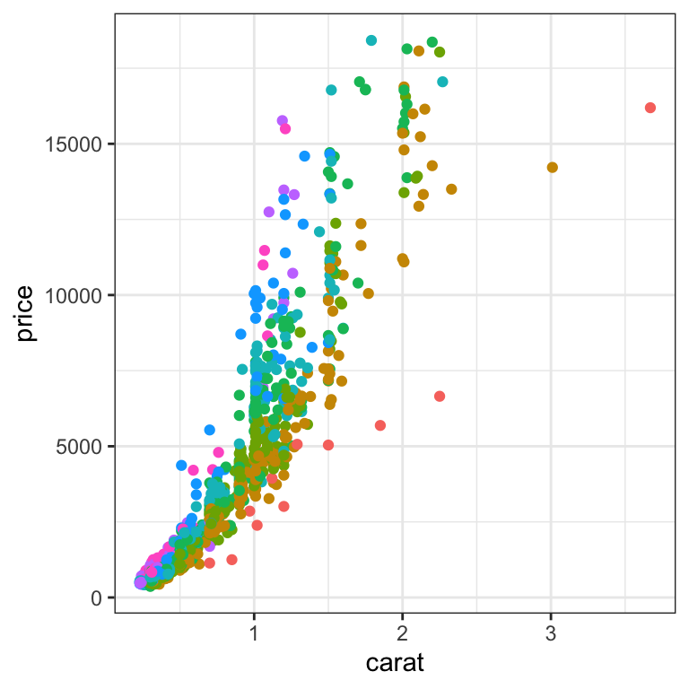
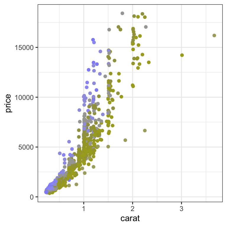
Change blindness
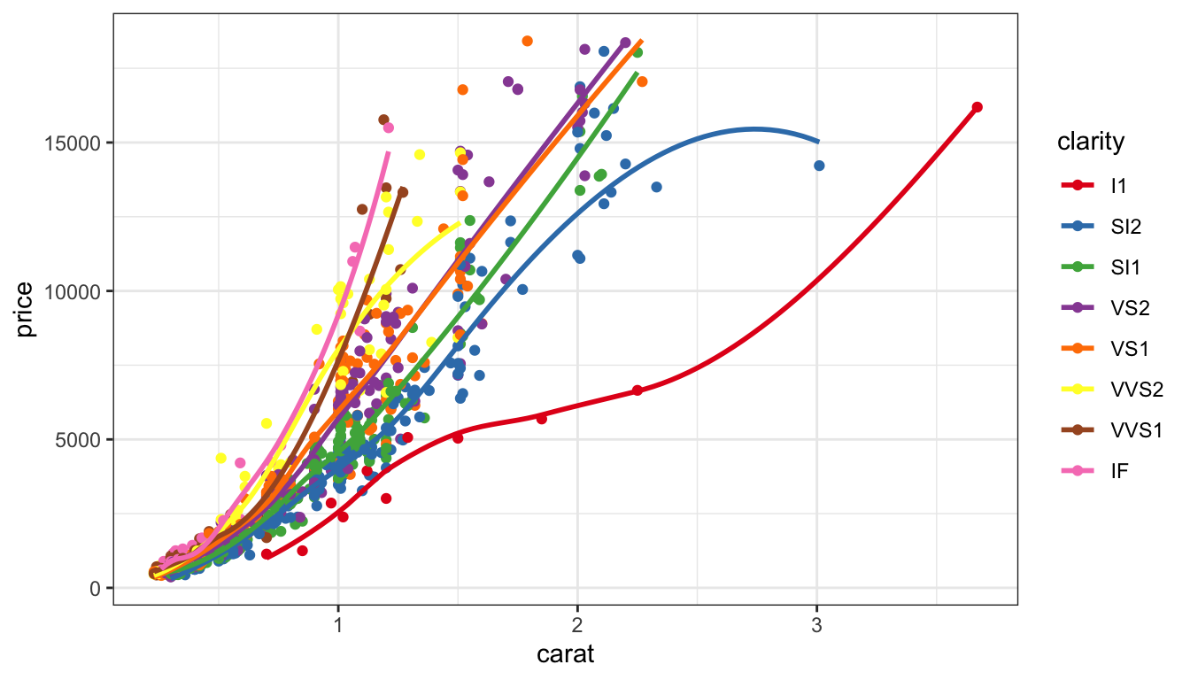
ggplot(dsamp, aes(x=carat, y=price, colour = clarity)) +
  geom_point() +
  geom_smooth(se=FALSE) +
  scale_color_brewer(palette="Set1") +
  facet_wrap(~clarity, ncol=4)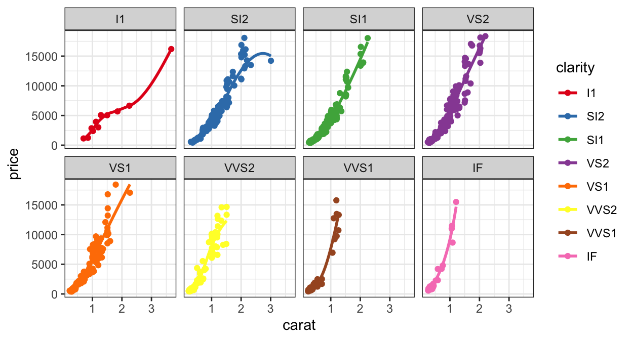
Which has the steeper slope, VS1 or VS2?
Change blindness
Resources
- Claus Wilke, Fundamentals of Data Visualization
- Naomi Robbins, Creating More Effective Graphs
- Cleveland, McGill (1984) Graphical perception: Theory, experimentation
- Heer, Bostock (2010) Crowdsourcing graphical perception
- Antony Unwin, Graphical Data Analysis with R
- Wagemans et al. (2012) A Century of Gestalt Psychology in Visual Perception:
- Wickham (2013) Graphical criticism
- VanderPlas, Goluch, Hofmann (2019) Framed! Reproducing & Revisiting 150 y/o Charts
- VanderPlas, Hofmann (2015) Signs of the Sine Illusion
 This work is licensed under a Creative Commons Attribution-NonCommercial-ShareAlike 4.0 International License.