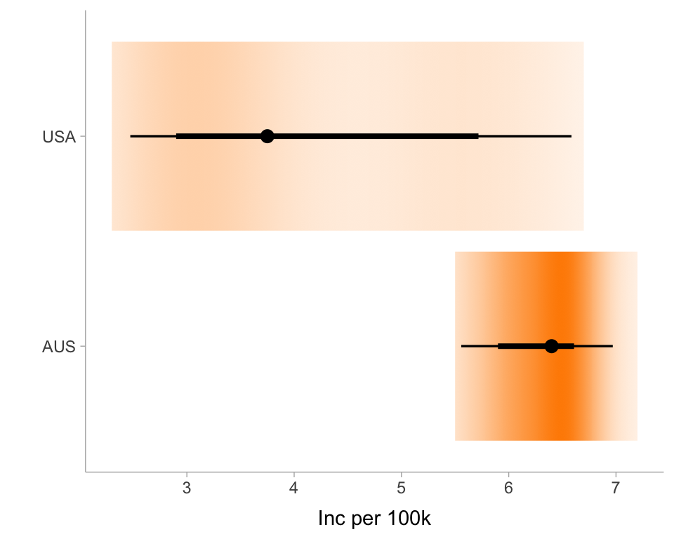
tb_inc_100k <-read_csv(here::here("data/TB_burden_countries_2025-07-22.csv")) |>filter(iso3 %in%c("USA", "AUS"))ggplot(tb_inc_100k, aes(y = iso3, x = e_inc_100k)) +stat_gradientinterval(fill ="darkorange") +ylab("") +xlab("Inc per 100k") +theme_ggdist()
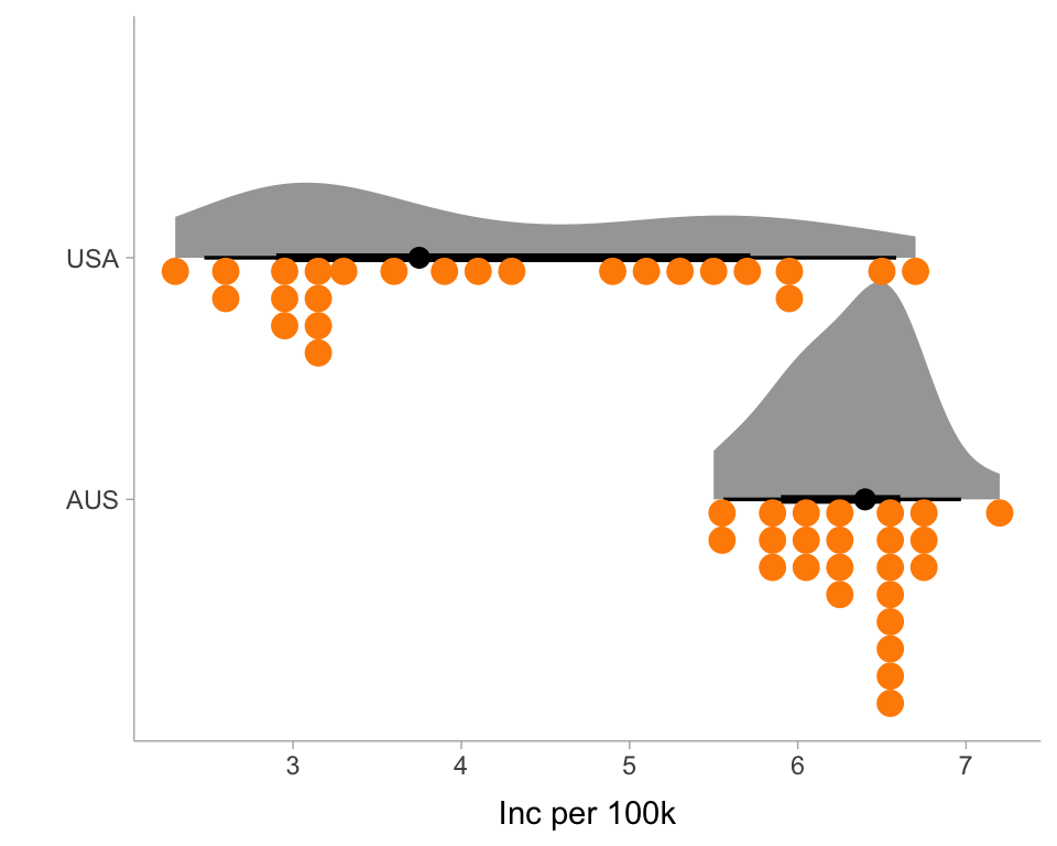
ggplot(tb_inc_100k, aes(y = iso3, x = e_inc_100k)) +stat_halfeye(side ="right") +geom_dots(side="left", fill ="darkorange", color ="darkorange") +ylab("") +xlab("Inc per 100k") +theme_ggdist()
Your turn
05:00
Explore other possibilities in ggdist, for example, how stat_interval() would change a previous chart.
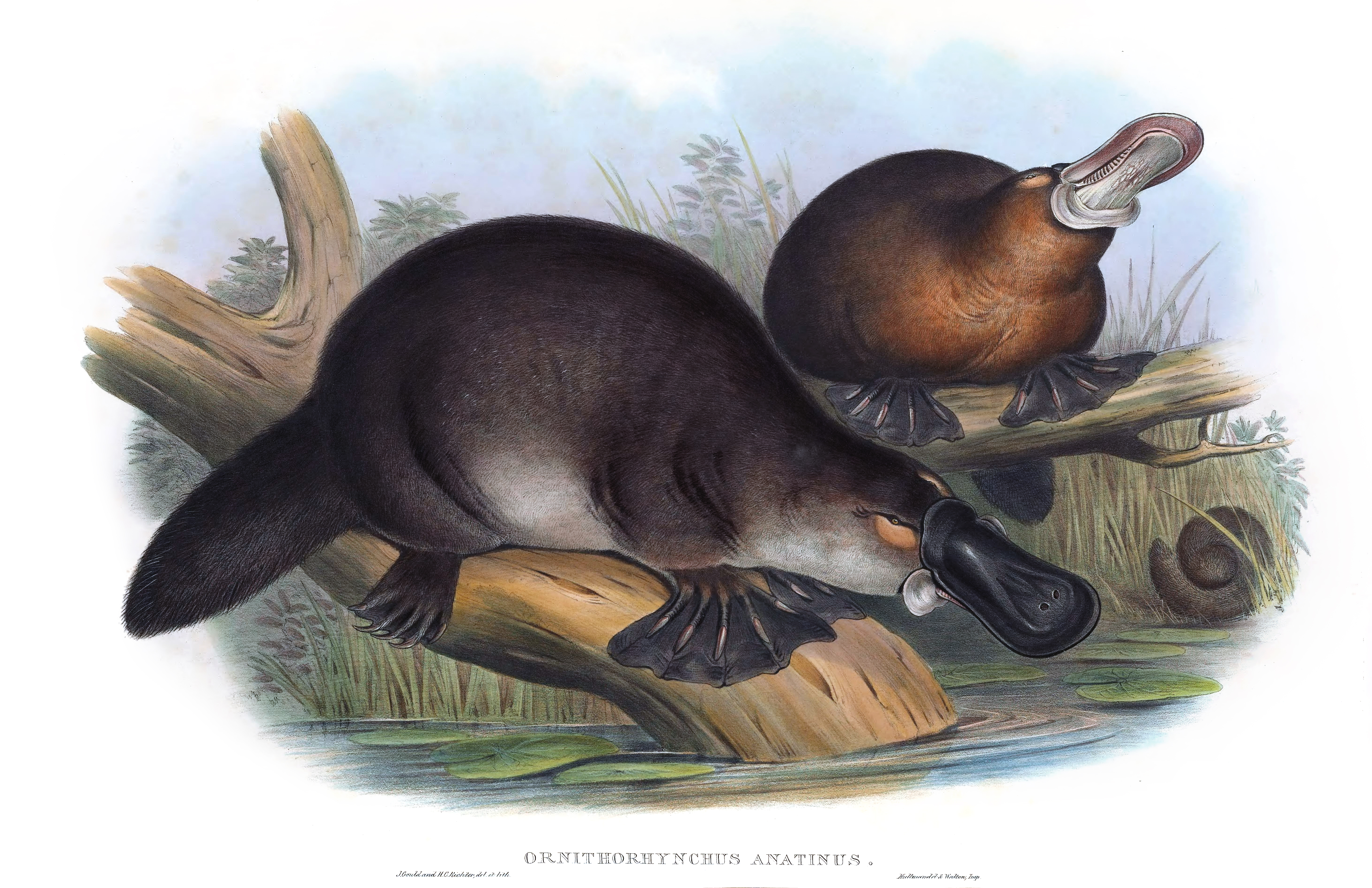
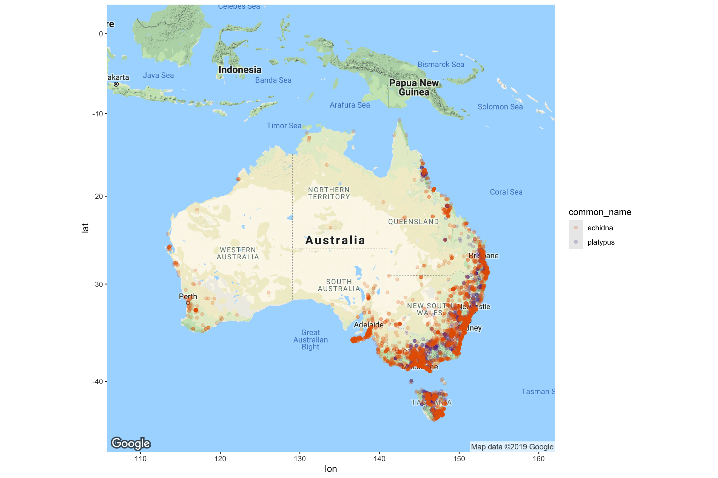
Example: Monotremes in Australia
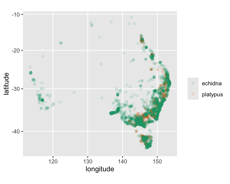
Where can you find the strange platypus and echidna live in Australia?
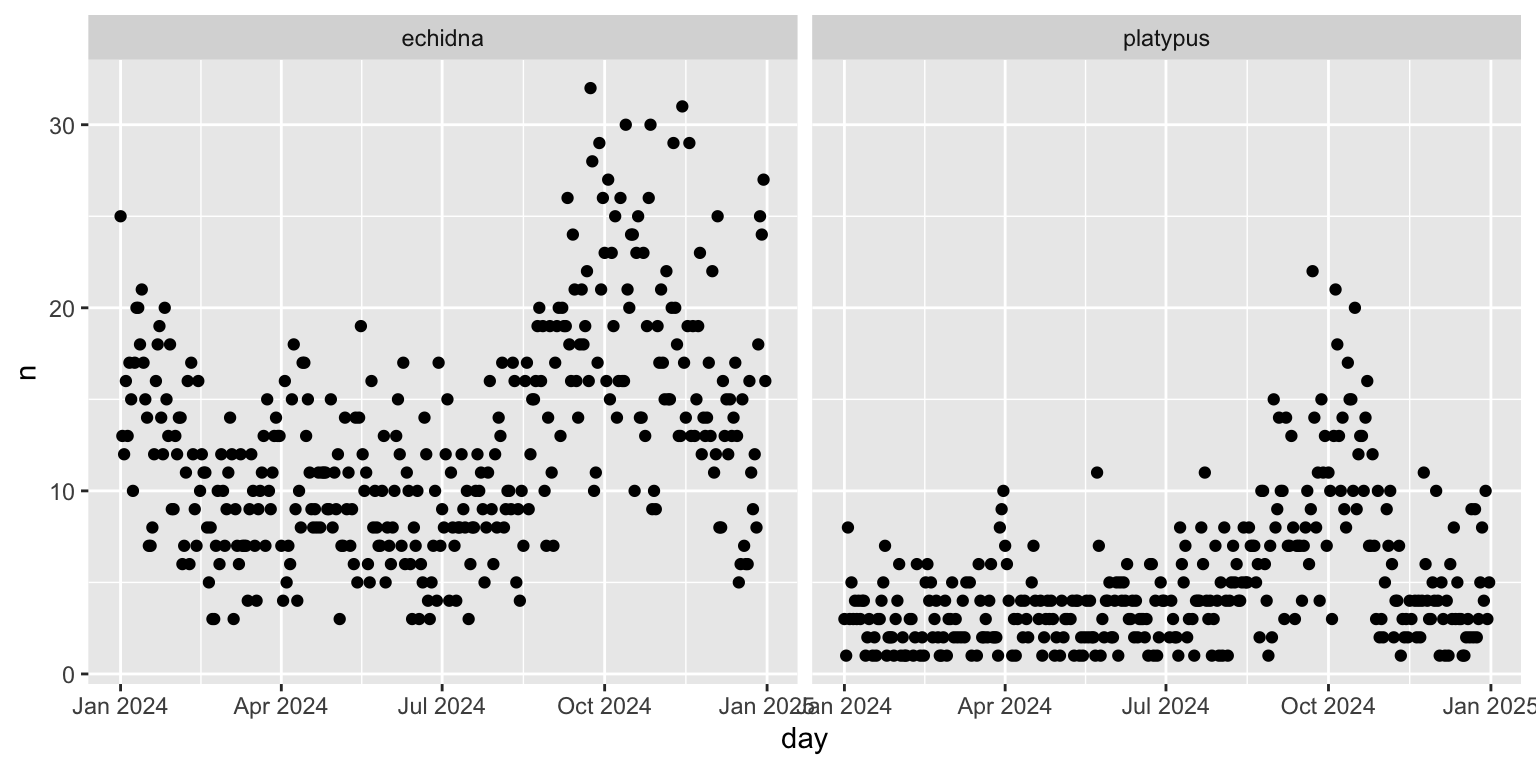
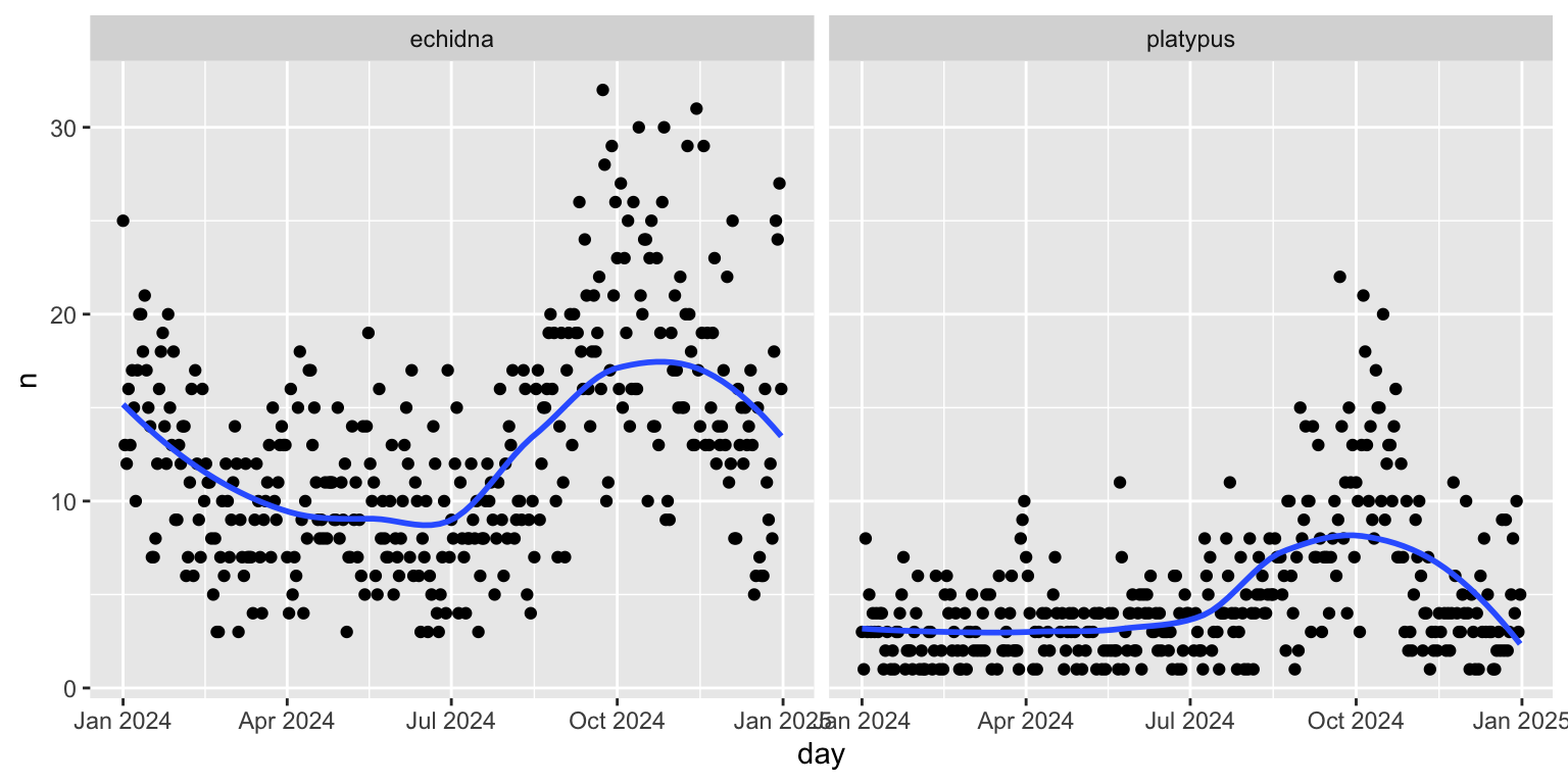
Our goal is to examine how sightings change over time. The orginal variable eventDate was renamed to be datetime and converted into two variables during pre-processing: day which is a date variable, and hour.
SOME STUFF HERE |>mutate(day =ymd(str_sub(datetime, 1, 10),tz="Australia/Sydney"), hour =as.numeric(str_sub(datetime, 15, 16)))
Make sure you can make all the plots shown in this session, and then tackle these tasks:
Change the dotplot into a density plot. This changes the focus to be on the locations of the most frequent sightings.
Facetting by creatures might
How would the interpretation change using the density plot instead of the scatterplot?
Your turn
Explore the temporal trend differently by making a side-by-side boxplot of the occurrences over month. Note that you still need to summarise by day for this to be meangingful. Does this change the focus for the temporal trend?
Your turn
There is something quite wrong in the previous plots. Can you guess what it is?

