A statistic is a function on the values of items in a sample, e.g. for \(n\) iid random variates \(\bar{X}_1=\displaystyle\sum_{i=1}^n X_{i1}\), \(s_1^2=\displaystyle\frac{1}{n-1}\displaystyle\sum_{i=1}^n(X_{i1}-\bar{X}_1)^2\)
We study the behaviour of the statistic over all possible samples of size \(n\).
The grammar of graphics is the mapping of (random) variables to graphical elements, making plots of data into statistics
What is inference?
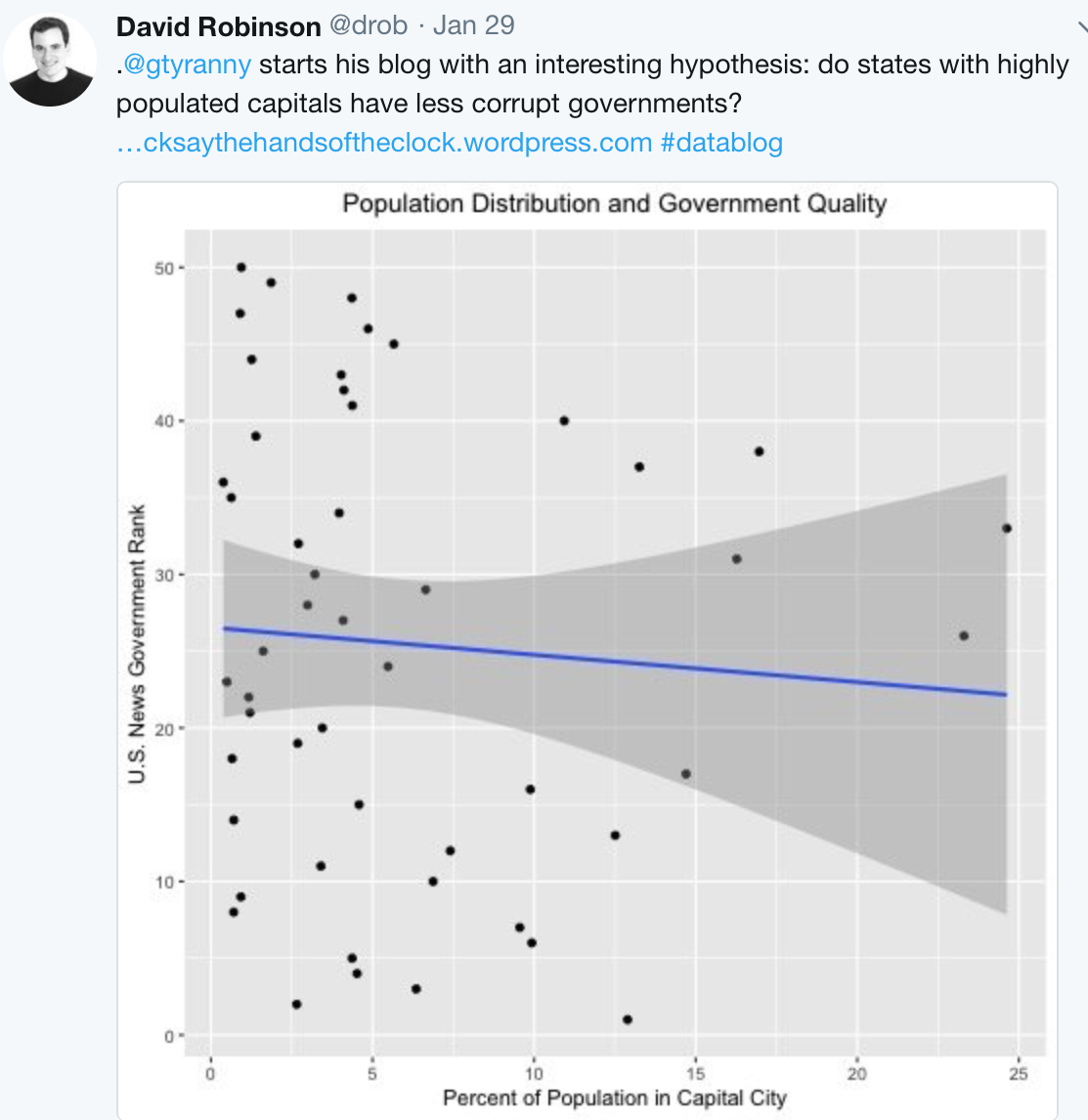
Inferring that what we see in the data at hand holds more broadly in life, society and the world.
reference distribution on which to measure the statistic
if it is extreme on this scale, reject the null
Inference with data plots
You need a:
plot description provided by the grammar (a statistic)
This implies one or more null hypotheses
null generating mechanism, e.g. permutation, simulation from a distribution or model
visual evaluation: is one plot in the array different?
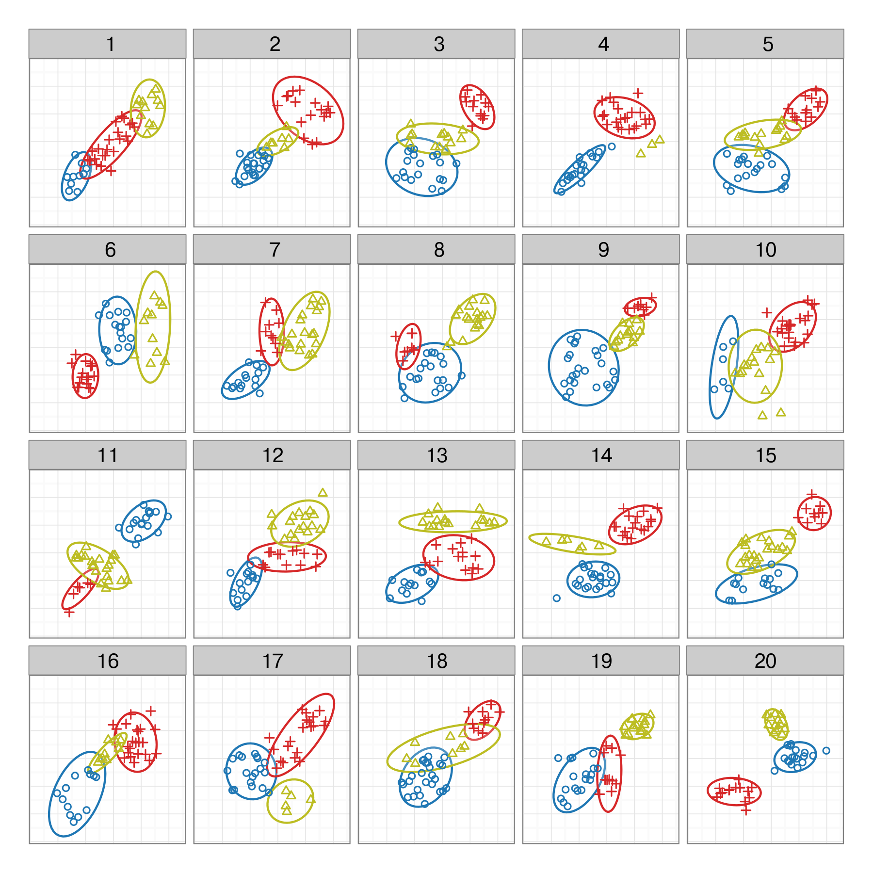
Some examples
Here are several plot descriptions.
What would be the null hypothesis in each?
Which plot definition would best match \(H_0:\)there is no difference in the distribution between the groups?
Some examples
Here are several null hypotheses.
What type of plot would you use to test each?
\(H_0:\) no association between x1 and x2
\(H_0:\) no difference between levels of cl
\(H_0:\) the distribution of x1 is XXX
\(H_0:\) no difference in the distribution of x1 b/w levels of cl
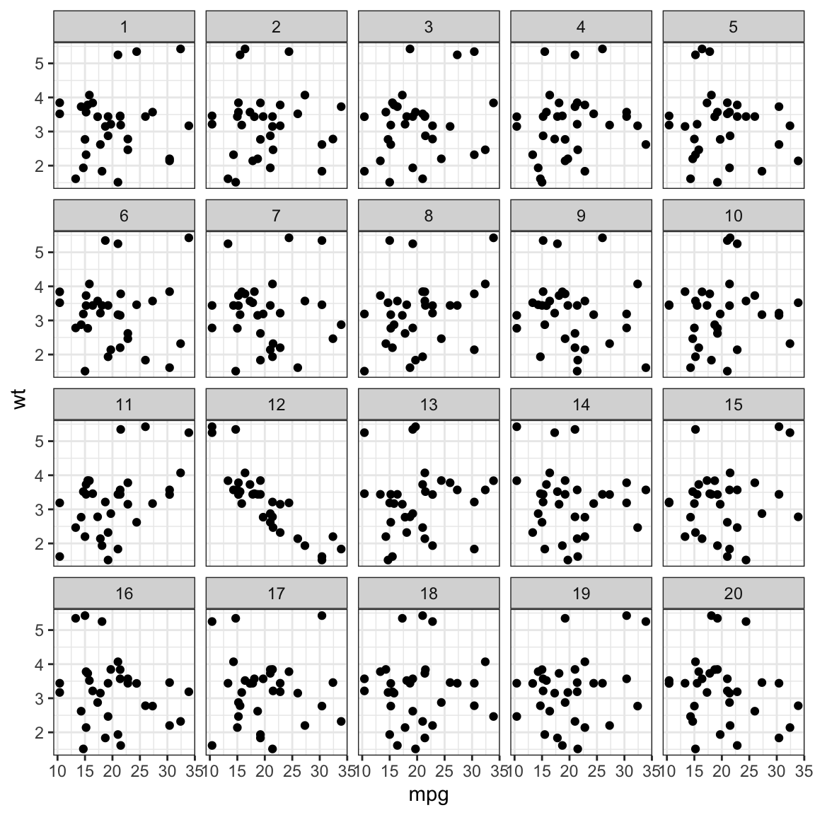
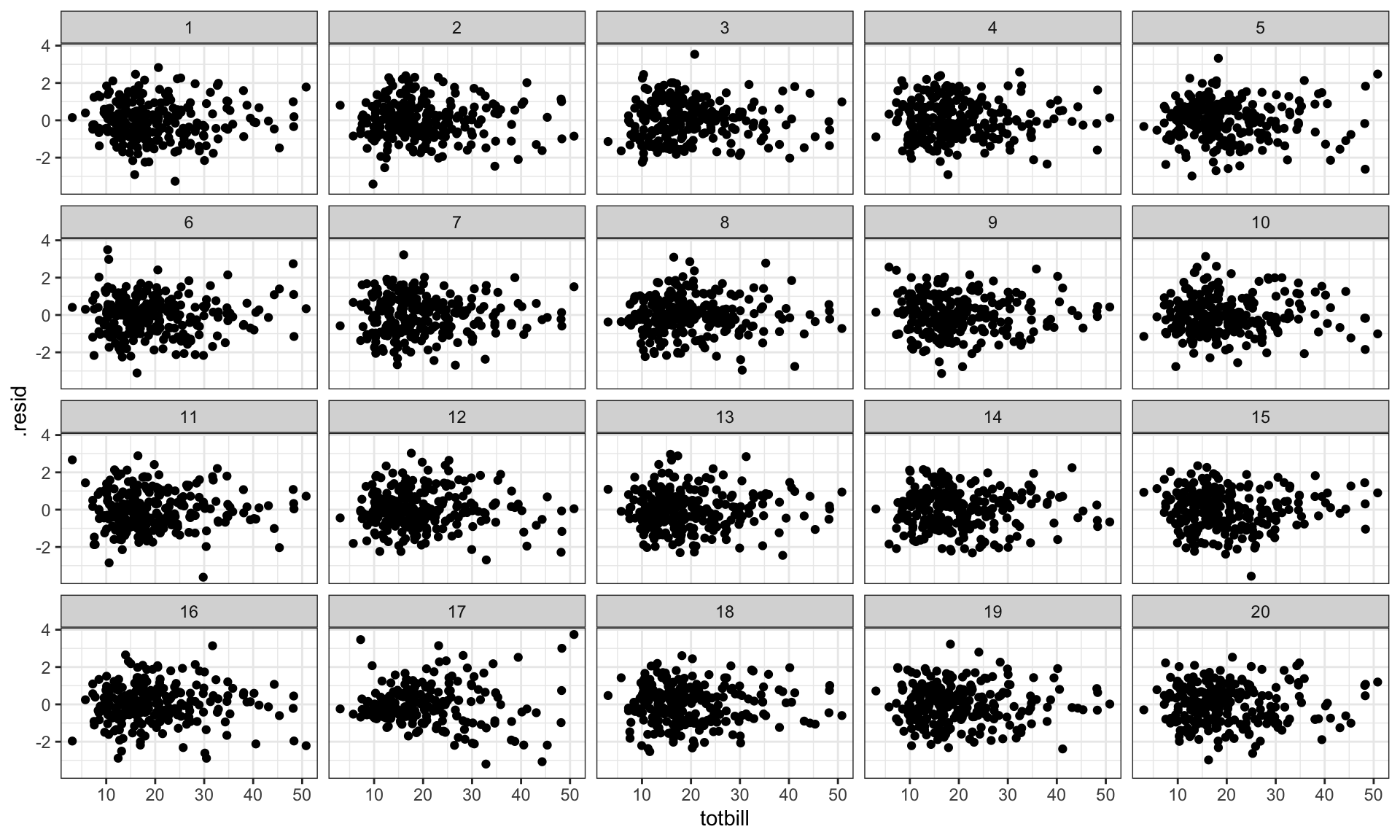
Let’s do it
# Make a lineup of mtcars data# 20 plots, one data, 19 nulls# Which one is different?set.seed(20190709)library(ggplot2)ggplot(lineup(null_permute('mpg'), mtcars), aes(mpg, wt)) +geom_point() +facet_wrap(~ .sample)
Lineup
Mix the data plot
into a field of null plots
Which plot is different?
Null-generating mechanisms
Permutation: randomizing the order of one of the variables breaks association, but keeps marginal distributions the same
Simulation: from a given distribution, or model. Assumption is that the data comes from that model.
Evaluation
Compute \(p\)-value
Power \(=\) signal strength
p-values
\(K\) independent observers
\(x\) individuals pick the data plot from \(m\) plots
Assuming that all plots in a lineup are equally likely to be selected,
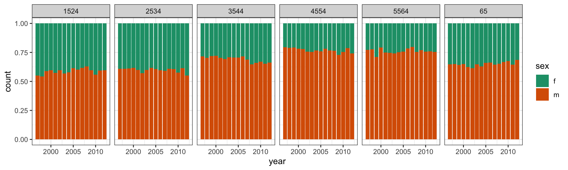
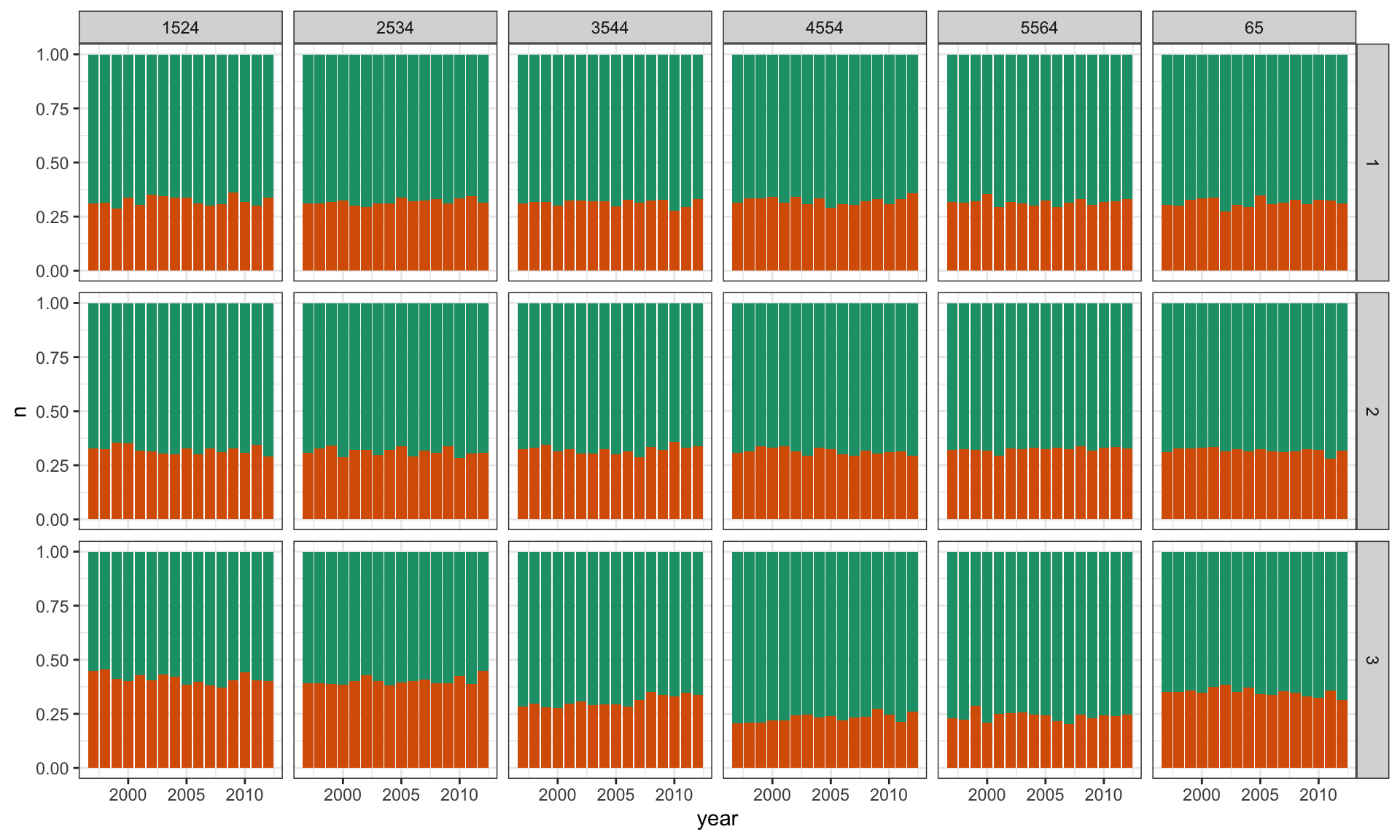
Across all ages, and years, the proportion of males having TB is higher than females
These proportions tend to be higher in the middle age groups, for all years.
Relatively similar proportions occur across years.
Null hypothesis
Plot count against year, separately for each age group, coloured by sex.
Colouring by sex \(\Rightarrow\) primary comparison
Plot shows proportion of sex, given age group and year
\(H_0\): TB occurs equally among men and women, regardless of age and year.
\(H_A\): It doesn’t.
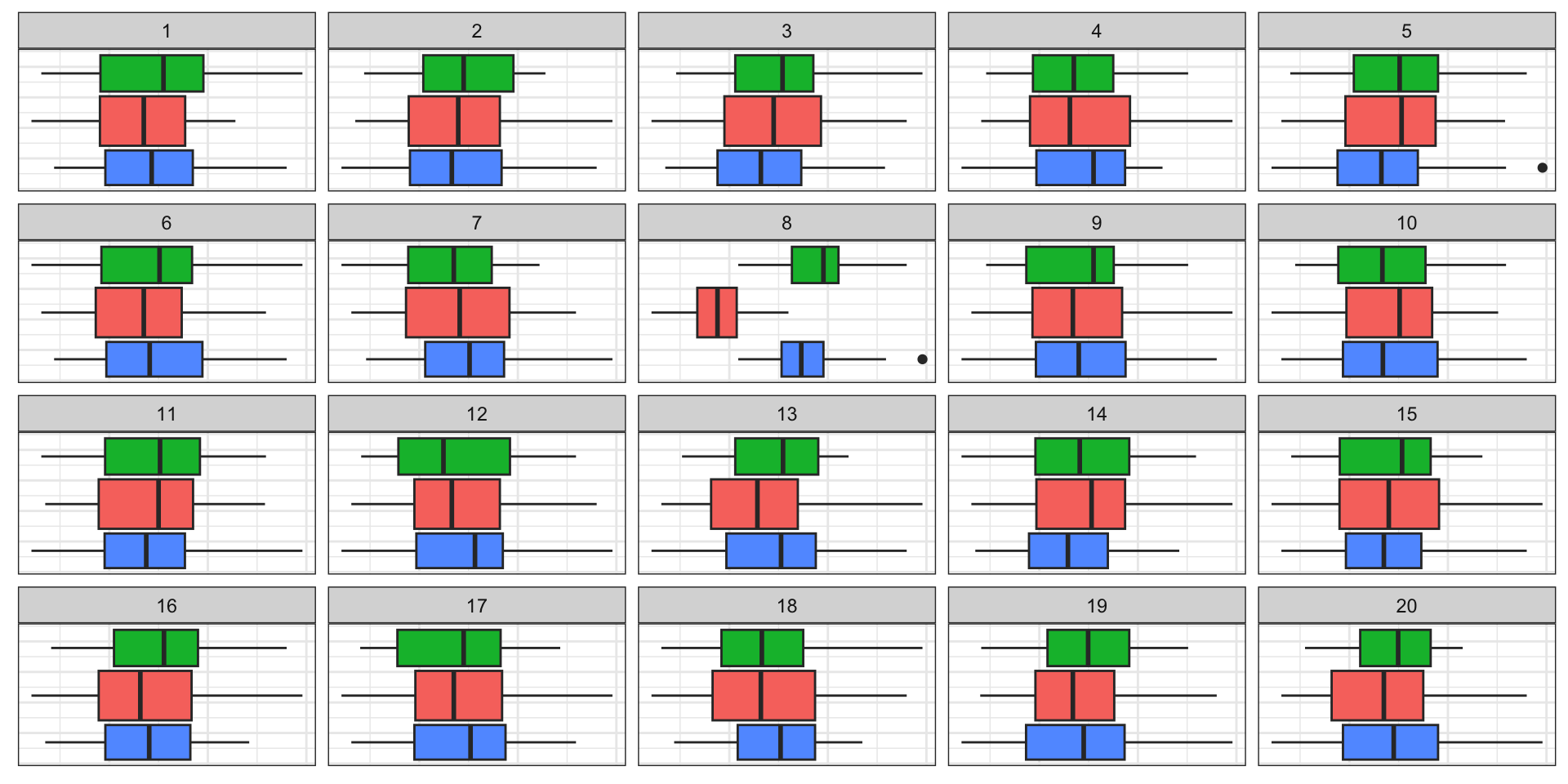
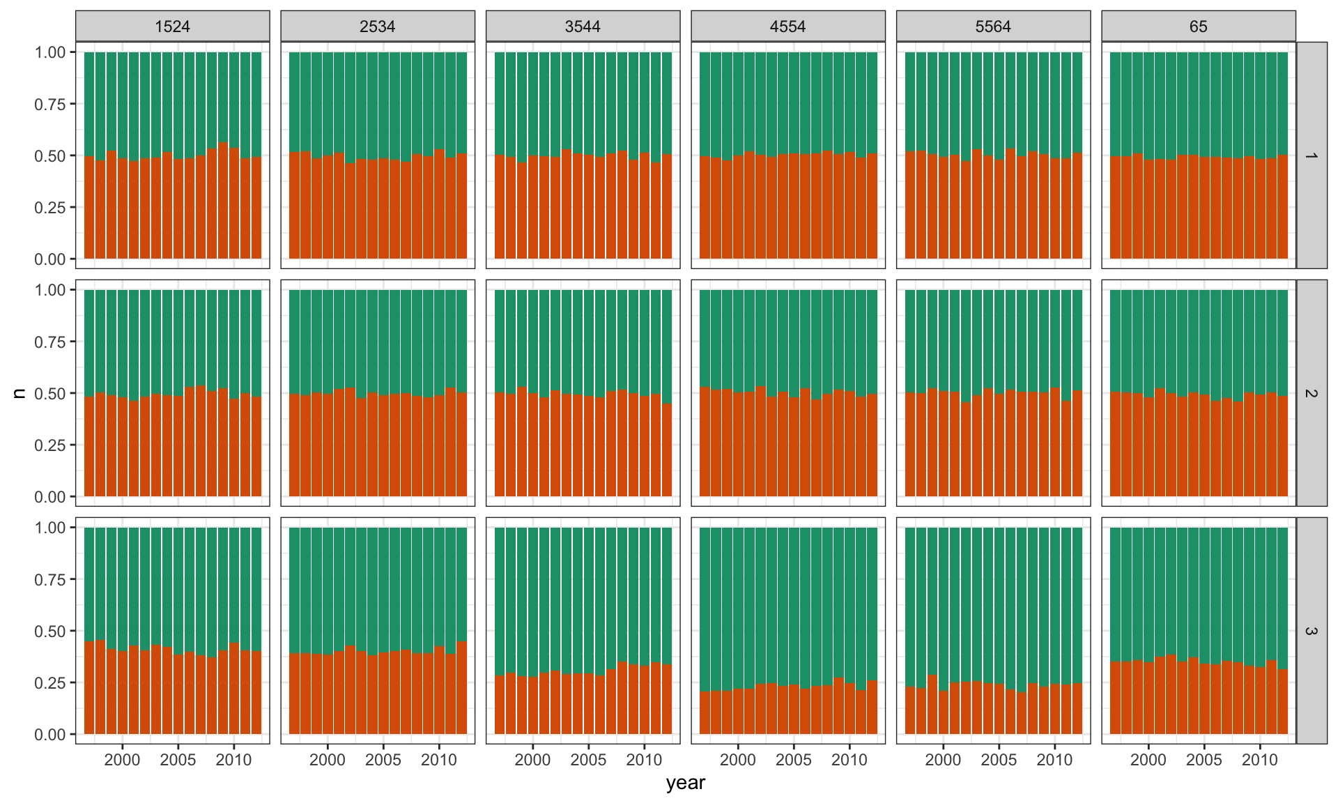
TB Lineup
# Make expanded rows of categorical variables matching the # counts of aggregated data. Sex needs to be converted to 0, 1# to match binomial output.tb_us_long <-uncount(tb_us, count)tb_us_long <- tb_us_long |>mutate(sex01 =ifelse(sex=="m", 0, 1)) |>select(-sex)# Generate a lineup of n=3, randomly choose the data position.# Compute counts again.pos =sample(1:3, 1)l <-lineup(null_dist(var="sex01", dist="binom", list(size=1, p=0.5)), true=tb_us_long, n=3, pos=pos)l <- l |>group_by(.sample, year, age) |>count(sex01)
TB Lineup
ggplot(l, aes(x = year, y = n, fill =factor(sex01))) +geom_bar(stat ="identity", position ="fill") +facet_grid(.sample ~ age) +scale_fill_brewer(palette="Dark2") +theme(legend.position="none")
TB Lineup
A more complicated null
\(H_0\): Rates are the same across sex, regardless of age and year. \(H_A\): They aren’t.
Create lineup, with null data sampled from a Binomial() distribution with the sample proportion as \(p\)
3
Compute aggregate results
# A tibble: 2 × 2
  sex   count
  <chr> <dbl>
1 f     25915
2 m     55640
TB Lineup
ggplot(l, aes(x = year, y = n, fill =factor(sex01))) +geom_bar(stat ="identity", position ="fill") +facet_grid(.sample ~ age) +scale_fill_brewer(palette="Dark2") +theme(legend.position="none")
TB Lineup
Danger zone
\(H_0\) is determined based on the plot type
\(H_0\) is not based on the structure seen in the data set
Null data creation method does not match characteristics of original sample other than that in \(H_0\)


 This work is licensed under a Creative Commons Attribution-NonCommercial-ShareAlike 4.0 International License.