Touring multivariate data
SISBID 2025
https://github.com/dicook/SISBID
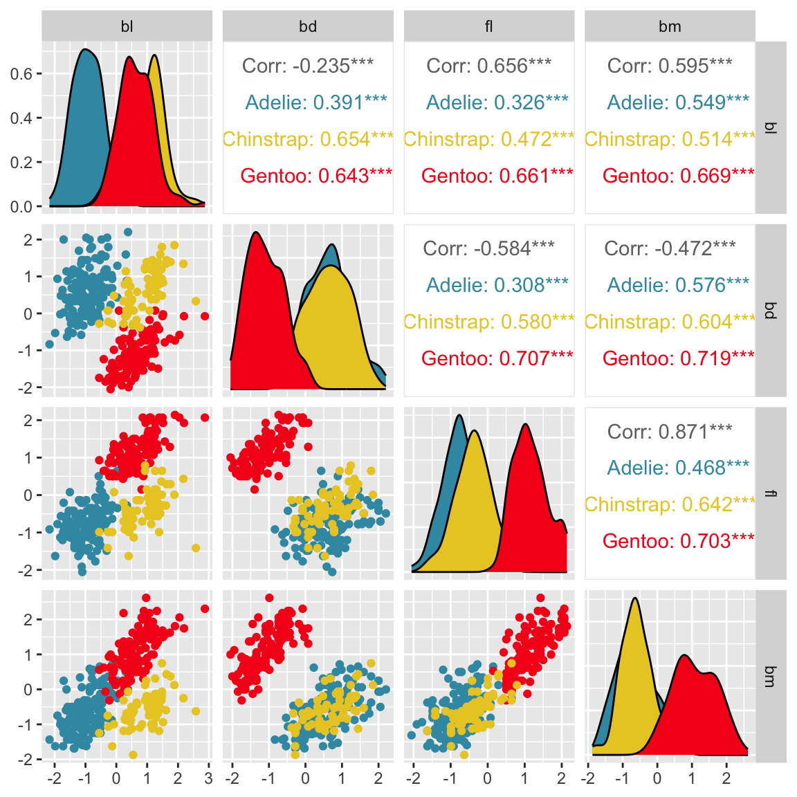
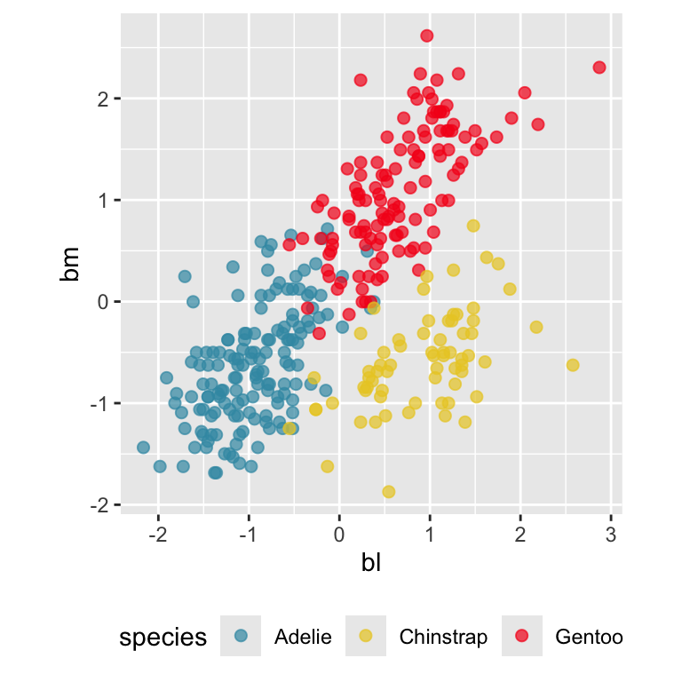
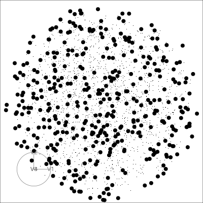
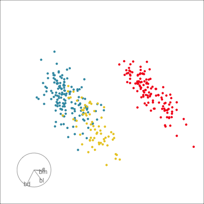
Our first tour
What patterns do you see?
01:30 Which shows better separation?
What is a tour?
- a movie of low-dim projections
- constructed to come close to showing all possible low-dim projections
- a grand tour is a space-filling curve in the manifold of low-dim projections of high-dim data spaces.
\({\mathbf x}_i \in \mathcal{R}^p\), \(i^{th}\) data vector
\(F\) is a \(p\times d\) orthonormal basis
\(F'F=I_d\), where \(d\) is the projection dimension.
The projection of \({\mathbf x_i}\) onto \(F\) is \({\mathbf y}_i=F'{\mathbf x}_i\).
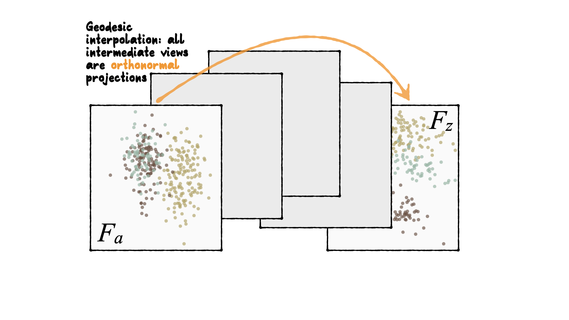
Tour is indexed by time, \(F(t)\), where \(t\in [a, z]\). Starting and target frame denoted as \(F_a = F(a), F_z=F(t)\).
The animation of the projected data is given by a path \({\mathbf y}_i(t)=F'(t){\mathbf x}_i\).
Geodesic interpolation b/w planes
Tour is indexed by time, \(F(t)\), where \(t\in [a, z]\). Starting and target frame denoted as \(F_a = F(a), F_z=F(t)\).
The animation of the projected data is given by a path \({\mathbf y}_i(t)=F'(t){\mathbf x}_i\).
Reading axes - interpretation
Length and direction of axes relative to the pattern of interest
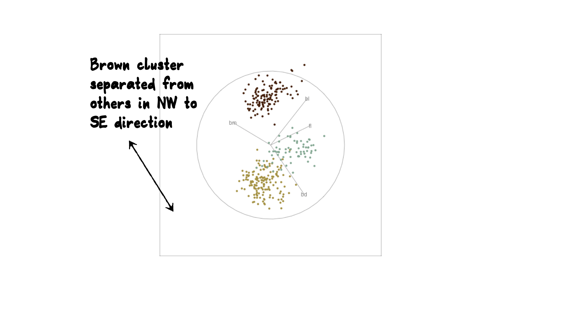
Reading axes - interpretation
Length and direction of axes relative to the pattern of interest
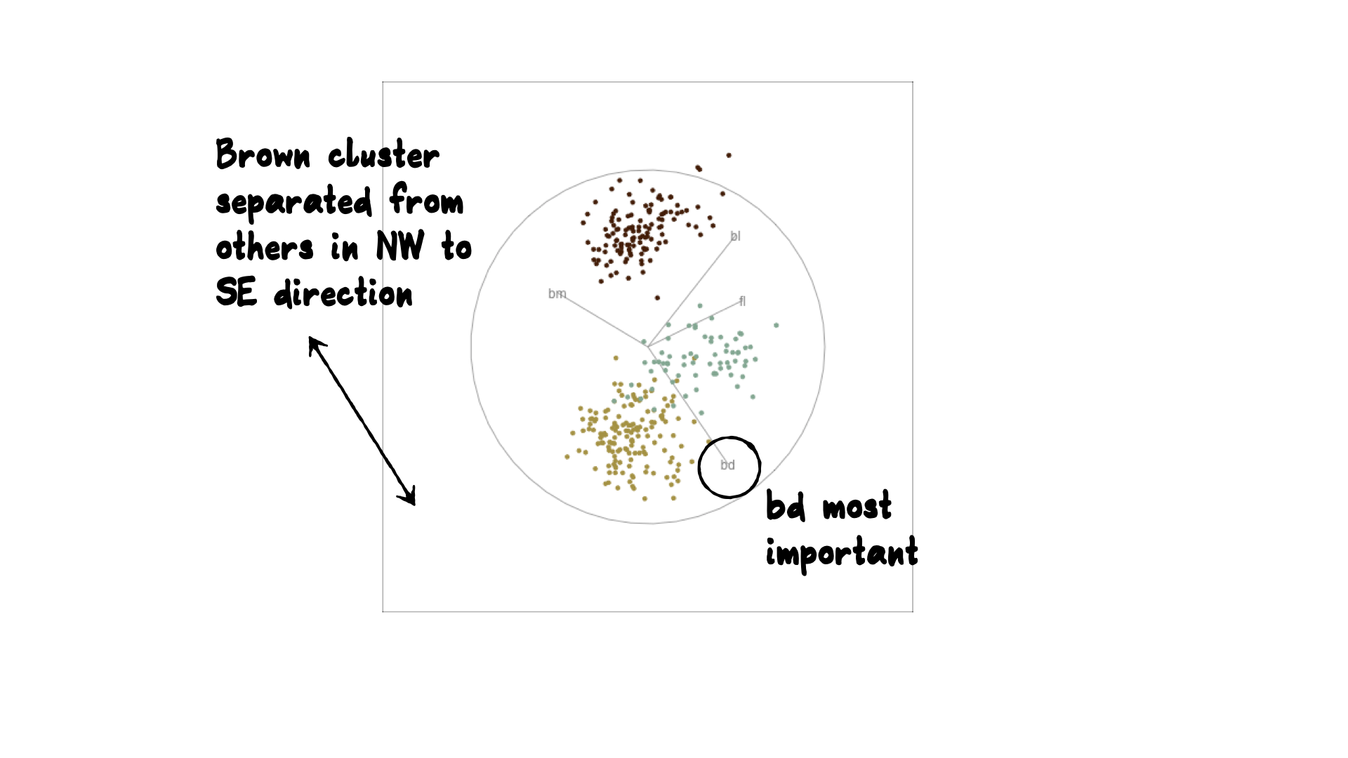
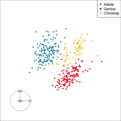
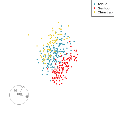
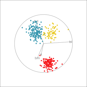
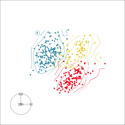
Understanding the projections
Grand
Might accidentally see best separation
Guided, using LDA index
Moves to the best separation
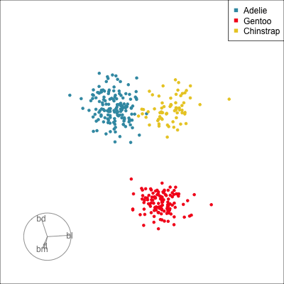
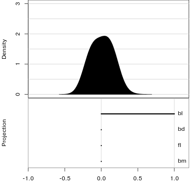
Manual tour
- start from best projection, given by projection pursuit
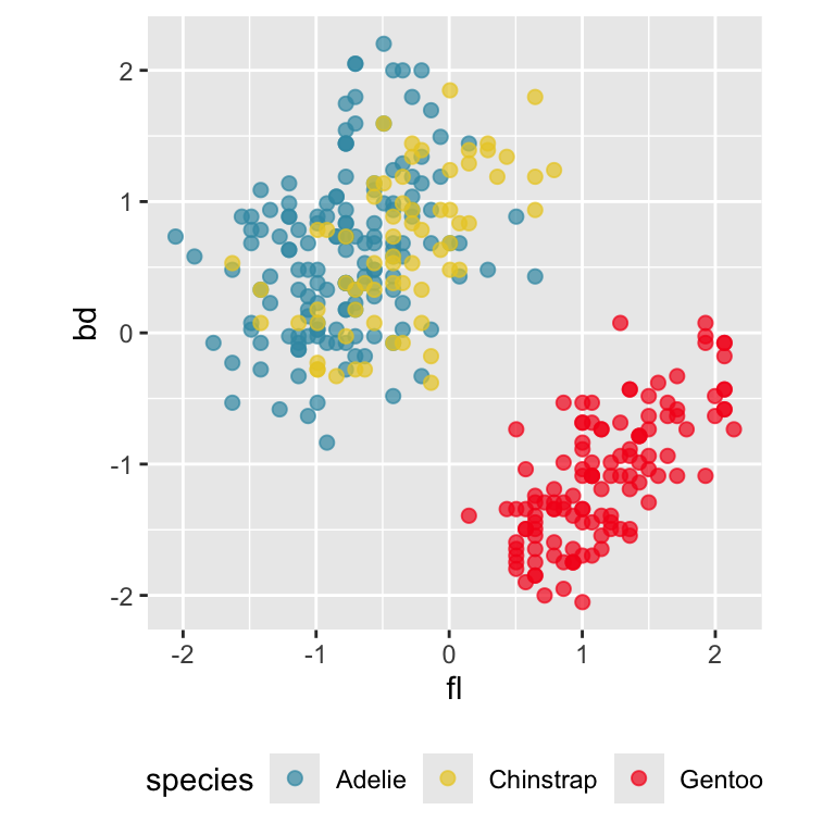
bdcontribution controlled- if
bdis removed from projection, Gentoo separation disappears bdis important for distinguishing Gentoo

Manual tour
- start from best projection, given by projection pursuit
blcontribution controlledblis important for distinguishing Adelie from Chinstrap
Local Tour
Rocks from and to a given projection, in order to observe the neighbourhood
Geometric shapes with slice tour
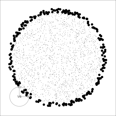
Geometric shapes with slice tour
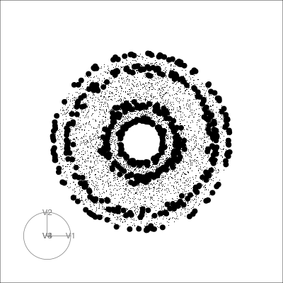
4D Torus
PCA tour
Compute PCA, reduce dimension, show original variable axes in the reduced space.
Projection dimension and displays
Saving and sharing: Animated gif
Resources
- Cook and Laa (2025)
- Emerson et al (2013) The Generalized Pairs Plot, JCGS, 22:1, 79-91
- Natalia da Silva: PPForest and shiny app.
- Wickham et al (2011) tourr: An R Package for Exploring Multivariate Data with Projections, tourr R package
- Schloerke et al (2016) Escape from Boxland, the web site zoo and geozoo R package
- Spyrison and Cook (2020). spinifex: Manual Tours, Manual Control of Dynamic Projections of Numeric Multivariate Data.
- Stuart Lee liminal: tools to do linked brushing between tours and PCA/tSNE/PDS views
 This work is licensed under a Creative Commons Attribution-NonCommercial-ShareAlike 4.0 International License.