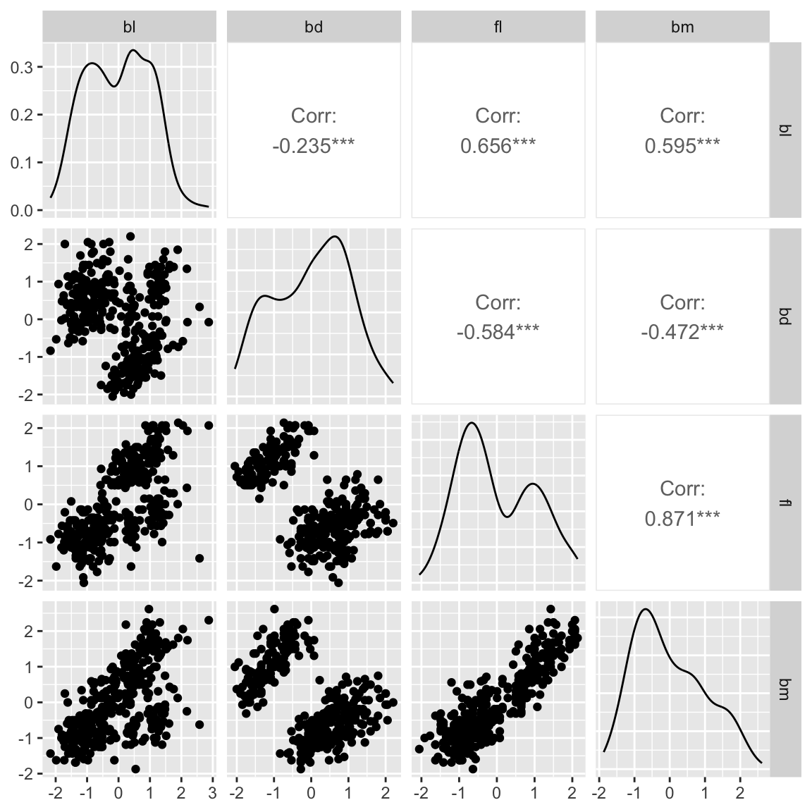
ggpairs(penguins_std, columns=c(2:5)) Multivariate data plots
SISBID 2025
https://github.com/dicook/SISBID
Your turn
- What is multivariate data?
- What makes multivariate analysis different from univariate analysis?
- data is multivariate if we have more information than a single aspect for each entity/person/experimental unit.
- multivariate analysis takes relationships between these different aspects into account.
Main types of plots
- pairwise plots: explore association between pairs of variables
- parallel coordinate plots: use parallel axes to lay out many variables on a page
- heatmaps: represent data value using colour, present as a coloured table
- tours: sequence of projections of high-dimensional data, good for examining shape and distribution between many variables
Scatterplot matrix: GGally
The basic plot plot for multivariate data is a scatterplot matrix.
Use the GGally package function ggpairs.
What do we learn?
- clustering
- linear dependence
- outlier(s)
Scatterplot matrix
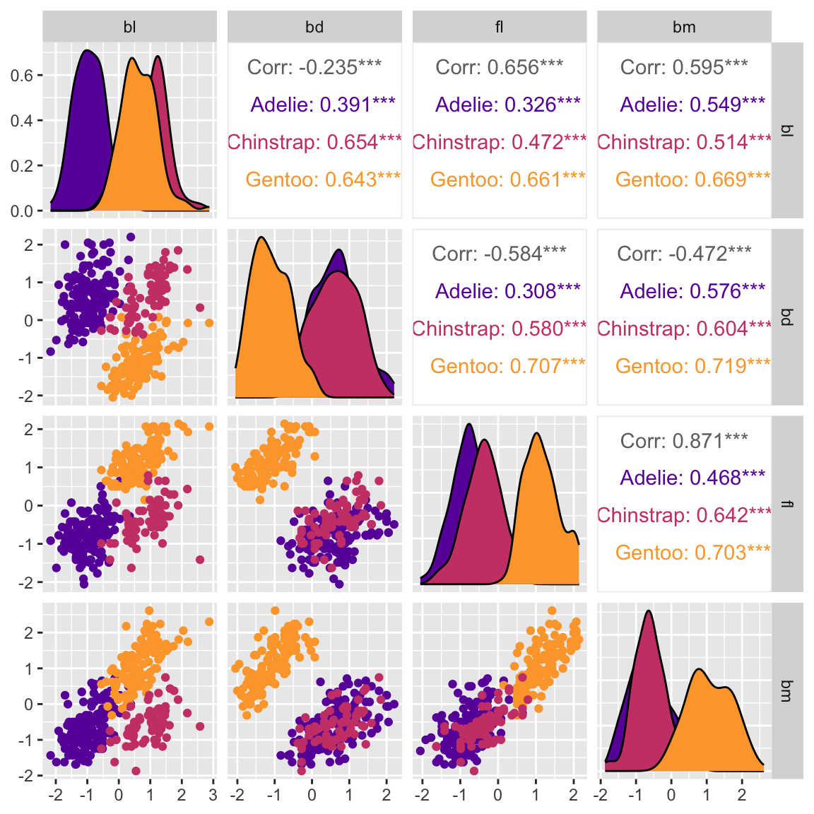
# Re-make mapping colour to species (class)
ggpairs(penguins_std, columns=c(2:5),
        ggplot2::aes(colour=species)) +
  scale_color_viridis_d(option = "plasma", begin=0.2, end=0.8) +
  scale_fill_viridis_d(option = "plasma", begin=0.2, end=0.8)
What do we learn?
- clustering is due to the class variable
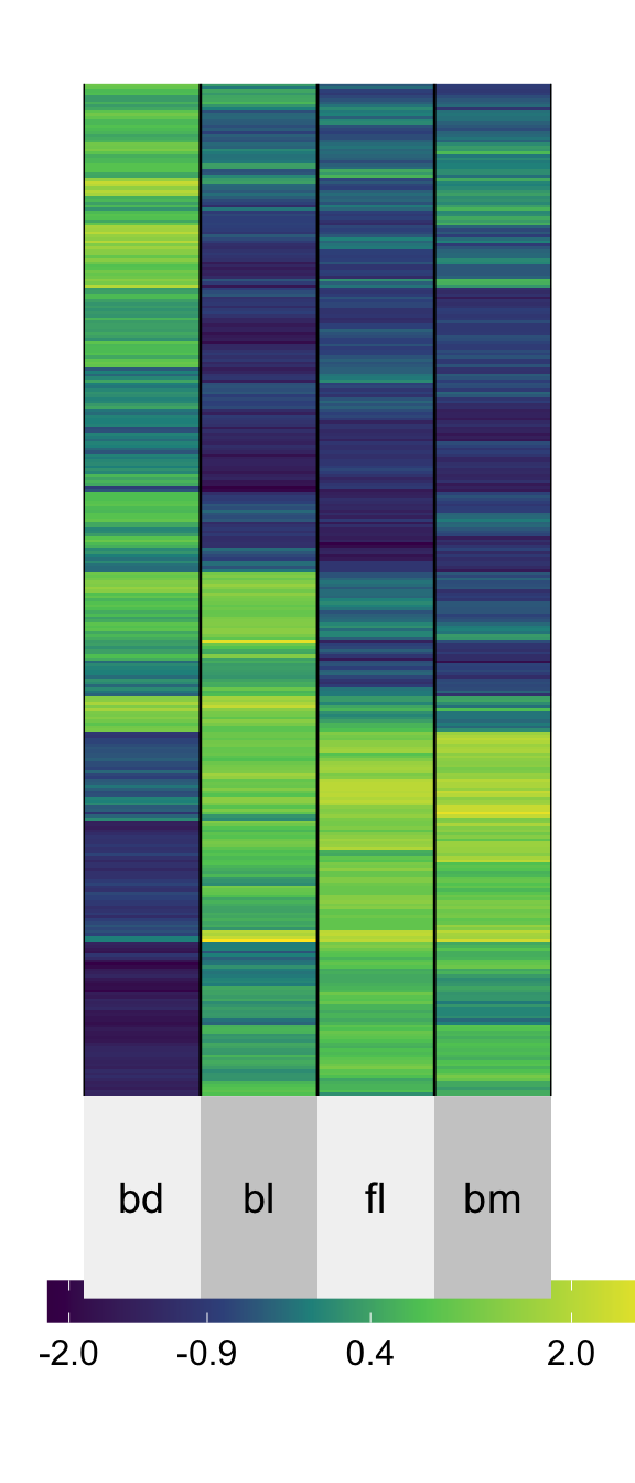
Heatmaps ⚠️
# install.packages("superheat")
library(superheat)
superheat(penguins_std[,2:5],
          pretty.order.rows = T,
          pretty.order.cols = T)
How many clusters do you see?
Mapping numeric values to color is sub-optimal, as we know from the hierarchy.
It is possible to NOT see clusters, and also imagine clusters that don’t exist when using heatmaps of multivariate data.
Heatmaps of correlation
Only show correlation. This is dangerous!
Only appropriate if correlation is a good summary of the association.
# Look at one species only
adelie <- penguins_std |>
  filter(species == "Adelie") |>
  select(bl:bm)
ggcorr(adelie)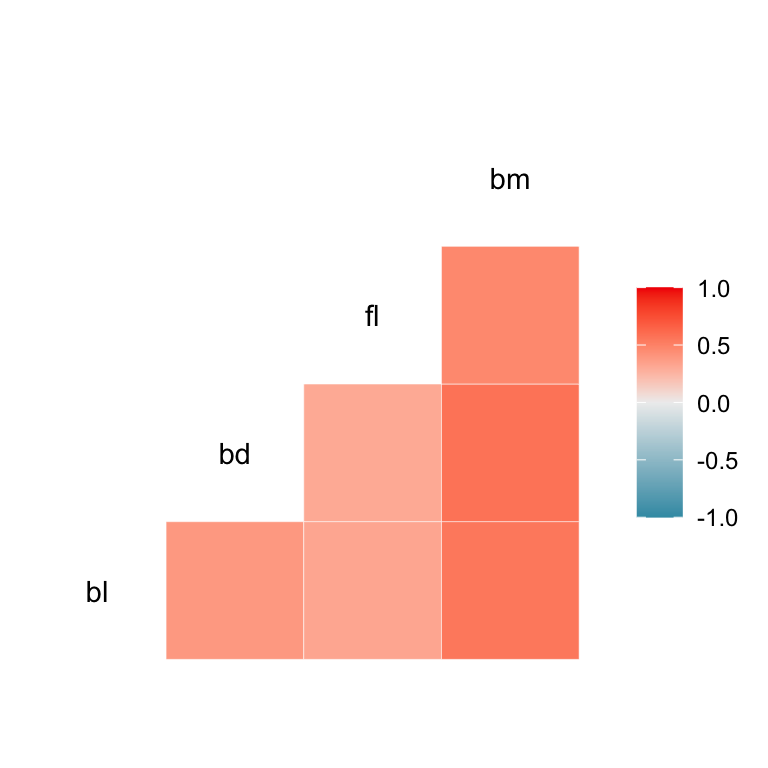
Corrgrams
- can be dangerous ⚠️
- useful for a broad overview IF correlation is a good summary
corrgram(adelie,
  lower.panel=
    corrgram::panel.ellipse)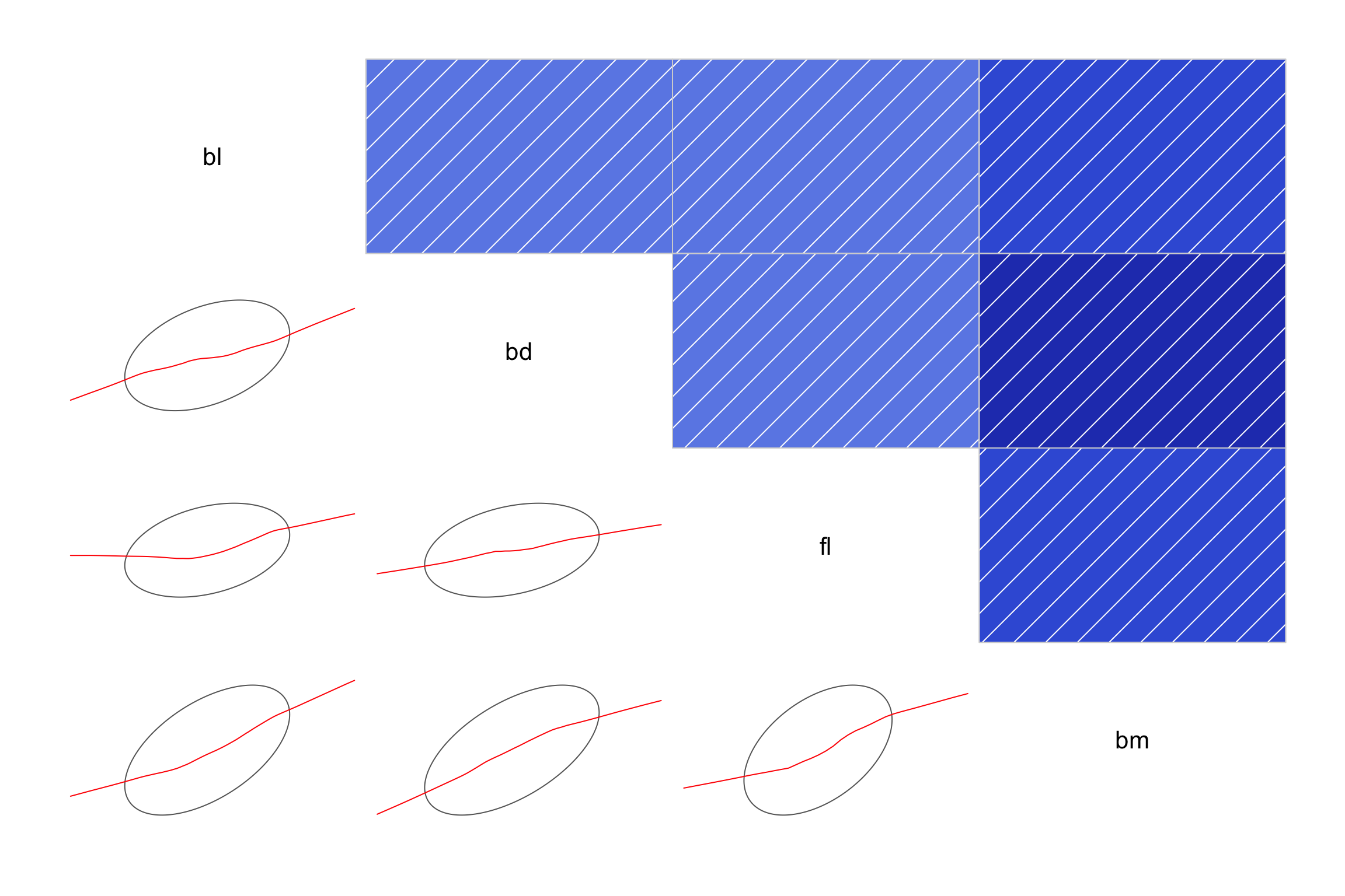
The corrgram package has numerous correlation display capabilities.
Large sample size
# Data downloaded from https://archive.ics.uci.edu/dataset/401/gene+expression+cancer+rna+seq
# This chunk takes some time to run, so evaluated off-line
if (!file.exists(here("data", "TCGA-PANCAN-HiSeq-801x20531", "data.csv"))) {
  download.file(url = "https://archive.ics.uci.edu/static/public/401/gene+expression+cancer+rna+seq.zip",
                destfile = here::here("data", "TCGA-PANCAN-HiSeq-801x20531.zip"), mode = "wb")
  unzip(here::here("data", "TCGA-PANCAN-HiSeq-801x20531.zip"),
        exdir = here::here("data/TCGA-PANCAN-HiSeq-801x20531/"))
  # Untar into folder
  untar(here::here("data/TCGA-PANCAN-HiSeq-801x20531/TCGA-PANCAN-HiSeq-801x20531.tar.gz"),
        exdir = here("data"))
}

tcga <- tibble(read.csv(here("data", "TCGA-PANCAN-HiSeq-801x20531", "data.csv")))

tcga_t <- t(as.matrix(tcga[,2:20532]))
colnames(tcga_t) <- tcga$X
tcga_t_pc <- prcomp(tcga_t, scale = FALSE)$x
ggally_hexbin <- function (data, mapping, ...)  {
    p <- ggplot(data = data, mapping = mapping) + geom_hex(binwidth=20, ...)
    p
}
ggpairs(tcga_t_pc, columns=c(1:4),
        lower = list(continuous = "hexbin")) +
  scale_fill_gradient(trans="log",
    low="#E24C80", high="#FDF6B5")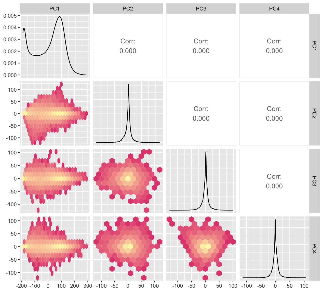
Generalized pairs plot
The pairs plot can also incorporate non-numerical variables, and different types of two variable plots.
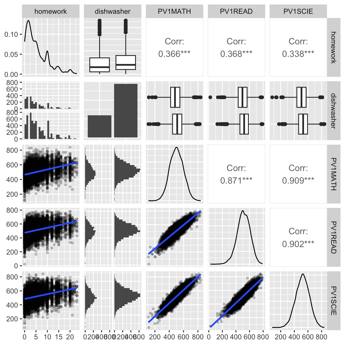
# Matrix plot when variables are not numeric
data(australia_PISA2012)
australia_PISA2012 <- australia_PISA2012 |>
  mutate(across(desk:dishwasher, factor))
australia_PISA2012 |>
  filter(!is.na(dishwasher)) |>
  ggpairs(columns=c(3, 15, 16, 21, 26))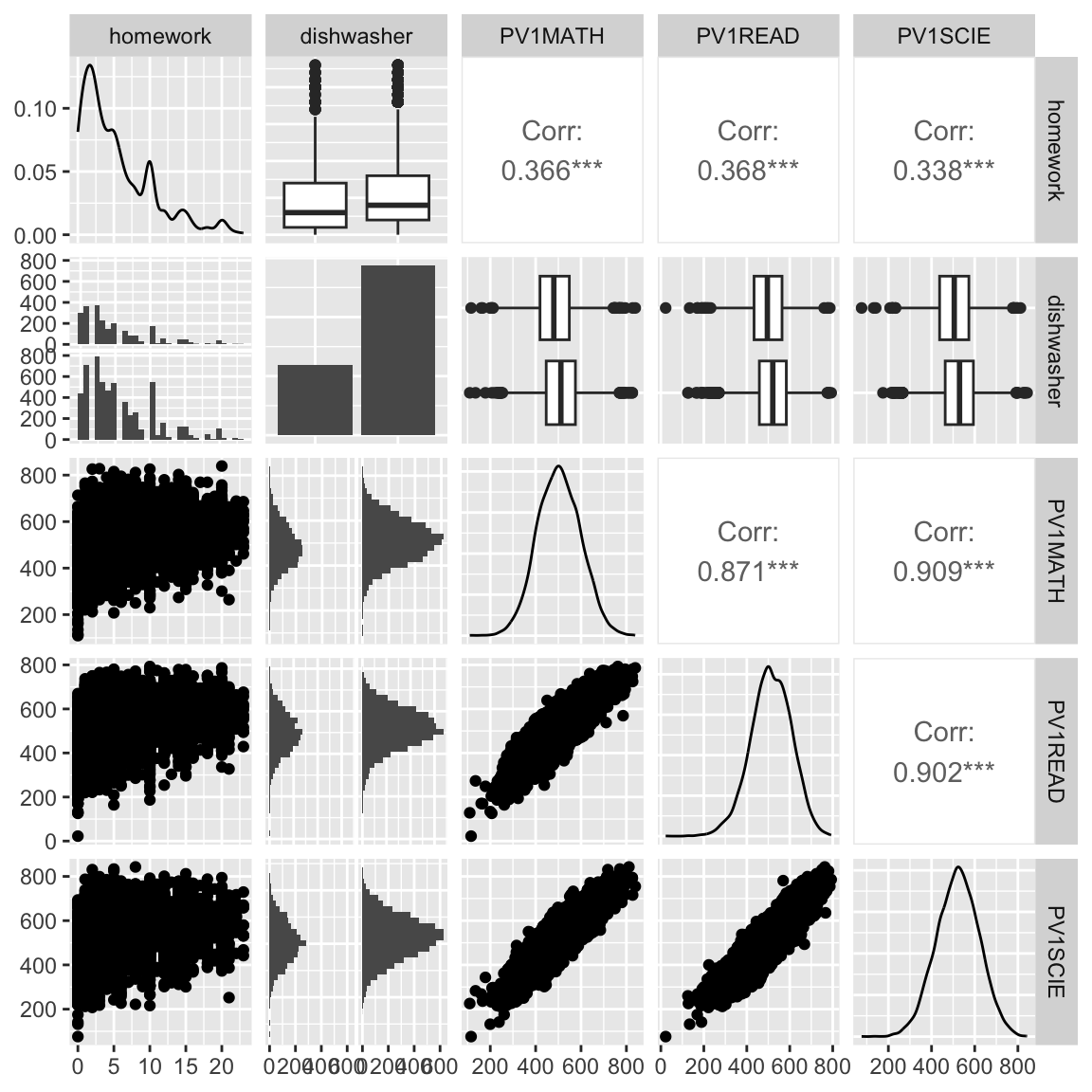
Generalized Pairs Plots
# Modify the defaults, set the transparency of points since there is a lot of data
australia_PISA2012 |>
  filter(!is.na(dishwasher)) |>
  ggpairs(
    columns=c(3, 15, 16, 21, 26),
    lower = list(
      continuous = wrap("points",
                        alpha=0.05)))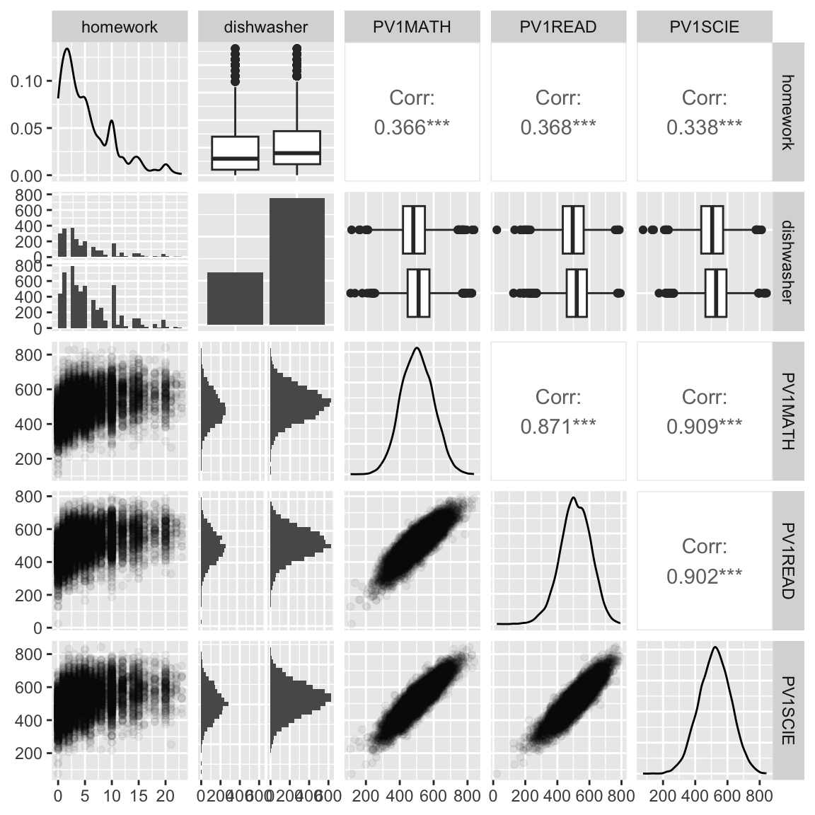
Customized Generalized Pairs Plots
What do we learn?
- moderate increase in all scores as more time is spent on homework
- test scores all have a very regular bivariate normal shape - is this simulated data? yes.
- having a dishwasher in the household corresponds to small increase in homework time
- very little but slight increase in scores with a dishwasher in household
Your turn
Re-make the plot with
- side-by-side boxplots on the lower triangle, for the combo variables,
- and the density plots in the upper triangle.
Regression setting
housing <- read_csv(here::here("data/housing.csv")) |>
  mutate(date = dmy(date)) |>
  mutate(year = year(date)) |>
  filter(year == 2016) |>
  filter(!is.na(bedroom2), !is.na(price)) |>
  filter(bedroom2 < 7, bathroom < 5) |>
  mutate(bedroom2 = factor(bedroom2),
         bathroom = factor(bathroom))
ggduo(housing[, c(4,3,8,10,11)],
      columnsX = 2:5, columnsY = 1,
      aes(colour=type, fill=type),
      types = list(continuous =
                     wrap("smooth",
                       alpha = 0.10)))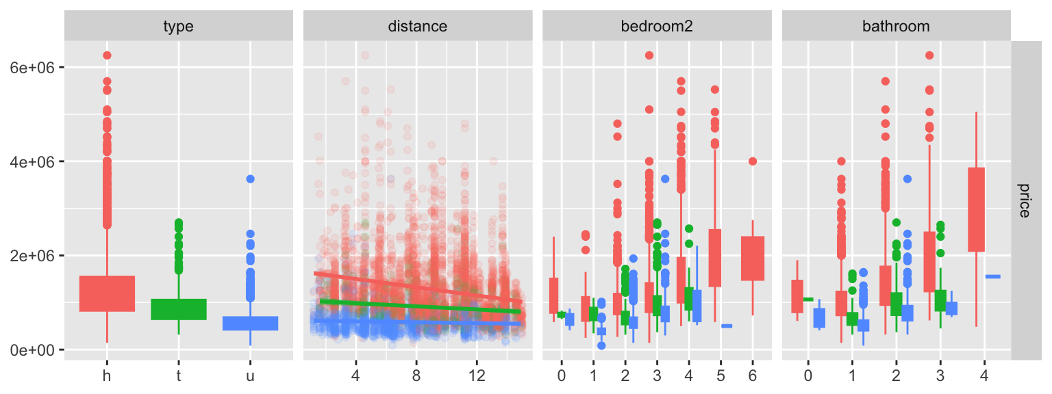
Parallel coordinate plots
# install.packages("ggpcp")
library(ggpcp)
penguins_std |>
  pcp_select(species, bl:bm) |>
  pcp_arrange() |>
  ggplot(aes_pcp()) +
    geom_pcp(aes(colour=species)) +
    geom_pcp_boxes() +
    geom_pcp_labels() +
    scale_colour_discrete_divergingx(
      palette = "Zissou 1") +
    theme_pcp() +
    theme(legend.position = "none")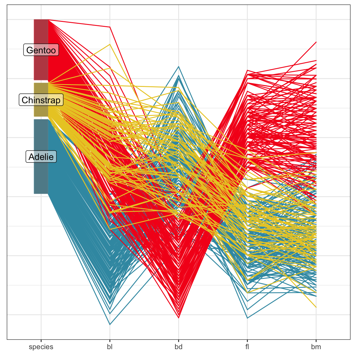
Axes are parallel, observations are connecting lines.
PCP: large sample size
ggplot() +
    geom_ribbon(data = dframe, aes(x=pcp_x, ymin = lower, ymax = upper, group = level), alpha=0.5) +
    geom_pcp_axes(data=tcga_t_pc_pcp_sub, aes_pcp()) +
    geom_pcp_boxes(data=tcga_t_pc_pcp_sub, aes_pcp(), boxwidth = 0.1) +
    geom_pcp(data=tcga_t_pc_pcp_sub, aes_pcp(), colour="orange") +
    theme_pcp()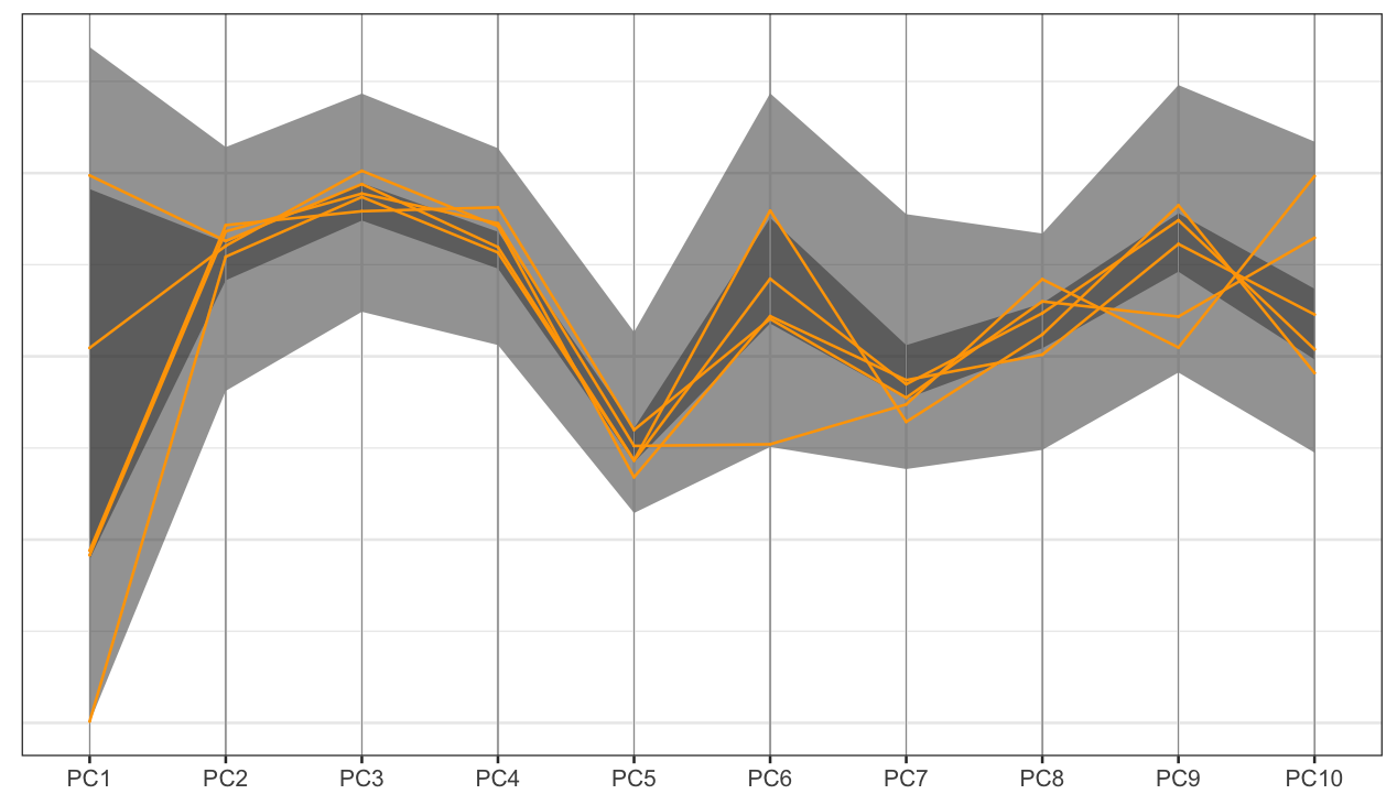
With large data, aggregate to get an overview, and select some observations to show.
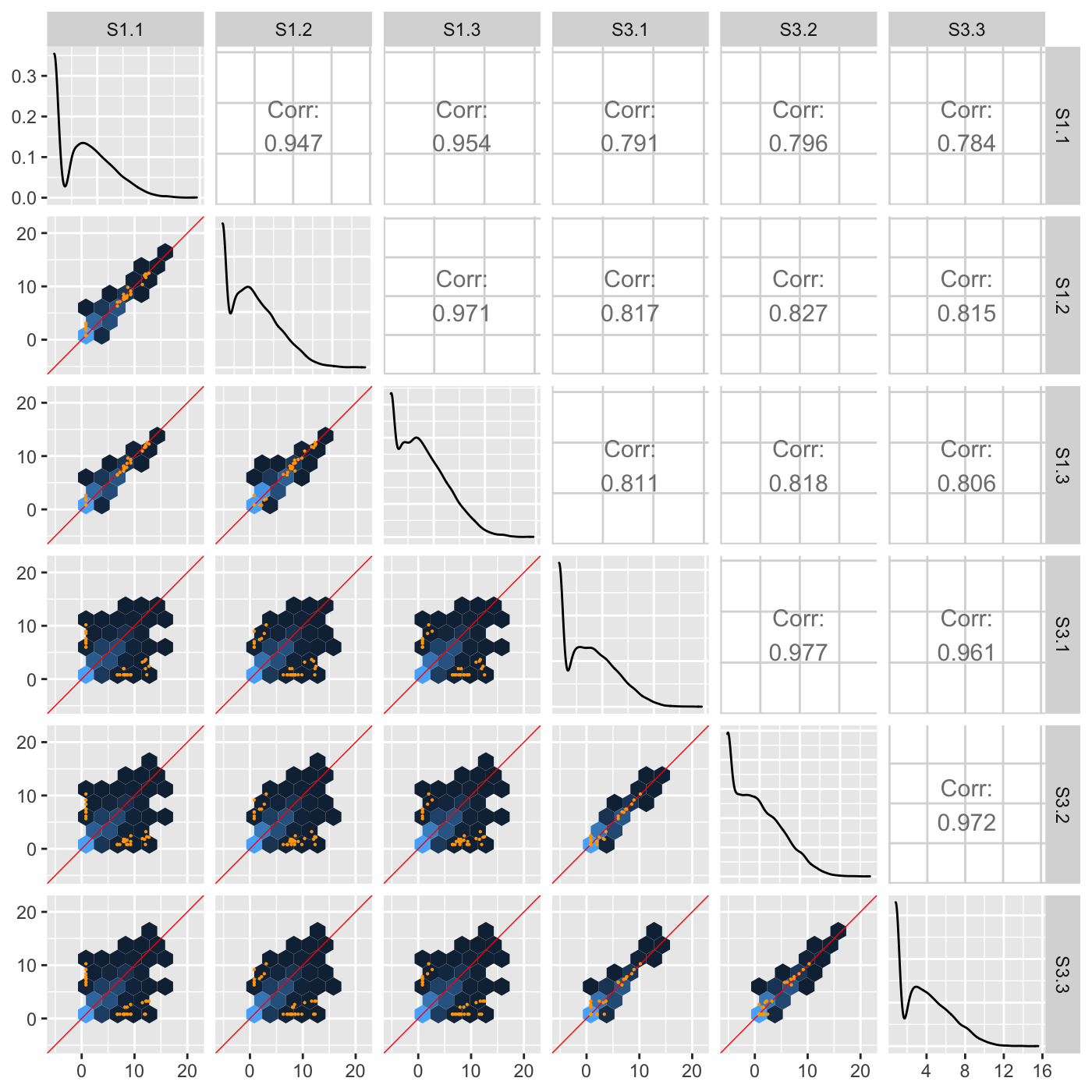
Big biological data
The Bioconductor package bigPint has tools for working with larger amounts of data, as seen in RNA-Seq experiments. It has variations of scatterplot matrices, parallel coordinate plots and interactivity with these displays.
More info at https://lindsayrutter.github.io/bigPint/

Resources
- Cook and Laa (2025)
- Emerson et al (2013) The Generalized Pairs Plot, Journal of Computational and Graphical Statistics, 22:1, 79-91
- Natalia da Silva PPForest and shiny app.
- Eunkyung Lee PPtreeViz
- Wickham, Cook, Hofmann (2015) Visualising Statistical Models: Removing the blindfold
- Cook and Swayne (2007) Interactive and Dynamic Graphics for Data Analysis
- Wickham et al (2011) tourr: An R Package for Exploring Multivariate Data with Projections and the R package tourr
- Schloerke et al (2016) Escape from Boxland, the web site zoo and geozoo
 This work is licensed under a Creative Commons Attribution-NonCommercial-ShareAlike 4.0 International License.