# A tibble: 6 × 9
  time  treatment subject   rep potato buttery grassy rancid painty
  <fct> <fct>     <fct>   <dbl>  <dbl>   <dbl>  <dbl>  <dbl>  <dbl>
1 1     1         3           1    2.9     0      0      0      5.5
2 1     1         3           2   14       0      0      1.1    0
3 1     1         10          1   11       6.4    0      0      0
4 1     1         10          2    9.9     5.9    2.9    2.2    0
5 1     1         15          1    1.2     0.1    0      1.1    5.1
6 1 1 15 2 8.8 3 3.6 1.5 2.3Making a mess again - with the data
SISBID 2025
https://github.com/dicook/SISBID
Warmup
Turn the french_fries data from wide format into a long format with variables type and rating.
What would you like to find out about the french fries data set?
Put your questions in the chat!
What would we like to know?
- Is the design complete?
- Are replicates like each other?
- How do the ratings on the different scales differ?
- Are raters giving different scores on average?
- Do ratings change over the weeks?
Each of these questions requires a different summary of the data.
When we get a new dataset, we have to check to see whether it’s complete, whether it matches our expectations, and then we start thinking about how to approach modeling and visualization of the results.
These questions are just a few that we might ask!
Pivot french fries to long
# A tibble: 6 × 6
  time  treatment subject   rep type    rating
  <fct> <fct>     <fct>   <dbl> <chr>    <dbl>
1 1     1         3           1 potato     2.9
2 1     1         3           1 buttery    0
3 1     1         3           1 grassy     0
4 1     1         3           1 rancid     0
5 1     1         3           1 painty     5.5
6 1     1         3           2 potato    14
The data comes in a form that’s easier to record – which makes sense. But our first step has to be rearranging it so that it’s easier to work with and visualize. We would need 5 different geom_line statements to plot the results for each time/treatment/subject/scale – one for each scale – in the original format. But, if we move to long form, we can plot the data with much less effort, leading to much more readable code.
Pivot long to wide
Examples:
- Are replicates like each other?
- compare rep 1 to rep 2 values
- How do the ratings on the different scales differ?
- compare ratings across scales
- Are raters giving different scores on average?
- compare ratings across raters
- Do ratings change over the weeks?
- compare ratings week-by-week
Long form data gives us the ability to use dplyr mutate/summarize commands to answer a bunch of different questions, like the ones shown here.
Moreover, we can move from long form to a different wide form to answer these questions, which can be useful if we need to present summary data in a table.
Pivot to wide form
tidyr’s pivot_wider function creates variables with comparable values
Long form:
| time | treatment | subject | rep | type | rating |
|---|---|---|---|---|---|
| 1 | 1 | 3 | 1 | potato | 2.9 |
| 1 | 1 | 3 | 1 | buttery | 0.0 |
| 1 | 1 | 3 | 1 | grassy | 0.0 |
| 1 | 1 | 3 | 1 | rancid | 0.0 |
Pivot to wide form
tidyr’s pivot_wider function creates variables with comparable values
Wide form:
| treatment | subject | rep | type | 1 | 2 | 3 | 4 | 5 | 6 | 7 | 8 | 9 | 10 |
|---|---|---|---|---|---|---|---|---|---|---|---|---|---|
| 1 | 3 | 1 | potato | 2.9 | 9.0 | 11.8 | 13.6 | 14.0 | 0.4 | 2.9 | 3.5 | 1.1 | NA |
| 1 | 3 | 1 | buttery | 0.0 | 0.3 | 0.2 | 0.1 | 0.3 | 1.2 | 0.0 | 0.5 | 0.4 | NA |
| 1 | 3 | 1 | grassy | 0.0 | 0.1 | 0.0 | 0.0 | 0.0 | 0.0 | 0.0 | 1.3 | 0.0 | NA |
Here, we pivot to a different wide form – we’ll have columns indicating time points instead of rating characteristics.
Pivot to wide form
# A tibble: 6 × 14
  treatment subject   rep type     `1`   `2`   `3`   `4`   `5`   `6`   `7`   `8`
  <fct>     <fct>   <dbl> <chr>  <dbl> <dbl> <dbl> <dbl> <dbl> <dbl> <dbl> <dbl>
1 1         3           1 potato   2.9   9    11.8  13.6  14     0.4   2.9   3.5
2 1         3           1 butte…   0     0.3   0.2   0.1   0.3   1.2   0     0.5
3 1         3           1 grassy   0     0.1   0     0     0     0     0     1.3
4 1         3           1 rancid   0     5.8   6     1.7   0     0     0     0
5 1         3           1 painty   5.5   0.3   0     0     1.7   9.5   5.5   3.8
6 1         3           2 potato  14     5.5   7.8   5.3  12.9   3.3   0.8   0.6
# ℹ 2 more variables: `9` <dbl>, `10` <dbl>
pivot_wider:
- creates a new column for each value of the variable in
names_from - fills values in using the variable in
values_from
The posit cheatsheets are amazing for helping you get from concept to muscle memory. I used them every day for years until I no longer needed them as often, and even now, when they update the syntax a bit, I will still keep the cheat sheets handy to remind myself about the new options.
Comparing ratings: different weeks
Note the use of the backtick for variable names with special characters or numbers.
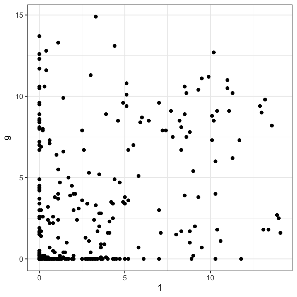
Here, you can see how easy it is for us to create a scatterplot of the week 1 vs. 9 ratings. We’ll learn later how to do this for all 10 weeks, comparing each week to all other weeks, but for now let’s just examine a single scatterplot.
Your turn: Are the replicates similar?
Goal: Plot the replicates against each other using a scatterplot.
- Convert the data into long form
- Get the replicates spread into separate columns by replicate.
- Make the plot.
Are ratings similar across scales?
- Scales: potato-y, buttery, grassy, rancid and painty?
- Pivot into long form, plot with
facet_...(~scale).
# A tibble: 6 × 6
  time  treatment subject   rep type    rating
  <fct> <fct>     <fct>   <dbl> <chr>    <dbl>
1 1     1         3           1 potato     2.9
2 1     1         3           1 buttery    0
3 1     1         3           1 grassy     0
4 1     1         3           1 rancid     0
5 1     1         3           1 painty     5.5
6 1     1         3           2 potato    14
Many times when multiple scales are used, we want to ensure the values are comparable across scales – we might standardize by subtracting the mean and then divide by the SD for each scale.
To know whether that’s necessary, though, we need to get into a form where we can plot the data… which is typically long form.
Are ratings similar across scales?
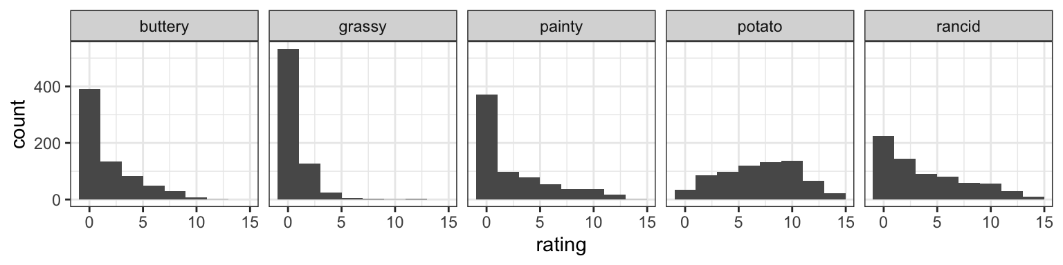
We can see here that people tend to give much lower values for grassy and buttery than for potato and rancid. Painty has the same 0-inflation issue seen in the first two scales, but has a wider spread.
What if we use a boxplot instead?
Side-by-side boxplots
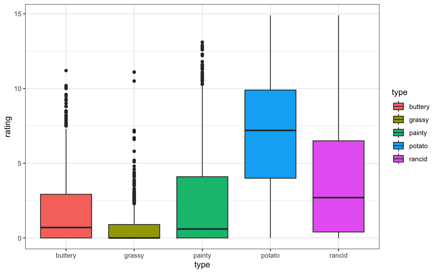
You can see many of the same features in a boxplot - the 0-inflation is clear when the median is still 0, as in grassy. Potato is clearly different from the other scales in terms of how it’s used by participants, and even rancid seems to be used fairly differently than the others.
Your turn: Correlation b/w scales?
Create a wide form of the data by type of scale.
corallows you to create a correlation matrix.
Run?corto look up how to get rid ofNAvalues in the result.Draw a scatterplot of two scales with the highest (positive or negative) correlation value.
Let’s see if you can create a correlation matrix for the different scales. You’ll want to move to wide form, then use the cor function. Cor doesn’t handle NAs that well, so you’ll want to remove them. Take a few minutes to do this and paste your plot into the chat when you’re done!
Ratings by week
Use the long form of the data and plot:
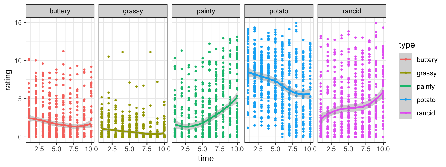
When we looked at the distribution of ratins, I started wondering about the effect of time – luckily, it’s pretty easy to look into that using long form. I’ve made the plot, but perhaps you can fit a model?
Your turn: Ratings by time & scale?
- Find a linear model describing the average rating by week (time) and type of scale as shown below.
- Which form of the dataset should we use?
- Challenge: can you plot the fitted lines from the model?
Long form is typically also used when fitting models! See if you can get the data into the correct form to fit a linear model of rating by time and scale type.
As a challenge, see if you can get the predicted values back out to show the fitted lines!
Paste your plots in the chat to show off when you’re done.
Resources
- posit cheatsheets
- Wickham (2007) Reshaping data
- R for Data Science (Wickham & Grolemund), chapter 9
- Telling Stories with Data (Alexander), chapters 9 & 10
 This work is licensed under a Creative Commons Attribution-NonCommercial-ShareAlike 4.0 International License.