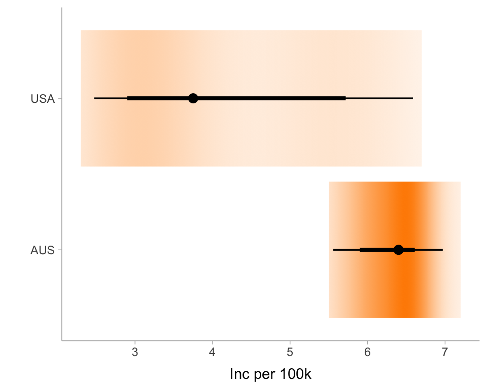
tb_inc_100k <-read_csv(here::here("data/TB_burden_countries_2025-07-22.csv")) |>filter(iso3 %in%c("USA", "AUS"))ggplot(tb_inc_100k, aes(y = iso3, x = e_inc_100k)) +stat_gradientinterval(fill ="darkorange") +ylab("") +xlab("Inc per 100k") +theme_ggdist()
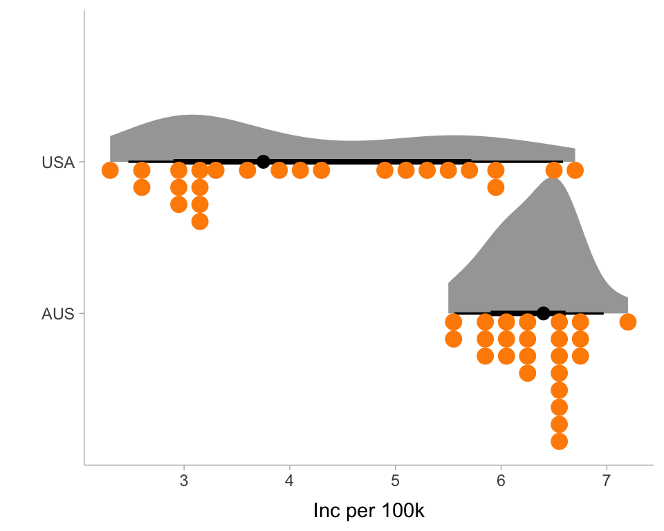
ggplot(tb_inc_100k, aes(y = iso3, x = e_inc_100k)) +stat_halfeye(side ="right") +geom_dots(side="left", fill ="darkorange", color ="darkorange") +ylab("") +xlab("Inc per 100k") +theme_ggdist()
Your turn
05:00
Explore other possibilities in ggdist, for example, how stat_interval() would change a previous chart.
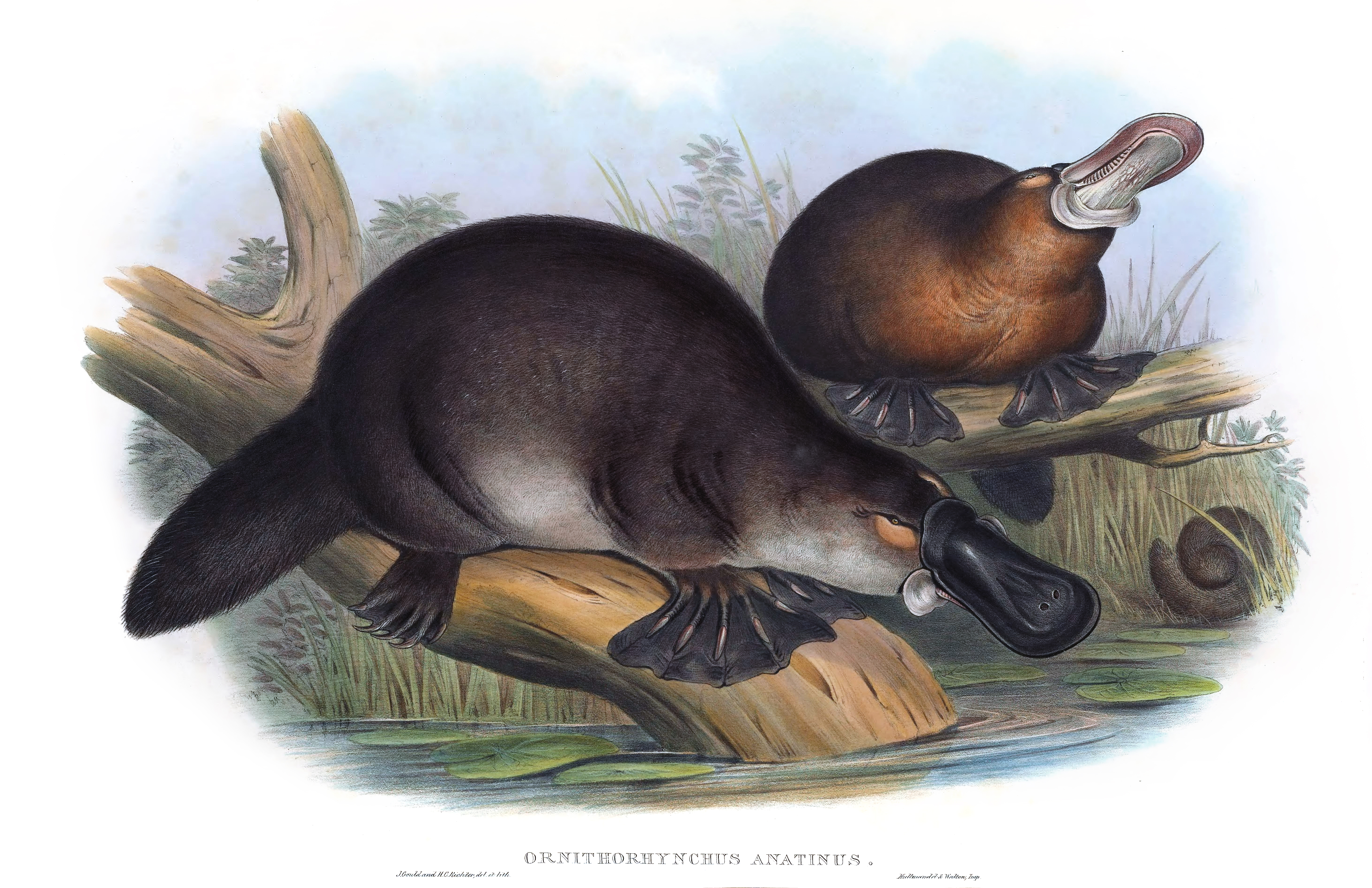
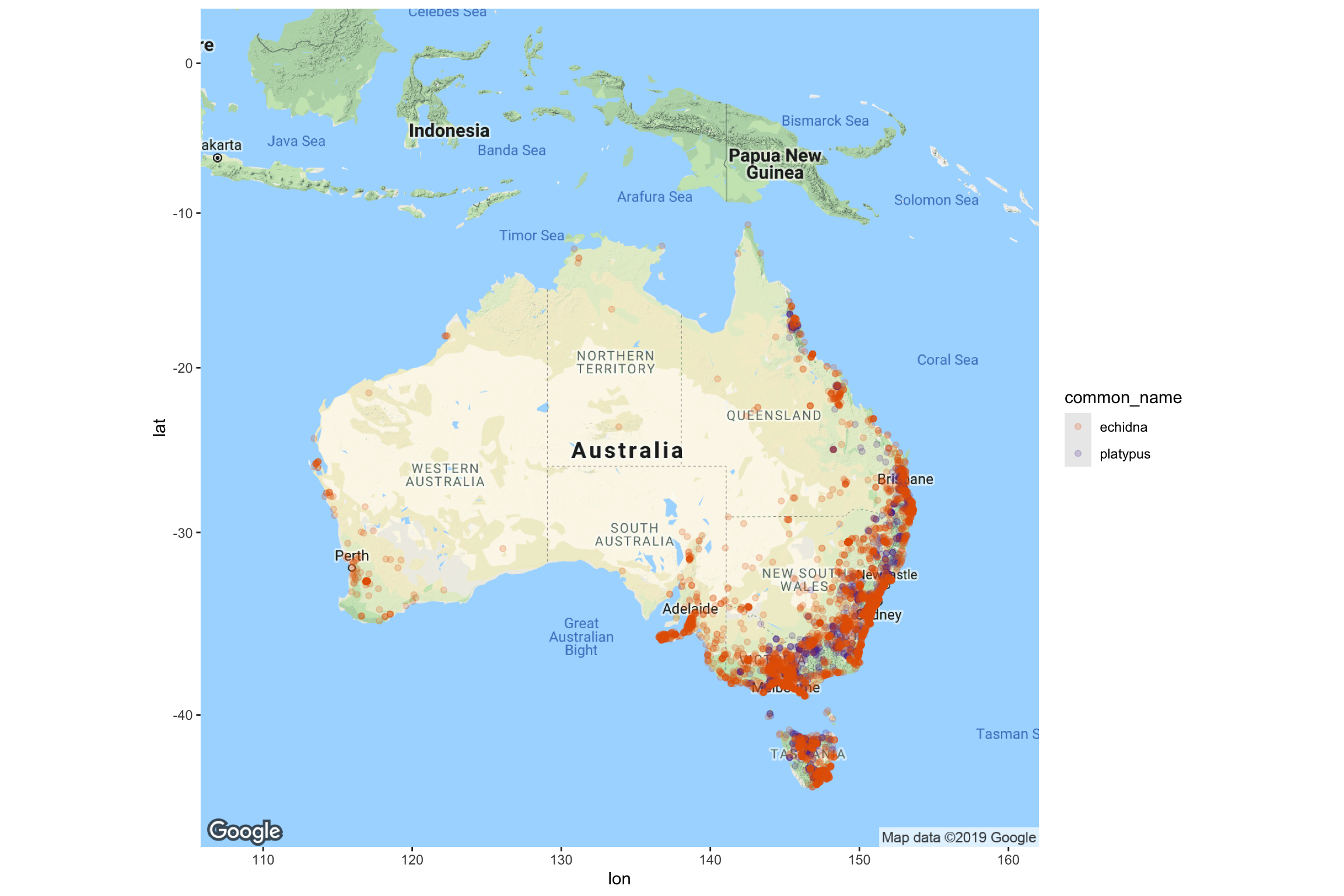
Example: Monotremes in Australia
Where can you find the strange platypus and echidna live in Australia?
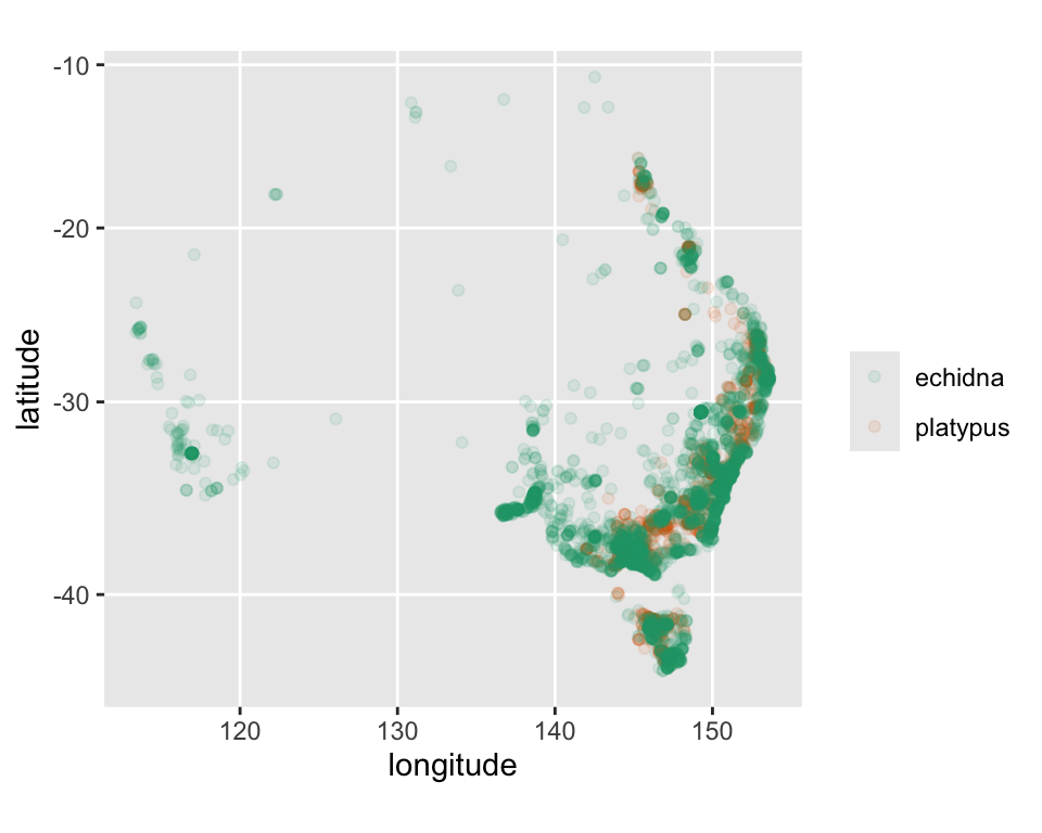
load(here::here("data/monotremes.rda"))ggplot(data=monotremes) +geom_point(aes(x = longitude, y = latitude, colour = family),alpha=0.5)
We can make the data look a bit more realistic with coord_map.
If you are good at recognising the shape of Australia, you might realise that the sightings are primarily along the east coast and Tasmania, with fewer sightings in western Australia.
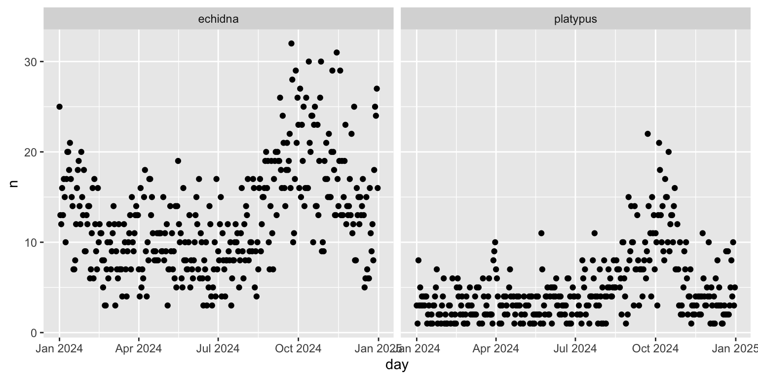
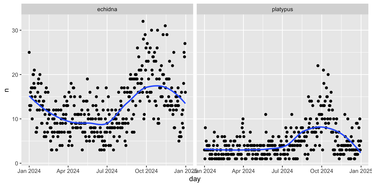
Our goal is to examine how sightings change over time. The orginal variable eventDate was renamed to be datetime and converted into two variables during pre-processing: day which is a date variable, and hour.
SOME STUFF HERE |>mutate(day =ymd(str_sub(datetime, 1, 10),tz="Australia/Sydney"), hour =as.numeric(str_sub(datetime, 15, 16)))
Make sure you can make all the plots shown in this session, and then tackle these tasks:
Change the dotplot into a density plot. This changes the focus to be on the locations of the most frequent sightings.
Facetting by creatures might
How would the interpretation change using the density plot instead of the scatterplot?
Previously it looked like echidnas are found all over Australia. The density plot suggests they are found in the south-east similar to platypus. This possibly reveals a limitation of this data, that to be an occurrence requires a person to be present. There are a lot more people in Australia’s southeast than the rest of the country, so it is possibly just showing where people are!
Your turn
Explore the temporal trend differently by making a side-by-side boxplot of the occurrences over month. Note that you still need to summarise by day for this to be meangingful. Does this change the focus for the temporal trend?
The focus now is median, and IQR over the year.
Your turn
There is something quite wrong in the previous plots. Can you guess what it is?
Days without any observations are missing from these plots. This is something that would need to be created in the pre-processing.
What should it be?
If no observations happened on any day, it would be reasonable to use 0 for these days. So we would need to complete the data to have a row for each day in the year, and fill the n column with 0.

