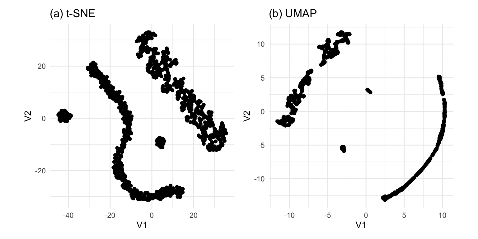
Gene expressions measured as scRNA-Seq of 2622 human peripheral blood mononuclear cells data is available from the Seurat R package Satija et al. (2015). The paper web site has code to extract and pre-process the data, which follow the tutorial at https://satijalab.org/seurat/articles/pbmc3k_tutorial.html. The processed data, containing the first 50 PCs is provided with the book, as pbmc_pca_50.rds.
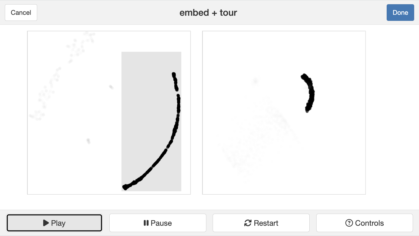
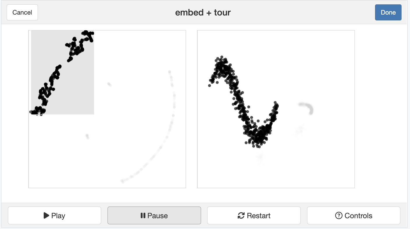
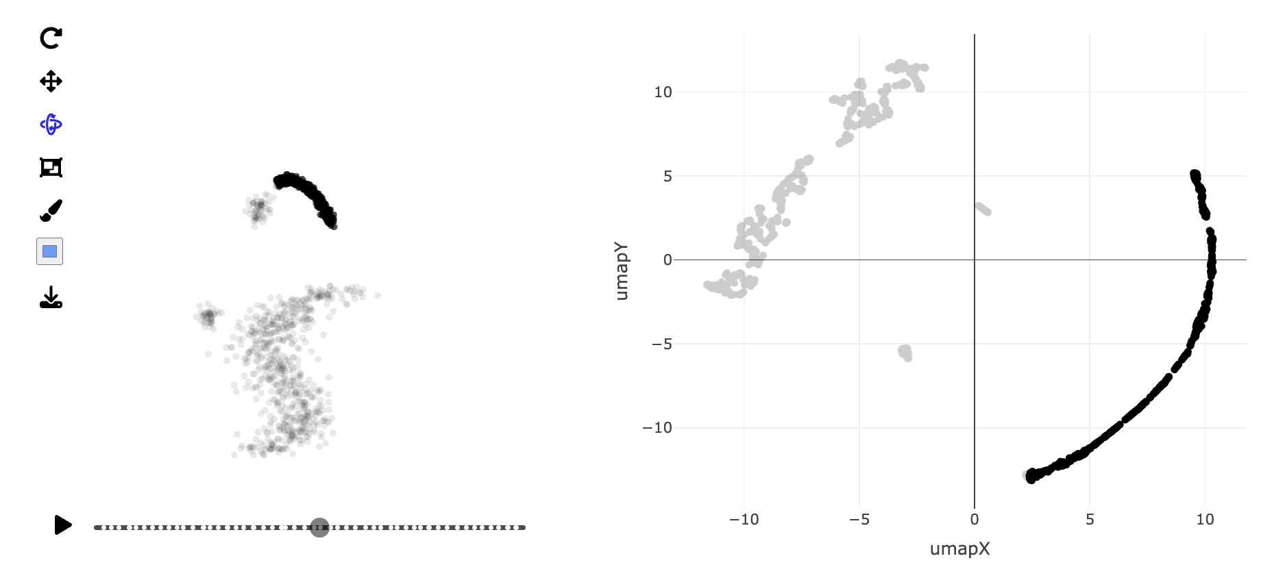
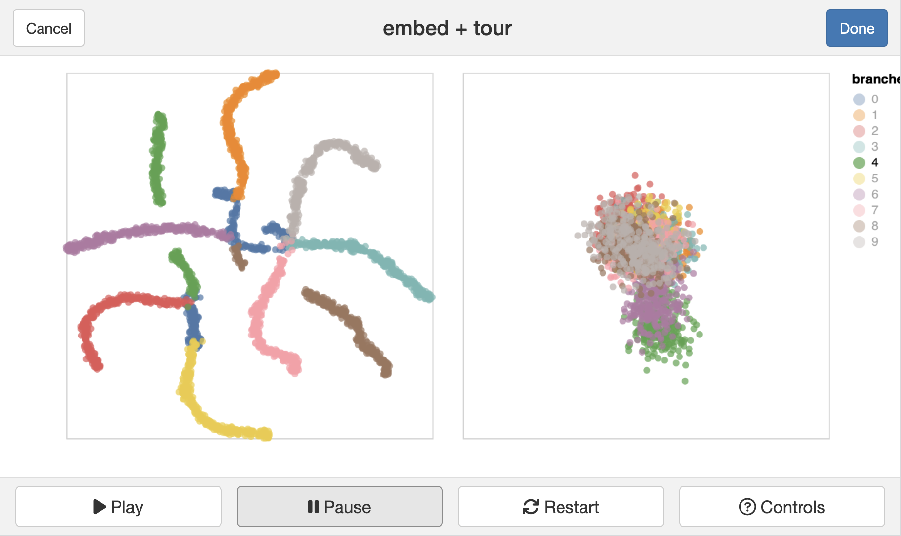
Generate the t-SNE and UMAP representations of the first 9 PCs of data, using their default settings. They should be quite different. (We use 9 PCs because the scree plot in the data pre-processing suggests that 15 is too many.) Based on your examination of the data in a tour, which method yields the more accurate representation? Explain what the structure in the 2D is relative to that seen in the tour.
Abbott, E. (1884). Flatland: A Romance of Many Dimensions. Dover Publications.
Ahlberg, C., Williamson, C., & Shneiderman, B. (1991). Dynamic Queries for Information Exploration: An Implementation and Evaluation. ACM CHI ‘92 Conference Proceedings, 619–626.
Allaire, J., & Chollet, F. (2023).
keras: R interface to Keras.
https://CRAN.R-project.org/package=keras
Anderson, E. (1957). A Semigraphical Method for the Analysis of Complex Problems. Proceedings of the National Academy of Science, 13, 923–927.
Andrews, D. F. (1972). Plots of High-dimensional Data. Biometrics, 28, 125–136.
Andrews, D. F., Gnanadesikan, R., & Warner, J. L. (1971). Transformations of Multivariate Data. Biometrics, 27, 825–840.
Anselin, L., & Bao, S. (1997). Exploratory Spatial Data Analysis Linking SpaceStat and ArcView. In M. M. Fischer & A. Getis (Eds.), Recent Developments in Spatial Analysis (pp. 35–59). Springer.
Arnold, J. B. (2024).
ggthemes: Extra Themes, Scales and Geoms for ggplot2.
https://jrnold.github.io/ggthemes/
Asimov, D. (1985). The Grand Tour: A Tool for Viewing Multidimensional Data. SIAM Journal of Scientific and Statistical Computing, 6(1), 128–143.
Batsaikhan, Z., Cook, D., & Laa, U. (2023).
Frame to Frame Interpolation for High-dimensional Data Visualisation using the woylier package.
https://doi.org/10.48550/arXiv.2311.08181
Batsaikhan, Z., Cook, D., & Laa, U. (2024).
woylier: Alternative Tour Frame Interpolation Method.
https://numbats.github.io/woylier/
Becker, R. A., & Chambers, J. M. (1984). S: An Environment for Data Analysis and Graphics. Wadsworth.
Becker, R. A., & Cleveland, W. S. (1988). Brushing Scatterplots (W. S. Cleveland & M. E. McGill, Eds.; pp. 201–224). Wadsworth.
Becker, R., Cleveland, W. S., & Shyu, M.-J. (1996). The Visual Design and Control of Trellis Displays. Journal of Computational and Graphical Statistics, 6(1), 123–155.
Bederson, B. B., & Schneiderman, B. (2003). The Craft of Information Visualization: Readings and Reflections. Morgan Kaufmann.
Bellman, R. (1961). Adaptive Control Processes: A Guided Tour.
Bickel, P. J., Kur, G., & Nadler, B. (2018). Projection
Pursuit in
High
Dimensions.
Proceedings of the National Academy of Sciences,
115, 9151–9156.
https://doi.org/10.1073/pnas.1801177115
Bishop, C. M. (2006). Pattern Recognition and Machine Learning. Springer.
Boehmke, B., & Greenwell, B. M. (2019).
Hands-On Machine Learning with R (1st ed.). Chapman; Hall/CRC.
https://doi.org/10.1201/9780367816377
Boelaert, J., Ollion, E., & Sodoge, J. (2022).
aweSOM: Interactive Self-Organizing Maps.
https://CRAN.R-project.org/package=aweSOM
Bonneau, G.-P., Ertl, T., & Nielson, G. M. (Eds.). (2006). Scientific Visualization: The Visual Extraction of Knowledge from Data. Springer.
Borg, I., & Groenen, P. J. F. (2005). Modern Multidimensional Scaling. Springer.
Breiman, L. (2001). Random Forests. Machine Learning, 45(1), 5–32.
Breiman, L., Cutler, A., Liaw, A., & Wiener, M. (2022).
randomForest: Breiman and Cutler’s Random Forests for classification and Regression.
https://www.stat.berkeley.edu/~breiman/RandomForests/
Breiman, L., Friedman, J., Olshen, C., & Stone, C. (1984). Classification and Regression Trees. Wadsworth; Brooks/Cole.
Buja, A. (1996). Interactive Graphical Methods in the Analysis of Customer Panel Data: Comment. Journal of Business & Economic Statistics, 14(1), 128–129.
Buja, A., & Asimov, D. (1986). Grand Tour Methods: An Outline. Computing Science and Statistics, 17, 63–67.
Buja, A., Asimov, D., Hurley, C., & McDonald, J. A. (1988). Elements of a Viewing Pipeline for Data Analysis (W. S. Cleveland & M. E. McGill, Eds.; pp. 277–308). Wadsworth.
Buja, A., Cook, D., Asimov, D., & Hurley, C. (2005). Computational Methods for High-Dimensional Rotations in Data Visualization. In C. R. Rao, E. J. Wegman, & J. L. Solka (Eds.), Handbook of Statistics: Data Mining and Visualization (pp. 391–414). Elsevier/North-Holland.
Buja, A., Cook, D., & Swayne, D. (1996). Interactive High-Dimensional Data Visualization. Journal of Computational and Graphical Statistics, 5(1), 78–99.
Buja, A., Hurley, C., & McDonald, J. A. (1986). A Data Viewer for Multivariate Data. Computing Science and Statistics, 17(1), 171–174.
Buja, A., & Swayne, D. F. (2002). Visualization Methodology for Multidimensional Scaling. Journal of Classification, 19(1), 7–43.
Buja, A., Swayne, D. F., Littman, M. L., Dean, N., Hofmann, H., & Chen, L. (2008). Data
Visualization with
Multidimensional
Scaling.
Journal of Computational and Graphical Statistics,
17(2), 444–472.
https://doi.org/10.1198/106186008X318440
Buja, A., & Tukey, P. (Eds.). (1991). Computing and Graphics in Statistics. Springer-Verlag.
Butler, A., Hoffman, P., Smibert, P., Papalexi, E., & Satija, R. (2018). Integrating
Single-
Cell
Transcriptomic
Data
Across
Different
Conditions,
Technologies, and
Species.
Nature Biotechnology,
36, 411–420.
https://doi.org/10.1038/nbt.4096
Card, S. K., Mackinlay, J. D., & Schneiderman, B. (1999). Readings in Information Visualization. Morgan Kaufmann Publishers.
Carr, D. B., Wegman, E. J., & Luo, Q. (1996). ExplorN: Design Considerations Past and Present (Technical Report No. 129). Center for Computational Statistics, George Mason University.
Chatfield, C. (1995). Problem Solving: A Statistician’s Guide. Chapman; Hall/CRC Press.
Chen, C.-H., Härdle, W., & Unwin, A. (Eds.). (2007).
Handbook of Data Visualization. Springer.
https://doi.org/10.1007/978-3-540-33037-0
Chen, Z., Wang, C., Huang, S., Shi, Y., & Xi, R. (2024). Directly
Selecting
Cell-type
Marker
Genes for
Single-cell
Clustering
Analyses.
Cell Reports Methods,
4, 100810.
https://doi.org/10.1016/j.crmeth.2024.100810
Cheng, B., & Titterington, M. (1994). Neural Networks: A Review from a Statistical Perspective. Statistical Science, 9(1), 2–30.
Cheng, J., & Sievert, C. (2023).
crosstalk: Inter-Widget Interactivity for HTML Widgets.
https://rstudio.github.io/crosstalk/
Chernoff, H. (1973). The Use of Faces to Represent Points in \(k\)-dimensional Space Graphically. Journal of the American Statistical Association, 68, 361–368.
Cleveland, W. S. (1979). Robust Locally Weighted Regression and Smoothing Scatterplots. Journal of American Statistics Association, 74, 829–836.
Cleveland, W. S. (1993). Visualizing Data. Hobart Press.
Cleveland, W. S., & McGill, M. E. (Eds.). (1988). Dynamic Graphics for Statistics. Wadsworth.
Cook, D., & Buja, A. (1997). Manual Controls For High-Dimensional Data Projections. Journal of Computational and Graphical Statistics, 6(4), 464–480.
Cook, D., Buja, A., & Cabrera, J. (1993). Projection Pursuit Indexes Based on Orthonormal Function Expansions. Journal of Computational and Graphical Statistics, 2(3), 225–250.
Cook, D., Buja, A., Cabrera, J., & Hurley, C. (1995). Grand Tour and Projection Pursuit. Journal of Computational and Graphical Statistics, 4(3), 155–172.
Cook, D., Hofmann, H., Lee, E.-K., Yang, H., Nikolau, B., & Wurtele, E. (2007). Exploring Gene Expression Data, Using Plots. Journal of Data Science, 5(2), 151–182.
Cook, D., & Laa, U. (2025).
mulgar: Functions for Pre-Processing Data for Multivariate data Visualisation using Tours.
https://dicook.github.io/mulgar/
Cook, D., Lee, E.-K., Buja, A., & Wickham, H. (2006).
Grand
Tours,
Projection
Pursuit
Guided
Tours and
Manual
Controls. In C.-H. Chen, W. Härdle, & A. Unwin (Eds.),
Handbook of Data Visualization. Springer.
https://doi.org/10.1007/978-3-540-33037-0
Cook, D., Majure, J. J., Symanzik, J., & Cressie, N. (1996). Dynamic Graphics in a GIS: Exploring and Analyzing Multivariate Spatial Data using Linked Software. Computational Statistics: Special Issue on Computer Aided Analyses of Spatial Data, 11(4), 467–480.
Cook, D., & Swayne, D. F. (2007).
Interactive and Dynamic Graphics for Data Analysis: With R and GGobi. Springer-Verlag.
https://doi.org/10.1007/978-0-387-71762-3
Cortes, C., Pregibon, D., & Volinsky, C. (2003). Computational Methods for Dynamic Graphs. Journal of Computational & Graphical Statistics, 12(4), 950–970.
Cortes, C., & Vapnik, V. N. (1995). Support-Vector Networks. Machine Learning, 20(3), 273–297.
d’Ocagne, M. (1885). Coordonnées Parallèles et Axiales: Méthode de Transformation Géométrique et Procédé Nouveau de Calcul Graphique dÉduits de la Considération des Coordonnées Paralléles. Gauthier-Villars.
Dalgaard, P. (2002). Introductory Statistics with R. Springer.
Dasu, T., Swayne, D. F., & Poole, D. (2005). Grouping Multivariate Time Series: A Case Study. Proceedings of the IEEE Workshop on Temporal Data Mining: Algorithms, Theory and Applications, in Conjunction with the Conference on Data Mining, Houston, November 27, 2005, 25–32.
de Vries, A., & Ripley, B. D. (2024).
ggdendro: Create Dendrograms and Tree Diagrams Using ggplot2.
https://andrie.github.io/ggdendro/
Department of Environment, Land, Water & Planning. (2019).
Fire Origins - Current and Historical.
https://discover.data.vic.gov.au/dataset/fire-origins-current-and-historical
Department of Environment, Land, Water & Planning. (2020a).
CFA - Fire Station.
https://discover.data.vic.gov.au/dataset/cfa-fire-station-vmfeat-geomark_point
Department of Environment, Land, Water & Planning. (2020b).
Recreation Sites.
https://discover.data.vic.gov.au/dataset/recreation-sites
Diaconis, P., & Freedman, D. (1984). Asymptotics of Graphical Projection Pursuit. Annals of Statistics, 12, 793–815.
Dolnicar, S., Grün, B., & Leisch, F. (2018).
Market Segmentation Analysis: Understanding it, Doing it, and Making it Useful (pp. 11–22).
https://doi.org/10.1007/978-981-10-8818-6_2
Dykes, J., MacEachren, A. M., & Kraak, M.-J. (2005). Exploring Geovisualization. Elsevier.
Emerson, J. W., Green, W. A., Schloerke, B., Crowley, J., Cook, D., Hofmann, H., & Wickham, H. (2013). The
Generalized
Pairs
Plot.
Journal of Computational and Graphical Statistics,
22(1), 79–91.
https://doi.org/10.1080/10618600.2012.694762
Everitt, B. S., Landau, S., Leese, M., & Stahel, D. (2011). Cluster Analysis (5th ed). John Wiley; Sons, Ltd.
Fienberg, S. E. (1979). Graphical Methods in Statistics. Journal of American Statistical Association, 33(4), 165–178.
Fisher, R. A. (1936). The
Use of
Multiple
Measurements in
Taxonomic
Problems.
Annals of Eugenics,
7(2), 179–188.
https://doi.org/10.1111/j.1469-1809.1936.tb02137.x
Fisherkeller, M. A., Friedman, J. H., & Tukey, J. W. (1973).
PRIM-9, an Interactive Multidimensional Data Display and Analysis System.
https://www.youtube.com/watch?v=B7XoW2qiFUA
Fisherkeller, M. A., Friedman, J. H., & Tukey, J. W. (1974). PRIM-9, an Interactive Multidimensional Data Display and Analysis System. In W. S. Cleveland (Ed.), The collected works of john w. Tukey: Graphics 1965-1985, volume v (pp. 340–346).
Forbes, J., Cook, D., & Hyndman, R. J. (2020). Spatial modelling of the two-party preferred vote in australian federal elections: 2001–2016.
Australian & New Zealand Journal of Statistics,
62(2), 168–185. https://doi.org/
https://doi.org/10.1111/anzs.12292
Ford, B. J. (1992). Images of Science: A History of Scientific Illustration. The British Library.
Forgy, E. (1965). Cluster Analysis of Multivariate Data: Efficiency versus Interpretability of Classification. Biometrics, 21(3), 768–769.
Fraley, C., & Raftery, A. E. (2002). Model-based
Clustering,
Discriminant
Analysis,
Density
Estimation.
Journal of the American Statistical Association,
97, 611–631.
https://doi.org/10.1198/016214502760047131
Fraley, C., Raftery, A. E., & Scrucca, L. (2024).
Mclust: Gaussian mixture modelling for model-based clustering, classification, and density estimation.
https://mclust-org.github.io/mclust/
Friedman, J. H. (1987). Exploratory Projection Pursuit. Journal of American Statistical Association, 82, 249–266.
Friedman, J. H., & Tukey, J. W. (1974). A Projection Pursuit Algorithm for Exploratory Data Analysis. IEEE Transactions on Computing C, 23, 881–889.
Friendly, M., & Denis, D. J. (2004). Milestones in the History of Thematic Cartography, Statistical Graphics, and Data Visualization. http://www.math.yorku.ca/SCS/Gallery/milestone/.
Fritsch, S., Guenther, F., & Wright, M. N. (2019).
neuralnet: Training of Neural Networks.
https://CRAN.R-project.org/package=neuralnet
Furnas, G. W., & Buja, A. (1994). Prosection Views: Dimensional Inference Through Sections and Projections. Journal of Computational and Graphical Statistics, 3(4), 323–385.
Gabriel, K. R. (1971). The Biplot Graphical Display of Matrices with Applications to Principal Component Analysis. Biometrika, 58, 453–467.
Gentle, J. E., Härdle, W., & Mori, Y. (Eds.). (2004). Handbook of Computational Statistics: Concepts and Methods. Springer.
Giordani, P., Ferraro, M. B., & Martella, F. (2020).
An Introduction to Clustering with R. Springer Singapore.
https://doi.org/10.1007/978-981-13-0553-5
Glover, D. M., & Hopke, P. K. (1992). Exploration of Multivariate Chemical Data by Projection Pursuit. Chemometrics and Intelligent Laboratory Systems, 16, 45–59.
Good, P. (2005). Permutation, Parametric, and Bootstrap Tests of Hypotheses. Springer.
Gower, J. C., & Hand, D. J. (1996). Biplots. Chapman; Hall.
Gruen, B. (2024). CRAN Task View: Cluster Analysis & Finite Mixture Models (Version 2024-08-20). https://cran.r-project.org/web/views/Cluster.html.
Hajibaba, H., Karlsson, L., & Dolnicar, S. (2016). Residents Open Their Homes to Tourists When Disaster Strikes. Journal of Travel Research, 56(8), 1065–1078.
Hansen, C., & Johnson, C. R. (2004). Visualization Handbook. Academic Press.
Hao, Y., Hao, S., Andersen-Nissen, E., III, W. M. M., Zheng, S., Butler, A., Lee, M. J., Wilk, A. J., Darby, C., Zagar, M., Hoffman, P., Stoeckius, M., Papalexi, E., Mimitou, E. P., Jain, J., Srivastava, A., Stuart, T., Fleming, L. B., Yeung, B., … Satija, R. (2021). Integrated
Analysis of
Multimodal
Single-
Cell
Data.
Cell.
https://doi.org/10.1016/j.cell.2021.04.048
Harrison, P. (2023).
langevitour:
Smooth
Interactive
Touring of
High
Dimensions,
Demonstrated with
scRNA-Seq Data.
The R Journal,
15, 206–219.
https://doi.org/10.32614/RJ-2023-046
Harrison, P. (2024).
Langevitour: Langevin tour.
https://logarithmic.net/langevitour/
Hart, C., & Wang, E. (2024).
detourr: Portable and Performant Tour Animations.
https://casperhart.github.io/detourr/
Hartigan, J. A., & Kleiner, B. (1981). Mosaics for Contingency Tables. Computer Science and Statistics: Proceedings of the 13th Symposium on the Interface, 268–273.
Hartigan, J., & Kleiner, B. (1984). A Mosaic of Television Ratings. The American Statistician, 38, 32–35.
Haslett, J., Bradley, R., Craig, P., Unwin, A., & Wills, G. (1991). Dynamic Graphics for Exploring Spatial Data with Application to Locating Global and Local Anomalies. The American Statistician, 45(3), 234–242.
Hastie, T., Tibshirani, R., & Friedman, J. (2001). The Elements of Statistical Learning. Springer.
Hennig, C. (2024).
fpc: Flexible Procedures for Clustering.
https://CRAN.R-project.org/package=fpc
Hennig, C., Meila, M., Murtagh, F., & Rocci, R. (2015).
Handbook of Cluster Analysis (1st ed.). Chapman; Hall/CRC.
https://doi.org/10.1201/b19706
Hofmann, H. (2001). Graphical Tools for the Exploration of Multivariate Categorical Data. Books on Demand.
Hofmann, H. (2003). Constructing and Reading Mosaicplots. Computational Statistics and Data Analysis, 43(4), 565–580.
Hofmann, H., & Theus, M. (1998). Selection Sequences in MANET. Computational Statistics, 13(1), 77–87.
Horikoshi, M., & Tang, Y. (2018).
ggfortify: Data Visualization Tools for Statistical Analysis Results.
https://CRAN.R-project.org/package=ggfortify
Horikoshi, M., & Tang, Y. (2024).
ggfortify: Data Visualization Tools for Statistical Analysis Results.
https://github.com/sinhrks/ggfortify
Horst, A. M., Hill, A. P., & Gorman, K. B. (2022). Palmer
Archipelago
Penguins
Data in the palmerpenguins
R Package -
An
Alternative to
Anderson’s
Irises.
The R Journal,
14, 244–254.
https://doi.org/10.32614/RJ-2022-020
Horst, A., Hill, A., & Gorman, K. (2022).
palmerpenguins: Palmer Archipelago (Antarctica) Penguin Data.
https://allisonhorst.github.io/palmerpenguins/
Hotelling, H. (1933). Analysis of a
Complex of
Statistical
Variables into
Principal
Components.
Journal of Educational Psychology,
24(6), 417--441.
https://doi.org/10.1037/h0071325
Huber, P. J. (1985). Projection Pursuit (with discussion). Annals of Statistics, 13, 435–525.
Hurley, C. (1987). The Data Viewer: An Interactive Program for Data Analysis [PhD thesis]. University of Washington.
Iannone, R., Cheng, J., Schloerke, B., Hughes, E., Lauer, A., & Seo, J. (2024).
Gt: Easily create presentation-ready display tables.
https://gt.rstudio.com
Ihaka, R., & Gentleman, R. (1996). R: A Language for Data Analysis and Graphics. Journal of Computational and Graphical Statistics, 5, 299–314.
Ihaka, R., Murrell, P., Hornik, K., Fisher, J. C., Stauffer, R., Wilke, C. O., McWhite, C. D., & Zeileis, A. (2024).
colorspace: A Toolbox for Manipulating and Assessing Colors and Palettes.
https://colorspace.R-Forge.R-project.org/
Inselberg, A. (1985). The Plane with Parallel Coordinates. The Visual Computer, 1, 69–91.
Johnson, D., & Travis, J. (2007). Flatland: The Movie. https://round-drum-w7xh.squarespace.com/our-story.
Johnson, R. A., & Wichern, D. W. (2002). Applied Multivariate Statistical Analysis (5th ed). Prentice-Hall.
Jolliffe, I. T., & Cadima, J. (2016). Principal
Component
Analysis: A
Review and
Recent
Developments.
Philosophical Transactions of the Royal Society A,
374, 20150202.
https://doi.org/10.1098/rsta.2015.0202
Jones, M. C., & Sibson, R. (1987). What is Projection Pursuit? (With discussion). Journal of the Royal Statistical Society, Series A, 150, 1–36.
Kandanaarachchi, S. (2022).
dobin: Dimension Reduction for Outlier Detection.
https://sevvandi.github.io/dobin/
Kandanaarachchi, S., & Hyndman, R. J. (2021). Dimension
Reduction for
Outlier
Detection
Using DOBIN.
Journal of Computational and Graphical Statistics,
30(1), 204–219. https://doi.org/
https://doi.org/10.1080/10618600.2020.1807353
Kassambara, A. (2017). Practical Guide to Cluster Analysis in R: Unsupervised Machine Learning. STHDA.
Kassambara, A. (2023).
ggpubr: ggplot2 Based Publication Ready Plots.
https://rpkgs.datanovia.com/ggpubr/
Kohonen, T. (2001). Self-Organizing Maps (3rd ed). Springer.
Koschat, M. A., & Swayne, D. F. (1996). Interactive Graphical Methods in the Analysis of Customer Panel Data (with discussion). Journal of Business and Economic Statistics, 14(1), 113–132.
Krijthe, J. (2023).
Rtsne: T-Distributed Stochastic Neighbor Embedding using a Barnes-hut Implementation.
https://github.com/jkrijthe/Rtsne
Kruskal, J. B. (1964a). Multidimensional Scaling by Optimizing Goodness of Fit to a Nonmetric Hypothesis. Psychometrika, 29, 1–27.
Kruskal, J. B. (1964b). Nonmetric Multidimensional Scaling: A Numerical Method. Psychometrika, 29, 115–129.
Kruskal, J. B., & Wish, M. (1978). Multidimensional Scaling. Sage Publications.
Kuhn, M., & Wickham, H. (2020).
tidymodels: A Collection of Packages for Modeling and Machine Learning using tidyverse Principles. https://www.tidymodels.org
Kuhn, M., & Wickham, H. (2024).
tidymodels: Easily Install and Load the Tidymodels Packages.
https://tidymodels.tidymodels.org
Laa, U., Aumann, A., Cook, D., & Valencia, G. (2023). New and
Simplified
Manual
Controls for
Projection and
Slice
Tours,
With
Application to
Exploring
Classification
Boundaries in
High
Dimensions.
Journal of Computational and Graphical Statistics,
32(3), 1229–1236.
https://doi.org/10.1080/10618600.2023.2206459
Laa, U., Cook, D., & Lee, S. (2022). Burning
Sage:
Reversing the
Curse of
Dimensionality in the
Visualization of
High-
Dimensional
Data.
Journal of Computational and Graphical Statistics,
31(1), 40–49.
https://doi.org/10.1080/10618600.2021.1963264
Laa, U., Cook, D., & Valencia, G. (2020). A
Slice
Tour for
Finding
Hollowness in
High-
Dimensional
Data.
Journal of Computational and Graphical Statistics,
29(3), 681–687.
https://doi.org/10.1080/10618600.2020.1777140
Lancaster, H. O. (1965). The Helmert Matrices. The American Mathematical Monthly, 72(1), 4–12.
Laurent, S. (2023).
cxhull: Convex Hull.
https://github.com/stla/cxhull
Lee, E.-K. (2018). PPtreeViz: An
R package for
Visualizing
Projection
Pursuit
Classification
Trees.
Journal of Statistical Software,
83(8), 1–30.
https://doi.org/10.18637/jss.v083.i08
Lee, E.-K., & Cook, D. (2009). A
Projection
Pursuit
Index for
Large
\(p\) Small
\(n\) Data.
Statistics and Computing,
20, 381–392.
https://doi.org/10.1007/s11222-009-9131-1
Lee, E.-K., Cook, D., Klinke, S., & Lumley, T. (2005). Projection Pursuit for Exploratory Supervised Classification. Journal of Computational and Graphical Statistics, 14(4), 831–846.
Lee, S. (2021).
Liminal: Multivariate data visualization with tours and embeddings.
https://github.com/sa-lee/liminal/
Lee, S., Cook, D., Silva, N. da, Laa, U., Spyrison, N., Wang, E., & Zhang, H. S. (2022). The
State-of-the-
Art on
Tours for
Dynamic
Visualization of
High-
Dimensional
Data.
WIREs Computational Statistics,
14(4), e1573.
https://doi.org/10.1002/wics.1573
Lee, Y. D., Cook, D., Park, J., & Lee, E.-K. (2013).
PPtree: Projection Pursuit Classification Tree.
Electronic Journal of Statistics,
7(none), 1369–1386.
https://doi.org/10.1214/13-EJS810
Leisch, F. (2008). Visualizing
Cluster
Analysis and
Finite
Mixture
Models. In
Handbook of Data Visualization (pp. 561–587). Springer.
https://doi.org/10.1007/978-3-540-33037-0_22
Li, M., Zhao, Z., & Scheidegger, C. (2020). Visualizing
Neural
Networks with the
Grand
Tour.
Distill.
https://doi.org/10.23915/distill.00025
Liaw, A., & Wiener, M. (2002). Classification and
Regression by
randomForest.
R News,
2(3), 18–22.
https://CRAN.R-project.org/doc/Rnews/
Littman, M. L., Swayne, D. F., Dean, N., & Buja, A. (1992). Visualizing the Embedding of Objects in Euclidean Space. Computing Science and Statistics: Proceedings of the 24th Symposium on the Interface, 208–217.
Lloyd, S. (1982). Least
Squares
Quantization in PCM.
IEEE Transactions on Information Theory,
28(2), 129–137.
https://doi.org/10.1109/TIT.1982.1056489
Longley, P. A., Maguire, D. J., Goodchild, M. F., & Rhind, D. W. (2005). Geographic Information Systems and Science. John Wiley & Sons.
Loperfido, N. (2018). Skewness-
Based
Projection
Pursuit: A
Computational
Approach.
Computational Statistics & Data Analysis,
120, 42–57. https://doi.org/
https://doi.org/10.1016/j.csda.2017.11.001
Maaten, L. van der, & Hinton, G. (2008). Visualizing
Data
Using
t-SNE.
J. Mach. Learn. Res.,
9(Nov), 2579–2605.
http://www.jmlr.org/papers/v9/vandermaaten08a.html
MacQueen, J. B. (1967). Some Methods for Classification and Analysis of Multivariate Observations. In L. M. L. Cam & J. Neyman (Eds.), Proc. Of the fifth Berkeley Symposium on Mathematical Statistics and Probability (Vol. 1, pp. 281–297). University of California Press.
Maindonald, J., & Braun, J. (2003). Data Analysis and Graphics using R - an Example-based Approach. Cambridge University Press.
Martin, E. (1965). Flatland. http://www.der.org/films/flatland.html.
Mayer, M. (2024).
shapviz: SHAP visualizations.
https://CRAN.R-project.org/package=shapviz
Mayer, M., & Watson, D. (2023).
kernelshap: Kernel SHAP.
https://CRAN.R-project.org/package=kernelshap
McFarlane, M., & Young, F. W. (1994). Graphical Sensitivity Analysis for Multidimensional Scaling. Journal of Computational and Graphical Statistics, 3, 23–33.
McInnes, L., Healy, J., & Melville, J. (2018).
UMAP: Uniform Manifold Approximation and Projection for Dimension Reduction.
http://arxiv.org/abs/1802.03426
McNeil, D. (1977). Interactive Data Analysis. John Wiley; Sons.
McVicar, T. (2011).
Near-Surface Wind Speed. v10. CSIRO. Data Collection. https://doi.org/10.25919/5c5106acbcb02
Meyer, D., Dimitriadou, E., Hornik, K., Weingessel, A., & Leisch, F. (2024).
e1071: Misc Functions of the Department of Statistics, Probability Theory Group (Formerly: E1071), TU Wien.
https://CRAN.R-project.org/package=e1071
Milborrow, S. (2024).
rpart.plot: Plot rpart Models: An Enhanced Version of plot.rpart.
http://www.milbo.org/rpart-plot/index.html
Molnar, C. (2025). Interpretable Machine Learning: A Guide for Making Black Box Models Explainable (3rd ed). https://christophm.github.io/interpretable-ml-book/.
Moon, K. R., Dijk, D. van, Wang, Z., Gigante, S., Burkhardt, D. B., Chen, W. S., Yim, K., Elzen, A. van den, Hirn, M. J., Coifman, R. R., Ivanova, N. B., Wolf, G., & Krishnaswamy, S. (2019). Visualizing
Structure and
Transitions for
Biological
Data
Exploration.
Nature Biotechnology,
37, 1482–1492.
https://doi.org/10.1038/s41587-019-0336-3
Murrell, P. (2005). R Graphics. Chapman; Hall/CRC.
OpenStreetMap contributors. (2020).
Planet Dump Retrieved from https://planet.osm.org .
https://www.openstreetmap.org.
Pearson, K. (1901). LIII. On
Lines and
Planes of
Closest
Fit to
Systems of
Points in
Space.
The London, Edinburgh, and Dublin Philosophical Magazine and Journal of Science,
2(11), 559–572.
https://doi.org/10.1080/14786440109462720
Pedersen, T. L. (2024).
patchwork: The Composer of Plots.
https://patchwork.data-imaginist.com
Perisic, I., & Posse, C. (2005). Projection
Pursuit
Indices
Based on the
Empirical
Distribution
Function.
Journal of Computational and Graphical Statistics,
14(3), 700–715.
https://doi.org/10.1198/106186005X69440
Polzehl, J. (1995). Projection Pursuit Discriminant Analysis. Computational Statistics and Data Analysis, 20, 141–157.
Posse, C. (1992). Projection Pursuit Discriminant Analysis for Two Groups. Communications in Statistics, Part A - Theory and Methods, 21, 1–19.
Posse, C. (1995). Tools for Two-dimensional Projection Pursuit. Journal of Computational and Graphical Statistics, 4(2), 83–100.
P-Tree System. (2020).
JAXA Himawari Monitor - User’s Guide.
https://www.eorc.jaxa.jp/ptree/userguide.html
R Core Team. (2023).
R: A Language and Environment for Statistical Computing. R Foundation for Statistical Computing.
https://www.R-project.org/
Rao, C. R. (1948). The Utilization of Multiple Measurements in Problems of Biological Classification (with discussion). Journal of the Royal Statistical Society, Series B, 10, 159–203.
Rao, C. R. (Ed.). (1993). Handbook of Statistics, Vol. 9. Elsevier Science Publishers.
Rao, C. R., Wegman, E. J., & Solka, J. L. (Eds.). (2006). Handbook of Statistics: Data Mining and Visualization. Elsevier/North-Holland.
Ripley, B. (1996). Pattern Recognition and Neural Networks. Cambridge University Press.
Ripley, B. (2023).
nnet: Feed-Forward Neural Networks and Multinomial Log-Linear Models.
http://www.stats.ox.ac.uk/pub/MASS4/
Ripley, B., & Venables, B. (2024).
MASS: Support functions and datasets for venables and ripley’s MASS.
http://www.stats.ox.ac.uk/pub/MASS4/
Robinson, D., Hayes, A., & Couch, S. (2024).
broom: Convert Statistical Objects into Tidy Tibbles.
https://CRAN.R-project.org/package=broom
Rothkopf, E. Z. (1957). A
Measure of
Stimulus
Similarity and
Errors in
Some
Paired-
Associate
Learning
Tasks.
Journal of Experimental Psychology,
2, 94–101.
https://psycnet.apa.org/doi/10.1037/h0041867
Roweis, S. T., & Saul, L. K. (2000). Nonlinear
Dimensionality
Reduction by
Locally
Linear
Embedding.
Science,
290(5500), 2323–2326.
https://doi.org/10.1126/science.290.5500.2323
Satija, R., Farrell, J. A., Gennert, D., Schier, A. F., & Regev, A. (2015). Spatial
Reconstruction of
Single-
Cell
Gene
Expression
Data.
Nature Biotechnology,
33, 495–502.
https://doi.org/10.1038/nbt.3192
Savageau, D., & Boyer, R. (1993). Places Rated Almanac: Your Guide to Finding the Best Places to Live in North America. Prentce Hall Travel.
Schloerke, B. (2016).
geozoo: Zoo of Geometric Objects.
http://schloerke.github.io/geozoo/
Schloerke, B., Cook, D., Larmarange, J., Briatte, F., Marbach, M., Thoen, E., Elberg, A., & Crowley, J. (2024).
GGally: Extension to ggplot2.
https://ggobi.github.io/ggally/
Schloerke, B., Wickham, H., Cook, D., & Hofmann, H. (2016). Escape from Boxland. The R Journal, 8, 243–257.
Scrucca, L., Fraley, C., Murphy, T. B., & Raftery, A. E. (2023).
Model-Based Clustering, Classification, and Density Estimation Using mclust in R. Chapman; Hall/CRC.
https://doi.org/10.1201/9781003277965
Shepard, R. N. (1962). The Analysis of Proximities: Multidimensional Scaling with an Unknown Distance Function, I and II. Psychometrika, 27, 125-139 and 219-246.
Sievert, C. (2020).
Interactive Web-Based Data Visualization with R, plotly, and shiny. Chapman; Hall/CRC.
https://plotly-r.com
Sievert, C., Parmer, C., Hocking, T., Chamberlain, S., Ram, K., Corvellec, M., & Despouy, P. (2024).
plotly: Create Interactive Web Graphics via plotly.js.
https://plotly-r.com
Sjoberg, D. D., Larmarange, J., Curry, M., Lavery, J., Whiting, K., & Zabor, E. C. (2024).
Gtsummary: Presentation-ready data summary and analytic result tables.
https://github.com/ddsjoberg/gtsummary
Sjoberg, D. D., Whiting, K., Curry, M., Lavery, J. A., & Larmarange, J. (2021). Reproducible
Summary
Tables with the
gtsummary Package.
The R Journal,
13, 570–580.
https://doi.org/10.32614/RJ-2021-053
Slowikowski, K. (2024).
Ggrepel: Automatically position non-overlapping text labels with ggplot2.
https://ggrepel.slowkow.com/
Sparks, A. H., Carroll, J., Goldie, J., Marchiori, D., Melloy, P., Padgham, M., Parsonage, H., & Pembleton, K. (2020).
bomrang: Australian government bureau of meteorology (BOM) data client.
https://CRAN.R-project.org/package=bomrang
Spence, R. (2007). Information Visualization: Design for Interaction. Prentice Hall.
Stauffer, R., Mayr, G. J., Dabernig, M., & Zeileis, A. (2009).
Somewhere over the
Rainbow:
How to
Make
Effective
Use of
Colors in
Meteorological
Visualizations.
Bulletin of the American Meteorological Society,
96(2), 203–216.
https://doi.org/10.1175/BAMS-D-13-00155.1
Stuart, T., Butler, A., Hoffman, P., Hafemeister, C., Papalexi, E., III, W. M. M., Hao, Y., Stoeckius, M., Smibert, P., & Satija, R. (2019). Comprehensive
Integration of
Single-
Cell
Data.
Cell,
177, 1888–1902.
https://doi.org/10.1016/j.cell.2019.05.031
Sutherland, P., Rossini, A., Lumley, T., Lewin-Koh, N., Dickerson, J., Cox, Z., & Cook, D. (2000). Orca: A
Visualization
Toolkit for
High-
Dimensional
Data.
Journal of Computational and Graphical Statistics,
9(3), 509–529.
https://doi.org/10.1080/10618600.2000.10474896
Swayne, D. F., Buja, A., & Temple Lang, D. (2004). Exploratory Visual Analysis of Graphs in GGobi. In J. Antoch (Ed.), CompStat: Proceedings in computational statistics, 16th symposium. Physica-Verlag.
Swayne, D. F., Cook, D., & Buja, A. (1992). XGobi: Interactive Dynamic Graphics in the X Window System with a Link to S. American Statistical Association 1991 Proceedings of the Section on Statistical Graphics, 1–8.
Swayne, D. F., Cook, D., & Buja, A. (1998). XGobi:
Interactive
Dynamic
Data
Visualization in the
X Window
System.
Journal of Computational and Graphical Statistics,
7(1), 113–130.
https://doi.org/10.1080/10618600.1998.10474764
Swayne, D. F., & Klinke, S. (1998). Editorial Commentary. Computational Statistics: Special Issue on The Use of Interactive Graphics, 14(1).
Swayne, D. F., Temple Lang, D., Buja, A., & Cook, D. (2003). GGobi: Evolving from XGobi into an Extensible Framework for Interactive Data Visualization. Computational Statistics & Data Analysis, 43, 423–444.
Swayne, D., & Buja, A. (1998). Missing Data in Interactive High-Dimensional Data Visualization. Computational Statistics, 13(1), 15–26.
Symanzik, J. (2002). New
Applications of the
Image
Grand
Tour.
Computing Science and Statistics,
34, 500--512.
https://math.usu.edu/symanzik/papers/2002_interface.pdf
Symanzik, J. (2004). Interactive and Dynamic Graphics. In J. E. Gentle, W. Härdle, & Y. Mori (Eds.), Handbook of Computational Statistics: Concepts and Methods (pp. 293–336). Springer.
Takatsuka, M., & Gahegan, M. (2002). GeoVISTA Studio: A Codeless Visual Programming Environment for Geoscientific Data Analysis and Visualization. The Journal of Computers and Geosciences, 28(10), 1131–1144.
Tang, Y., Horikoshi, M., & Li, W. (2016).
ggfortify:
Unified
Interface to
Visualize
Statistical
Result of
Popular
R Packages.
The R Journal,
8(2), 474–485.
https://doi.org/10.32614/RJ-2016-060
Tarpey, T., Li, L., & Flury, B. (1995). Principal Points and Self-Consistent Points of Elliptical Distributions. The Annals of Statistics, 23, 103–112.
Temple Lang, D., Swayne, D., Wickham, H., & Lawrence, M. (2006). rggobi: An Interface between R and GGobi. http://www.R-project.org.
Tenenbaum, J. B., Silva, V. de, & Langford, J. C. (2000). A
Global
Geometric
Framework for
Nonlinear
Dimensionality
Reduction.
Science,
290(5500), 2319–2323.
https://doi.org/10.1126/science.290.5500.2319
Therneau, T., & Atkinson, B. (2023).
rpart: Recursive Partitioning and Regression trees.
https://github.com/bethatkinson/rpart
Theus, M. (2002). Interactive Data Visualization Using Mondrian. Journal of Statistical Software, 7(11), http://www.jstatsoft.org.
Theus, M., Hofmann, H., & Wilhelm, A. F. X. (1998). Selection Sequences - Interactive Analysis of Massive Data Sets. Computing Science and Statistics, 29(1), 439–444.
Thompson, G. L. (1993). Generalized Permutation Polytopes and Exploratory Graphical Methods for Ranked Data. The Annals of Statistics, 21, 1401–1430.
Tierney, L. (1991). LispStat: An Object-Orientated Environment for Statistical Computing and Dynamic Graphics. John Wiley & Sons.
Tierney, N., & Cook, D. (2023a). Expanding
Tidy
Data
Principles to
Facilitate
Missing
Data
Exploration,
Visualization and
Assessment of
Imputations.
Journal of Statistical Software,
105(7), 1–31.
https://doi.org/10.18637/jss.v105.i07
Tierney, N., & Cook, D. (2023b). Expanding
Tidy
Data
Principles to
Facilitate
Missing
Data
Exploration,
Visualization and
Assessment of
Imputations.
Journal of Statistical Software,
105(7), 1–31.
https://doi.org/10.18637/jss.v105.i07
Tierney, N., Cook, D., McBain, M., & Fay, C. (2024).
naniar: Data Structures, Summaries, and Visualisations for Missing Data.
https://github.com/njtierney/naniar
Torgerson, W. S. (1952). Multidimensional Scaling. 1. Theory and Method. Psychometrika, 17, 401–419.
Tufte, E. (1983). The Visual Display of Quantitative Information. Graphics Press.
Tufte, E. (1990). Envisioning Information. Graphics Press.
Tukey, J. W. (1965). The Technical Tools of Statistics. The American Statistician, 19, 23–28.
Unwin, A. R., Hawkins, G., Hofmann, H., & Siegl, B. (1996). Interactive Graphics for Data Sets with Missing Values - MANET. Journal of Computational and Graphical Statistics, 5(2), 113–122.
Unwin, A., Hofmann, H., & Wilhelm, A. (2002). Direct Manipulation Graphics for Data Mining. Journal of Image and Graphics, 2(1), 49–65.
Unwin, A., Theus, M., & Hofmann, H. (2006). Graphics of Large Datasets: Visualizing a Million. Springer.
Unwin, A., Volinsky, C., & Winkler, S. (2003). Parallel
Coordinates for
Exploratory
Modelling
Analysis.
Comput. Stat. Data Anal.,
43(4), 553–564. https://doi.org/
{\tt http://dx.doi.org/10.1016/S0167-9473(02)00292-X}
Urbanek, S., & Theus, M. (2003). iPlots: High Interaction Graphics for R. In K. Hornik, F. Leisch, & A. Zeileis (Eds.), Proceedings of the 3rd international workshop on distributed statistical computing (DSC 2003).
Vaidyanathan, R., Xie, Y., Allaire, J., Cheng, J., Sievert, C., & Russell, K. (2023).
Htmlwidgets: HTML widgets for r.
https://github.com/ramnathv/htmlwidgets
van den Boogaart, K. G., Tolosana-Delgado, R., & Bren, M. (2024).
compositions: Compositional Data Analysis.
http://www.stat.boogaart.de/compositions/
van der Maaten, L. J. P. (2014). Accelerating t-SNE using Tree-Based lgorithms. Journal of Machine Learning Research, 15, 3221–3245.
van der Maaten, L. J. P., & Hinton, G. E. (2008). Visualizing High-Dimensional Data using t-SNE. Journal of Machine Learning Research, 9, 2579–2605.
Vapnik, V. N. (1999). The Nature of Statistical Learning Theory. Springer.
Velleman, P. F., & Velleman, A. Y. (1985). Data Desk Handbook. Data Description, Inc.
Venables, W. N., & Ripley, B. (2002).
Modern Applied Statistics with S. Springer-Verlag.
https://www.stats.ox.ac.uk/pub/MASS4/
Wainer, H. (2000). Visual Revelations (2nd ed). LEA, Inc.
Wainer, H., & Spence, I. (eds). (2005a). The Commercial and Political Atlas, Representing, by means of Stained Copper-Plate Charts, The Progress of the Commerce, Revenues, Expenditure, and Debts of England, during the whole of the Eighteenth Century, by William Playfair. Cambridge University Press.
Wainer, H., & Spence, I. (eds). (2005b). The Statistical Breviary; Shewing on a Principle entirely new, the resources of every state and kingdom in Europe; illustrated with Stained Copper-Plate Charts, representing the physical powers of each distinct nation with ease and perspicuity by William Playfair. Cambridge University Press.
Wang, P. C. C. (Ed.). (1978). Graphical Representation of Multivariate Data. Academic Press.
Wang, Y., Huang, H., Rudin, C., & Shaposhnik, Y. (2021). Understanding
How
Dimension
Reduction
Tools
Work: An
Empirical
Approach to
Deciphering
t-SNE,
UMAP,
TriMap, and
PaCMAP for
Data
Visualization.
Journal of Machine Learning Research,
22(201), 1–73.
http://jmlr.org/papers/v22/20-1061.html
Wegman, E. (1990). Hyperdimensional Data Analysis Using Parallel Coordinates. Journal of American Statistics Association, 85, 664–675.
Wegman, E. J. (1991). The Grand Tour in \(k\)-Dimensions (Technical Report No. 68). Center for Computational Statistics, George Mason University.
Wegman, E. J., & Carr, D. B. (1993). Statistical Graphics and Visualization (C. R. Rao, Ed.; pp. 857–958). Elsevier Science Publishers.
Wegman, E. J., Poston, W. L., & Solka, J. L. (1998). Image Grand Tour. Automatic Target Recognition VIII - Proceedings of SPIE, 3371, 286–294.
Wehrens, R., & Buydens, L. M. C. (2007). Self- and
Super-
Organizing
Maps in
R: The
kohonen package.
Journal of Statistical Software,
21(5), 1–19.
https://doi.org/10.18637/jss.v021.i05
Wehrens, R., & Kruisselbrink, J. (2018). Flexible
Self-
Organizing
Maps in
kohonen 3.0.
Journal of Statistical Software,
87(7), 1–18.
https://doi.org/10.18637/jss.v087.i07
Wehrens, R., & Kruisselbrink, J. (2023).
Kohonen: Supervised and unsupervised self-organising maps.
https://CRAN.R-project.org/package=kohonen
Wickham, H. (2016).
ggplot2: Elegant Graphics for Data Analysis. Springer-Verlag New York.
https://ggplot2.tidyverse.org
Wickham, H. (2022).
classifly: Explore Classification Models in High Dimensions.
http://had.co.nz/classifly
Wickham, H., Chang, W., Henry, L., Pedersen, T. L., Takahashi, K., Wilke, C., Woo, K., Yutani, H., Dunnington, D., & van den Brand, T. (2024).
ggplot2: Create Elegant Data Visualisations Using the Grammar of Graphics.
https://ggplot2.tidyverse.org
Wickham, H., & Cook, D. (2025).
tourr: Tour Methods for Multivariate Data Visualisation.
https://github.com/ggobi/tourr
Wickham, H., Cook, D., & Hofmann, H. (2015). Visualizing
Statistical
Models:
Removing the
Blindfold.
Statistical Analysis and Data Mining: The ASA Data Science Journal,
8(4), 203–225.
https://doi.org/10.1002/sam.11271
Wickham, H., Cook, D., Hofmann, H., & Buja, A. (2011).
tourr:
An R Package for
Exploring Multivariate Data with
Projections.
Journal of Statistical Software,
40(2).
https://doi.org/10.18637/jss.v040.i02
Wickham, H., François, R., Henry, L., Müller, K., & Vaughan, D. (2023).
dplyr: A Grammar of Data Manipulation.
https://dplyr.tidyverse.org
Wickham, H., Hester, J., & Bryan, J. (2024).
readr: Read Rectangular Text Data.
https://readr.tidyverse.org
Wilhelm, A. F. X., Wegman, E. J., & Symanzik, J. (1999). Visual Clustering and Classification: The Oronsay Particle Size Data Set Revisited. Computational Statistics: Special Issue on Interactive Graphical Data Analysis, 14(1), 109–146.
Wilkinson, L. (2005). The Grammar of Graphics. Springer.
Wills, G. (1999). NicheWorks - Interactive Visualization of Very Large Graphs. Journal of Computational and Graphical Statistics, 8(2), 190–212.
Xie, Y., Hofmann, H., & Cheng, X. (2014).
Reactive Programming for Interactive Graphics.
Statistical Science,
29(2), 201–213.
https://doi.org/10.1214/14-STS477
Young, F. W., Valero-Mora, P. M., & Friendly, M. (2006). Visual Statistics: Seeing Data with Dynamic Interactive Graphics. John Wiley & Sons.
Zeileis, A., Fisher, J. C., Hornik, K., Ihaka, R., McWhite, C. D., Murrell, P., Stauffer, R., & Wilke, C. O. (2020).
colorspace: A toolbox for manipulating and assessing colors and palettes.
Journal of Statistical Software,
96(1), 1–49.
https://doi.org/10.18637/jss.v096.i01
Zeileis, A., Hornik, K., & Murrell, P. (2009). Escaping
RGBland:
Selecting
Colors for
Statistical
Graphics.
Computational Statistics & Data Analysis,
53(9), 3259–3270.
https://doi.org/10.1016/j.csda.2008.11.033
Zhang, C., Ye, J., & Wang, X. (2023). A
Computational
Perspective on
Projection
Pursuit in
High
Dimensions:
Feasible or
Infeasible
Feature
Extraction.
International Statistical Review,
91(1), 140–161.
https://doi.org/10.1111/insr.12517
Zhang, H. S., Cook, D., Laa, U., Langrené, N., & Menéndez, P. (2021). Visual
Diagnostics for
Constrained
Optimisation with
Application to
Guided
Tours.
The R Journal,
13(2), 624–641.
https://doi.org/10.32614/RJ-2021-105
Zhang, H. S., Cook, D., Laa, U., Langrené, N., & Menéndez, P. (2024).
ferrn: Facilitate Exploration of touRR optimisatioN.
https://github.com/huizezhang-sherry/ferrn/