1 Picturing high dimensions
High-dimensional data means that we have a large number of features or variables, which can be considered as dimensions in a mathematical space. The variables can be different types, such as categorical or temporal, but the handling of these variables involves different techniques. Here we focus on primarily numeric variables, which might be considered as belonging to a Euclidean space where each observation is a vector and the distance between observations can be described by a distance metric.
Models that operate on high-dimensional data can be thought of as decomposing observations into two sets of values, fitted values and residuals from the fit. The fitted values capture the systematic or predictable variation between variables, and can be considered a sharpened view of the data, to see through the noise in the data. The residuals capture this noise, and represent random variation. When using models for high-dimensional data, such as unsupervised or supervised classification, or dimension reduction, it is important to use visualisation to assess how well the model fits the data. If it fits well, picturing the model fit might be a clearer view of the relationships between variables.
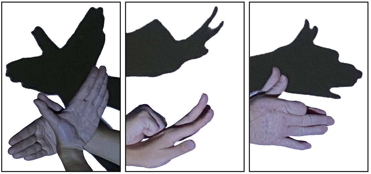
One approach to visualise numeric high dimensional data and models is by using linear projections, as done in a tour (Asimov, 1985; Buja & Asimov, 1986; Cook et al., 2006; S. Lee et al., 2022). You can think of projections of high-dimensional data like shadows (Figure 1.1). Unlike shadow puppets, though the object stays fixed, and with multiple projections we can obtain a view of the object from all sides. A tour will pick directions to look at by selecting a set of linear projections. The views are interpolated to move from one linear projection to the next, this is displayed as an animation.
With a tour we slowly rotate the viewing direction, this allows us to see many individual projections and to track movement patterns. Look for interesting structures such as clusters or outlying points.
1.1 Getting familiar with tours
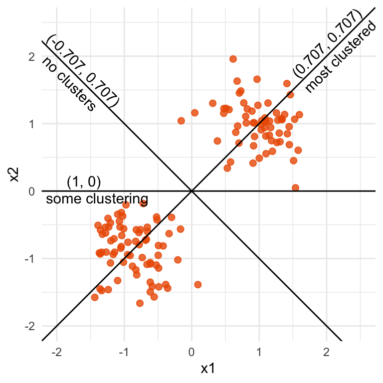
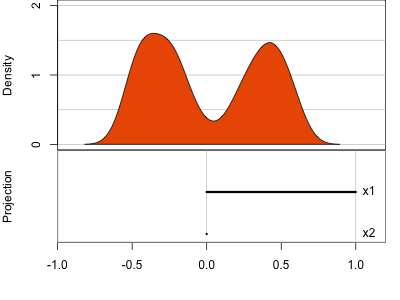
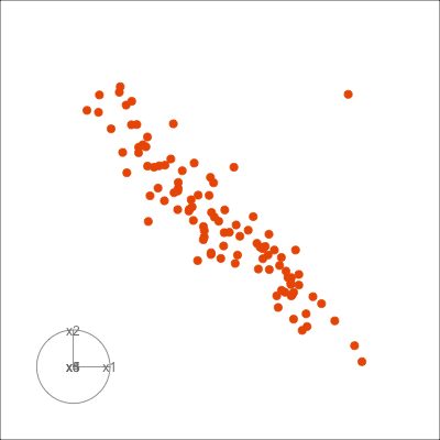
x1=x2 (0.707, 0.707) or (-0.707, -0.707) the clustering is the strongest. When it is at x1=-x2 (0.707, -0.707) there is no clustering.
Figure 1.2 illustrates a tour for 2D data and 1D projections. The (grand) tour will generate all possible 1D projections of the data, and display with a univariate plot like a histogram or density plot. For this data, the simple_clusters data, depending on the projection, the distribution might be clustered into two groups (bimodal), or there might be no clusters (unimodal). In this example, all projections are generated by rotating a line around the centre of the plot. Clustering can be seen in many of the projections, with the strongest being when the contribution of both variables is equal, and the projection is (0.707, 0.707) or (-0.707, -0.707). (If you are curious about the number 0.707, the Chapter 2 provides the explanation.)
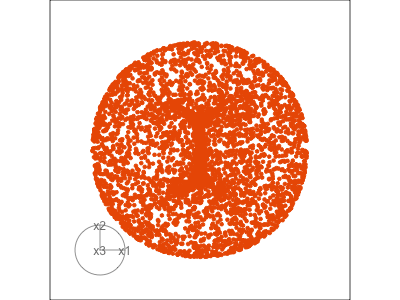
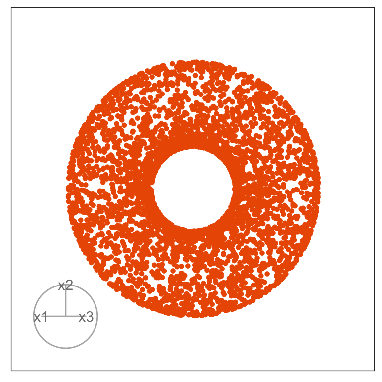
Figure 1.3 illustrates a tour for 3D data using 2D projections. The data are points on the surface of a donut shape. By showing the projections using a scatterplot the donut looks transparent and we can see through the data. The donut shape can be inferred from watching many 2D projections but some are more revealing that others. The projection shown in (b) is where the hole in the donut is clearly visible.
1.2 Reading the axes
The coefficients of the projection are important to matching the variables with the patterns detected. For example, in the 2D data used in Figure 1.2 the primary structure to detect is the clustering. It is when a positive, equal combination of the two variables x1 and x2 are used that the two clusters can be observed in a projection.
When the projection dimension is 2, as in the example data used in Figure 1.3, there are two sets of projection coefficients. These are represented in the plot by the circle and line segments. The direction and length of the line segments indicate how the variable contributes to the view seen. Lining these up with any patterns in the data helps to understand how the variables contribute to making the pattern. In this data, the interesting feature is the hole in the donut, which can be seen in certain combinations of x1 and x3 plotted against x2.
1.3 What’s different about space beyond 2D?
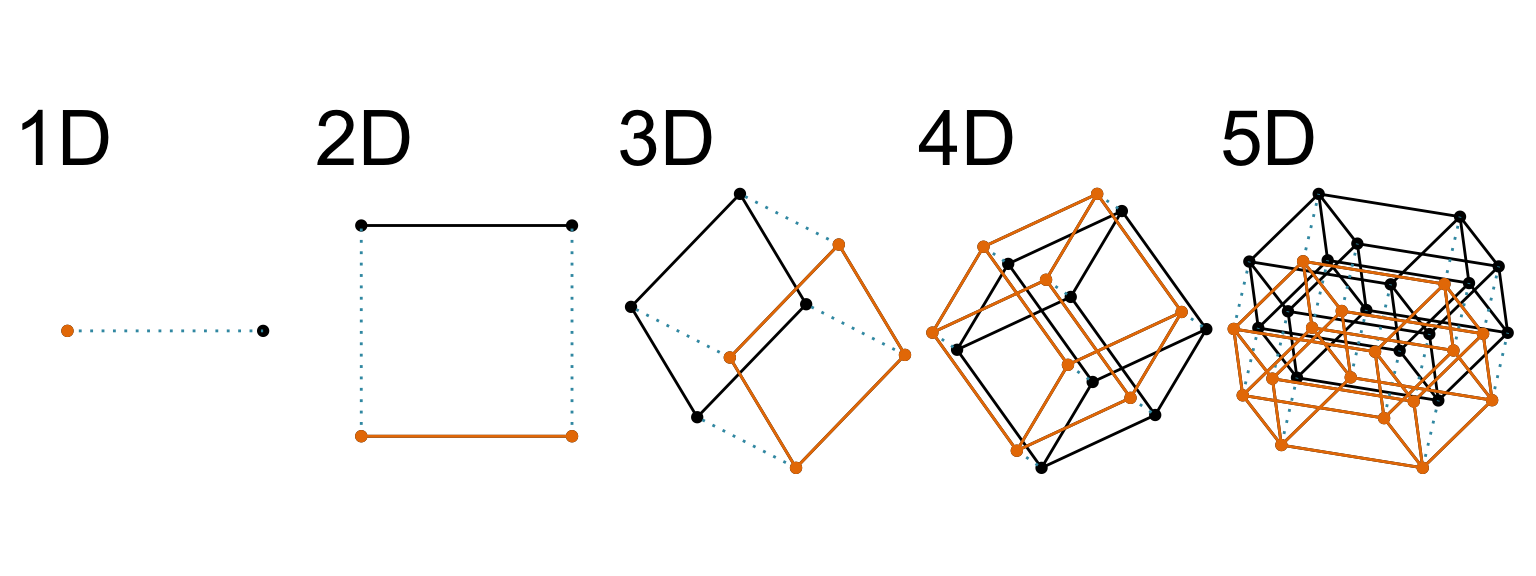
The term “high-dimensional” in this book refers to the dimensionality of the Euclidean space. Figure 1.4 shows a way to imagine this. It shows a sequence of cube wireframes, ranging from one-dimensional (1D) through to five-dimensional (5D), where beyond 2D is a linear projection of the cube. As the dimension increases, a new orthogonal axis is added. For cubes, this is achieved by doubling the cube: a 2D cube consists of two 1D cubes, a 3D cube consists of two 2D cubes, and so forth. This is a great way to think about the space being examined by the visual methods, and also all of the machine learning methods mentioned, in this book.
Interestingly, the struggle with imagining high-dimensions this way is described in a novel titled “Flatland: A Romance of Many Dimensions” published in 1884 (Abbott, 1884) 1. Yes, more than 100 years ago! This is a story about characters living in a 2D world, being visited by an alien 3D character. It also is a social satire, serving the reader strong messages about gender inequity, although this provides the means to explain more intricacies in perceiving dimensions. There have been several movies made based on the book in recent decades (e.g. Martin (1965), D. Johnson & Travis (2007)). Although purchasing the movies may be prohibitive, watching the trailers available for free online is sufficient to gain enough geometric intuition on the nature of understanding high-dimensional spaces while living in a low-dimensional world.
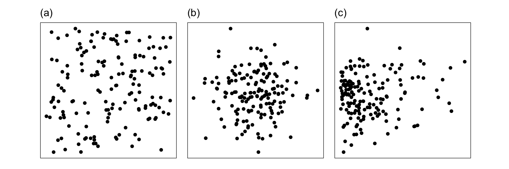
When we look at high-dimensional spaces from a low-dimensional space, we meet the “curse of dimensionality”, a term introduced by Bellman (1961) to express the difficulty of doing optimization in high dimensions because of the exponential growth in space as dimension increases. A way to imagine this is look at the cubes in Figure 1.4: As you go from 1D to 2D, 2D to 3D, the space expands a lot, and imagine how vast space might get as more dimensions are added2. The volume of the space grows exponentially with dimension, which makes it infeasible to sample enough points – any sample will be less densely covering the space as dimension increases. The effect is that most points will be far from the sample mean, on the edge of the sample space.
For visualisation, the curse manifests in an opposite manner. Projecting from high to low dimensions creates a crowding or piling of points near the center of the distribution. This was noted by Diaconis & Freedman (1984). Figure 1.5 illustrates this phenomenon, using samples that are uniformly distributed in \(p\)-dimensional spheres. As dimension increases, the points crowd the centre, even with as few as ten dimensions. This is something that we may need to correct for when exploring high dimensions with low-dimensional projections, which is explained in Laa et al. (2022).
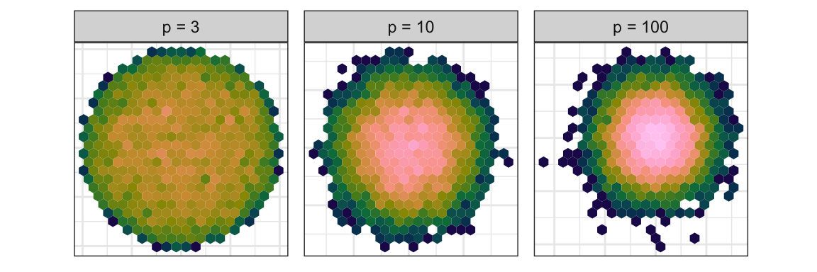
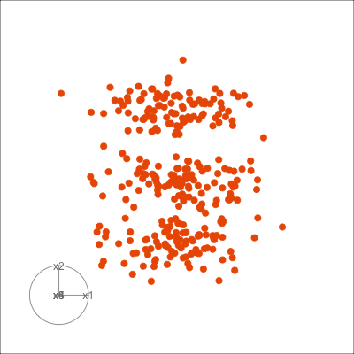
Figure 1.6 shows 2D tours of two different 5D data sets. One has clusters (a) and the other has two outliers and a plane (b). Can you see these? One difference in the viewing of data with more than three dimensions with 2D projections is that the points seem to shrink towards the centre, and then expand out again. This is the effect of dimensionality, with different variance or spread in some directions.
1.4 What can you learn?
There are two ways of detecting structure in tours:
- patterns in a single low-dimensional projection
- movement patterns
with the latter being especially useful when displaying the projected data as a scatterplot. Figure 1.7 shows examples of patterns we typically look for when making a scatterplot of data. These include clustering, linear and non-linear association, outliers, barriers where there is a sharp edge beyond which no observations are seen. Not shown, but it also might be possible to observe multiple modes, or density of observations, L-shapes, discreteness or uneven spread of points. The tour is especially useful if these patterns are only visible in combinations of variables.
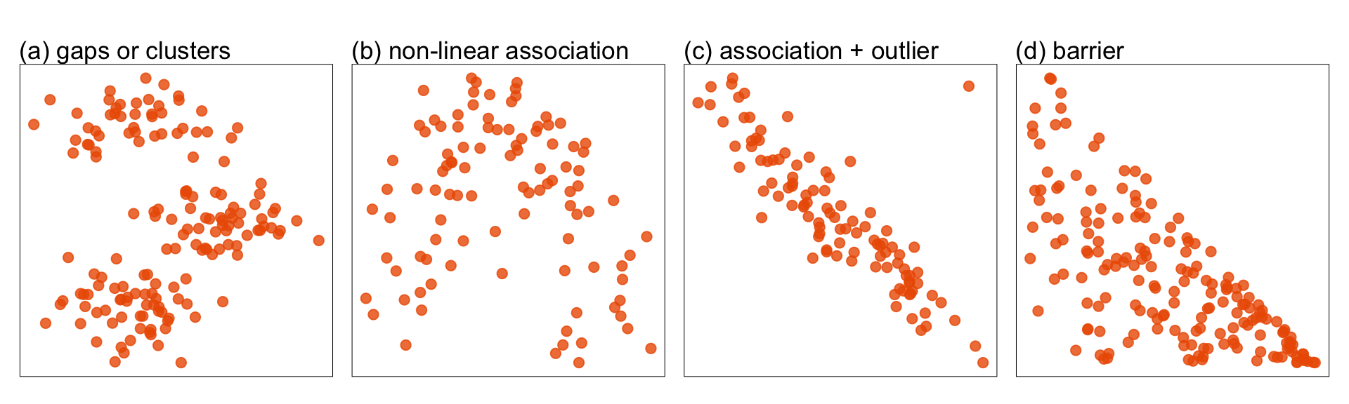
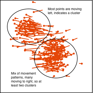
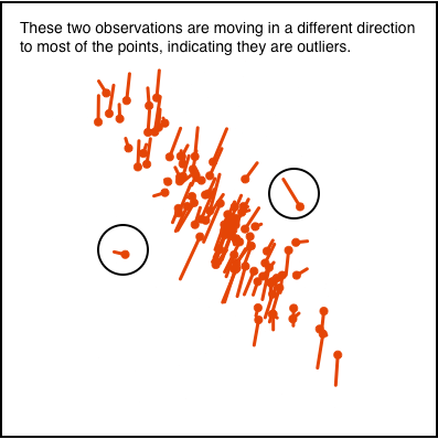
Figure 1.8 illustrates how movement patterns of points can be interpreted when using scatterplots to display 2D projections, to indicate clustering (a) or outliers (b).
This type of visualisation is useful for many activities in dealing with high-dimensional data, including:
- exploring high-dimensional data.
- detecting if the data lives in a lower dimensional space than the number of variables.
- checking assumptions required for multivariate models to be applicable.
- check for potential problems in modeling such as multicollinearity among predictors.
- checking assumptions required for probabilities calculated for statistical hypothesis testing to be valid.
- diagnosing the fit of multivariate models.
You use a tour when analysing multivariate data so that you can see what exists in the data and what your models are fitting, in the same way that you walk down the street with your eyes open to avoid being hit by a bus or to discover a delightful shop.
1.5 A little history
Viewing high-dimensional data based on low-dimensional projections can probably be traced back to the early work on principal component analysis by Pearson (1901) and Hotelling (1933), which was extended to known classes as part of discriminant analysis by Fisher (1936).
With computer graphics, the capability of animating plots to show more than a single best projection became possible. The video library (ASA Statistical Graphics Section, 2023) is the best place to experience the earliest work. Kruskal’s 1962 animation of multidimensional scaling showed the process of finding a good 2D representation of high dimensional data, although the views are not projections. Chang’s 1970 video shows her rotating a high dimensional point cloud along coordinate axes to find a special projection where all the numbers align. The classic video that must be watched is PRIM9 (Fisherkeller et al., 1973) where a variety of interactive and dynamic tools are used together to explore high dimensional physics data, documented in Fisherkeller et al. (1974).
The methods in this book primarily emerge from Asimov (1985)’s grand tour method. The algorithm provided the first smooth and continuous sequence of low-dimensional projections, and guaranteed that all possible low-dimensional projections were likely to be shown. The algorithm was refined in Buja & Asimov (1986) (and documented in detail in Buja et al. (2005)) to make it efficiently show all possible projections. Since then there have been numerous varieties of tour algorithms developed to focus on specific tasks in exploring high dimensional data, and these are documented in S. Lee et al. (2022).
This book is an evolution from Cook & Swayne (2007). One of the difficulties in working on interactive and dynamic graphics research has been the rapid change in technology. Programming languages have changed a little (FORTRAN to C to java to python) but graphics toolkits and display devices have changed a lot! The tour software used in this book evolved from XGobi, which was written in C and used the X Window System, which was then rewritten in GGobi using gtk. The video library has engaging videos of these software systems. There have been several other short-lived implementations, including orca (Sutherland et al., 2000), written in java, and cranvas (Xie et al., 2014), written in R with a back-end provided by wrapper functions to qt libraries.
Although attempts were made with these ancestor systems to connect the data plots to a statistical analysis system, these were always limited. With the emergence of R, having graphics in the data analysis workflow has been much easier, albeit at the cost of the interactivity with graphics that matches the old systems. We are mostly using the R package, tourr (Wickham et al., 2011) for examples in this book. It provides the machinery for running a tour, and has the flexibility that it can be ported, modified, and used as a regular element of data analysis.
1.6 An illustration of the benefits
The Palmer penguins data (A. M. Horst et al., 2022) is available in the R package palmerpenguins (A. Horst et al., 2022). These are measurements on three species of penguins, recording the bill length (bl) and depth (bd), flipper length (fl) and body mass (bm), along with the sex, island location and year of recording. Of interest here are the four physical measurements and the species. There are two penguins with missing values on these measurements which are removed from the analysis below. The variables have also been standardised.
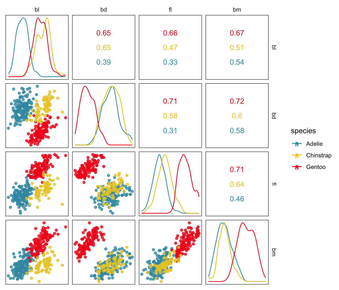
Figure 1.9 shows the data as a scatterplot matrix, as produced by the ggscatmat function in the R package GGally (Emerson et al., 2013), a common way to examine multivariate data with low-dimensional plots: pairwise scatterplots and univariate density plots. A lot of information can be gained from viewing this plot:
- the three species form three clusters, indicating that the physical characteristics of the three are different.
- the Gentoo species forms a separated cluster when
bdis plotted withbm. - there is one anomaly, a Chinstrap penguin that has a very low value of
flrelative to it’sblmeasurement.
Although one cannot see it in this plot clearly, making the plot larger also reveals that fl values appear to have been often rounded because there is some discreteness in the plots.
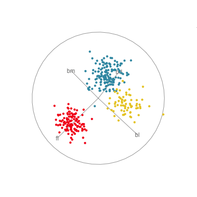
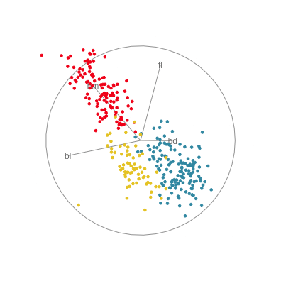
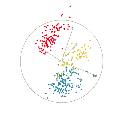
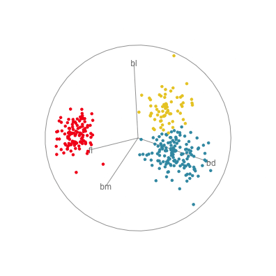
In Figure 1.10 there are four 2D projections from a grand tour of the penguins data. Projection (a) reveals a 2D projection where all three species are distinct. It’s quite a nice view where all species have circular spread, the Gentoo are separated, and the other two are very slightly overlapped. There is also one Adelie penguin that is a little different from the others here, primarily due to having large flippers but small bill depth. Projection (b) shows the anomalous Chinstrap penguin, and reveals that the gap between it and the other penguins is bigger than was seen in the scatterplot matrix. Projection (c) shows that there is an unusual Gentoo penguin, and projection (d) shows possibly a few more anomalous Gentoo, with relatively small bl and larger bm.
In terms of understanding how the variables contribute to the patterns observed, we need to study the axes display on each plot. In projection (a) showing the nice view of the clusters, all four variables contribute in an interesting way. The variables operate in pairs of what we might call contrasts in statistics: bl and bm combine in the top left to bottom right direction, while fl and bd combine in the top right to bottom left direction. Because the axes are pointing in opposite directions, in each pair one variable contributes in the opposite way to the other. That is, one coefficient in the pair will be positive and the other negative. We can also infer that fl and bd contribute most to distinguishing Gentoo from the other species, and also that bl and bm contribute primarily to distinguishing Chinstrap from Adelie penguins.
Interpretations can be checked against plots of the individual variables, like the scatterplot matrix in Figure 1.9. Here, can see that, yes, bl is primarily distinguishing Chinstrap from Adelie, and fl strongly contributes to distinguishing Gentoo from the others. The plot of bl against fl has a reasonably good view of the three species as different from each other. This view gets even better when bm is combined with bl, and bd is combined with fl, to produce what we see with the tour.
The penguins data is relatively simple, and well-studied. Despite this, examining the data with a tour of linear projections provides a few more details that may have gone unobserved.
1.7 Common choices of tours
There are many different types of tours, all generated by different ways of choosing the sequence of linear projections to show. There are three main ones we commonly use, grand tour, guided tour and manual or radial tour. The grand tour is designed to show as many projections of the data as fast as possible with the goal being to give an overview or big picture of the data. The guided tour is used when particular patterns, such as clusters or anomalies, need to be discovered. It steers the choice of projections towards those that have these patterns. The radial tour removes a variable (or combination of two) from the projection, then puts it back, with the specific intent to learn if the pattern depends on this variable’s contribution. If the pattern disappears when the variable disappears it means that this variable is vital or very important for defining the pattern.
The Appendix A contains details on running tours, primarily using the tourr package but other software is listed. A grand tour making 2D projections uses the animate_xy() function, which implicitly uses the algorithm created by the grand_tour() function. The guided tour is created using the guided_tour() function as an argument, and the radial/manual tour is created using the radial_tour() function as an argument. It is also useful to use the save_history() function to pre-compute the set of projections to show, and then use the planned_tour() function to play the sequence. All the different algorithms for generating paths of projections can be used with save_history(). For saving an animation to include in an HTML document the render_gif() can be used. It will save a set of images to a file that will be recognised as an animated gif. It is also possible to extract any of the individual images from this file. All the gifs accompanying this book are created using the render_gif() function.
1.8 Do you really have high-dimensional data?
Even though, you have multiple numeric variables, there may not be any need to use high-dimensional data visualisation. The purpose of using high-dimensional visualisation is to learn about the associations between variables. If there is no association between variables everything we need to learn can be done with univariate data visualisation methods. Chapter 3 focuses on this dimensionality, finding associations, and reducing dimensionality.
Exercises
- Randomly generate data points that are uniformly distributed in a hyper-cube of 3, 5 and 10 dimensions, with 500 points in each sample, using the
cube.solid.random()function of thegeozoopackage. What differences do we expect to see? Now visualise each set in a grand tour and describe how they differ, and whether this matched your expectations? - Use the
geozoopackage to generate samples from different shapes and use them to get a better understanding of how shapes appear in a grand tour. You can start with exploring the conic spiral in 3D, a torus in 4D and points along the wire frame of a cube in 5D. - For each of the challenge data sets,
c1, …,c7from themulgarpackage, use the grand tour to view and try to identify structure (outliers, clusters, non-linear relationships). - The
datasetspackage in R has some classic data to explore.- Examine the
USArrestsdata, using a grand tour (animate_xy()). Explain the structure, and why the scale of the variables might affect your interpretation of the structure. Re-run the tour on standardised variables (optionrescale=TRUE). Do you see any outliers? - Examine the
swissdata, using a grand tour, making sure to use standardised variables. Explain the patterns that you see.
- Examine the
- The
MASSpackage has two data sets that are interesting to examine.- Using a grand tour of the physical variables (
FL,RW,CL,CW,BD) variables in thecrabsdata with the points coloured by species (sp) what can you see? Is there a difference in the species? (Note that for this data you don’t need to standardise. All are measured in the same units, and are not too different in scale, so the associations can still be seen well enough.) - Using a grand tour of the chemical % (
Na:Fe) variables in thefgldata with the points coloured bytypewhat can you see? Is there a difference in the types of glass? (Here, the variables need to be standardised. Even though they are %’s, the different amounts of each impede the ability to assess the associations without rescaling.)
- Using a grand tour of the physical variables (
- There are several interesting data sets available on the GGobi website, for example, one of Tukey’s original data set
PRIM7. Examine this data for different types of patterns. Theolive,PBC, andmusicdata sets are also interesting to explore.PRIM7can be read using:
Answer 1. Each of the projections has a boxy shape, which gets less distinct as the dimension increases.
As the dimension increases, the points tend to concentrate in the centre of the plot window, with a smattering of points in the edges.
Answer 4. a. Using the original variable scale the data looks very linear, like a pencil rotating around. This is due to the different scales for each of the variables. Using standardised variables is the appropriate way to examine this data, to see associations between variables, and outliers (states that are different). There appear to be a couple of outliers, one clearly, and one other smaller outlier. Adding the state name reveals that Alaska is the large outlier. b. There are two distinct, well-separated clusters, and several outliers.
Answer 5. a. You should see two elongated shapes, like two pencils, that are slightly shifted from each other. So yes, the two species are a little different from each other. b. There are several outliers. The groups (types of glass) are a little different from each other but they are not separated clusters. There are some projections (very few) where the points all line up, which is due to the constraint that these values add up to 100% for each observation.
Answer 6. The data has a really interesting shape. It looks a bit like a mechanical arm or arms, several linear strands that emerge from a central cluster in different projections. There is no clustering. There are several outliers.
Project
The data set nigeria-water-imputed.csv contains water availability data recorded for Nigeria, obtained from https://www.waterpointdata.org. Examining this data is motivated by an analysis by Julia Silge “Predict availability in #TidyTuesday water sources with random forest models”. The data has been cleaned, and a small number of missing values have been imputed using the variable means. Variables with _NA at the end indicate values that are imputed, and can be ignored for this exercise.
- There are 86684 observations. To do an initial examination of the the data we will start with a small subset. Make a 1% sample to work with. Note, that generally when sampling one should sample the same fraction within strata that are important for the analysis. Here we will examine the type of water source as indicated by the
water_tech_categoryvariable. You can do the sampling with this code:
- Take a look at the variables starting with
distance_. This can be done more easily by making a smaller subset of variables (see code below, and using shorter variable names). What are the patterns you can see? Does it look like there is much association between variables, or clustering?
Code
water_dist <- water_sub |>
  select(water_tech_category, starts_with("distance")) |>
  select(!contains("_NA")) |>
  mutate(water_tech_category = factor(water_tech_category)) |>
  rename(dpr = distance_to_primary_road,
         dsr = distance_to_secondary_road,
         dtr = distance_to_tertiary_road,
         dc = distance_to_city,
         dt = distance_to_town)
animate_xy(water_dist[,2:6], rescale=TRUE)- Now let’s see how the type of water source might vary by distance. Colour the points by the
water_tech_categoryand examine this in a grand tour. Would you expect that the water source is different depending on the distance from populated areas?
Code
animate_xy(water_dist[,2:6], rescale=TRUE,
col=water_dist$water_tech_category)- Now try using a guided tour to find the best combination to see the differences between the type of water sources. Interpret which variable combination yields this difference.
Code
set.seed(324)
animate_xy(water_dist[,2:6],
           guided_tour(lda_pp(water_dist$water_tech_category)),
           rescale=TRUE,
           col=water_dist$water_tech_category)
Answers. 1. It is worth checking that the proportions of the groups remain the same with the sampling, so the 1% is applied in each group, eg
- There is not so much association between the variables. There is no clustering of the data. Most of the observations are concentrated in a central area and spread thinner further away from the centre. There are a few locations that are possibly considered to be outliers.
Distances are often skewed, so this may not be different from what is expected. Often it is useful to take log transformations of skewed data, but for perceiving differences between the types of water sources is easier on the original variables. Because the data is skewed it might not be appropriate to interpret observations as outliers, unless they are very different from the other points.
Many
Hand Pump’s tend to be larger distances than theMotorized Pumps, on most of the distance variables. There are too fewPublic Tapstandobservations to say much.The biggest difference between the types of water sources is in a combination of most of the variables. Distance to town, distance to city, and distance to tertiary roads have the largest contribution.
Thanks to Barret Schloerke for directing co-author Cook to this history when he was an undergraduate student and we were starting the geozoo project.↩︎
“Space is big. Really big. You might think it’s a long way to the pharmacy, but that’s peanuts to space.” from Douglas Adams’ Hitchhiker’s Guide to the Galaxy always springs to mind when thinking about high dimensions!↩︎