Load libraries
source("code/setup.R")There are several places where visualisation can provide additional insight on the adequacy of the model fit, extending diagnostics beyond the common metrics, such as confusion matrix, accuracy, precision, loss, error, sensitivity, area under the curve (AUC), and receiver operating characteristic (ROC).
The first is to examine where the model makes errors. This can be done by marking the errors with different symbols and making plots of the data including a tour. Another approach is to use linked brushing between a representation of the confusion matrix and other plots of the data to focus on selected mistakes, similar to what was shown in comparing cluster solutions in Section 12.2. What you are looking for is acceptable errors in neighbourhoods where the classes overlap, versus unacceptable errors where there is a big difference between classes but the architecture of the model is mismatched with the data distribution. This would indicate that the model has high bias.
The second area is to examine where the model places the boundaries between classes, relative to the training sample. The purpose again is to learn where the model architecture is a good match with the data distribution.
Lastly, it is important to understand it, by determining which variables contribute most to the classification. This is probably only useful if the model fit is first established to be good, although this can also help to understand how a model has gone bad (as we’ll see in Section 18.3). For linear boundaries interpretability can be global, applying to the entire data, as may be produced by partial dependence plots. With a highly non-linear model, there has been a rapid growth in newly designed metrics for local explainability. With interpretability, the focus is on how individual variables affect the classification, and thus methods such as the radial tour are especially useful.
To examine misclassifications, we can create a separate variable that identifies the errors or not. Constructing this for each class, and exploring in small steps is helpful. Let’s do this using the random forest model for the penguins fit. The random forest fit has only a few misclassifications. There are four Adelie penguins confused with Chinstrap, and similarly four Chinstrap confused with Adelie. There is one Gentoo penguin confused with a Chinstrap. This is interesting, because the Gentoo cluster is well separated from the clusters of the other two penguin species.
source("code/setup.R")load("data/penguins_sub.rda")
penguins_rf <- randomForest(species~.,
data=penguins_sub[,1:5],
importance=TRUE)penguins_rf$confusion Adelie Chinstrap Gentoo class.error
Adelie 143 2 1 0.020547945
Chinstrap 4 64 0 0.058823529
Gentoo 0 1 118 0.008403361penguins_errors <- penguins_sub |>
mutate(err = ifelse(penguins_rf$predicted !=
penguins_rf$y, 1, 0))symbols <- c(1, 16)
p_pch <- symbols[penguins_errors$err+1]
p_cex <- rep(1, length(p_pch))
p_cex[penguins_errors$err==1] <- 2
animate_xy(penguins_errors[,1:4],
col=penguins_errors$species,
pch=p_pch, cex=p_cex)
render_gif(penguins_errors[,1:4],
grand_tour(),
display_xy(col=penguins_errors$species,
pch=p_pch, cex=p_cex),
gif_file="gifs/p_rf_errors.gif",
frames=500,
width=400,
height=400)
animate_xy(penguins_errors[,1:4],
guided_tour(lda_pp(penguins_errors$species)),
col=penguins_errors$species,
pch=pch)
render_gif(penguins_errors[,1:4],
guided_tour(lda_pp(penguins_errors$species)),
display_xy(col=penguins_errors$species,
pch=p_pch, cex=p_cex),
gif_file="gifs/p_rf_errors_guided.gif",
frames=500,
width=400,
height=400,
loop=FALSE)Figure 18.1 shows a grand tour, and a guided tour, of the penguins data, where the misclassifications are marked by filled circles. (If the gifs are too small to see the different glyphs, you can zoom in to make the figures larger.) It can be seen that the one Gentoo penguin that is mistaken for a Chinstrap by the forest model is always moving with its other Gentoo (yellow) family. It can occasionally be seen to be on the edge of the group, closer to the Chinstraps, in some projections in the grand tour. But in the final projection from the guided tour it is hiding well among the other Gentoos. This is an observation where a mistake has been made because of the inadequacies of the forest algorithm. Forests are only as good as the trees they are constructed from, and we have seen from Section 15.1 that the splits only on single variables done by trees does not adequately utilise the covariance structure in each class. They make mistakes based on the boxy nature of the boundaries. This can carry through to the forests model. Even though many trees are combined to generate smoother boundaries, forests do not effectively utilise covariance in clusters either. The other mistakes, where Chinstrap are predicted to be Adelie, and vice versa, are more sensible. These mistaken observations can be seen to lie in the border region between the two clusters, and reflect genuine uncertainty about the classification of penguins in these two species.
The random forest model is inadequate because it has made a mistake on a Gentoo penguin, where there should not be any mistakes because there is a big gap between this species and the others.
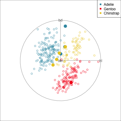
Some errors are reasonable because there is overlap between the class clusters. Some errors are not reasonable because the model used is inadequate.
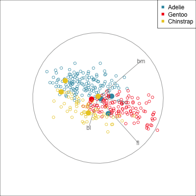
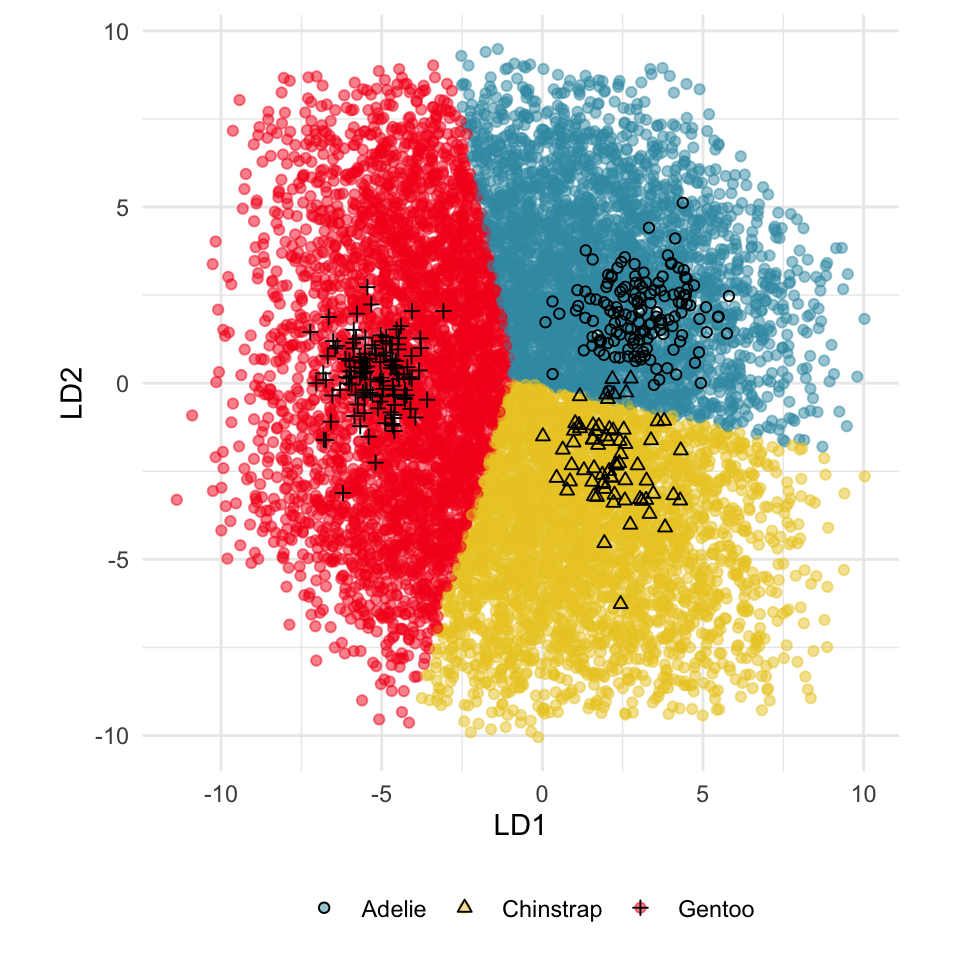
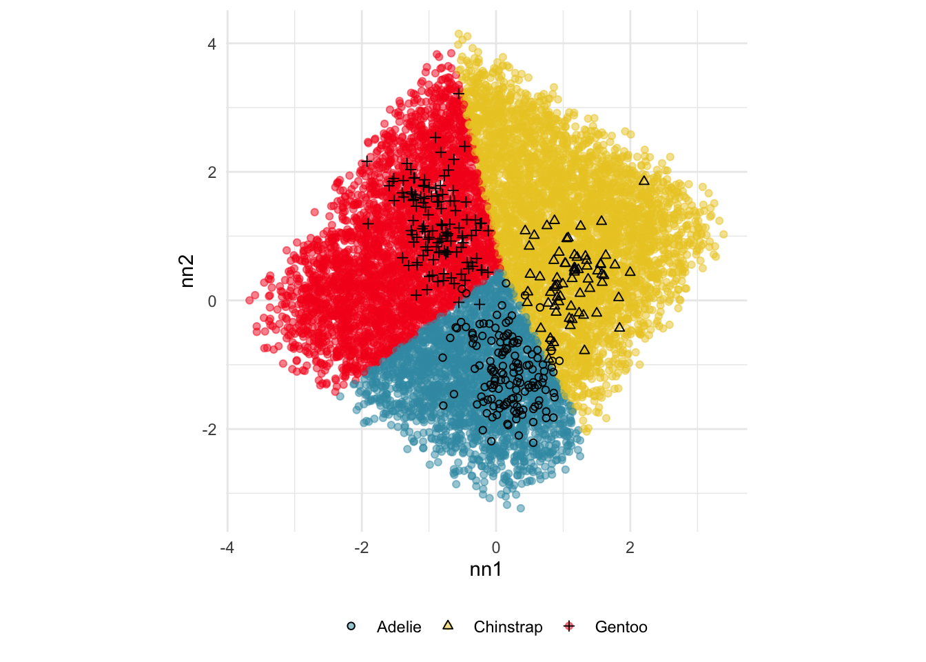
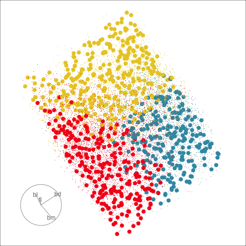
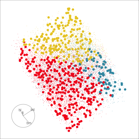
Figure 18.2 shows the boundaries for the NN model fitted in Section 17.1 along with those of the LDA model fitted in Section 14.3. Because there are three classes, LDA conducts the separation in two dimensions, and this is the 2D view examined. The NN model used had a hidden layer that similarly did a reduction of dimension to 2D, and it is the 2D projection formed by the hidden layer that is shown. The separation between the three classes occurs in this projection. In order to get these views, data is simulated in the full domain of the four variables, and the class labels of these points are predicted.
# Generate grid over explanatory variables
p_grid <- tibble(
  bl = runif(10000, min(penguins_sub$bl), max(penguins_sub$bl)),
  bd = runif(10000, min(penguins_sub$bd), max(penguins_sub$bd)),
  fl = runif(10000, min(penguins_sub$fl), max(penguins_sub$fl)),
  bm = runif(10000, min(penguins_sub$bm), max(penguins_sub$bm))
)
# Predict grid
p_grid_pred <- p_nn_model |>
  predict(as.matrix(p_grid), verbose=0)
p_grid_pred_cat <- levels(p_train$species)[apply(p_grid_pred, 1, which.max)]
p_grid_pred_cat <- factor(p_grid_pred_cat,
                          levels=levels(p_train$species))

# Project into weights from the two nodes
p_grid_proj <- as.matrix(p_grid) %*% p_nn_wgts_on
colnames(p_grid_proj) <- c("nn1", "nn2")
p_grid_proj <- p_grid_proj |>
  as_tibble() |>
  mutate(species = p_grid_pred_cat)

# Plot
ggplot(p_grid_proj, aes(x=nn1, y=nn2,
                     colour=species)) +
  geom_point(alpha=0.5) +
  geom_point(data=p_all_m, aes(x=nn1,
                               y=nn2,
                               shape=species),
             inherit.aes = FALSE) +
  scale_colour_discrete_divergingx(palette="Zissou 1") +
  scale_shape_manual(values=c(1, 2, 3)) +
  theme_minimal() +
  theme(aspect.ratio=1,
        legend.position = "bottom",
        legend.title = element_blank())
To examine boundaries, simulate data in a \(p-D\) cube matching the data domain. Make plots of this data, ideally with the training sample overlaid.
The LDA model is excellent: it captures the big gap between Gentoo and others, and divides the other two with as little overlap as possible. This NN model is inadequate, because the hidden layer dimension reduction is poor.
Figure 18.3 shows these boundaries in the full 4D space of the data, using a slice tour. It can be see that the LDA model provides an excellent classification of this data, but this NN model does not adequately capture the separation between classes. NN models can be tricky to fit, and typically require many fits from different random starts and picking the fit with the smallest training error to be confident that a good fit has been achieved. Both of these tours use the same tour path. It makes it easier to compare the boundaries created by each model if both are showing the same projections.
The purpose of interpreting a model is to develop an understanding of how the predictors are related to class differences. If the model fits well, then how the model sees the relationship will reliably describe the relationship. Ideally, one can make statements like “class A differs from class B most when this combination of \(x_1\), …, \(x_p\) is used”, or more simply “\(x_1\) and \(x_5\) are the most important variables for distinguishing class A from B”.
When statistical models are used, such as LDA (or logistic regression) boundaries between classes are linear, and the importance of variables are typically read from the estimated coefficients. They can be considered to be global, because the relationship is the same throughout the data domain. The variable importance provided by random forests is also global importance, but they do not describe smaller intricacies in the (likely non-linear) boundaries induced by the fitted model.
If the predictors have associations, then interpreting measures of importance can be confounded by the associations. A variable may earn a low importance score but actually have a strong contribution to a class separation because it is associated with another predictor that has a high importance score. This can be detangled by examining relationships between predictor and response, conditional on other predictors. Statistical models, though, tend to have a singular focus, and even though two associated variables may have similar importance they will primarily build from only one of them. Ensemble models such as random forest have an advantage here because of the sub-sampling of variables built in to the ensemble architecture. Some elements of the ensemble will only have one of the two variables, so both variables should emerge in the diagnostics as having high importance scores.
But forests build from trees which make greedy linear splits on single variables. If there are multiple ways to separate class clusters, trees and forests will grab one to use. So similarly the fitted model has tunnel vision for one solution.
This is what explainability is attempting to assist with, what is it that the fitted model sees. What we see when we make plots of the data might differ from what the model sees, which can be confusing. The role of explainability is to pull the fitted model apart to inspect how it has been built for the purposes of understanding how it will make predictions and how it considers the relationship between response and predictors.
As suggested by the ruminations above, it can be messy work, requiring persistence and effort to develop a good understanding of any fitted model. Local explanation measures are designed to help, but there are a variety of different calculation techniques which may produce conflicting interpretations. In addition, local explanations are observation-level values, because they provide information that is only reliable for a local neighbourhood of a single observation.
A good interpretability workflow includes:
The variable importance and explainability measures can be used to examine the boundary produced by a classifier. They can help to find the boundary in the neighbourhood of an observation, and seeing the boundary can also help to understand what the measures are reporting about the model.
A good resource for learning about the range of local explainability methods is Molnar (2025). Here we describe how to use tours in association with explanation metrics. Primarily for interpretability, we need to make plots of single (or pairs of) variables because we need to make explanations in terms of single variables. Tours are used to examine boundaries close to a point, if we are to understand local non-linear boundaries, so a slice tour on a small neighbourhood is needed. Also, when multiple variables are working together to generate a prediction, the radial tour to examine the influence of single variables on the projection can be useful.
For illustration, we choose local explanations produced by Shapley values. These are computed using the kernelshap function in the kernelshap package (Mayer & Watson, 2023), and re-organised using the shapviz function in the shapviz package (Mayer, 2024). A Shapley value for an observation indicates how the variable contributes to the model prediction for that observation, relative to other variables. It is an average, computed from the change in prediction for all combinations of presence or absence of other variables. In the computation, for each combination, the prediction is computed by substituting absent variables with their average value, like one might do when imputing missing values. A (larger) positive SHAP value indicates that the variable increases the likelihood of prediction to that class, and conversely a (larger) negative value indicates decreased likelihood of prediction to that class.
# Split the data intro training and testing, as done in 17-nn chapter
library(rsample)
library(tidymodels)
library(keras)

load("data/penguins_sub.rda") # from mulgar book

set.seed(821)
p_split <- penguins_sub |>
  select(bl:species) |>
  initial_split(prop = 2/3,
                strata=species)
p_train <- training(p_split)
p_test <- testing(p_split)

# Data needs to be matrix, and response needs to be numeric
p_train_x <- p_train |>
  select(bl:bm) |>
  as.matrix()
p_train_y <- p_train |> pull(species) |> as.numeric()
p_train_y <- p_train_y-1 # Needs to be 0, 1, 2
p_test_x <- p_test |>
  select(bl:bm) |>
  as.matrix()
p_test_y <- p_test |> pull(species) |> as.numeric()
p_test_y <- p_test_y-1 # Needs to be 0, 1, 2load("data/p_train_pred.rda")
load("data/p_test_pred.rda")
p_train_pred_cat <- levels(p_train$species)[
apply(p_train_pred, 1,
which.max)]
p_train_pred_cat <- factor(
p_train_pred_cat,
levels=levels(p_train$species))
p_test_pred_cat <- levels(p_test$species)[
apply(p_test_pred, 1,
which.max)]
p_test_pred_cat <- factor(
p_test_pred_cat,
levels=levels(p_test$species))
# Explanations
# https://www.r-bloggers.com/2022/08/kernel-shap/
library(kernelshap)
library(shapviz)
p_explain <- kernelshap(
    p_nn_model,
    p_train_x,
    bg_X = p_train_x,
    verbose = FALSE
  )
p_exp_sv <- shapviz(p_explain)
save(p_exp_sv, file="data/p_exp_sv.rda")p_row_id <- c(1:nrow(p_exp_gentoo))[p_exp_gentoo$species == "Gentoo" &
p_exp_gentoo$pspecies == "Adelie"]
p_outlier <- rbind(as.numeric(p_exp_sv$Class_1$S[p_row_id,]),
as.numeric(p_exp_sv$Class_2$S[p_row_id,]),
as.numeric(p_exp_sv$Class_3$S[p_row_id,])) |>
as_tibble() |>
rename(bl=V1, bd=V2, fl=V3, bm=V4) |>
mutate(species = c("Adelie", "Chinstrap", "Gentoo")) |>
select(species, bl:bm)
knitr::kable(p_outlier, digits=2)| species | bl | bd | fl | bm |
|---|---|---|---|---|
| Adelie | 0.06 | -0.06 | 0.04 | 0.09 |
| Chinstrap | -0.13 | -0.05 | -0.05 | 0.02 |
| Gentoo | 0.07 | 0.11 | 0.01 | -0.11 |
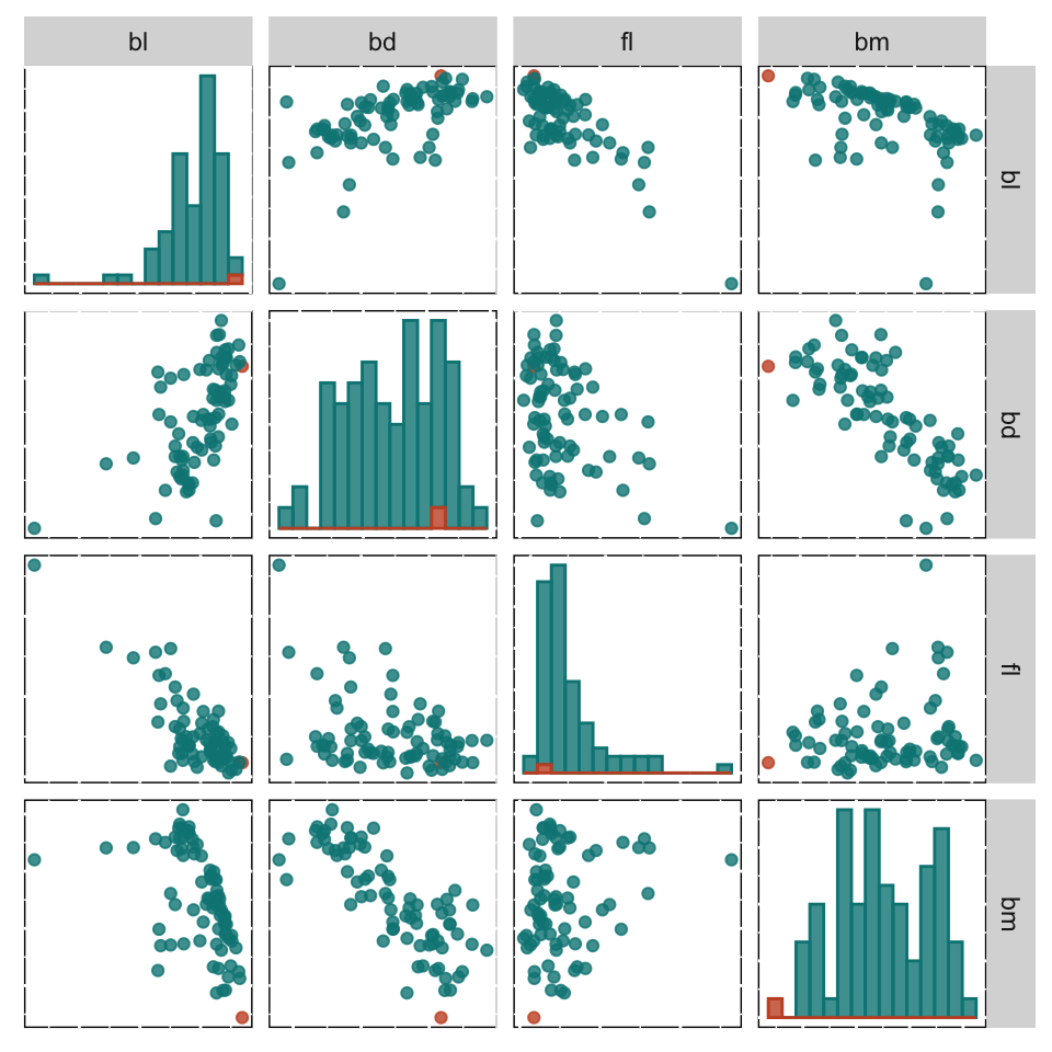
Figure 18.4 shows the Shapley values for all the Gentoo observations in the training set of penguins data, as a parallel coordinate plot (a) and a scatterplot matrix (b). It can be useful to compare the SHAP values for all the observations in a class, to understand differences in their predictions. A parallel coordinate plot is better than a scatterplot matrix here because it focuses on single variables, and the differences in SHAP values across the variables. The values for the single misclassified Gentoo penguin (in the training set) is coloured orange-brown. The SHAP values for this penguin are similar to other penguins on bl, bd and fl but they are very different on bm.
Table 18.1 contains the SHAP values for this penguin, for all three classes, and all four variables. The explanations for this misclassified penguin are then:
bd, and possibly bl but not the bm value.bm value is considered.bl is considered.p_exp_gentoo |>
filter(species == "Gentoo") |>
pivot_longer(bl:bm, names_to="var", values_to="shap") |>
mutate(var = factor(var, levels=c("bl", "bd", "fl", "bm"))) |>
ggplot(aes(x=var, y=shap, colour=factor(error))) +
geom_quasirandom(alpha=0.8) +
scale_colour_discrete_divergingx(palette="Geyser") +
#facet_wrap(~var) +
xlab("") + ylab("SHAP") +
theme_minimal() +
theme(legend.position = "none")p_pcp <- p_exp_gentoo |>
filter(species == "Gentoo") |>
pcp_select(1:4) |>
ggplot(aes_pcp()) +
geom_pcp_axes() +
geom_pcp_boxes(fill="grey80") +
geom_pcp(aes(colour = factor(error)),
linewidth = 1.5, alpha=0.3) +
scale_colour_discrete_divergingx(palette="Geyser") +
xlab("") + ylab("SHAP") +
theme_minimal() +
theme(legend.position = "none")
d <- p_exp_gentoo |>
filter(species == "Gentoo")
p_sm <- ggpairs(d, columns = 1:4,
upper = list(continuous = wrap("points", alpha = 0.8)),
lower = list(continuous = wrap("points", alpha = 0.8)),
diag = list(continuous = wrap("barDiag", alpha = 0.8, bins = 15)),
ggplot2::aes(colour = error, fill = error),
alpha = 0.5) +
scale_colour_discrete_divergingx(palette="Geyser") +
scale_fill_discrete_divergingx(palette="Geyser") +
theme(aspect.ratio = 1,
panel.background=element_rect(fill=NA, colour="black"),
axis.text = element_blank(),
axis.ticks = element_blank())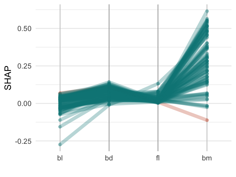
If we examine the data in Figure 18.5 the explanations make some sense. The misclassified penguin has an unusually small value on bm. That the SHAP value for bm was quite different from those of the other Gentoo penguins pointed to this being the potential issue with the model, particularly for this penguin. This penguin’s prediction is negatively impacted by bm being in the model.
# Check position on bm
shap_proj <- p_exp_gentoo |>
  filter(species == "Gentoo", error == "yes") |>
  select(bl:bm)
shap_proj <- tourr::normalise(shap_proj) #as.matrix(shap_proj/sqrt(sum(shap_proj^2)))
p_exp_gentoo_proj <- p_exp_gentoo |>
  rename(shap_bl = bl,
         shap_bd = bd,
         shap_fl = fl,
         shap_bm = bm) |>
  bind_cols(as_tibble(p_train_x)) |>
  mutate(shap1 = shap_proj[1]*bl+
           shap_proj[2]*bd+
           shap_proj[3]*fl+
           shap_proj[4]*bm)
sp1 <- ggplot(p_exp_gentoo_proj, aes(x=bm, y=bl,
             colour=species,
             shape=factor(error))) + #factor(1-error))) +
    geom_point(alpha=0.8) +
  scale_colour_discrete_divergingx(palette="Zissou 1") +
  scale_shape_manual("error", values=c(1, 19)) +
  theme_minimal() +
  theme(aspect.ratio=1,
        legend.position="bottom",
        legend.direction="horizontal")
sp2 <- ggplot(p_exp_gentoo_proj, aes(x=bm, y=shap1,
             colour=species,
             shape=factor(error))) + #factor(1-error))) +
    geom_point(alpha=0.8) +
  scale_colour_discrete_divergingx(palette="Zissou 1") +
  scale_shape_manual("error", values=c(19, 1)) +
  ylab("SHAP") +
  theme_minimal() +
  theme(aspect.ratio=1,
        legend.position="bottom",
        legend.direction = "horizontal",
        axis.text = element_blank())
sp2 <- ggplot(p_exp_gentoo_proj, aes(x=shap1,
             fill=species, colour=species)) +
  geom_density(alpha=0.5) +
  geom_vline(xintercept = p_exp_gentoo_proj$shap1[
    p_exp_gentoo_proj$species=="Gentoo" &
    p_exp_gentoo_proj$error==1], colour="black") +
  scale_fill_discrete_divergingx(palette="Zissou 1") +
  scale_colour_discrete_divergingx(palette="Zissou 1") +
  theme_minimal() +
  theme(aspect.ratio=1, legend.position="bottom")
sp2 <- ggplot(p_exp_gentoo_proj, aes(x=bm, y=bd,
             colour=species,
             shape=factor(error))) + #factor(1-error))) +
    geom_point(alpha=0.8) +
  scale_colour_discrete_divergingx(palette="Zissou 1") +
  scale_shape_manual("error", values=c(1, 19)) +
  theme_minimal() +
  theme(aspect.ratio=1,
        legend.position="bottom",
        legend.direction = "horizontal",
        axis.text = element_blank())
sp3 <- ggplot(p_exp_gentoo_proj, aes(x=bm, y=fl,
             colour=species,
             shape=factor(error))) + #factor(1-error))) +
    geom_point(alpha=0.8) +
  scale_colour_discrete_divergingx(palette="Zissou 1") +
  scale_shape_manual("error", values=c(1, 19)) +
  theme_minimal() +
  theme(aspect.ratio=1,
        legend.position="bottom",
        legend.direction = "horizontal",
        axis.text = element_blank())
sp1 + sp2 + sp3 + plot_layout(ncol=3, guides = "collect") &
  theme(legend.position="bottom",
        legend.direction = "horizontal")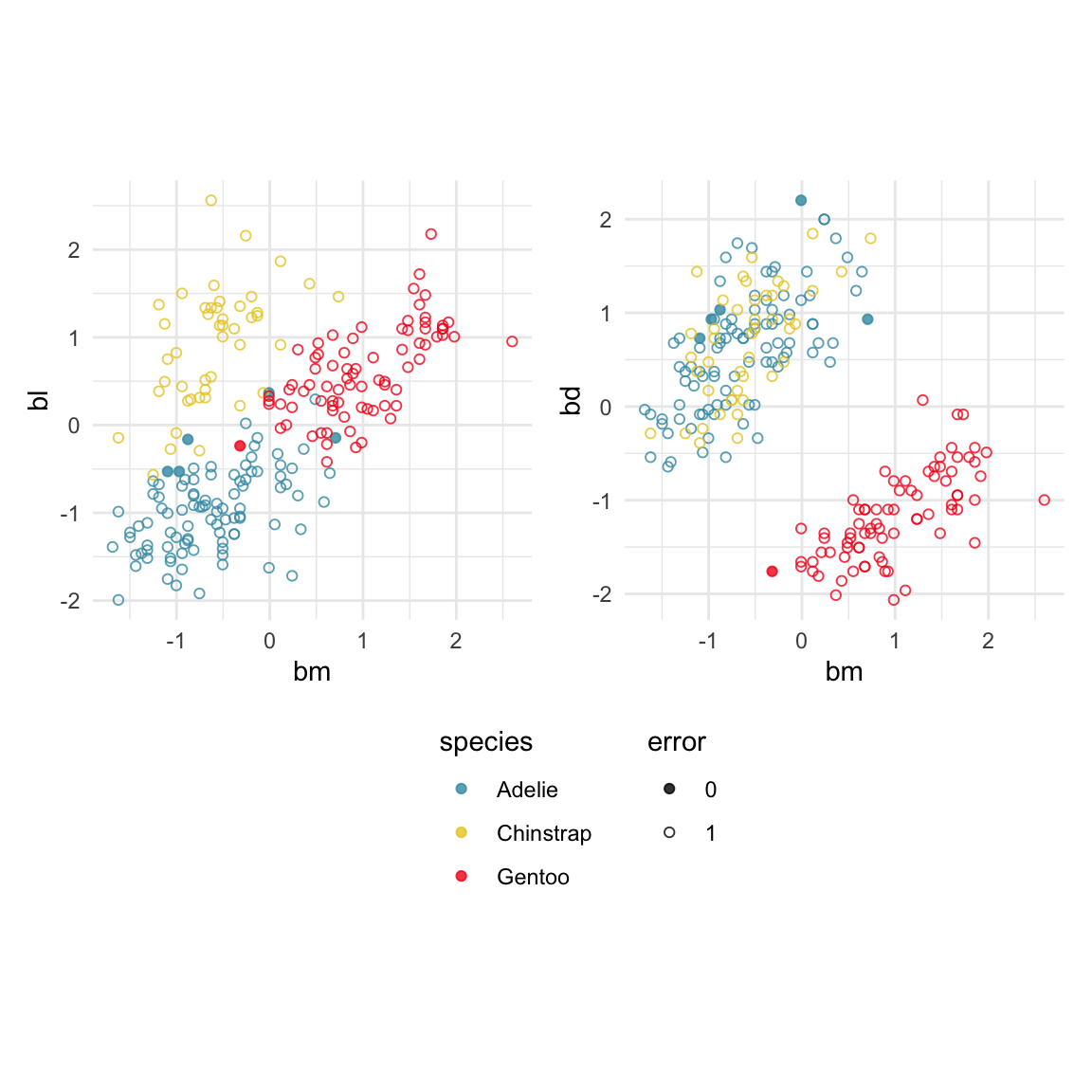
This is a good point to examine the boundary between Gentoo and Adelie penguins. Focusing on just two classes is easier, and it is between these two classes that the error in classification occurs. Examining the boundary can be achieved by simulating a large number of points in the data domain and predicting the class of these points. Figure 18.6 shows these predictions, along with the observed training values. The scatterplots show the same pairs of variables as shown in Figure 18.5. Pixel points indicate the simulated data covering the data domain, and allowing the boundary to be examined. The observed training data is overlaid, with solid circles indicating an error. It’s a bit messy but the most important part to see is that the boundary between classes is mostly in the vertical direction, which corresponds to cutting primarily on bm. It’s not completely bm because there is some overlap of the red and blue points here, and the direction is not quite vertical. Particularly, with bd there the direction of the boundary is slightly oblique. (Note that the white area in the top left of bl vs bm actually corresponds to the Chinstrap prediction region, which we have removed to focus on Adelie and Gentoo.)
# Need to do the predictions and save because saved model
# appears to be machine-dependent
n <- 10000
p_sim <- tibble(bl = runif(n, min(penguins_sub$bl), max(penguins_sub$bl)),
                bd = runif(n, min(penguins_sub$bd), max(penguins_sub$bd)),
                fl = runif(n, min(penguins_sub$fl), max(penguins_sub$fl)),
                bm = runif(n, min(penguins_sub$bm), max(penguins_sub$bm))) |>
  as.matrix()
p_sim_pred <- p_nn_model |>
  predict(p_sim, verbose = 0)
colnames(p_sim_pred) <- c("Adelie", "Chinstrap", "Gentoo")
save(p_sim_pred, file="data/p_sim_pred.rda")
save(p_sim, file="data/p_sim.rda")load("data/p_sim_pred.rda")
load("data/p_sim.rda")
p_sim_class <- apply(p_sim_pred, 1, which.max)
p_sim_class <- c("Adelie", "Chinstrap", "Gentoo")[p_sim_class]
p_sim_pred <- p_sim_pred |>
as_tibble() |>
mutate(species = factor(p_sim_class))
p_sim <- p_sim |>
as_tibble() |>
mutate(species = factor(p_sim_class))
# animate_slice(p_sim[,1:4], col=p_sim$species, v_rel=0.6, axes="bottomleft")
p_sim_a_g <- p_sim |>
filter(species != "Chinstrap")
bd1 <- p_sim_a_g |>
ggplot() +
geom_point(aes(x=bm, y=bl, colour=species), shape=20, size=0.01) +
# geom_point(data=filter(p_exp_gentoo_proj, species != "Chinstrap"),
# aes(x=bm, y=bl,
# colour=species,
# shape=factor(error)), alpha=0.8) +
scale_colour_discrete_divergingx(palette="Zissou 1") +
scale_shape_manual("error", values=c(1, 19)) +
theme_minimal() +
theme(aspect.ratio=1,
legend.position="bottom",
legend.direction="horizontal",
axis.text = element_blank())
bd2 <- p_sim_a_g |>
ggplot() +
geom_point(aes(x=bm, y=bd, colour=species), shape=20, size=0.01) +
geom_point(data=filter(p_exp_gentoo_proj, species != "Chinstrap"),
aes(x=bm, y=bd,
colour=species,
shape=factor(error)), alpha=0.8) +
scale_colour_discrete_divergingx(palette="Zissou 1") +
scale_shape_manual("error", values=c(1, 19)) +
theme_minimal() +
theme(aspect.ratio=1,
legend.position="bottom",
legend.direction="horizontal",
axis.text = element_blank())
bd3 <- p_sim_a_g |>
filter(species != "Chinstrap") |>
ggplot() +
geom_point(aes(x=bm, y=fl, colour=species), shape=20, size=0.01) +
geom_point(data=filter(p_exp_gentoo_proj, species != "Chinstrap"),
aes(x=bm, y=fl,
colour=species,
shape=factor(error)), alpha=0.8) +
scale_colour_discrete_divergingx(palette="Zissou 1") +
scale_shape_manual("error", values=c(1, 19)) +
theme_minimal() +
theme(aspect.ratio=1,
legend.position="bottom",
legend.direction="horizontal",
axis.text = element_blank())
bd1 + bd2 + bd3 + plot_layout(ncol=3, guides = "collect") &
theme(legend.position="bottom",
legend.direction = "horizontal")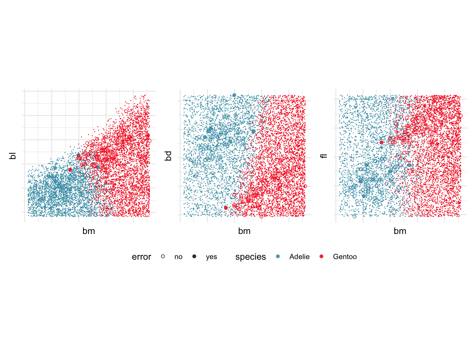
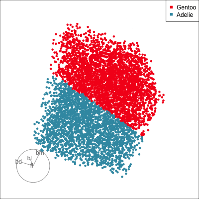
The next step is to use a radial tour to very directly find the boundary bteween Adelie and Gentoo. It is probably reasonable to start from a projection that is constructed using the SHAP values, with the idea that this combination of variables might also reveal where the prediction to either class occurs. Because we have seen that bm plays the most important role in the classification, creating a 2D projection basis where bm is contrasted against a combination of the other variables, is our strategy for initialising the radial tour. Figure 18.7 shows the boundary being found using the radial tour.
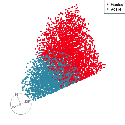
The SHAP values for the NN model are correct in reporting that body mass is a variable that strongly contributes to the misclassified penguin. They do not effectively take global variable importance into account, and give too much weight to bill length and flipper length in the interpretation. These two variables contribute very little to the classification boundary.
So what have we learned? The SHAP values suggested numerous variables involved with the classification of the species. Using the tour shows that the separation between Adelie and Gentoo is mostly due to bm, for this fitted neural network model. The SHAP values over-stated the importance of the other variables. However, examining the SHAP values for all the training sample did help to uncover the reason why the one Gentoo penguin was misclassified as Adelie, its value of bm is unusual.
By examining the class boundary, we also learn that this model is inadequate. It does not adequately use the relationship between bm and bd effectively as can be seen in Figure 18.6 (middle plot). A cleaner distinction between Adelie and Gentoo would be achieved with a more oblique linear split.
This example has been a relatively simple classification. The fitted model used linear splits to separate the classes, which was not very difficult to visualise. If the boundary between classes is much more non-linear then it might be necessary to zoom in close to the observation of interest, and to use a slice tour to examine the boundary close to the observation.
What we have seen is that the SHAP values provided some insight, but the message was not very clear even in this simple situation. It is helpful to use the tour to help to explain the explainers.
In general, local explanations can mislead and be inaccurate explainers of the model fit. If a different method was used, such as LIME, counterfactuals, or anchors, the results can be conflicting explanations. After all, they are all estimates of what the model thinks. We need additional tools to evaluate which is more useful.
It is also important to keep in mind that they are explaining a particular model fit. If the model is not a good fit, then the explainers are explaining a bad fit (aka rubbish), and you check the model fit statistics to make sure that the fit is one worth explaining. In most applications, predictors will have some association, which means there may be many similarly good fits, even though the end result of model fitting is to pick just one.
Compute the SHAP values for the LDA model and examine the Gentoo penguin that was misclassified as a Adelie by the NN model. How do these differ from those of the NN model? What does this tell us about the classification boundary produced by LDA as different from the NN model?
Why should it be possible to obtain a NN fit, where the architecture has two nodes in the hidden layer to do a dimension reduction, that is at least as good as the LDA model? Re-fit the NN model, by varying the random seed, to obtain the best fit possible. Save this model fit, and compare it with the LDA model.
Examine misclassifications from a random forest model for the fake trees data between cluster 1 and 0, using the (a) principal components, (b) votes matrix. Describe where these show errors relative to their true and predicted class clusters. When examining the simplex, are the misclassifications the points that are furthest from any vertices?
Examine the misclassifications for the random forest model on the sketches data, focusing on cactus sketches that were mistaken for bananas. Follow up by plotting the images of these errors, and describe whether the classifier is correct that these sketches are so poor their true cactus or banana identity cannot be determined.
How do the errors from the random forest model compare with those of your best fitting NN model? Are the the corresponding images poor sketches of cacti or bananas?
Now examine the misclassifications of the sketches data in the