Load libraries
source("code/setup.R")Neural networks (NN) can be considered to be nested additive (or even ensemble) models where explanatory variables are combined, and transformed through an activation function like a logistic. These transformed combinations are added recursively to yield class predictions. They are considered to be black box models, but there is a growing demand for interpretability. Although interpretability is possible, it can be unappealing to understand a complex model constructed to tackle a difficult classification task. Nevertheless, this is the motivation for the explanation of visualisation for NN models in this chapter.
In the simplest form, we might write the equation for a NN as
\[ \hat{y} = f(x) = a_0+\sum_{h=1}^{s} w_{0h}\phi(a_h+\sum_{i=1}^{p} w_{ih}x_i) \] where \(s\) indicates the number of nodes in the hidden (middle layer), and \(\phi\) is a choice of activation function. In a simple situation where \(p=3\), \(s=2\), and linear output layer, the model could be written as:
\[ \begin{aligned} \hat{y} = a_0+ & w_{01}\phi(a_1+w_{11}x_1+w_{21}x_2+w_{31}x_3) +\\ & w_{02}\phi(a_2+w_{12}x_1+w_{22}x_2+w_{32}x_3) \end{aligned} \] which is a combination of two (linear) models, each of which could be examined for their role in making predictions.
In practice, a model may have many nodes, and several hidden layers, a variety of activation functions, and regularisation modifications. One should keep in mind the principle of parsimony is important when applying NNs, because it is tempting to make an overly complex, and thus over-parameterised, construction. Fitting NNs is still problematic. One would hope that fitting produces a stable result, whatever the starting seed the same parameter estimates are returned. However, this is not the case, and different, sometimes radically different, results are routinely obtained after each attempted fit (Wickham et al., 2015).
For these examples we use the software keras (Allaire & Chollet, 2023) following the installation and tutorial details at https://tensorflow.rstudio.com/tutorials/. Because it is an interface to python it can be tricky to install. If this is a problem, the example code should be possible to convert to use nnet (Venables & Ripley, 2002) or neuralnet (Fritsch et al., 2019). We will use the penguins data to illustrate the fitting, because it makes it easier to understand the procedures and the fit. However, a NN is like using a jackhammer instead of a trowel to plant a seedling, more complicated than necessary to build a good classification model for this data.
A first step is to decide how many nodes the NN architecture should have, and what activation function should be used. To make these decisions, ideally you already have some knowledge of the shapes of class clusters. For the penguins classification, we have seen that it contains three elliptically shaped clusters of roughly the same size. This suggests two nodes in the hidden layer would be sufficient to separate three clusters (Figure 17.1). Because the shapes of the clusters are convex, using linear activation (“relu”) will also be sufficient. The model specification is as follows:
source("code/setup.R")library(keras)
tensorflow::set_random_seed(211)
# Define model
p_nn_model <- keras_model_sequential()
p_nn_model |>
layer_dense(units = 2, activation = 'relu',
input_shape = 4) |>
layer_dense(units = 3, activation = 'softmax')
p_nn_model |> summary
loss_fn <- loss_sparse_categorical_crossentropy(
from_logits = TRUE)
p_nn_model |> compile(
optimizer = "adam",
loss = loss_fn,
metrics = c('accuracy')
)Note that tensorflow::set_random_seed(211) sets the seed for the model fitting so that we can obtain the same result to discuss later. It needs to be set before the model is defined in the code. The model will also be saved in order to diagnose and make predictions.
Splitting the data into training and test is an essential way to protect against overfitting, for most classifiers, but especially so for the copiously parameterised NNs. The model specified for the penguins data with only two nodes is unlikely to be overfitted, but it is nevertheless good practice to use a training set for building and a test set for evaluation.
Figure 17.2 shows the tour being used to examine the split into training and test samples for the penguins data. Using random sampling, particularly stratified by group, should result the two sets being very similar, as can be seen here. It does happen that several observations in the test set are on the extremes of their class cluster, so it could be that the model makes errors in the neighbourhoods of these points.
# Split the data intro training and testing
library(rsample)
load("data/penguins_sub.rda") # from mulgar book

set.seed(821)
p_split <- penguins_sub |>
  select(bl:species) |>
  initial_split(prop = 2/3,
                strata=species)
p_train <- training(p_split)
p_test <- testing(p_split)

# Check training and test split
p_split_check <- bind_rows(
  bind_cols(p_train, type = "train"),
  bind_cols(p_test, type = "test")) |>
mutate(type = factor(type))animate_xy(p_split_check[,1:4],
col=p_split_check$species,
pch=p_split_check$type,
shapeset=c(16,1))
animate_xy(p_split_check[,1:4],
guided_tour(lda_pp(p_split_check$species)),
col=p_split_check$species,
pch=p_split_check$type,
shapeset=c(16,1))
render_gif(p_split_check[,1:4],
grand_tour(),
display_xy(
col=p_split_check$species,
pch=p_split_check$type,
shapeset=c(16,1),
cex=1.5,
axes="bottomleft"),
gif_file="gifs/p_split.gif",
frames=500,
loop=FALSE
)
render_gif(p_split_check[,1:4],
guided_tour(lda_pp(p_split_check$species)),
display_xy(
col=p_split_check$species,
pch=p_split_check$type,
shapeset=c(16,1),
cex=1.5,
axes="bottomleft"),
gif_file="gifs/p_split_guided.gif",
frames=500,
loop=FALSE
)
The data needs to be specially formatted for the model fitted using keras. The explanatory variables need to be provided as a matrix, and the categorical response needs to be separate, and specified as a numeric variable, beginning with 0.
# Data needs to be matrix, and response needs to be numeric
p_train_x <- p_train |>
  select(bl:bm) |>
  as.matrix()
p_train_y <- p_train |> pull(species) |> as.numeric()
p_train_y <- p_train_y-1 # Needs to be 0, 1, 2
p_test_x <- p_test |>
  select(bl:bm) |>
  as.matrix()
p_test_y <- p_test |> pull(species) |> as.numeric()
p_test_y <- p_test_y-1 # Needs to be 0, 1, 2
The specified model is reasonably simple, four input variables, two nodes in the hidden layer and a three column binary matrix for output. This corresponds to 5+5+3+3+3=19 parameters.
Model: "sequential"
________________________________________________________________________________
 Layer (type)                       Output Shape                    Param #
================================================================================
 dense_1 (Dense)                    (None, 2)                       10
 dense (Dense)                      (None, 3)                       9
================================================================================
Total params: 19 (76.00 Byte)
Trainable params: 19 (76.00 Byte)
Non-trainable params: 0 (0.00 Byte)
________________________________________________________________________________# Fit model
p_nn_fit <- p_nn_model |> keras::fit(
x = p_train_x,
y = p_train_y,
epochs = 200,
verbose = 0
)Because we set the random number seed we will get the same fit each time the code provided here is run. However, if the model is re-fit without setting the seed, you will see that there is a surprising amount of variability in the fits. Setting epochs = 200 helps to usually get a good fit. One expects that keras is reasonably stable so one would not expect the huge array of fits as observed in Wickham et al. (2015) using nnet. That this can happen with the simple model used here reinforces the notion that fitting of NN models is fiddly, and great care needs to be taken to validate and diagnose the fit.
Fitting NN models is fiddly, and very different fitted models can result from restarts, parameter choices, and architecture.
library(keras)

# load fitted model
p_nn_model <- load_model_tf("data/penguins_cnn")
The fitted model that we have chosen as the final one has reasonably small loss and high accuracy. Plots of loss and accuracy across epochs showing the change during fitting can be plotted, but we don’t show them here, because they are generally not very interesting.
p_nn_model |> evaluate(p_test_x, p_test_y, verbose = 0)The model object can be saved for later use with:
save_model_tf(p_nn_model, "data/penguins_cnn")View the individual node models to understand how they combine to produce the overall model.
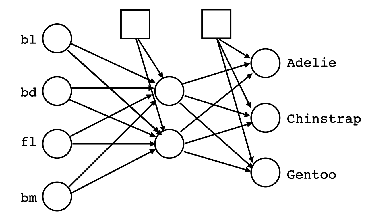
Because nodes in the hidden layers of NNs are themselves (relatively simple regression) models, it can be interesting to examine these to understand how the model is making it’s predictions. Although it’s rarely easy, most software will allow the coefficients for the models at these nodes to be extracted. With the penguins NN model there are two nodes, so we can extract the coefficients and plot the resulting two linear combinations to examine the separation between classes.
# Extract hidden layer model weights
p_nn_wgts <- keras::get_weights(p_nn_model, trainable=TRUE)# Show hidden layer model weights
load("data/p_nn_wgts.rda")
p_nn_wgts [[1]]
[,1] [,2]
[1,] 0.6216676 1.33304155
[2,] 0.1851478 -0.01596385
[3,] -0.1680396 -0.30432791
[4,] -0.8867414 -0.36627045
[[2]]
[1] 0.12708087 -0.09466381
[[3]]
[,1] [,2] [,3]
[1,] -0.1646167 1.527644 -1.9215064
[2,] -0.7547278 1.555889 0.3210194
[[4]]
[1] 0.4554813 -0.9371488 0.3577386The linear coefficients for the first node in the model are 0.62, 0.19, -0.17, -0.89, and the second node in the model are 1.33, -0.02, -0.3, -0.37. We can use these like we used the linear discriminants in LDA to make a 2D view of the data, where the model is separating the three species. The constants 0.13, -0.09 are not important for this. They are only useful for drawing the location of the boundaries between classes produced by the model.
These two sets of model coefficients provide linear combinations of the original variables. Together, they define a plane on which the data is projected to view the classification produced by the model. Ideally, though this plane should be defined using an orthonormal basis otherwise the shape of the data distribution might be warped. So we orthonormalise this matrix before computing the data projection.
# Orthonormalise the weights to make 2D projection
p_nn_wgts_on <- tourr::orthonormalise(p_nn_wgts[[1]])
p_nn_wgts_on
[,1] [,2]
[1,] 0.5593355 0.7969849
[2,] 0.1665838 -0.2145664
[3,] -0.1511909 -0.1541475
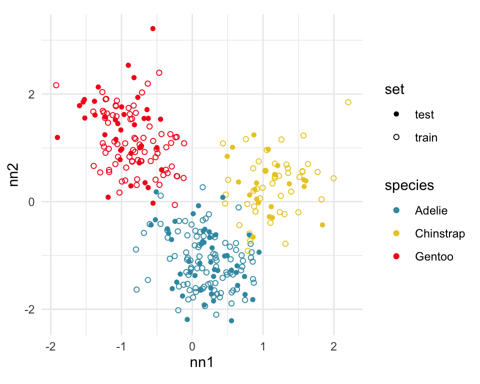
[4,] -0.7978314 0.5431528Figure 17.3 shows the data projected into the plane determined by the two linear combinations of the two nodes in the hidden layer. Training and test sets are indicated by empty and solid circles. The three species are clearly different but there is some overlap or confusion for a few penguins. The most interesting aspect to learn is that there is no big gap between the Gentoo and other species, which we know exists in the data. The model has not found this gap, and thus is likely to unfortunately and erroneously confuse some Gentoo penguins, particularly with Adelie.
What we have shown here is a process to use the models at the nodes of the hidden layer to produce a reduced dimensional space where the classes are best separated, at least as determined by the model. The process will work in higher dimensions also.
When there are more nodes in the hidden layer than the number of original variables it means that the space is extended to achieve useful classifications that need more complicated non-linear boundaries. The extra nodes describe the non-linearity. Wickham et al. (2015) provides a good illustration of this in 2D. The process of examining each of the node models can be useful for understanding this non-linear separation, also in high dimensions.
# Hidden layer
p_train_m <- p_train |>
  mutate(nn1 = as.matrix(p_train[,1:4]) %*%
           as.matrix(p_nn_wgts_on[,1], ncol=1),
         nn2 = as.matrix(p_train[,1:4]) %*%
           matrix(p_nn_wgts_on[,2], ncol=1))

# Now add the test points on.
p_test_m <- p_test |>
  mutate(nn1 = as.matrix(p_test[,1:4]) %*%
           as.matrix(p_nn_wgts_on[,1], ncol=1),
         nn2 = as.matrix(p_test[,1:4]) %*%
           matrix(p_nn_wgts_on[,2], ncol=1))
p_train_m <- p_train_m |>
  mutate(set = "train")
p_test_m <- p_test_m |>
  mutate(set = "test")
p_all_m <- bind_rows(p_train_m, p_test_m)
ggplot(p_all_m, aes(x=nn1, y=nn2,
                     colour=species, shape=set)) +
  geom_point() +
  scale_colour_discrete_divergingx(palette="Zissou 1") +
  scale_shape_manual(values=c(16, 1)) +
  theme_minimal() +
theme(aspect.ratio=1)This particular fit is not good, based on what we know about the data. There should be a fit where a two node hidden layer produces a 2D representation where the difference between classes is clearer.
When the predictive probabilities are returned by a model, as is done by this NN, we can use a ternary diagram for three class problems, or high-dimensional simplex when there are more classes to examine the strength of the classification. This done in the same way that was used for the votes matrix from a random forest in Section 15.2.1.
# Predict training and test set
# This looks like there is some machine dependency on the
# saved model, so predictions are saved for loading across platforms
p_nn_model <- load_model_tf("data/penguins_cnn")
p_train_pred <- p_nn_model |>
  predict(p_train_x, verbose = 0)
p_test_pred <- p_nn_model |>
  predict(p_test_x, verbose = 0)

save(p_train_pred, file="data/p_train_pred.rda")
save(p_test_pred, file="data/p_test_pred.rda") p_train_pred_cat
Adelie Chinstrap Gentoo
Adelie 92 4 1
Chinstrap 0 45 0
Gentoo 1 0 78 p_test_pred_cat
Adelie Chinstrap Gentoo
Adelie 45 3 1
Chinstrap 0 23 0
Gentoo 1 0 39# Set up the data to make the ternary diagram
# Join data sets
colnames(p_train_pred) <- c("Adelie", "Chinstrap", "Gentoo")
colnames(p_test_pred) <- c("Adelie", "Chinstrap", "Gentoo")
p_train_pred <- as_tibble(p_train_pred)
p_train_m <- p_train_m |>
mutate(pspecies = p_train_pred_cat) |>
bind_cols(p_train_pred) |>
mutate(set = "train")
p_test_pred <- as_tibble(p_test_pred)
p_test_m <- p_test_m |>
mutate(pspecies = p_test_pred_cat) |>
bind_cols(p_test_pred) |>
mutate(set = "test")
p_all_m <- bind_rows(p_train_m, p_test_m)
# Add simplex to make ternary
proj <- t(geozoo::f_helmert(3)[-1,])
p_nn_v_p <- as.matrix(p_all_m[,c("Adelie", "Chinstrap", "Gentoo")]) %*% proj
colnames(p_nn_v_p) <- c("x1", "x2")
p_nn_v_p <- p_nn_v_p |>
as.data.frame() |>
mutate(species = p_all_m$species,
set = p_all_m$set)
simp <- geozoo::simplex(p=2)
sp <- data.frame(cbind(simp$points), simp$points[c(2,3,1),])
colnames(sp) <- c("x1", "x2", "x3", "x4")
sp$species = sort(unique(penguins_sub$species))# Plot it
ggplot() +
geom_segment(data=sp, aes(x=x1, y=x2, xend=x3, yend=x4)) +
geom_text(data=sp, aes(x=x1, y=x2, label=species),
nudge_x=c(-0.1, 0.15, 0),
nudge_y=c(0.05, 0.05, -0.05)) +
geom_point(data=p_nn_v_p, aes(x=x1, y=x2,
colour=species,
shape=set),
size=2, alpha=0.5) +
scale_color_discrete_divergingx(palette="Zissou 1") +
scale_shape_manual(values=c(19, 1)) +
theme_map() +
theme(aspect.ratio=1, legend.position = "right")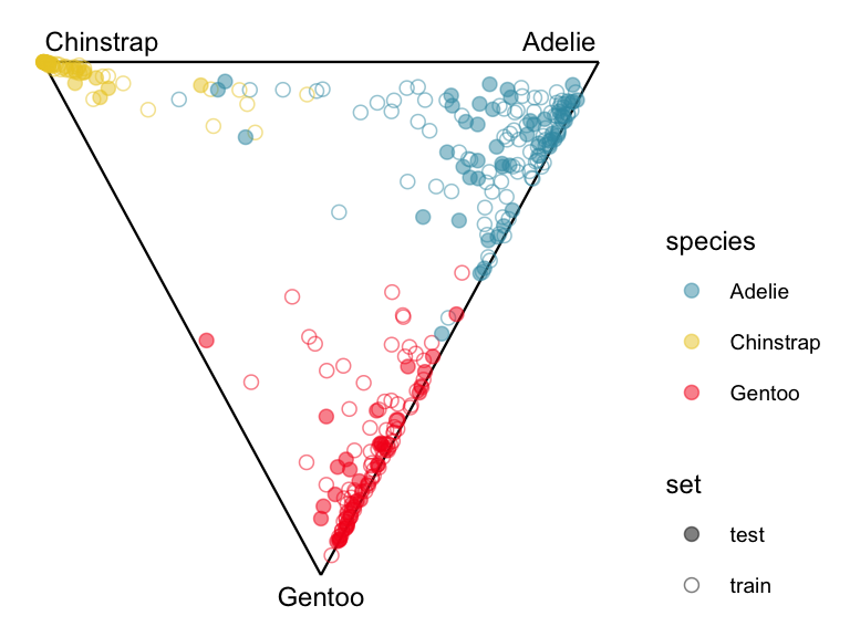
If the training and test sets look similar when plotted in the model space then the model is not suffering from over-fitting.
To see how these methods apply in the setting where we have a large number of variables, observations and classes we will look at a neural network that predicts the category for the fashion MNIST data. The code for designing and fitting the model is following the tutorial available from https://tensorflow.rstudio.com/tutorials/keras/classification and you can find additional information there. Below we only replicate the steps needed to build the model from scratch. We also note that a similar investigation was presented in Li et al. (2020), with a focus on investigating the model at different epochs during the training.
The first step is to download and prepare the data. Here we scale the observations to range between zero and one, and we define the label names.
library(keras3)

# download the data
fashion_mnist <- dataset_fashion_mnist()

# split into input variables and response
c(train_images, train_labels) %<-% fashion_mnist$train
c(test_images, test_labels) %<-% fashion_mnist$test

# for interpretation we also define the category names
class_names = c('T-shirt/top',
                'Trouser',
                'Pullover',
                'Dress',
                'Coat',
                'Sandal',
                'Shirt',
                'Sneaker',
                'Bag',
                'Ankle boot')

# rescaling to the range (0,1)
train_images <- train_images / 255
test_images <- test_images / 255
In the next step we define the neural network and train the model. Note that because we have many observations, even a very simple structure returns a good model. And because this example is well-known, we do not need to tune the model or check the validation accuracy.
# defining the model
model_fashion_mnist <- keras_model_sequential()
model_fashion_mnist |>
  # flatten the image data into a long vector
  layer_flatten(input_shape = c(28, 28)) |>
  # hidden layer with 128 units
  layer_dense(units = 128, activation = 'relu') |>
  # output layer for 10 categories
  layer_dense(units = 10, activation = 'softmax')

model_fashion_mnist |> compile(
  optimizer = 'adam',
  loss = 'sparse_categorical_crossentropy',
  metrics = c('accuracy')
)

# fitting the model, if we did not know the model yet we
# would add a validation split to diagnose the training
model_fashion_mnist |> fit(train_images,
              train_labels,
              epochs = 5)
save_model_tf(model_fashion_mnist, "data/fashion_nn")
We have defined a flat neural network with a single hidden layer with 128 nodes. To investigate the model we can start by comparing the activations to the original input data distribution. Since both the input space and the space of activations is large, and they are of different dimensionality, we will first use principal component analysis. This simplifies the analysis, and in general we do not need the original pixel or hidden node information for the interpretation here. The comparison is using the test-subset of the data.
# get the fitted model
model_fashion_mnist <- load_model_tf("data/fashion_nn")
# observed response labels in the test set
test_tags <- factor(class_names[test_labels + 1],
                    levels = class_names)

# calculate activation for the hidden layer, this can be done
# within the keras framework
activations_model_fashion <- keras_model(
  inputs = model_fashion_mnist$input,
  outputs = model_fashion_mnist$layers[[2]]$output
)
activations_fashion <- predict(
  activations_model_fashion,
  test_images, verbose = 0)

# PCA for activations
activations_pca <- prcomp(activations_fashion)
activations_pc <- as.data.frame(activations_pca$x)

# PCA on the original data
# we first need to flatten the image input
test_images_flat <- test_images
dim(test_images_flat) <- c(nrow(test_images_flat), 784)
images_pca <- prcomp(as.data.frame(test_images_flat))
images_pc <- as.data.frame(images_pca$x)load("data/activations_fashion.rda")
test_tags <- factor(class_names[as.numeric(fashion_test$Label)],
levels = class_names)
# PCA for activations
activations_pca <- prcomp(activations_fashion)
activations_pc <- as.data.frame(activations_pca$x)
# PCA on the original data
images_pca <- prcomp(fashion_test[,1:784])
images_pc <- as.data.frame(images_pca$x)p2 <- ggplot(activations_pc,
aes(PC1, PC2, color = test_tags)) +
geom_point(size = 0.1) +
ggtitle("Activations") +
scale_color_discrete_qualitative(palette = "Dynamic") +
theme_bw() +
theme(legend.position = "none", aspect.ratio = 1)
p1 <- ggplot(images_pc,
aes(PC1, PC2, color = test_tags)) +
geom_point(size = 0.1) +
ggtitle("Input space") +
scale_color_discrete_qualitative(palette = "Dynamic") +
theme_bw() +
theme(legend.position = "none", aspect.ratio = 1)
legend_labels <- cowplot::get_legend(
p1 +
guides(color = guide_legend(nrow = 1)) +
theme(legend.position = "bottom",
legend.title = element_blank()) +
guides(color = guide_legend(override.aes = list(size = 1)))
)
# hide plotting code
cowplot::plot_grid(cowplot::plot_grid(p1, p2), legend_labels,
rel_heights = c(1, .3), nrow = 2)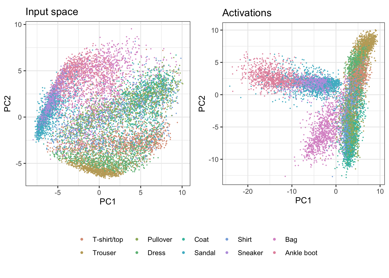
Looking only at the first two principal components we note some clear differences from the transformation in the hidden layer. The observations seem to be more evenly spread in the input space, while in the activations space we notice grouping along specific directions. In particular the category “Bag” appears to be most different from all other classes, and the non-linear transformation in the activations space shows that they are clearly different from the shoe categories, while in the input space we could note some overlap in the linear projection. To better identify differences between other groups we will use the tour on the first five principal components.
animate_xy(images_pc[,1:5], col = test_tags,
        cex=0.2, palette = "Dynamic")
animate_xy(activations_pc[,1:5], col = test_tags,
        cex=0.2, palette = "Dynamic")

render_gif(images_pc[,1:5],
           grand_tour(),
           display_xy(
             col=test_tags,
             cex=0.2,
             palette = "Dynamic",
             axes="bottomleft"),
           gif_file="gifs/fashion_images_gt.gif",
           frames=500,
           loop=FALSE
)
render_gif(activations_pc[,1:5],
           grand_tour(),
           display_xy(
             col=test_tags,
             cex=0.2,
             palette = "Dynamic",
             axes="bottomleft"),
           gif_file="gifs/fashion_activations_gt.gif",
           frames=500,
           loop=FALSE
)
As with the first two principal components we get a much more spread out distribution in the original space. Nevertheless we can see differences between the classes, and that some groups are varying along specific directions in that space. Overall the activations space shows tighter clusters as expected after including the ReLU activation function, but the picture is not as neat as the first two principal components would suggest. While certain groups appear very compact even in this larger subspace, others vary quite a bit within part of the space. For example we can clearly see the “Bag” observations as different from all other images, but also notice that there is a large variation within this class along certain directions.
Finally we will investigate the model performance through the misclassifications and uncertainty between classes. We start with the error matrix for the test observations. To fit the error matrix we use the numeric labels, the ordering is as defined above for the labels.
fashion_test_pred <- predict(model_fashion_mnist,
                             test_images, verbose = 0)
fashion_test_pred_cat <- levels(test_tags)[
  apply(fashion_test_pred, 1,
        which.max)]
predicted <- factor(
  fashion_test_pred_cat,
  levels=levels(test_tags)) |>
  as.numeric() - 1
observed <- as.numeric(test_tags) -1
table(observed, predicted)
predicted
observed 0 1 2 3 4 5 6 7 8 9
0 128 0 84 719 10 0 51 7 1 0
1 0 42 15 941 0 0 0 2 0 0
2 6 0 824 38 121 0 3 8 0 0
3 1 0 14 976 8 0 1 0 0 0
4 1 0 205 181 605 0 0 8 0 0
5 1 0 0 2 0 77 0 902 1 17
6 24 0 231 282 405 0 44 12 2 0
7 0 0 0 0 0 0 0 1000 0 0
8 17 1 78 102 49 0 5 730 16 2
9 0 0 0 2 0 0 0 947 0 51Here the labels are used as 0 - T-shirt/top, 1 - Trouser, 2 - Pullover, 3 - Dress, 4 - Coat, 5 - Sandal, 6 - Shirt, 7 - Sneaker, 8 - Bag, 9 - Ankle boot. From this we see that the model mainly confuses certain categories with each other, and within expected groups (e.g. different types of shoes can be confused with each other, or different types of shirts). We can further investigate this by visualizing the full probability matrix for the test observations, to see which categories the model is uncertain about.
# getting the probabilities from the output layer
fashion_test_pred <- predict(model_fashion_mnist,
                             test_images, verbose = 0)

# this is the same code as was used in the RF chapter
proj <- t(geozoo::f_helmert(10)[-1,])
f_nn_v_p <- as.matrix(fashion_test_pred) %*% proj
colnames(f_nn_v_p) <- c("x1", "x2", "x3", "x4", "x5", "x6", "x7", "x8", "x9")

f_nn_v_p <- f_nn_v_p |>
  as.data.frame() |>
  mutate(class = test_tags)

simp <- geozoo::simplex(p=9)
sp <- data.frame(simp$points)
colnames(sp) <- c("x1", "x2", "x3", "x4", "x5", "x6", "x7", "x8", "x9")
sp$class = ""
f_nn_v_p_s <- bind_rows(sp, f_nn_v_p) |>
  mutate(class = ifelse(class %in% c("T-shirt/top",
                                     "Pullover",
                                     "Shirt",
                                     "Coat"), class, "Other")) |>
  mutate(class = factor(class, levels=c("Other", "T-shirt/top",
                                        "Pullover",
                                        "Shirt",
                                        "Coat")))
labels <- c("0" , "1", "2", "3", "4", "5", "6", "7", "8", "9",
                rep("", 10000))

animate_xy(f_nn_v_p_s[,1:9], col = f_nn_v_p_s$class,
           axes = "off", cex=0.2,
           edges = as.matrix(simp$edges),
           edges.width = 0.05,
           obs_labels = labels,
           palette = "Viridis")

render_gif(f_nn_v_p_s[,1:9],
           grand_tour(),
           display_xy(
             col=f_nn_v_p_s$class,
             cex=0.2,
             palette = "Viridis",
             axes="off",
             obs_labels = labels,
             edges = as.matrix(simp$edges),
             edges.width = 0.05),
           gif_file="gifs/fashion_confusion_gt.gif",
           frames=500,
           loop=FALSE
)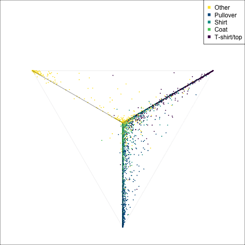
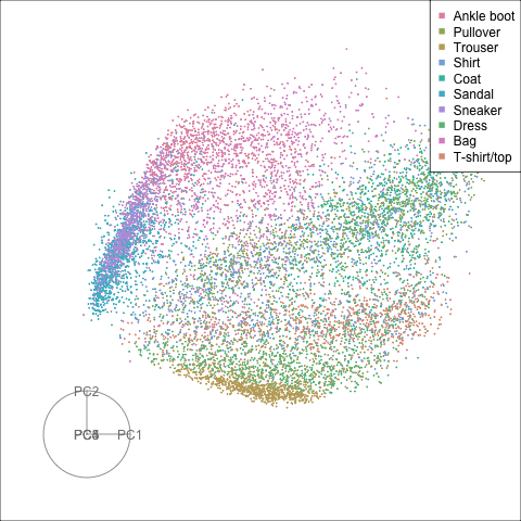
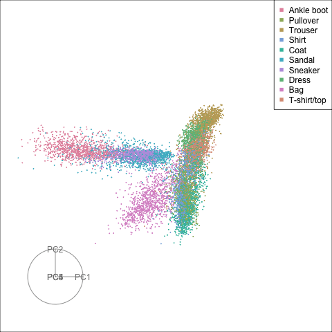
The tour of the class probabilities shows that the model is often confused between two classes, this appears as points falling along one edge in the simplex. In particular for the highlighted categories we can notice some interesting patterns, where pairs of classes get confused with each other. We also see some three-way confusions, these are observations that fall on one surface triangle defined via three corners of the simplex, for example between Pullover, Shirt and Coat.
For this data using explainers like SHAP is not so interesting, since the individual pixel contribution to a prediction are typically not of interest. With image classification a next step might be to further investigate which part of the image is important for a prediction, and this can be visualized as a heat map placed over the original image. This is especially interesting in the case of difficult or misclassified images. This however is beyond the scope of this book.
There are subsets of confusion, as can be seen by both confusion matrix and votes visualisation. T-shirt/top, Shirt, Pullover, Coat, Dress are mutually confused. And some pairs are commonly confused, e.g. Sandal and Sneaker. In the votes matrix visualisation this can be seen by the concentration of points in a tetrahedron and the concentrations along some edges.
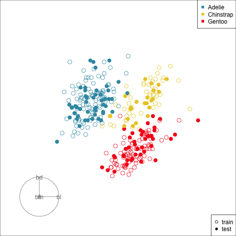
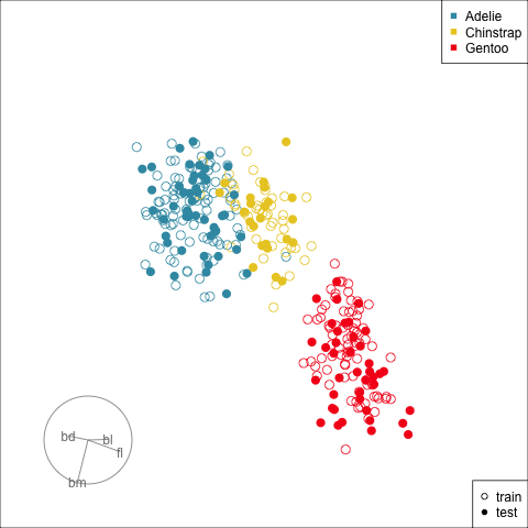
bd plays a stronger role in your best model? (bd is the main variable for distinguishing Gentoo’s from the other species, particularly when used with fl or bl.)