Chapter 5 Bivariate dependencies and relationships
5.1 Motivation
Scatter plots are glorious. Of all the major chart types, they are by far the most powerful. They allow us to .monash-orange2[quickly understand relationships] that would be nearly impossible to recognize in a table or a different type of chart. … Michael Friendly and Daniel Denis, psychologists and historians of graphics, call the scatter plot the most “generally useful invention in the history of statistical graphics.” Dan Kopf
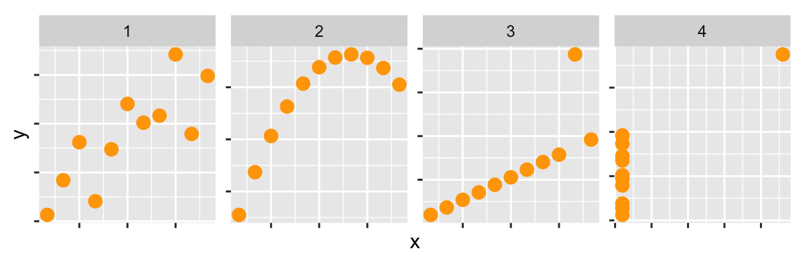
Scatterplots are the natural plot to make to explore association between two continuous (quantitative or numeric) variables].
They are not just for linear relationships but are useful for examining nonlinear patterns, clustering and outliers.
We also can think about scatterplots in terms of statistical distributions: if a histogram shows a marginal distribution, a scatterplot allows us to examine the bivariate distribution of a sample.
5.1.1 History
Descartes provided the Cartesian coordinate system in the 17\(^{th}\) century, with perpendicular lines indicating two axes.
It wasn’t until 1832 that the scatterplot appeared, when John Frederick Herschel (Friendly and Denis 2001) plotted position and time of double stars. This is 50 years after bar charts and line charts appeared, used in the work of William Playfair to examine economic data. Kopf argues that The scatter plot, by contrast, proved more useful for scientists, but it clearly is useful for economics today.
5.1.2 Language and terminology
The words “correlation” and “association” are NOT interchangeable. In the English language correlation means a mutual relationship or connection between two things. However, the statistic called correlation ONLY describes linear relationships.
If the relationship is NOT linear, call use the term association to describe it. Use the term correlated only for linear relationships to avoid confusion related to the statistic.]
5.2 Common features and their names
| Feature | Example | Description |
|---|---|---|
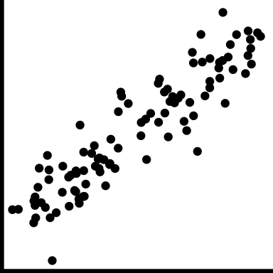
| positive trend |
|
Low value corresponds to low value, and high to high. |
| negative trend |
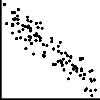
|
Low value corresponds to high value, and high to low. |
| no trend |
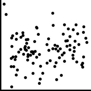
|
No relationship |
| strong |
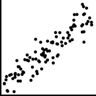
|
Very little variation around the trend |
| moderate |
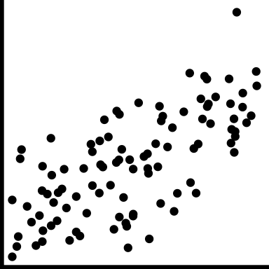
|
Variation around the trend is almost as much as the trend |
| weak |
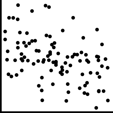
|
A lot of variation making it hard to see any trend |
| linear form |
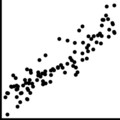
|
The shape is linear |
| nonlinear form |
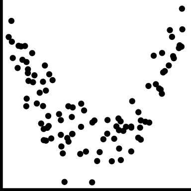
|
The shape is more of a curve |
| nonlinear form |
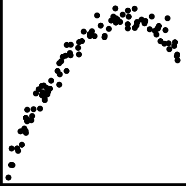
|
The shape is more of a curve |
| outliers |
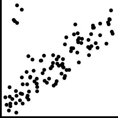
|
There are one or more points that do not fit the pattern on the others |
| clusters |
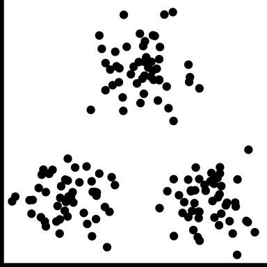
|
The observations group into multiple clumps |
| gaps |
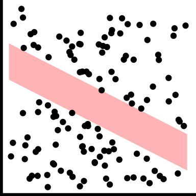
|
There is a gap, or gaps, but its not clumped |
| barrier |
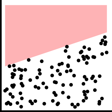
|
There is combination of the variables which appears impossible |
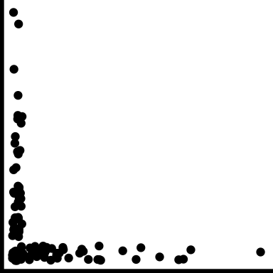
| l-shape |
|
When one variable changes the other is approximately constant |
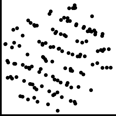
| discreteness |
|
Relationship between two variables is different from the overall, and observations are in a striped pattern |
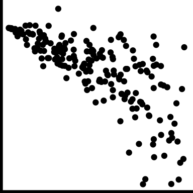
| heteroskedastic |
|
Variation is different in different areas, maybe depends on value of x variable |
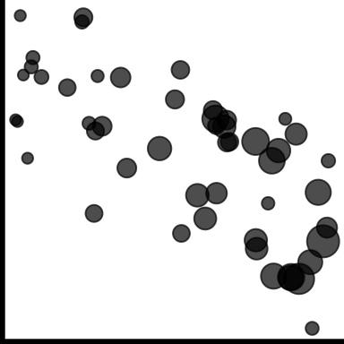
| weighted |
|
If observations have an associated weight, reflect in scatterplot, e.g. bubble chart |
- Weighted doesn’t fit structure table, but its there to remind us not to forget about weighted data
- causation: one variable has a direct influence on the other variable, in some way. For example, people who are taller tend to weigh more. The dependent variable is conventionally on the y axis. It’s not generally possible to tell from the plot that the relationship is causal, which typically needs to be argued from other sources of information.
- association: variables may be related to one another, but through a different variable, eg ice cream sales are positively correlated with beach drownings, is most likely a temperature relationship.
- conditional relationships: the relationship between variables is conditionally dependent on another, such as income against age likely has a different relationship depending on retired or not.
5.3 Case study 1: olympics
## Rows: 10,384
## Columns: 14
## $ Name    <fct> Lamusi A, A G Kruger, Jamale Aarrass, Abdelhak Aatakni, Maria …
## $ Country <fct> "People's Republic of China", "United States of America", "Fra…
## $ Age     <int> 23, 33, 30, 24, 26, 27, 30, 23, 27, 19, 37, 28, 28, 28, 22, 19…
## $ Height  <dbl> 1.70, 1.93, 1.87, NA, 1.78, 1.82, 1.82, 1.87, 1.90, 1.70, NA, …
## $ Weight  <int> 60, 125, 76, NA, 85, 80, 73, 75, 80, NA, NA, NA, 60, 64, 62, N…
## $ Sex     <fct> M, M, M, M, F, M, F, M, M, M, M, M, F, F, M, F, M, M, M, M, F,…
## $ DOB     <date> 1989-02-06, NA, NA, 1988-09-02, NA, 1984-06-09, NA, 1989-03-0…
## $ PlaceOB <fct> "NEIMONGGOL (CHN)", "Sheldon (USA)", "BEZONS (FRA)", "AIN SEBA…
## $ Gold    <int> 0, 0, 0, 0, 0, 0, 0, 0, 0, 0, 0, 0, 0, 0, 0, 0, 0, 0, 0, 0, 0,…
## $ Silver  <int> 0, 0, 0, 0, 0, 0, 0, 0, 0, 0, 0, 0, 0, 0, 0, 0, 0, 0, 0, 0, 0,…
## $ Bronze  <int> 0, 0, 0, 0, 0, 0, 0, 0, 0, 0, 0, 0, 0, 0, 0, 0, 0, 0, 0, 0, 0,…
## $ Total   <int> 0, 0, 0, 0, 0, 0, 0, 0, 0, 0, 0, 0, 0, 0, 0, 0, 0, 0, 0, 0, 0,…
## $ Sport   <fct> "Judo", "Athletics", "Athletics", "Boxing", "Athletics", "Hand…
## $ Event   <fct> "Men's -60kg", "Men's Hammer Throw", "Men's 1500m", "Men's Lig…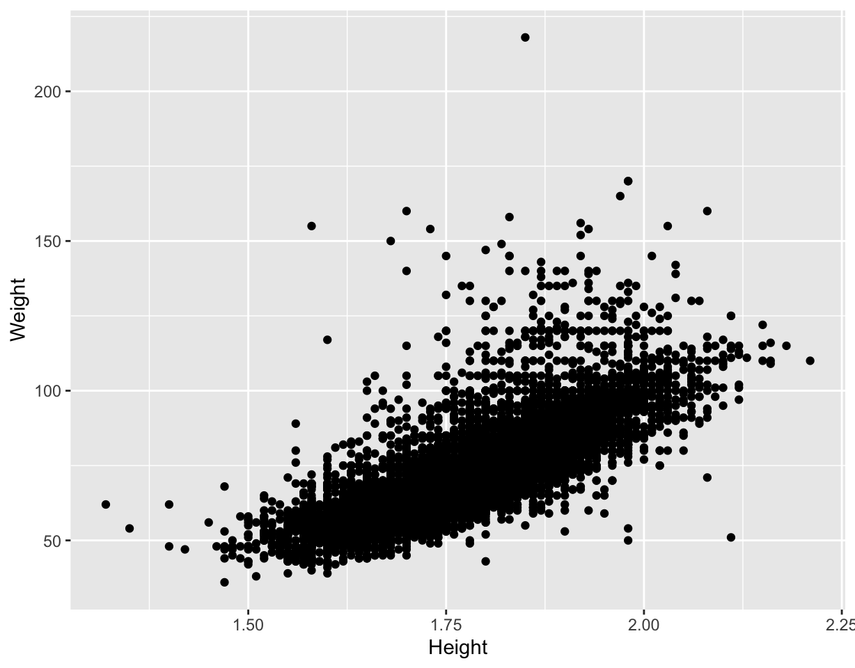
Warning message: Removed 1346 rows containing missing values (geom_point)- The expected linear relationship between height and weight is visible, although obscured by outliers.
- Some discretization of heights, and higher weight values.
- Likely to be substantial overplotting (57 athletes 1.7m, 60kg can’t tell this from this plot).
- Note the unusual height-weight combinations. What sport(s) would you expect some of these athletes might be participating in?
Your turn, cut and paste the code into your R console, and mouse over the resulting plot to examine the sport of the athlete.
library(tidyverse)
library(plotly)
data(oly12, package = "VGAMdata")
p <- ggplot(oly12, aes(x=Height, y=Weight, label=Sport)) +
  geom_point()
ggplotly(p)
5.3.1 How many athletes in the different sports?
| Sport | n |
|---|---|
| Athletics | 2120 |
| Swimming | 907 |
| Football | 596 |
| Rowing | 524 |
| Cycling | 489 |
| Hockey | 416 |
| Judo | 368 |
| Shooting | 368 |
| Sailing | 360 |
| Wrestling | 324 |
| Handball | 319 |
| Gymnastics | 274 |
| Boxing | 272 |
| Volleyball | 271 |
| Basketball | 269 |
| Water Polo | 249 |
| Weightlifting | 243 |
| Fencing | 235 |
| Canoe Sprint | 232 |
| Equestrian | 191 |
| Table Tennis | 167 |
| Tennis | 167 |
| Badminton | 166 |
| Diving | 133 |
| Taekwondo | 126 |
| Archery | 121 |
| Triathlon | 103 |
| Synchronised Swimming | 101 |
| Beach Volleyball | 93 |
| Canoe Slalom | 80 |
| Modern Pentathlon | 69 |
| Trampoline | 31 |
5.3.2 Consolidate factor levels
There are several cycling events that are reasonable to combine into one category. Similarly for gymnastics and athletics.
oly12 <- oly12 %>%
  mutate(Sport = as.character(Sport)) %>%
  mutate(Sport = ifelse(grepl("Cycling", Sport), #<<
                        "Cycling", Sport)) %>%  #<<
  mutate(Sport = ifelse(grepl("Gymnastics", Sport),
                        "Gymnastics", Sport)) %>%
  mutate(Sport = ifelse(grepl("Athletics", Sport),
                        "Athletics", Sport)) %>%
  mutate(Sport = as.factor(Sport))
5.3.3 Split by sport
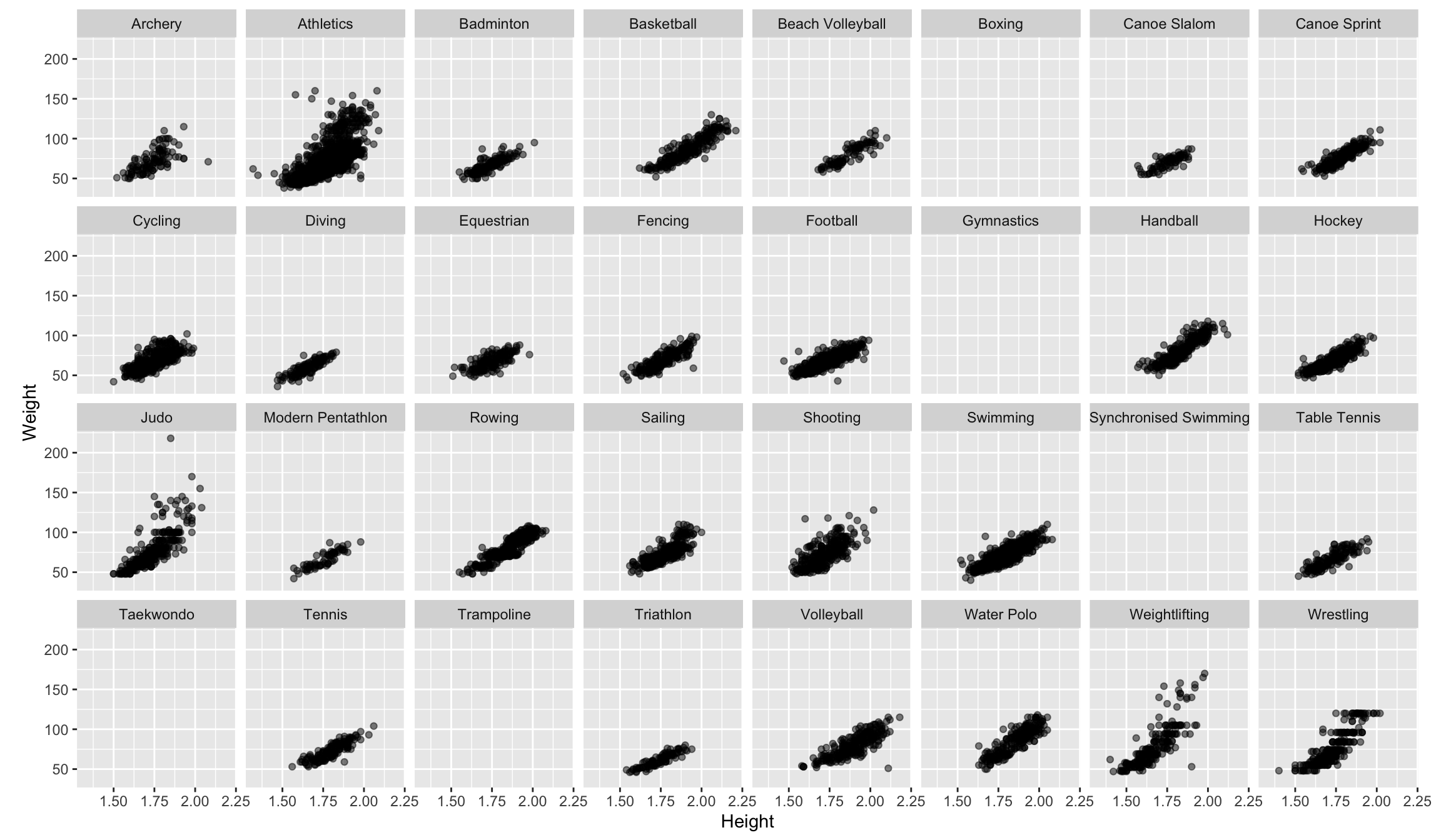
Note: alpha transparency, and aspect ratio
- Some sports have no data for height, weight
- The positive association between height and weight is visible across sports
- Nonlinear in wrestling?
- An outlier in judo, and football, and archery
- Maybe flatter among swimmers
- Taller in basketball, volleyball and handball
- Shorter in athletics, weightlifting and wrestling
- Little variance in tennis players
- It’s still messy, and hard to digest
Things to do to make comparisons easier:
- Remove sports with missings
- Make regression lines for remaining sports on one plot
- Separately examine male/female athletes
- Compare just one group against the rest
5.3.4 Remove missings, add colour for sex
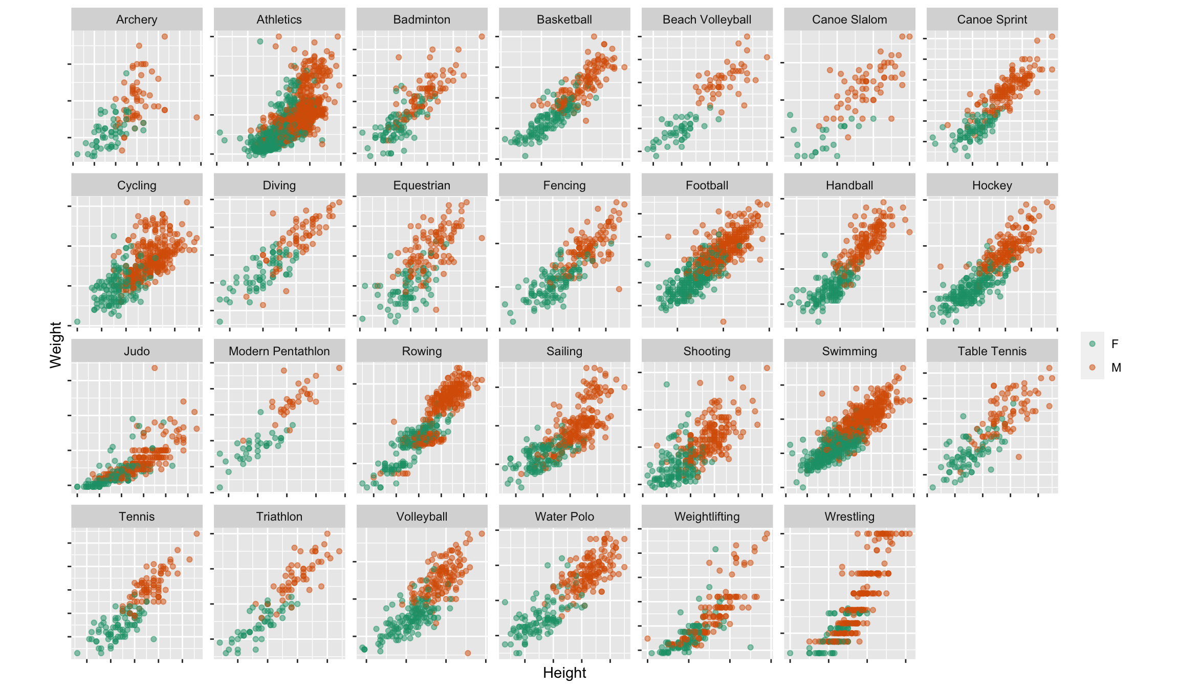
Note: Because the focus is now on males vs females association shape within sport, make plots scale separately.
- Athletics category should have been broken into several more categories like track, field: a shot-putter has a very different physique to a sprinter.
- Generally, clustering of male/female athletes
- Outliers: a tall skinny male archer, a medium height very light female athletics athlete, tall light female weightlifter, tall light male volleyballer
- Canoe slalom athletes, divers, cyclists are tiny.
5.3.5 Comparing association
## `geom_smooth()` using formula = 'y ~ x'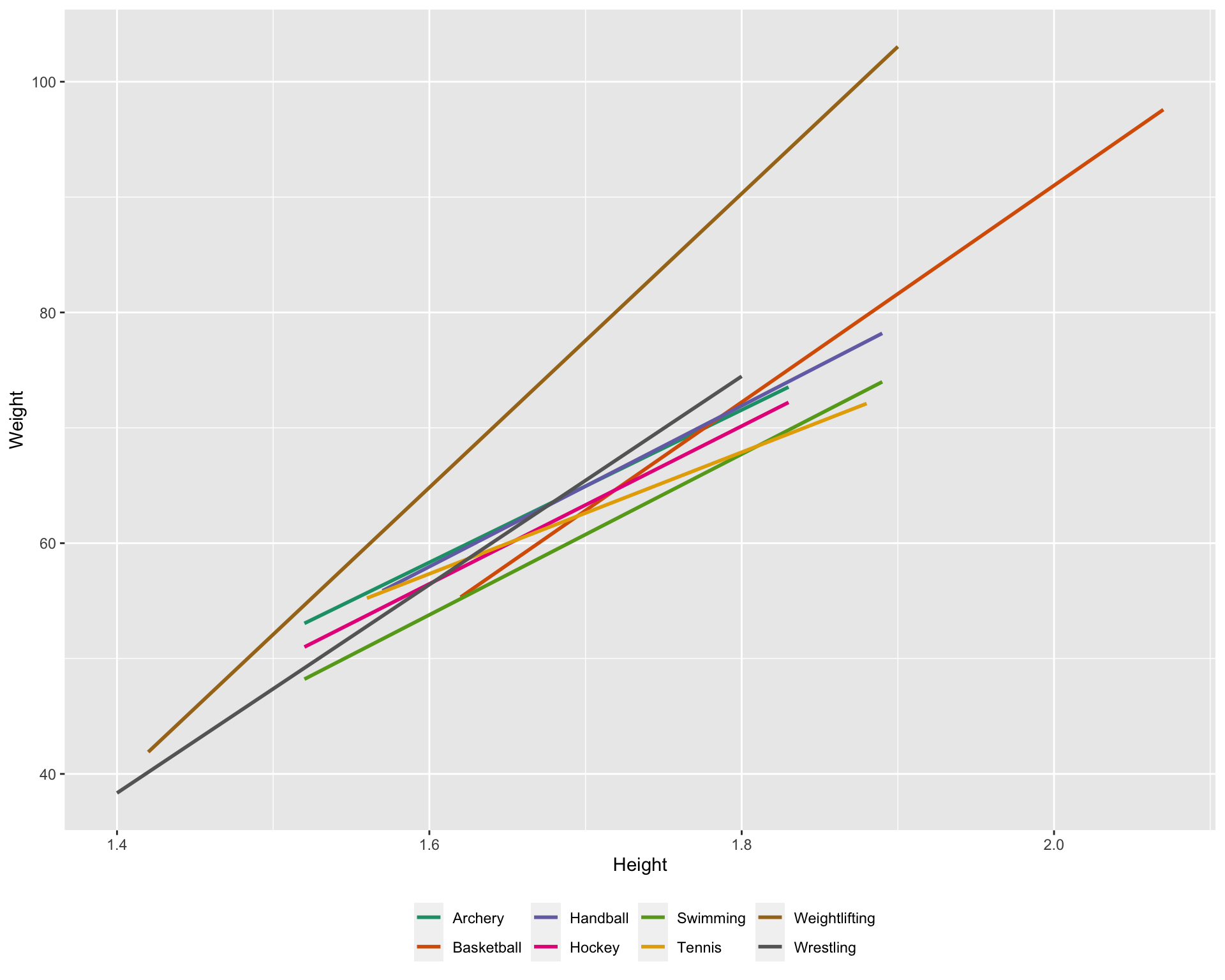
- Weightlifters are much heavier relative to height
- Swimmers are leaner relative to height
- Tennis players are a bit mixed, shorter tend to be heavier, taller tend to be lighter
5.3.6 Comparing variability
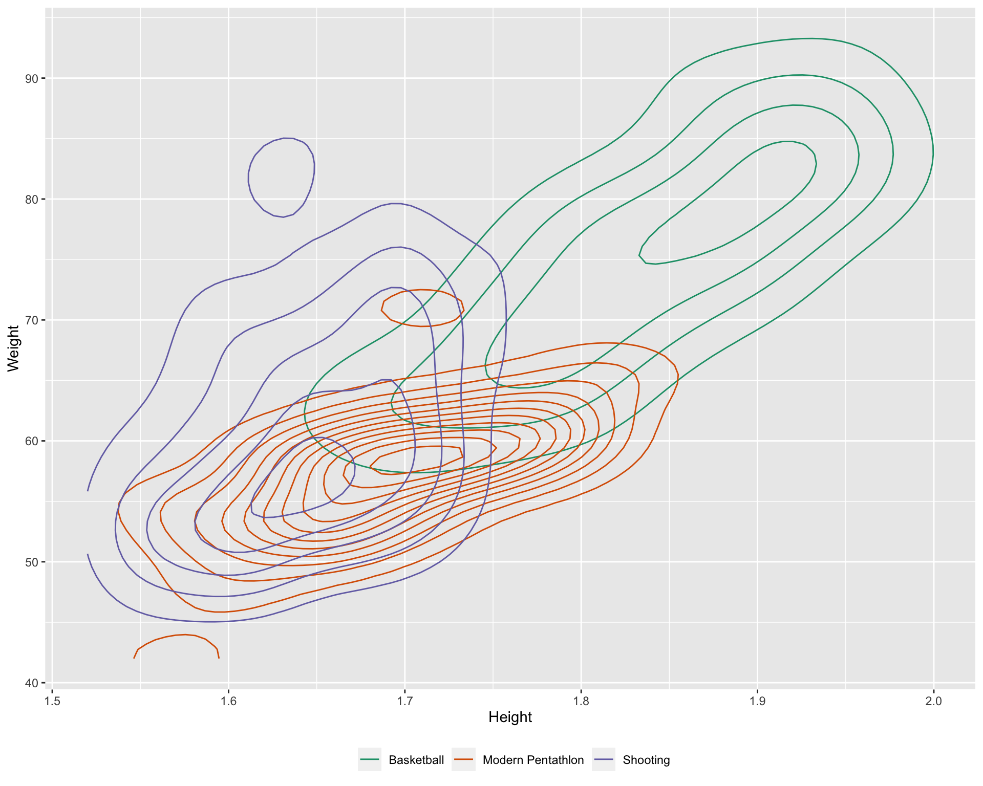
- Modern pentathlon athletes are uniformly height and weight related
- Shooters are quite varied in body type
5.3.7 Summary
We have seen that the association between height and weight is “contaminated” by different variables, sport, gender, and possibly country and age, too.
Some of the categories also are “contaminated”, for example, “Athletics” is masking many different types of events. This lurking variable probably contributes to different relationships depending on the event. There is another variable in the data set called Event. Athletics could be further divided based on key words in this variable.
If you were just given the Height and Weight in this data could you have detected the presence of conditional relationships? Can you see the conditional dependencies?
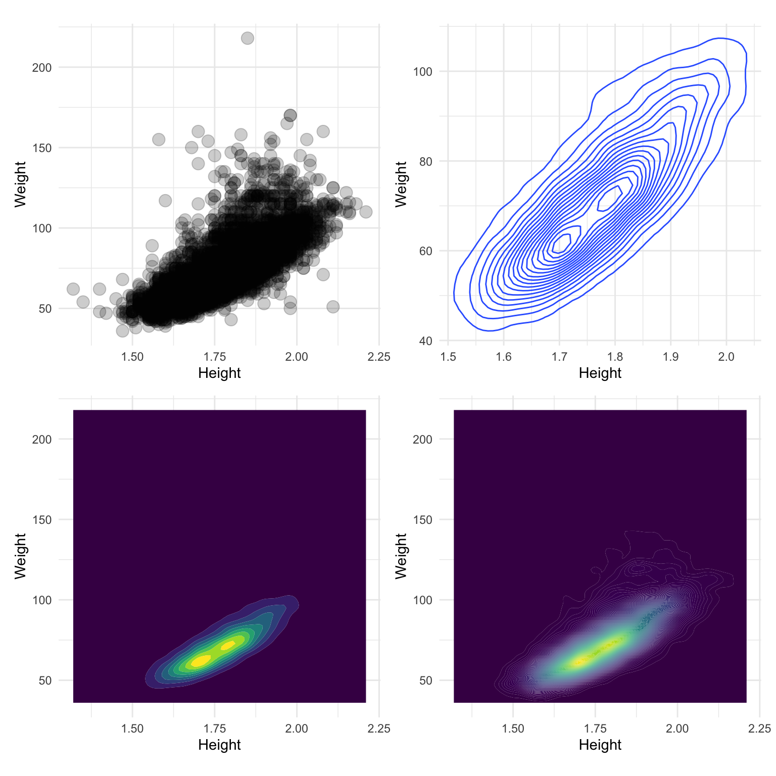
There is a hint of multimodality, barely a hint. It’s not easy to detect the presence of the additional variable, and thus accurately describe the relationship between height and weight among Olympic athletes.
5.3.8 Scatterplot modifications and purpose
| Modification | Example | Purpose |
|---|---|---|
| none |

|
raw information |
| alpha-blend |

|
alleviate overplotting to examine density at centre |
| model overlay |

|
focus on the trend |
| model + data |

|
trend plus variation |
| density |

|
overall distribution, variation and clustering |
| filled density |

|
high density locations in distribution (modes), variation and clustering |
| colour |

|
relationship with conditioning and lurking variables |
| colour + density |

|
relationship with conditioning and lurking variables |
About the Olympics 2012 data
- What can this data be used for?
- What’s the population?
- What could be informed by what is learned from this sample?
5.4 Numerical measures of association
5.4.1 Correlation
Correlation between variables \(x_1\) and \(x_2\), with \(n\) observations in each.
\[r = \frac{\sum_{i=1}^n (x_{i1}-\bar{x}_1)(x_{i2}-\bar{x}_2)}{\sqrt{\sum_{i=1}^n(x_{i1}-\bar{x}_1)^2\sum_{i=1}^n(x_{i2}-\bar{x}_2)^2}} = \frac{\mbox{covariance}(x_1, x_2)}{(n-1)s_{x_1}s_{x_2}}\] - Test for statistical significance, whether population correlation could be 0 based on observed \(r\), using a \(t_{n-2}\) distribution:
\[t=\frac{r}{\sqrt{1-r^2}}\sqrt{n-2}\] TO DO: Tabulate the examples below
set.seed(45)
d1 <- tibble(x=runif(200)-0.5) %>%
  mutate(y = 2*x + rnorm(200))
d1_p <- ggplot(d1, aes(x=x, y=y)) +
  geom_point() +
  theme(aspect.ratio=1)
d1_p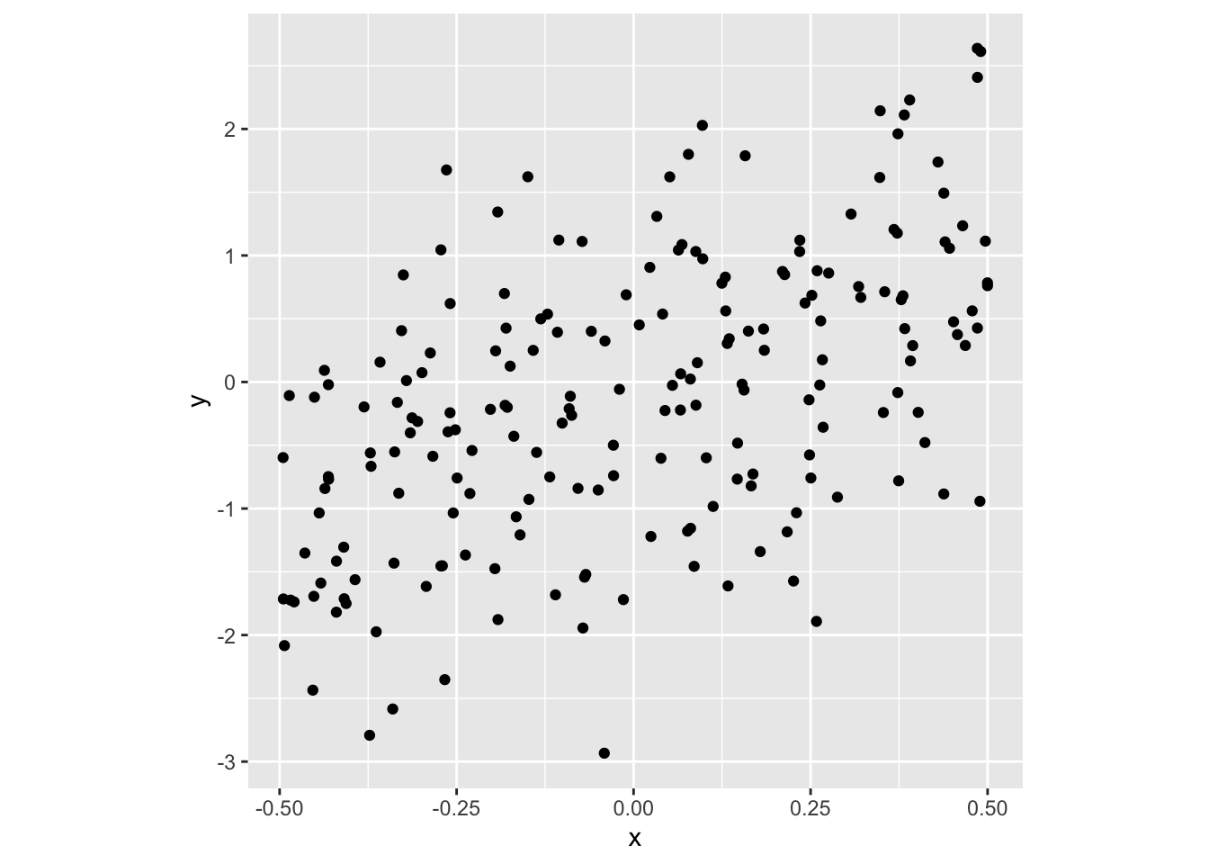
cor(d1$x, d1$y) ## [1] 0.5228401cor.test(d1$x, d1$y) ##
## Pearson's product-moment correlation
##
## data: d1$x and d1$y
## t = 8.6306, df = 198, p-value = 1.993e-15
## alternative hypothesis: true correlation is not equal to 0
## 95 percent confidence interval:
## 0.4141406 0.6168362
## sample estimates:
## cor
## 0.5228401d2 <- tibble(x=runif(200)-0.5) %>%
mutate(y = x^2 + rnorm(200)*0.01)
d2_p <- ggplot(d2, aes(x=x, y=y)) +
geom_point() +
theme(aspect.ratio=1)
d2_p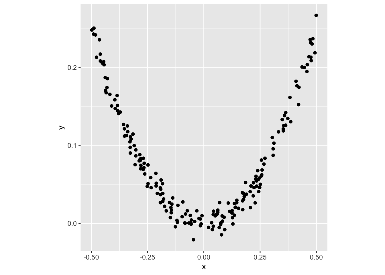
cor(d2$x, d2$y) ## [1] -0.04993755cor.test(d2$x, d2$y) ##
## Pearson's product-moment correlation
##
## data: d2$x and d2$y
## t = -0.70356, df = 198, p-value = 0.4825
## alternative hypothesis: true correlation is not equal to 0
## 95 percent confidence interval:
## -0.18738032 0.08942303
## sample estimates:
## cor
## -0.04993755d3 <- tibble(x = c(rnorm(200), 10)) %>%
mutate(y = c(rnorm(200), 10))
d3_p <- ggplot(d3, aes(x=x, y=y)) +
geom_point() +
theme(aspect.ratio=1)
d3_p 
All observations
## $estimate
##       cor
## 0.2994041
##
## $statistic
##        t
## 4.426682
##
## $p.value
## [1] 1.576086e-05
Without outlier
## $estimate
##         cor
## -0.01173776
##
## $statistic
##          t
## -0.1651764
##
## $p.value
## [1] 0.8689737
5.4.2 Peceiving correlation
set.seed(7777)
vc <- matrix(c(1,0,0,1), ncol=2, byrow=T)
d <- as_tibble(rmvnorm(500, sigma=vc))
## Warning: The `x` argument of `as_tibble.matrix()` must have unique column names if
## `.name_repair` is omitted as of tibble 2.0.0.
## ℹ Using compatibility `.name_repair`.
## This warning is displayed once every 8 hours.
## Call `lifecycle::last_lifecycle_warnings()` to see where this warning was
## generated.p1 <- ggplot(d, aes(x=V1, y=V2)) +
geom_point() +
theme_void() +
theme(aspect.ratio=1,
plot.background=element_rect(fill="gray90"))
vc <- matrix(c(1,0.4,0.4,1), ncol=2, byrow=T)
d <- as_tibble(rmvnorm(500, sigma=vc))
p2 <- ggplot(d, aes(x=V1, y=V2)) +
geom_point() +
theme_void() +
theme(aspect.ratio=1,
plot.background=element_rect(fill="gray90"))
vc <- matrix(c(1,0.6,0.6,1), ncol=2, byrow=T)
d <- as_tibble(rmvnorm(500, sigma=vc))
p3 <- ggplot(d, aes(x=V1, y=V2)) +
geom_point() +
theme_void() +
theme(aspect.ratio=1,
plot.background=element_rect(fill="gray90"))
vc <- matrix(c(1,0.8,0.8,1), ncol=2, byrow=T)
d <- as_tibble(rmvnorm(500, sigma=vc))
p4 <- ggplot(d, aes(x=V1, y=V2)) +
geom_point() +
theme_void() +
theme(aspect.ratio=1,
plot.background=element_rect(fill="gray90"))
vc <- matrix(c(1,-0.2,-0.2,1), ncol=2, byrow=T)
d <- as_tibble(rmvnorm(500, sigma=vc))
p5 <- ggplot(d, aes(x=V1, y=V2)) +
geom_point() +
theme_void() +
theme(aspect.ratio=1,
plot.background=element_rect(fill="gray90"))
vc <- matrix(c(1,-0.5,-0.5,1), ncol=2, byrow=T)
d <- as_tibble(rmvnorm(500, sigma=vc))
p6 <- ggplot(d, aes(x=V1, y=V2)) +
geom_point() +
theme_void() +
theme(aspect.ratio=1,
plot.background=element_rect(fill="gray90"))
vc <- matrix(c(1,-0.7,-0.7,1), ncol=2, byrow=T)
d <- as_tibble(rmvnorm(500, sigma=vc))
p7 <- ggplot(d, aes(x=V1, y=V2)) +
geom_point() +
theme_void() +
theme(aspect.ratio=1,
plot.background=element_rect(fill="gray90"))
vc <- matrix(c(1,-0.9,-0.9,1), ncol=2, byrow=T)
d <- as_tibble(rmvnorm(500, sigma=vc))
p8 <- ggplot(d, aes(x=V1, y=V2)) +
geom_point() +
theme_void() +
theme(aspect.ratio=1,
plot.background=element_rect(fill="gray90"))
p1 + p2 + p3 + p4 + p5 + p6 + p7 + p8 + plot_layout(ncol=4)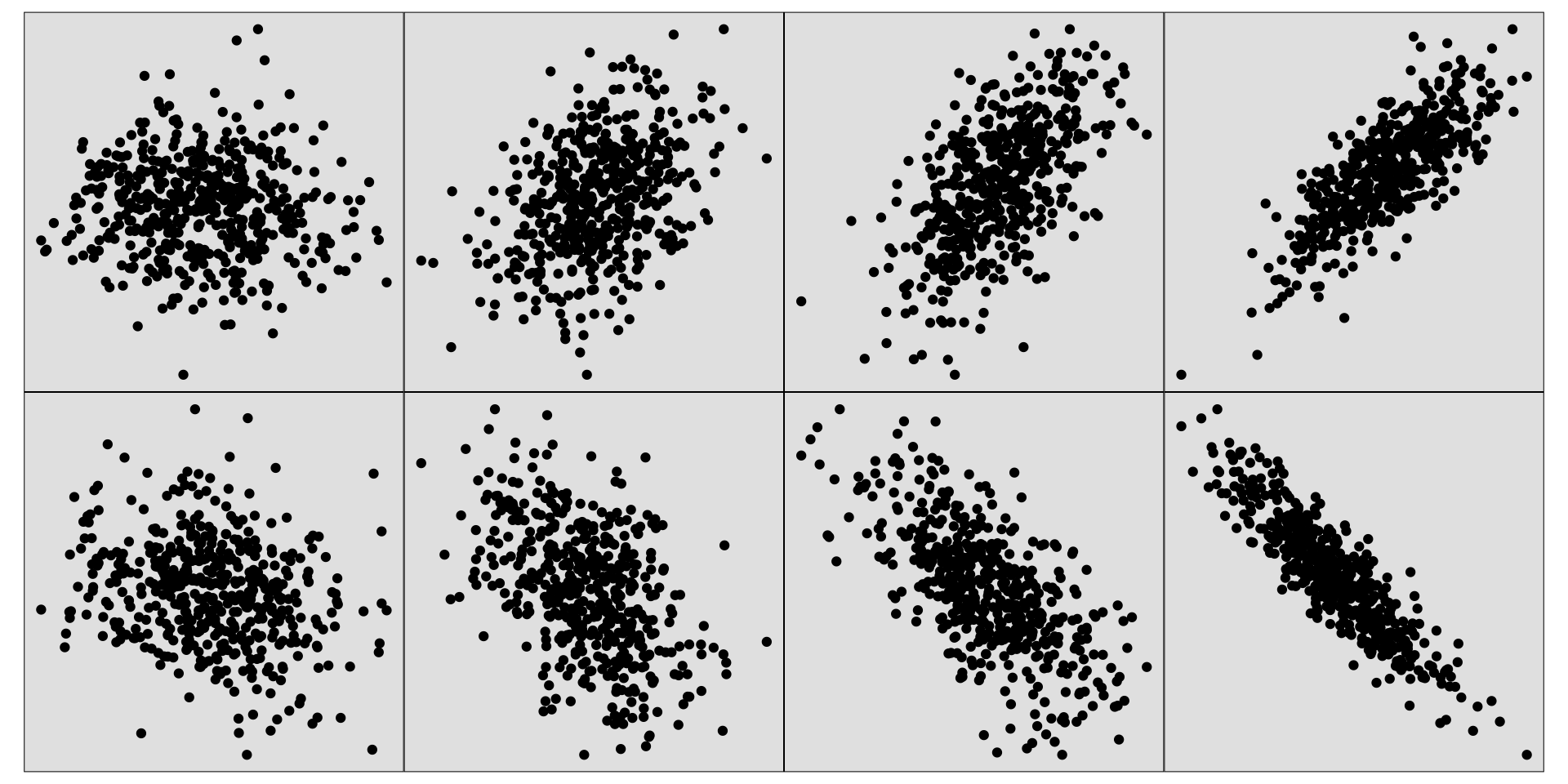
a1 <- ggplot() +
  geom_text(aes(x=0, y=0, label="r = 0.0")) +
  theme_void() +
  theme(aspect.ratio=1,
        plot.background=element_rect(fill="gray90"))
a2 <- ggplot() +
  geom_text(aes(x=0, y=0, label="r = 0.4")) +
  theme_void() +
  theme(aspect.ratio=1,
        plot.background=element_rect(fill="gray90"))
a3 <- ggplot() +
  geom_text(aes(x=0, y=0, label="r = 0.6")) +
  theme_void() +
  theme(aspect.ratio=1,
        plot.background=element_rect(fill="gray90"))
a4 <- ggplot() +
  geom_text(aes(x=0, y=0, label="r = 0.8")) +
  theme_void() +
  theme(aspect.ratio=1,
        plot.background=element_rect(fill="gray90"))
a5 <- ggplot() +
  geom_text(aes(x=0, y=0, label="r = -0.2")) +
  theme_void() +
  theme(aspect.ratio=1,
        plot.background=element_rect(fill="gray90"))
a6 <- ggplot() +
  geom_text(aes(x=0, y=0, label="r = -0.5")) +
  theme_void() +
  theme(aspect.ratio=1,
        plot.background=element_rect(fill="gray90"))
a7 <- ggplot() +
  geom_text(aes(x=0, y=0, label="r = -0.7")) +
  theme_void() +
  theme(aspect.ratio=1,
        plot.background=element_rect(fill="gray90"))
a8 <- ggplot() +
  geom_text(aes(x=0, y=0, label="r = -0.9")) +
  theme_void() +
  theme(aspect.ratio=1,
        plot.background=element_rect(fill="gray90"))
a1 + a2 + a3 + a4 + a5 + a6 + a7 + a8 + plot_layout(ncol=4)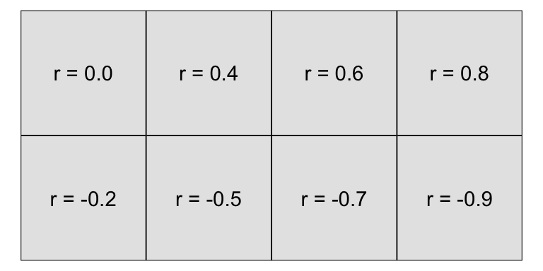
Generally, people don’t do very well at this task. Typically people under-estimate \(r\) from scatterplots, particularly when it is around 0.4-0.7. The variation in a scatterplot perceptually doesn’t vary is not linearly with \(r\).
When someone says correlation is 0.5 it sounds impressive. BUT when someone shows you a scatterplot of data that has correlation 0.5, you will say that’s a weak relationship.
5.4.3 Robust correlation measures
- Spearman (based on ranks)
- Sort each variable, and return rank (of actual value)
- Compute correlation between ranks of each variable
set.seed(60)
df <- tibble(x=c(round(rnorm(5), 1), 10),
             y=c(round(rnorm(5), 1), 10)) %>%
  mutate(xr = rank(x), yr = rank(y))
df
## # A tibble: 6 × 4
## x y xr yr
## <dbl> <dbl> <dbl> <dbl>
## 1 0.7 -1.7 5 1
## 2 0.5 1.1 4 5
## 3 -0.6 0.3 2 3
## 4 -0.2 -0.9 3 2
## 5 -1.7 0.4 1 4
## 6 10 10 6 6cor(df$x, df$y)## [1] 0.935397cor(df$xr, df$yr)## [1] 0.2cor(df$x, df$y, method = "spearman")## [1] 0.25.4.4 Robust correlation measures
- Kendall \(\tau\) (based on comparing pairs of observations)
- Sort each variable, and return rank (of actual value)
- For all pairs of observations \((x_i, y_i), (x_j, y_j)\), determine if concordant, \(x_i < x_j, y_i < y_j\) or \(x_i > x_j, y_i > y_j\), or discordant, \(x_i < x_j, y_i > y_j\) or \(x_i > x_j, y_i < y_j\).
\[\tau = \frac{n_c-n_d}{\frac12 n(n-1)}\]
ggplot(df, aes(x=x, y=y)) +
  annotate("rect", xmin = -2, xmax = df$x[2],
           ymin = -2, ymax = df$y[2],
           fill="red", alpha=0.5, colour=NA) +
  annotate("rect", xmin = df$x[2], xmax = 11,
           ymin = df$y[2], ymax = 11,
           fill="red", alpha=0.5, colour=NA) +
  annotate("text", x = 3, y = 10, label = "concordant", colour="red") +
  annotate("text", x = 5, y = -1.5, label = "disconcordant") +
  geom_point() +
  annotate("point", x = df$x[2], y = df$y[2], color="red") +
  theme(aspect.ratio=1)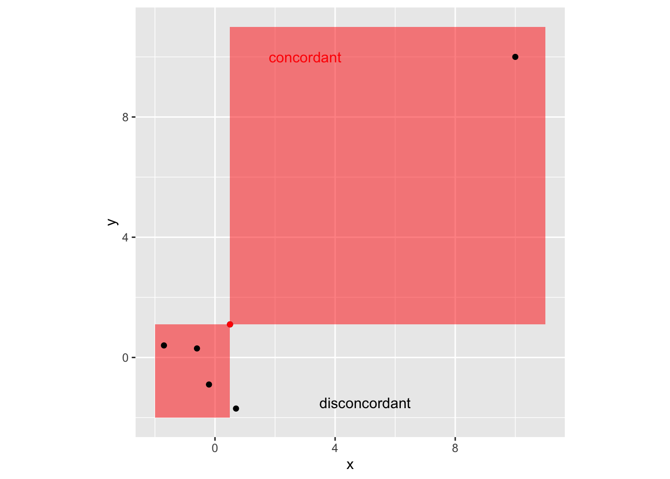
cor(df$x, df$y)## [1] 0.935397cor(df$x, df$y, method = "kendall")## [1] 0.066666675.4.5 Comparison of correlation measures
tribble(~sample, ~corr, ~spearman, ~kendall,
        '<img src="images/lecture-05B/diffscatter-1.png" height ="100px">',
        cor(d1$x, d1$y),
        cor(d1$x, d1$y, method="spearman"),
        cor(d1$x, d1$y, method="kendall"),
        '<img src="images/lecture-05B/diffscatter-2.png" height ="100px">',
        cor(d2$x, d2$y),
        cor(d2$x, d2$y, method="spearman"),
        cor(d2$x, d2$y, method="kendall"),
        '<img src="images/lecture-05B/diffscatter-3.png" height ="100px">',
        cor(d3$x, d3$y),
        cor(d3$x, d3$y, method="spearman"),
        cor(d3$x, d3$y, method="kendall")
) %>%
  knitr::kable(escape = FALSE, digits=3) %>%
  kableExtra::kable_styling(full_width = FALSE) %>%
kableExtra::kable_classic()| sample | corr | spearman | kendall |
|---|---|---|---|

|
0.523 | 0.512 | 0.355 |

|
-0.050 | -0.087 | -0.073 |

|
0.299 | -0.023 | -0.014 |
5.5 Case study 2: movies
ggplot(movies, aes(x=votes, y=rating)) +
  geom_point() +
  scale_y_continuous("rating", breaks = seq(0, 10, 2))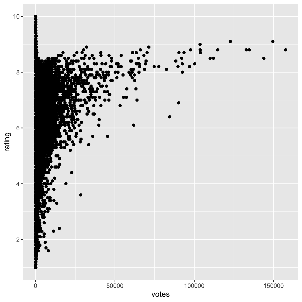
votes: Number of IMDB users who rated this movierating: Average IMDB user rating
Describe the relationship between rating and votes.
- Odd pattern, almost looks like an “r”
- No films with lots of votes and low rating
- No film with lots of votes has rating close to maximum possible: barrier?
- Films with very high ratings only have a few votes
- Generally, rating appears to increase as votes increases (its hard to really read this with so few points though)
- A few films with really large number of votes: outliers? or just skewness?
- Films with few votes have ratings that span the range of the scale.
Examine votes on a log scale
ggplot(movies, aes(x=votes, y=rating)) +
  geom_point(alpha=0.1) +
  geom_smooth(se=F, colour="orange", size=2) +
  scale_x_log10() +
  scale_y_continuous("rating", breaks = seq(0, 10, 2))
## `geom_smooth()` using method = 'gam' and formula = 'y ~ s(x, bs = "cs")'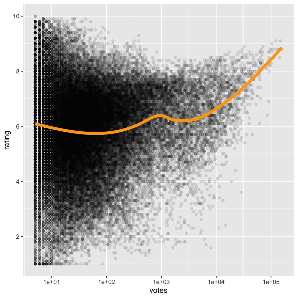
- Some positive association between two variables only for large number of votes.
- Note: Used transparency (because there is a lot of data) and a loess smooth (because I am interested in assessing the trend between votes and rating).
Correlation between raw variables is 0.1 and between transformed log(votes) and rating is 0.07. Which more accurately reflects the relationship?
5.6 Case study 3: cars
data(mtcars)
ggplot(mtcars, aes(x=hp, y=mpg)) +
  geom_point() +
  geom_smooth(colour="forestgreen", se=F)
## `geom_smooth()` using method = 'loess' and formula = 'y ~ x'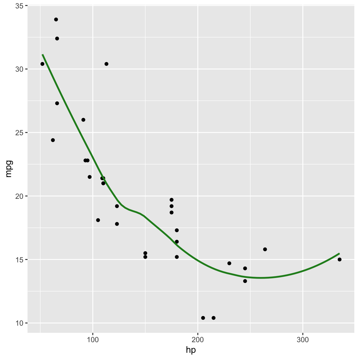
mpg: Miles/(US) gallonhp: Gross horsepowernegative: as horsepower increases fuel efficiency is worse
nonlinear: for lower horse power the decrease in efficieny is more
strong: very little variation between cars, looks fundamentally like a physics problem
outlier: one car with high horse power has unusually high efficiency
Transform horsepower on log scale
ggplot(mtcars, aes(x=hp, y=mpg)) +
  geom_point() +
  scale_y_log10("log mpg") + #<<
  geom_smooth(method="lm", colour="forestgreen", se=F) +
  geom_smooth(data=filter(mtcars, hp<300), method="lm", colour="orangered", se=F, lty=2)
## `geom_smooth()` using formula = 'y ~ x'
## `geom_smooth()` using formula = 'y ~ x'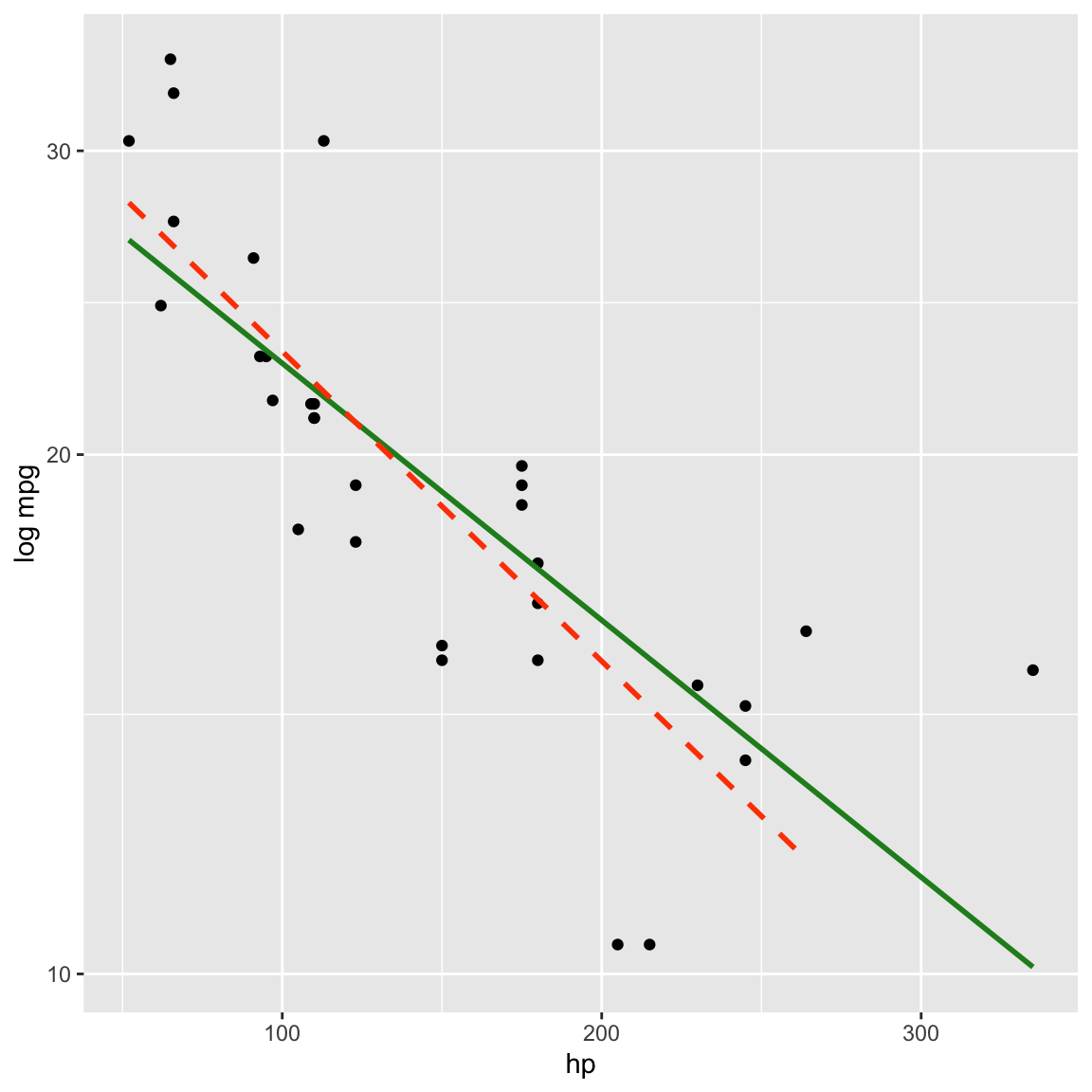
Log transforming mpg linearised the relationship between horsepower and mpg.
Correlation between raw variables is -0.78
and between transformed log(mpg) and hp is -0.85. Which more accurately reflects the relationship?
How does the correlation change if outlier is removed?
5.7 Circle of transformations for linearising
x <- c(seq(-0.95, -0.1, 0.025), seq(0.1, 0.95, 0.025))
x <- c(x, x)
d <- tibble(x, y = sqrt(1-x^2),
            q=c(rep("4", 35),
                rep("1", 35),
                rep("3", 35),
                rep("2", 35)))
d$y[71:140] <- -d$y[71:140]
ggplot(d, aes(x=x, y=y, colour=q, group=q)) +
  geom_line(size=2) +
  annotate("text", x=c(0.5, 0.5, -0.5, -0.5),
           y=c(0.5, -0.5, -0.5, 0.5),
           label=c("x up, y up", "x up, y down",
                   "x down, y down", "x down, y up"),
           size=5) +
  geom_vline(xintercept=0) + geom_hline(yintercept=0) +
  annotate("text", x=0, y=0, label="(0,0)", size=10) +
  theme_void() +
  theme(aspect.ratio=1, legend.position = "none")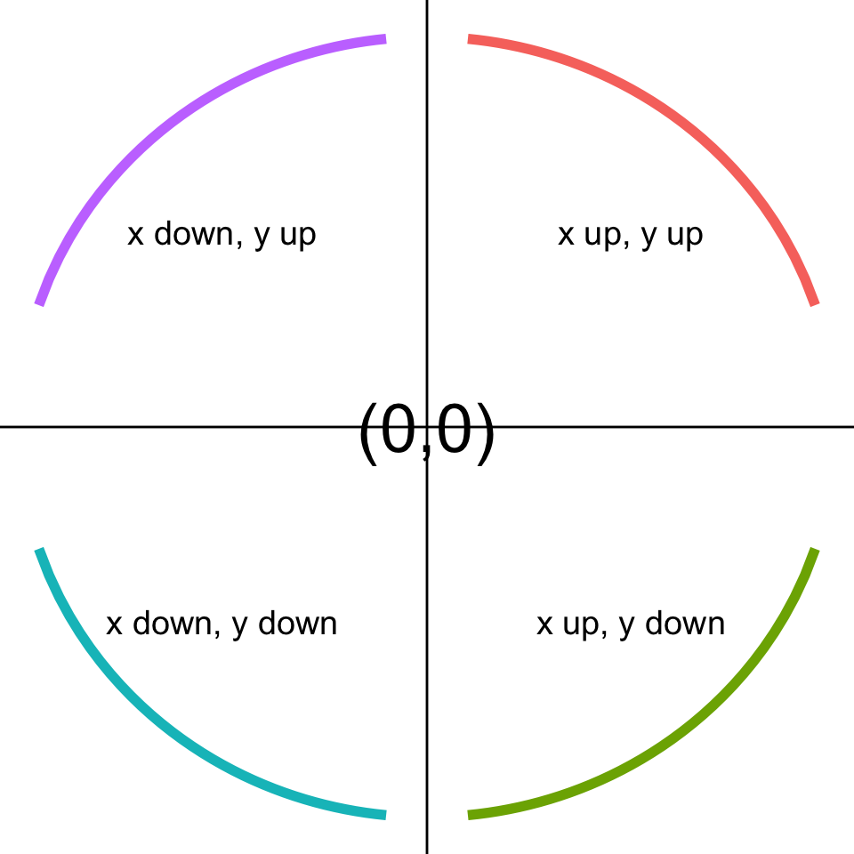
Remember the power ladder:
-1, 0, 1/3, 1/2, .monash-orange2[1], 2, 3, 4
- Look at the shape of the relationship.
- Imagine this to be a number plane, and depending on which quadrant the shape falls in, you either transform \(x\) or \(y\), up or down the ladder:
+,+both up;+,-x up, y down;-,-both down;-,+x down, y up
If there is heteroskedasticity, try transforming \(y\), may or may not help.
5.8 Case study 4: soils
baker <- read_csv("data/baker.csv")## Rows: 215 Columns: 13
## ── Column specification ────────────────────────────────────────────────────────
## Delimiter: ","
## dbl (13): X, Y, Corn97BU, B, Ca, Cu, Fe, K, Mg, Mn, Na, P, Zn
##
## ℹ Use `spec()` to retrieve the full column specification for this data.
## ℹ Specify the column types or set `show_col_types = FALSE` to quiet this message.p <- ggplot(baker, aes(x=B, y=Corn97BU)) +
geom_point() +
xlab("Boron (ppm)") +
ylab("Corn Yield (bushells)")
ggMarginal(p, type="density")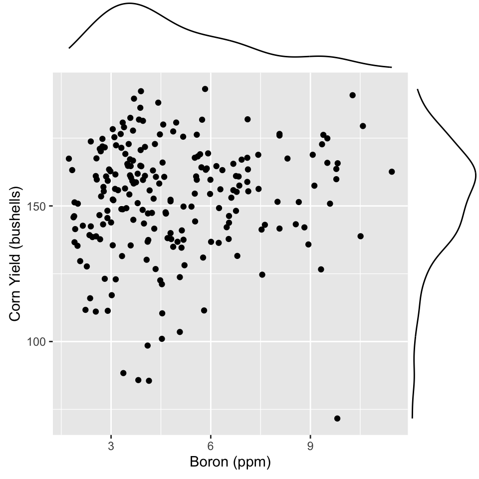
Interplay between skewness and association
Data is from a soil chemical analysis of a farm field in Iowa. Is there a relationship between Yield and Boron?
You can get a marginal plot of each variable added to the scatterplot using ggMarginal. This is useful for assessing the skewness in each variable.
Boron is right-skewed Yield is left-skewed. With skewed distributions in marginal variables it is .monash-orange2[hard] to assess the relationship between the two. Make a transformation to fix, first.
p <- ggplot(baker,
            aes(x=B, y=Corn97BU^2)) + #<<
  geom_point() +
  xlab("log Boron (ppm)") +
  ylab("Corn Yield^2 (bushells)") +
  scale_x_log10() #<<
ggMarginal(p, type="density") #<<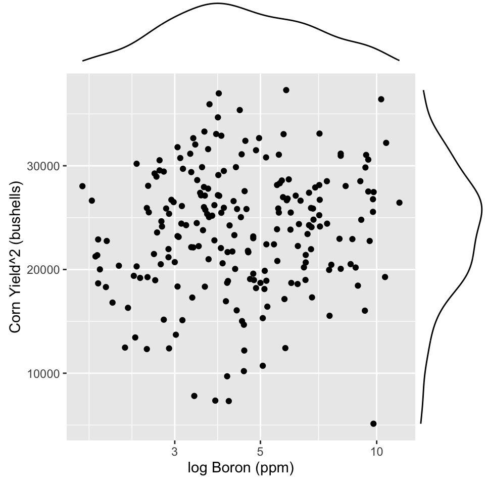
p <- ggplot(baker,
            aes(x=Fe, y=Corn97BU^2)) +
  geom_density2d(colour="orange") +
  geom_point() +
  xlab("Iron (ppm)") +#<<
  ylab("Corn Yield^2 (bushells)")
ggMarginal(p, type="density") 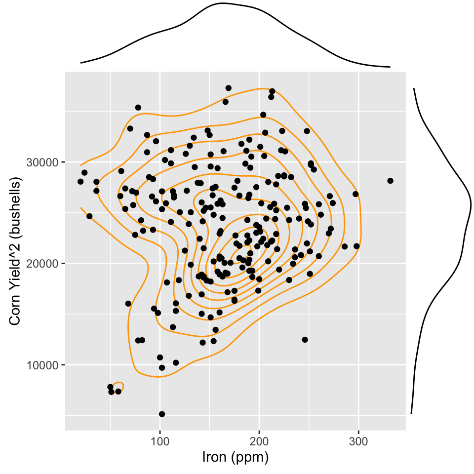
Lurking variable?
ggplot(baker, aes(x=Fe, y=Corn97BU^2,
       colour=ifelse(Ca>5200, #<<
                     "high", "low"))) + #<<
  geom_point() +
  xlab("Iron (ppm)") +
  ylab("Corn Yield^2 (bushells)") +
  scale_colour_brewer("", palette="Dark2") +
  theme(aspect.ratio=1,
        legend.position = "bottom",
        legend.direction = "horizontal")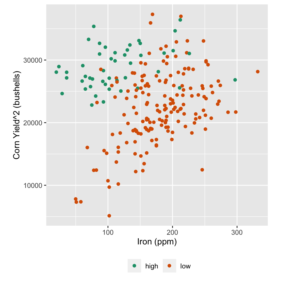
Colour high calcium (>5200ppm) calcium values
If calcium levels in the soil are high, yield is consistently high. If calcium levels are low, then there is a positive relationship between yield and iron, with higher iron leading to higher yields.
5.9 Case study 5: COVID
# Read data
nyt_county <- read_csv("https://raw.githubusercontent.com/nytimes/covid-19-data/master/us-counties.csv")

# Add centroid lat/long
geoCounty_new <- geoCounty %>% as_tibble() %>%
  mutate(fips = as.character(fips),
         county = as.character(county),
         state = as.character(state)) %>%
  select(fips, lon, lat)
nyt_county_total <- nyt_county %>%
  group_by(fips) %>%
  filter(date == max(date)) %>%
  left_join(geoCounty_new, by=c("fips"="fips"))

save(nyt_county_total, file="../data/nyt_covid.rda")load("data/nyt_covid.rda")
usa <- map_data("state")
ggplot() +
geom_polygon(data=usa,
aes(x=long, y=lat, group=group),
fill="grey90", colour="white") +
geom_point(data=nyt_county_total,
aes(x=lon, y=lat, size=cases),
colour="red", shape=1) +
geom_point(data=nyt_county_total,
aes(x=lon, y=lat, size=cases),
colour="red", fill="red", alpha=0.1, shape=16) +
scale_size("", range=c(1, 30)) +
theme_map() + theme(legend.position="none")## Warning: Removed 177 rows containing missing values (`geom_point()`).
## Removed 177 rows containing missing values (`geom_point()`).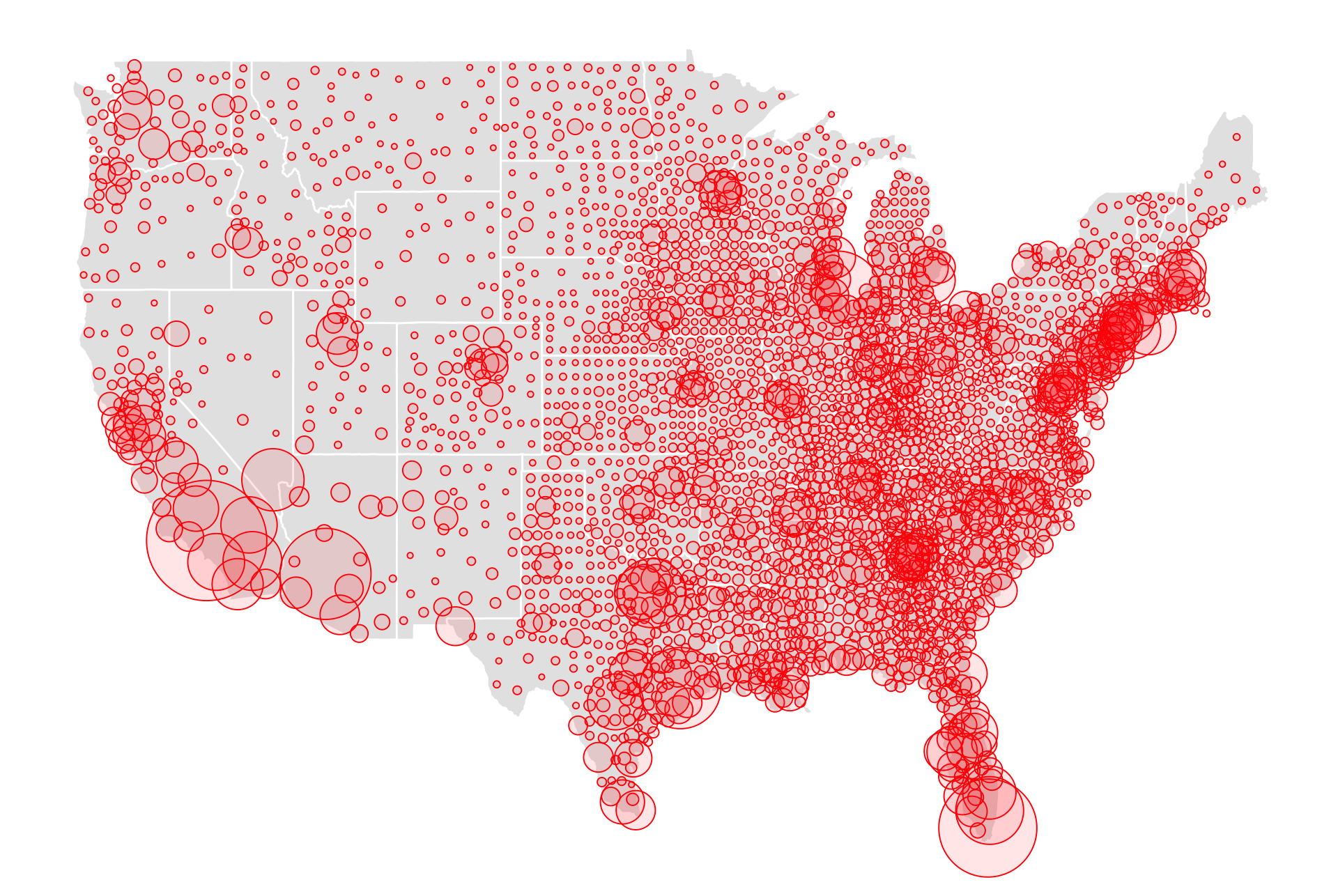
Bubble plots, size of point is mapped to another variable.
This bubble plot here shows total count of COVID-19 incidence (as of Aug 30, 2020) for every county in the USA, inspired by the New York Times coverage.
Where has COVID-19 hit the hardest?
Where are there more people?
This plot tells you NOTHING except where the population centres are in the USA. To understand relative incidence/risk, report COVID numbers relative the population. For example, number of cases per 100,000 people.
5.10 Beyond quantitative variables
The type of variable determines the choice of mapping.
- Continuous and categorical \(\longrightarrow\) side-by-side boxplots, side-by-side density plots
- Both categorical \(\longrightarrow\) faceted bar charts, stacked bar charts, mosaic plots, double decker plots
5.11 Simpsons paradox
There is an additional variable, which if used for conditioning, changes the association between the variables, you have a paradox 🙃.
set.seed(2222)
df <- tibble(x=c(rnorm(500)*0.2, runif(300)+1)) %>%
  mutate(y1=c(-2*x[1:500]+rnorm(500),
              3*x[501:800] + rexp(300)),
y2=c(rep("A", 500), rep("B", 300)))ggplot(df, aes(x=x, y=y1)) +
geom_point(alpha=0.5) + xlab("") + ylab("") +
annotate("text", x=0, y=8, label=paste0("r = ", round(cor(df$x,df$y1), 2))) +
theme_minimal() 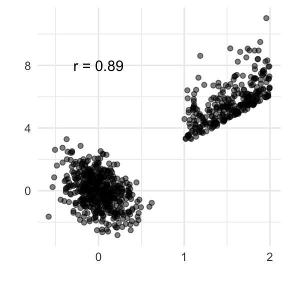
ggplot(df, aes(x=x, y=y1, colour=y2)) +
  geom_point(alpha=0.5) + xlab("") + ylab("") +
  scale_colour_brewer("", palette="Dark2") +
  annotate("text", x=0, y=8, label=paste0("r = ", round(cor(df$x[df$y2=="A"],df$y1[df$y2=="A"]), 2)), colour="forestgreen") +
    annotate("text", x=1.5, y=0, label=paste0("r = ", round(cor(df$x[df$y2=="B"],df$y1[df$y2=="B"]), 2)), colour="orangered") +
  theme_minimal() + theme(legend.position="none")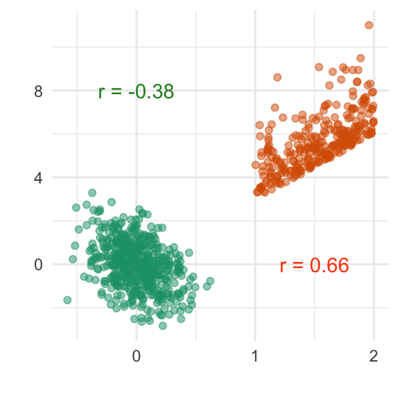
ucba <- as_tibble(UCBAdmissions)
a <- ggplot(ucba, aes(Dept)) +
  geom_bar(aes(weight=n))
b <- ggplot(ucba, aes(Admit)) +
  geom_bar(aes(weight=n)) +
  facet_wrap(~Gender)
a + b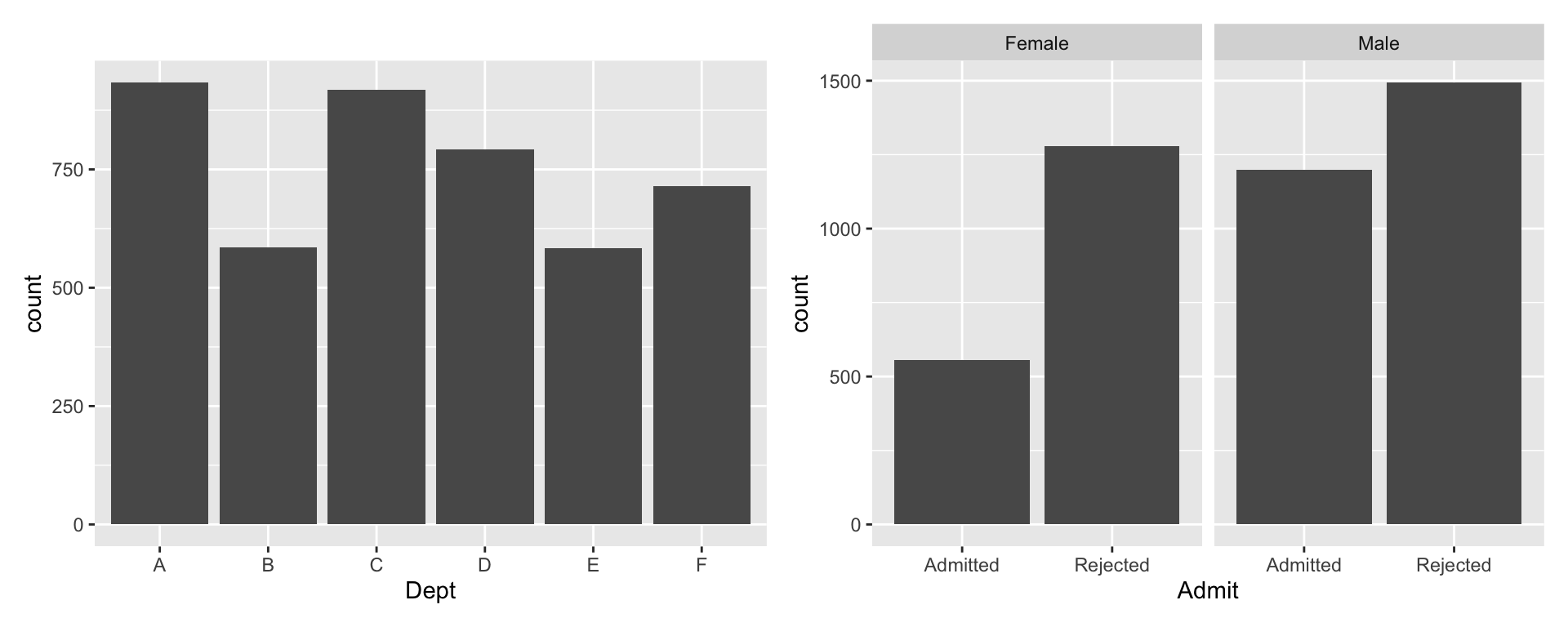
Did Berkeley .monash-orange2[discriminate] against female applicants?
library(vcd)## Loading required package: grid##
## Attaching package: 'vcd'## The following object is masked from 'package:nullabor':
##
## distplotucba <- ucba %>%
mutate(Admit = factor(Admit,
levels=c("Rejected", "Admitted")),
Gender = factor(Gender,
levels=c("Male", "Female"),
labels=c("M","F")))
doubledecker(xtabs(n~Dept+Gender+Admit, data=ucba),
gp = gpar(fill=c("grey90", "orangered")))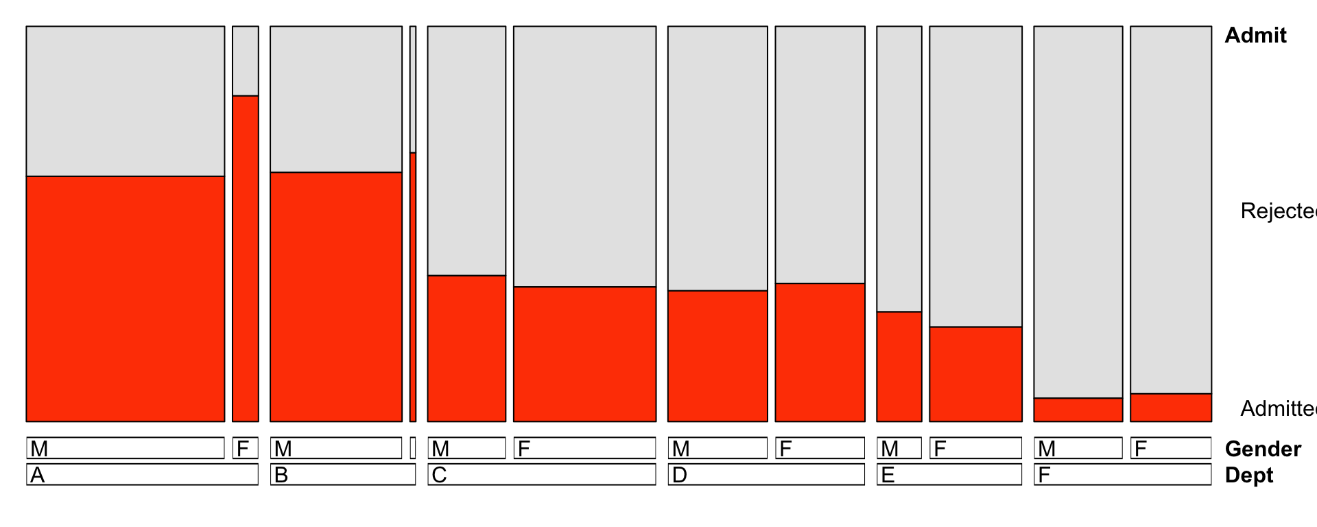
Based on separately examining each department, there is .monash-orange2[no evidence of discrimination] against female applicants.
5.13 Checking association with permutations
ggplot(lineup(null_permute("Corn97BU"), baker, n=12),
       aes(x=B, y=Corn97BU)) +
  geom_point() +
  facet_wrap(~.sample, ncol=4)
## decrypt("CLg7 X161 sO bJws6sJO qR")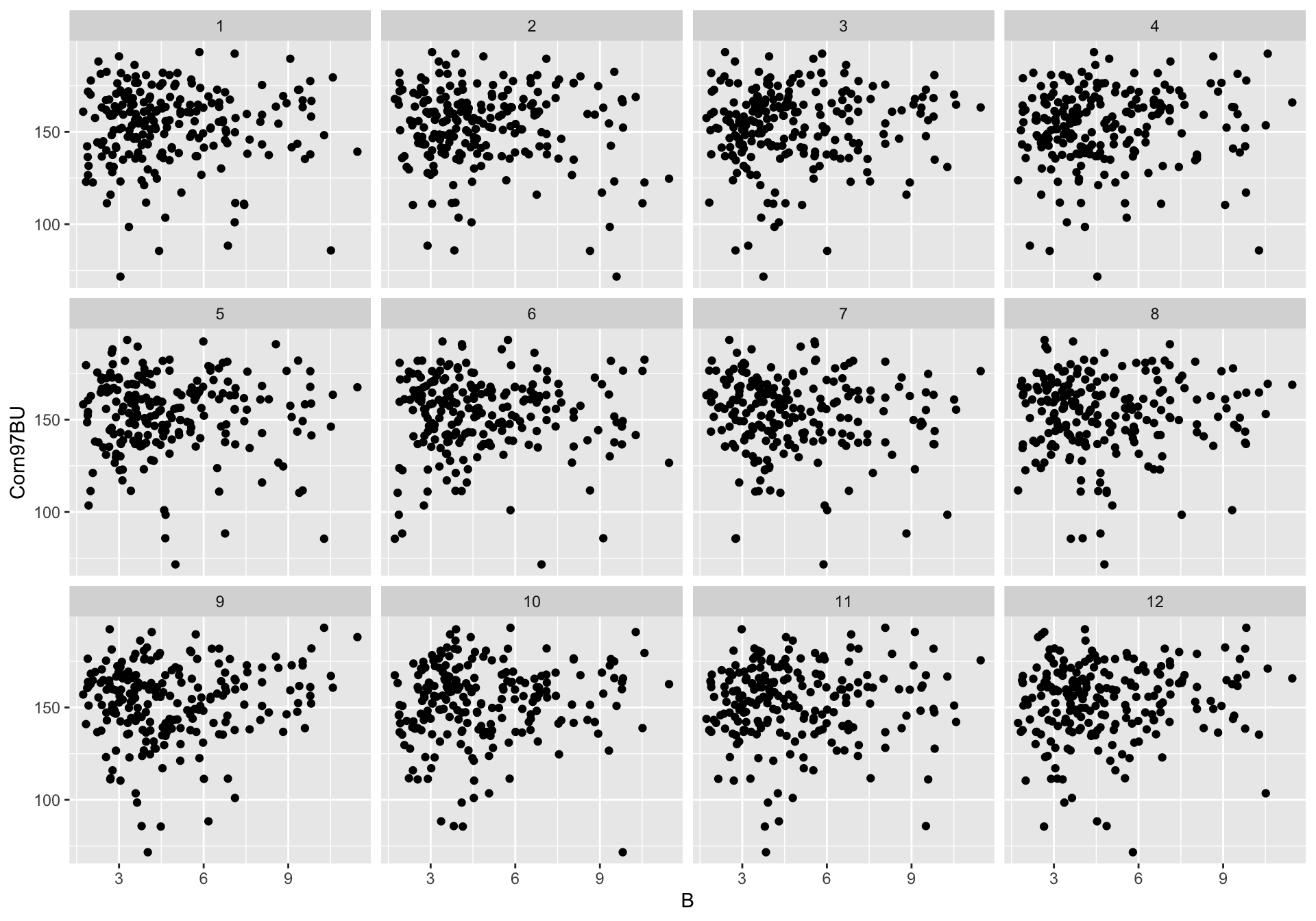
11 of the panels have had the association broken by permuting one variable. There is no association in these data sets, and hence plots. Does the data plot stand out as being different from the null (no association) plots?
data(oly12, package = "VGAMdata")
oly12_sub <- oly12 %>%
  filter(Sport %in% c("Swimming", "Archery",
                      "Hockey", "Tennis")) %>%
  filter(Sex == "F") %>%
  mutate(Sport = fct_drop(Sport), Sex=fct_drop(Sex))

ggplot(lineup(null_permute("Sport"), oly12_sub, n=12),
       aes(x=Height, y=Weight, colour=Sport)) +
  geom_smooth(method="lm", se=FALSE) +
  scale_colour_brewer("", palette="Dark2") +
  facet_wrap(~.sample, ncol=4) +
  theme(legend.position="none")
## decrypt("CLg7 X161 sO bJws6sJO vj")## `geom_smooth()` using formula = 'y ~ x'## Warning: Removed 276 rows containing non-finite values (`stat_smooth()`).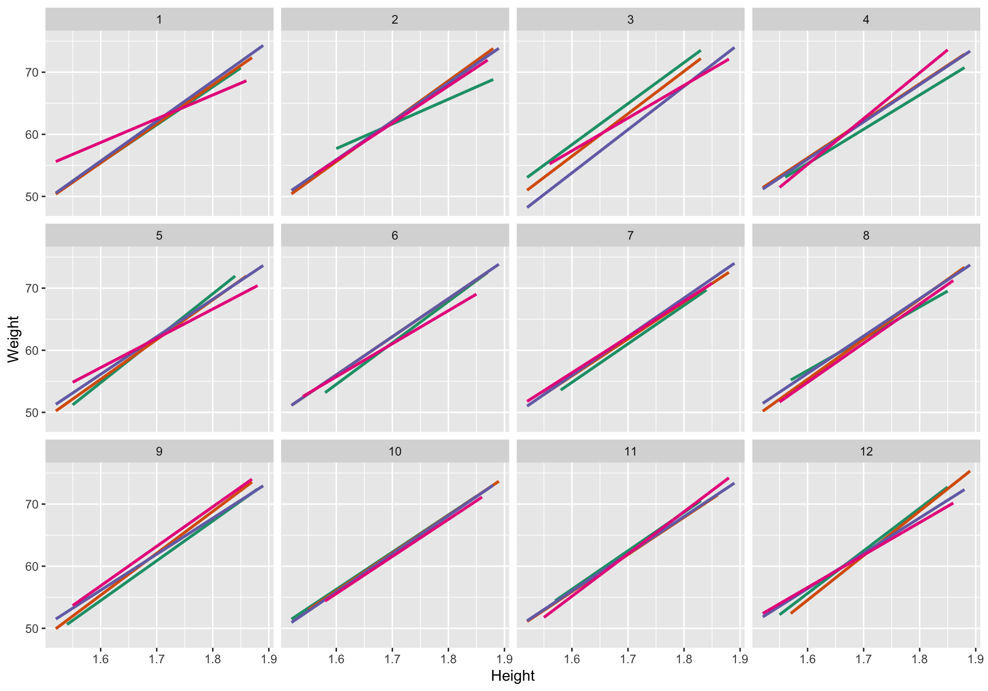
11 of the panels have had the association broken by permuting the Sport label. There is no difference in the association between weight and height across sports in these data sets, and hence plots. Does the data plot stand out as being different from the null (no association difference between sports) plots?
5.14 Resources
- Friendly and Denis “Milestones in History of Thematic Cartography, Statistical Graphics and Data Visualisation” available at http://www.datavis.ca/milestones/
- Unwin (2015) Graphical Data Analysis with R
- Graphics using ggplot2
- Wilke (2019) Fundamentals of Data Visualization https://clauswilke.com/dataviz/
5.15 Exercises
- For each of the following scatterplots, of different Olympic athlete’s height and weight identify the visible features, and which is the most surprising.
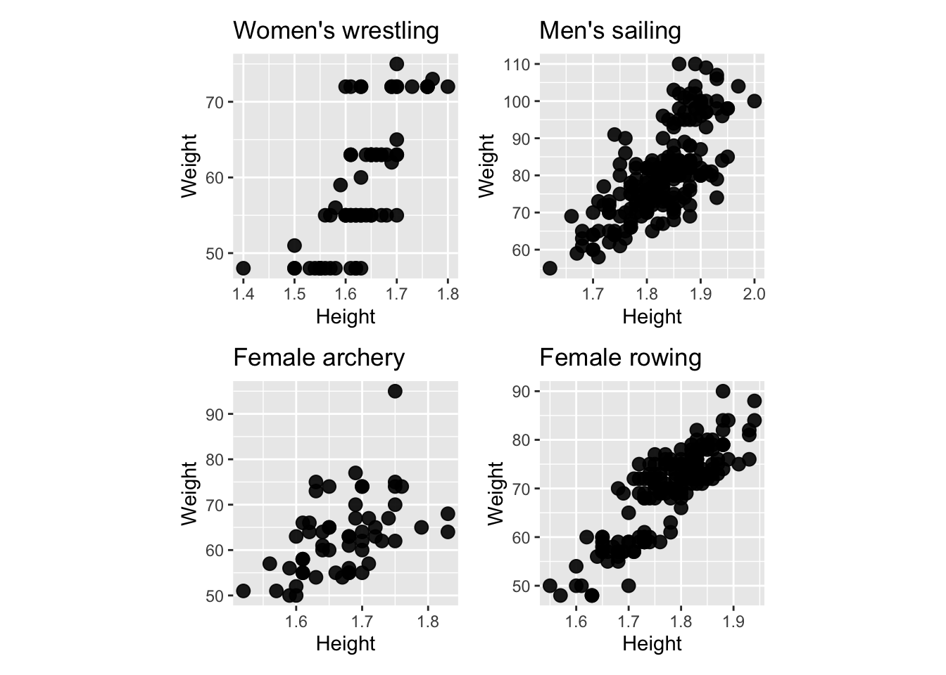
Guess the correlation between the two variables in each of the previous scatterplots.
From the following scatterplot, of diamond size and price, what are the most prominent features?
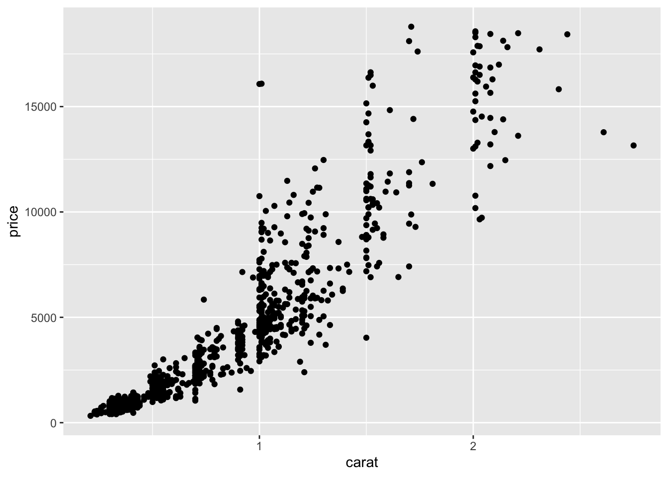
- In the previous plot of diamonds, what transformation would be recommended based on the “circle of transformations”?
- In the following plot of arrival delay and departure delay of flights into and out of the New York City area, what are the most prominent features?
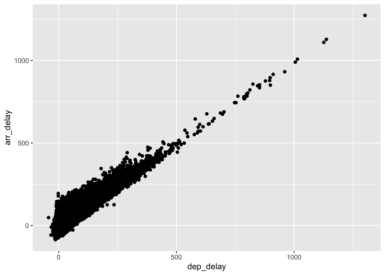
- Which of these would be a surprising feature learned from this plot? Why?
- There are negative departure and arrival delays
- If a flight has a delay in departure it likely will be delayed on arrival
- Some flights with negative departure delay have long arrival delays
- Some flights have long delays
- Some flights with negative arrival delays have positive departure delays
- A dominant feature in the plot of average rating by number of ratings of movies in the IMDB database is a barrier, or two barriers, both top and bottom of plot. What is a plausible explanation for this feature?
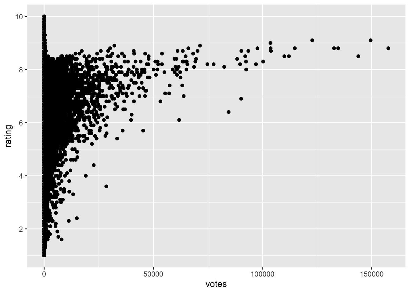
- As movies become more popular ratings invariably go down
- There are just very few frequently rated movies and this means it is unlikely to see high values.
- The lesser rated movies have a lot of variance in their ratings, producing a barrier for the more frequently rated movies.
- The lesser rated movies have a lot of variance in their ratings, producing a barrier for the more frequently rated movies.
- The average of many values tends to be unlikely to be at the highest and lowest possible values.
