Di Cook
22 April 2018
You can get access to your own electricity and gas usage data from https://www.citipower.com.au/our-services/myenergy. You will need a copy of your power bill, which has your smart meter number and meter id, to register for an account.
The data structure is described here.
The data is not especially nicely formatted (surprise). The main components are:
The code to read the data does the following steps:
A nice way to look at this data is using Earo Wang’s calendar plot functions from her R package sugrrants.
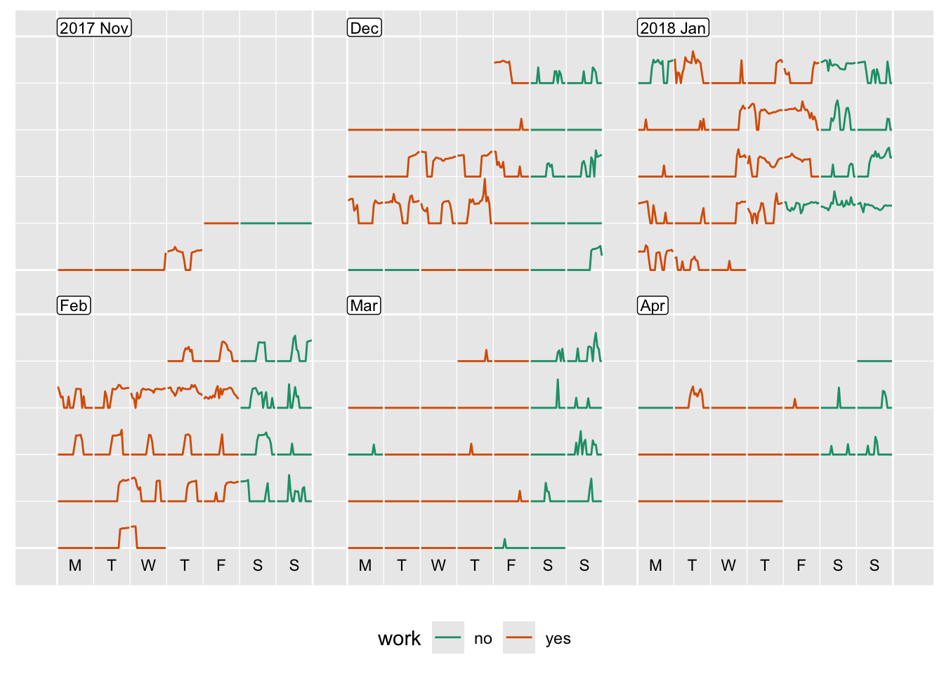
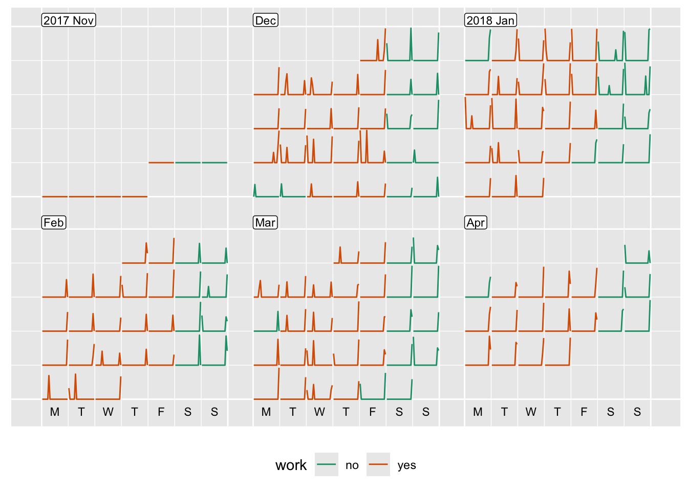
Below are the calendar plots for the two meters that are running at my apartment.
Meter 1 seems to be the daily activity. You can see
This meter seems to show regular use, not related to our activity. It comes on late at night, every day, and sometimes has an extra early peak also. I suspect the water heater is on this meter, alone. This is something that I could check, I guess.


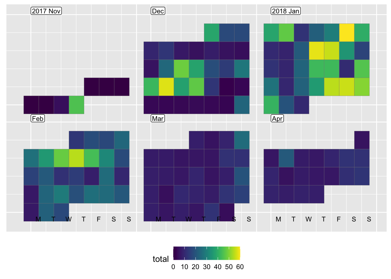
The plot below shows total daily usage. The heavy usage in January, December before holidaying at Christmas, and a few days in February, are clearer to see using the heatmap calendar.
Understanding our usage, is difficult, given that our son was visiting from the US. The high peak in daily usage Monday, Dec 18 was when he arrived. He has high internet usage, and likes long showers. Its hard to tell if there was an effect, because there were plenty of high usage days when he wasn’t around. It seems to be mostly the weather-related air conditioning usage. Will be interesting to see how heating affects the winter electricity use.
