Facetted barcharts, and fluctuation diagrams are good alternatives to stacked barcharts
When there are two categorical variables it is common to make a stacked barchart. The stacked barchart primarily allows the reader to see the overall count, but it is harder to compare the counts of categories, the colored segments. Using data from the vcd package in R, here is an example. The data describes the responses of couples on questions about their sex life.
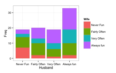
This is a bar chart showing the husbands views, with his wifes’ views forming the stacking. The primary message is that mostly husbands say that Sex is “Always Fun”. Separately, we can see that the color strips are not of equal length in each bar, which would indicated some difference with the wife’s viewpoint, but it takes some work to dig in deeper to digest how they are different.

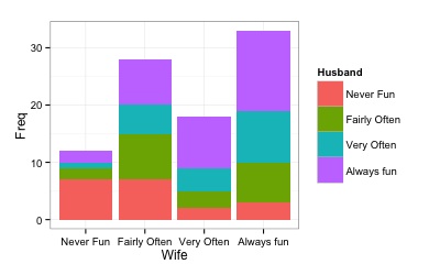
Same data, arranged differently. The bars represent the wifes’ views, and the husbands’ responses forming the stacking. The distribution of wifes’ responses is different to the husbands (previous barchart) - wives respond with “Fairly Often” more frequently than husbands.

It would also be common to show these as 100% charts, to read off the proportions. Showing both the barchart and the 100% chart enables viewing the overall frequencies, and the proportions within each category. It requires that the reader shift back and forward between the two plots to take both requency and proportion into account, which is hard work.
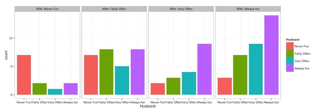
One alternative is to create separate bar charts for each response category for the other variable, as done below. The distribution of frequencies in each category are now easy to read (but overall count is more difficult). The main message is that the distribution of husbands’ responses is different depending on the wifes’ responses. When the wife responds “Never Fun” the husband typically also responds “Never Fun”. If the wife responds “Always Fun” the husband tends to respond “Always Fun” too. When the wife responds “Fairly Often” the husbands’ responses are uniform across the four possible answers.

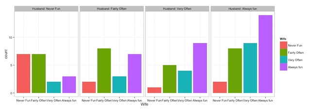
Rearranging in the opposite order changes the focus to wifes’ responses given the husbands’ responses.

Using both arrangements we can the asymmetry between each member of the couples responses.
To better read the symmetry, or asymmetry, show the data as a fluctuation diagram. Here the boxes reflect the count for the combination of the categories. The main message is that the couples agree, roughly, on the perception of sex (bigger boxes on leading diagonal), and there is asymmetry in the couples separate responses (boxes above and below diagonal are not equal size).

In summary, it is recommended to do a suite of plots rather than one single plot for problems like this, with the suggested set being:
- overall frequency for each variable using a single barchart for each variable
- facetted bar chart, arranged in two ways
- fluctuation diagram
See Unwin et al for more information about creating suites of plots to display data.