install.packages("flexdashboard")Building interactive documents with learnr, flexdashboard
SISBID 2026
https://github.com/dicook/SISBID
Data dashboard
A dashboard is a rmarkdown format shiny app. It adds more control over plot elements and is more focused on the data analysis than on a study or instructional materials.
Data dashboard
A dashboard
- allows you to create an interactive interface to a data set
- communicates a lot of information visually and numerically
- provides flexibility for the user to explore their own choice of aspects of the data.
Make sure you have the flexdashboard package installed on your computer.
Create a “New R Markdown” document -> “Interactive”
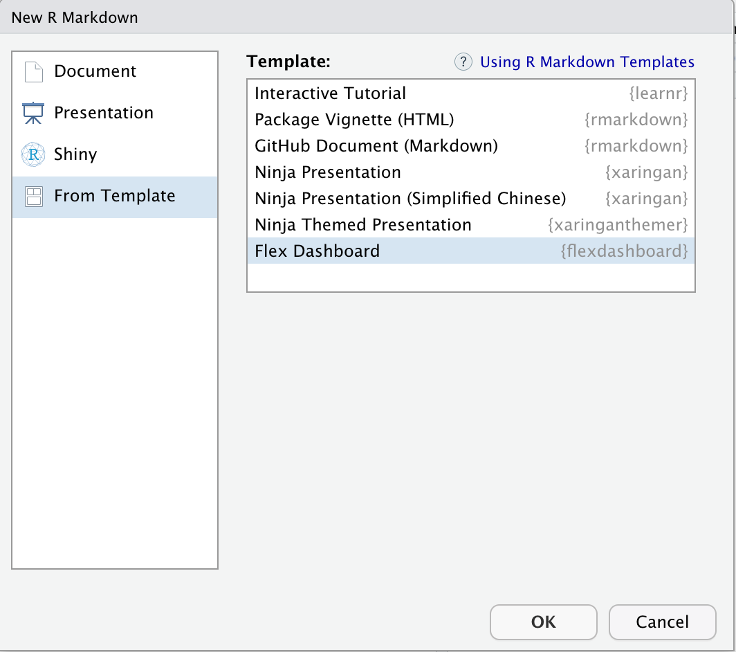
Basic dashboard
- Check that the document compiles, by clicking
Knit - Modify the title and author
---
title: "TB incidence around the globe"
author: "by Di Cook"
output:
  flexdashboard::flex_dashboard:
    orientation: columns
    vertical_layout: fill
---
Components
This creates a box or a pane for a plot or results
### Chart 1This sets up columns
Column {data-width=600}
-------------------------------------
Your turn!
- Change the default layout in your flexdashboard to have two plots in the left column.
- Make each column equal width
- Pick four countries and create the interactive chart of temporal trend.
- Change the tab titles to reflect what country is displayed.
- Add several sentences on each pane about the data, and some things they should learn about TB incidence in that country.
Adding pages and tabs
A new page (tab) can be added using
Page 1
=====================================
Add a second page to your flexdashboard that focuses on one country and has
- a data table showing counts for year, age, sex
- a facetted barchart of counts by year, by age and sex
Upload your dashboard to your shiny.apps.io account
Interactive tutorial
A set of notes with interactive plots, quizzes, and coding exercises.
learnr interactive tutorial
- Simple way to build plots into an online document
- Features:
- interactive multiple choice quizzes,
- coding exercises,
- incorporate interactive shiny elements like scrollbars on plots
🛑 To get started, make sure you have the learnr package installed on your computer.
install.packages("learnr")✅ Then create a new “R Markdown” document, “From Template”, “Interactive Tutorial”.
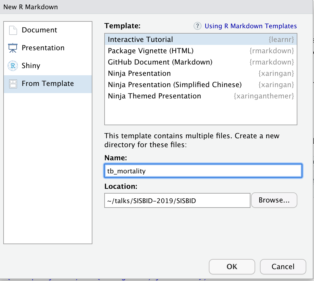
Basic tutorial
🛑 Check that the document compiles, by clicking Run Document
✅ Modify the title and author
---
title: "TB Incidence Around the Globe"
author: "Di Cook"
output: learnr::tutorial
runtime: shiny_prerendered
---
🛑 Check that the document compiles, by clicking Run Document
Write the first section
✅ Set the first section to be a description of the data
## Data description

This is current tuberculosis data taken from [WHO](http://www.who.int/tb/country/data/download/en/),
the case notifications table. The data looks like this:
🛑 Check that the document compiles, by clicking Run Document
✅ Create a data directory in your tutorial folder, and add the TB_burden_countries_2025-07-22.csv data into this.
Basic Tutorial
✅ Next, add a block of R code to read the data, and display the data in the page.
Here, we use the DT package to display the data in the output html.
library(tidyverse)
library(DT)
tb <- read_csv(here::here("data/TB_burden_countries_2025-07-22.csv")) |>
  select(country, iso3, year, e_inc_100k)

datatable(tb)
🛑 Check that the document compiles, by clicking Run Document
Add a plot
✅ Make a separate section titled “Incidence”, and add the code to make a plot, like the following
ggplot(tb, aes(x=year)) +
  geom_bar(aes(weight = e_inc_100k)) +
  xlab("") +
  ylab("TB incidence per 100k")
🛑 Check that the document compiles, by clicking Run Document
Polishing the data description
Loading the libraries generates some messages and warnings on the page.
This is good interactively, but distracting in the finished page.
## ── Attaching packages ──────────────────────────────────────────── tidyverse 1.2.1 ──
## ✔ ggplot2 3.2.0     ✔ purrr   0.3.2
## ✔ tibble  2.1.3     ✔ dplyr   0.8.3
...
## Google's Terms of Service: https://cloud.google.com/maps-platform/terms/.
## Please cite ggmap if you use it! See citation("ggmap") for details.
## Warning: Removed 619 rows containing missing values (geom_point).
We need to change the setup chunk options to turn these off:
Polishing the data description
library(learnr)
knitr::opts_chunk$set(
  echo = FALSE,
  message = FALSE,
  warning = FALSE,
  error = FALSE)
🛑 Check that the document compiles, by clicking Run Document
Building quizzes
An example quiz is provided in the template. Note that the format of the R code is
quiz()wraps a set of questions.question()contains the text of the question, and is coupled with multipleanswer()elements with possible choices.- At least one of the answers needs to be noted as correct with
, correct = TRUE. There can be more than one correct answer.
quiz(
  question("Which package contains functions for installing other R packages?",
    answer("base"),
    answer("tools"),
    answer("utils", correct = TRUE),
    answer("codetools")
  )
)
Try making a question about the TB data on the Incidence tab.
🛑 Check that the document compiles, by clicking Run Document
Exercises in coding
Adding exercise = TRUE on a code chunk provides an R console window where readers can type R code, and check for correctness.
- Move these into a second section of the document.
- Add a coding challenge that asks the reader to make a filter for the data to select just a single year. Click the “Run document” to make sure it works
- Add a hint, “you want to use the filter function”
- Change the hint to a solution, that provides the correct code
🛑 Check that the document compiles, by clicking Run Document
Adding a shiny element
Because this is an html document, interactive graphics can be incorporated.
We’ll add a section to use interactive plots to examine the temporal trend in TB incidence.
library(plotly)
p <- tb |>
  filter(iso3 %in% c("AUS", "USA", "CAN", "KEN", "IND", "COL", "ASM")) |>
  ggplot() +
    geom_point(aes(x=iso3, y=e_inc_100k, frame=year))
ggplotly(p)
🛑 Check that the document compiles, by clicking Run Document
Styling and cuteness
Use your emoji and anicon skills to add some friendly elements to the notes.
set.seed(20190709)
emo::ji("fantasy")
emo::ji("clock")anicon::nia("You've got 30 seconds!", colour="#FA700A", anitype="hover")
anicon::faa("hand-paper", animate="spin", grow=20, color="#B78ED2",
position=c(0,0,0,200))🛑 Check that the document compiles, by clicking Run Document
Upload your tutorial to your shiny.apps.io account
Resources
- Introducing learnr, Garret Grolemund
- flexdashboard: Easy interactive dashboards for R
- R Markdown
- Interactive web-based data visualization with R, plotly, and shiny, Carson Sievert
 This work is licensed under a Creative Commons Attribution-NonCommercial-ShareAlike 4.0 International License.