Building a shiny app
SISBID 2026
https://github.com/dicook/SISBID
Shiny Apps in R
Are these notes genuine?
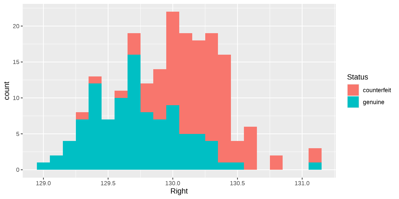
Swiss banknote data (Flury, B. and Riedwyl, H. 1988): measurements on 100 genuine and 100 counterfeit old-Swiss 1000-franc bank notes
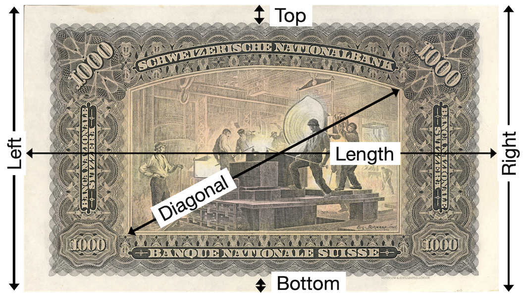
Status: genuine or counterfeit
Can we classify the status visually?
Visual classification
Counterfeits have on average a wider right edge. What about the other measurements?
A first shiny app with ggpaintr
Make a shiny app to explore histograms:
ggpaintr keywords: ppVar (make a variable widget), ppNum (make a number widget)
check the Addins > ggpaintr placeholders
You do it
Run the
ggpaintrcode in your session.Determine: which measurement does distinguishes the best between counterfeits and genuine banknotes
Rewrite the expression to show a scatterplot of two measurements. Don’t forget to make the y-axis interactive as well!
Which combination of variables allows a perfect distinction?
How does the magic work?
Create your second app
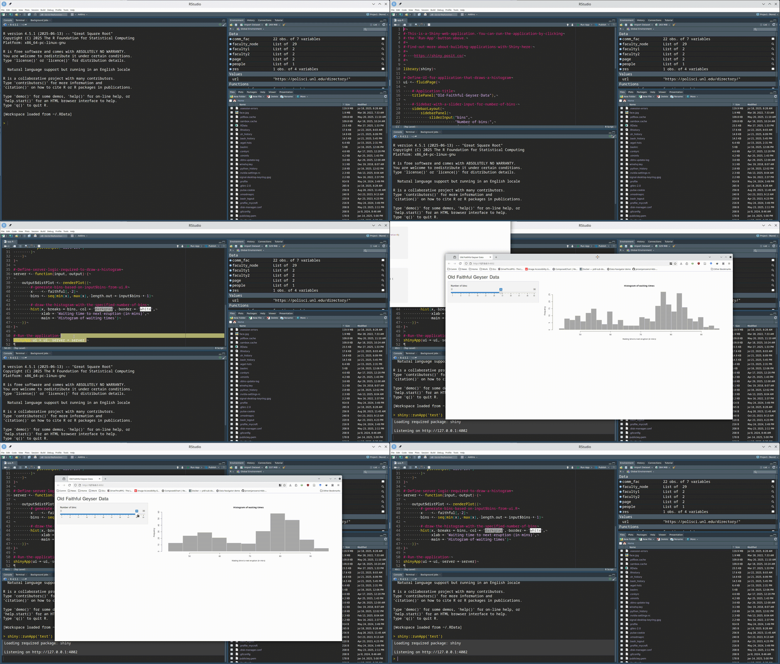
- In RStudio,
Filemenu,New file,Shiny web appto start a new app - The easiest start is the
Single file, which will put both server and ui functions in the same file,app.R - Make sure to change the number of bins!
Two main parts
- What we see and interact with:
- user interface: layout with user input and (plot) output
- What is going on underneath:
- the server: glue between user input and output
A Minimal Example
A bit more fancy
A bit more fancy
Shiny Inputs
Shiny has many different input options, see the widget gallery:
actionButton()- creates a clickable buttonselectInput()create a select listcheckboxInput()andcheckboxGroupInput()dateInput()- calendar to select a datedateRangeInput()- select a range of datesfileInput()- upload a filenumericInput()- input a numeric valueradioButtons()- select one or more itemssliderInput()- slide along a range of valuestextInput()- input a string
Your Turn
Add a list of your favorite countries to the sidebar panel:
Adding Output
- Output needs to be specified in two places:
- in the
uifunction we need to create a placeholder to reserve space for the output - in the
serverfunction, we need to create the output.
- in the
uicomponents are usuallyxxxOutput (outputID)
Output can be in form of tables, plots, text, …servercomponents arerenderXXX, wherexxxis a table, plot, text, etc.
Shiny Outputs
Shiny also has a variety of different output options:
renderDataTable()- outputs an interactive, sortable data tablehtmlOutput()- output html elementsrenderPlot()- output an R plotrenderPrint()- output text from print() in RrenderTable()- output an HTML tablerenderText()- output text from RrenderUI()- output a custom part of the user interfacerenderImage()- print an image to the page
Adding a plot
library(shiny)
library(ggplot2)
library(dplyr)

sidebar <-  sidebarPanel(
  width = 3,
  selectInput(
    "country", "Pick your favorite country:",
              choices = c("Australia", "Brazil", "China")
  )
)

main_col <- column(                               #<<
  width = 9,                                      #<<
  plotOutput("scatter")                           #<<
)                                                 #<<

ui <- fluidPage(
  title = "App Title", sidebar, main_col
)

server <- function(input, output, session) {
  output$scatter <- renderPlot({                  #<<
    mtcars %>% ggplot(aes(x = disp, y = mpg)) +   #<<
      geom_point() +                              #<<
      ggtitle(input$country)                      #<<
  })                                              #<<
}

shinyApp(ui, server)
Your turn
- Add an interactive plot of the TB data into your app.
- Change the select box, so that the user can choose any country. Think of
unique(tb$country)for defining the choices
Deploy an app
- Sign up for an account on https://www.shinyapps.io/
- Authenticate your account
- You may need to do some setup in your session, e.g. install the library
rsconnect
Big 24h Your turn
- Make your own app, or interactive document, on a topic of your choice
- Some ideas are data from TidyTuesday or fivethirtyeight
- Your app could have
- an interactive plot
- some GUI element like a menu or checkboxes
- some nice styling
😱 remember that LLMs are your friend - we will also monitor the chat and slack to help fix problems :)
Resources
- RStudio Tutorial
- Deploy your app for others to use
- Shiny Setup, Showcase, and Server
- Community discussion
- Programming shiny with LLM
 This work is licensed under a Creative Commons Attribution-NonCommercial-ShareAlike 4.0 International License.