Creating effective data plots
Monash University
Why (1/3)
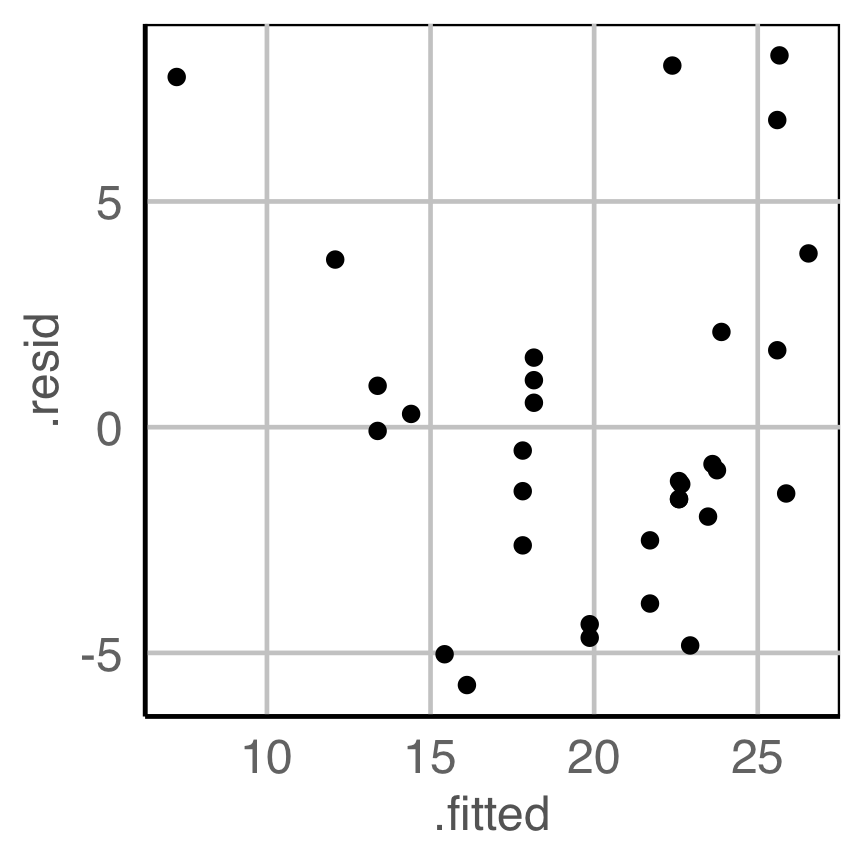
Is there any pattern in the residuals that indicate a problem with the model fit?
Do we need to change the model specification?
Why (2/3)
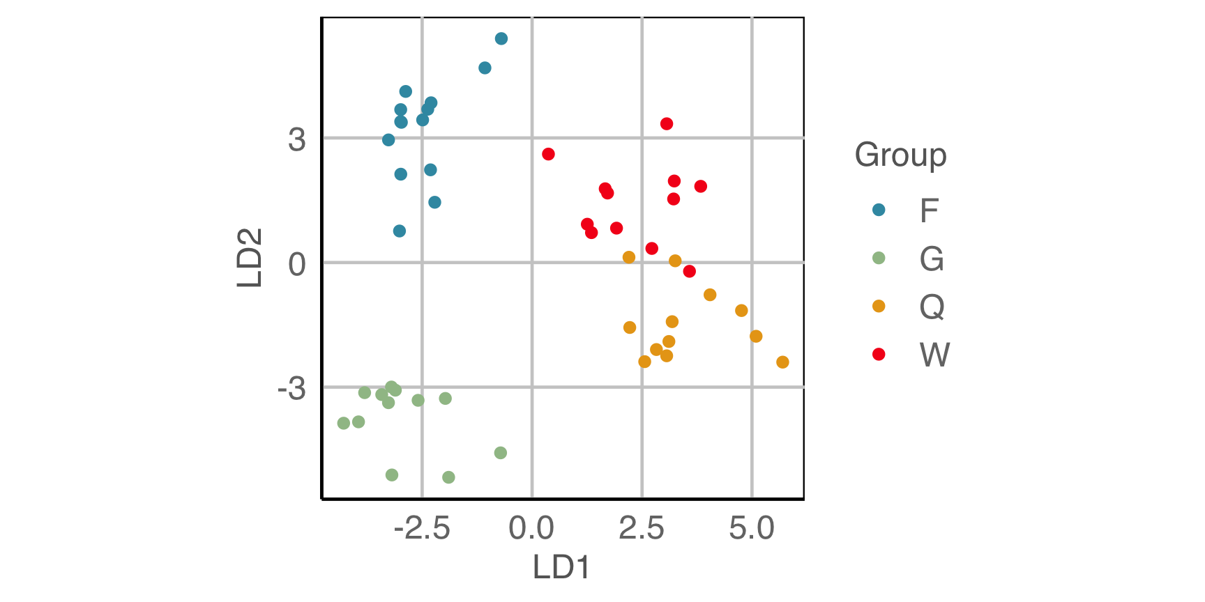
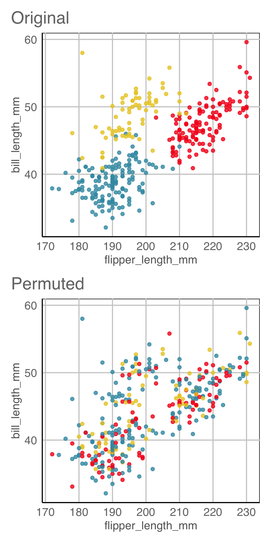
Is there a difference between the species?
Why (3/3)
Which is the best display to answer: what is distribution of thyroid cancer across Australia?
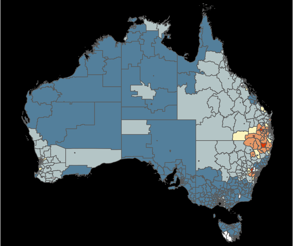
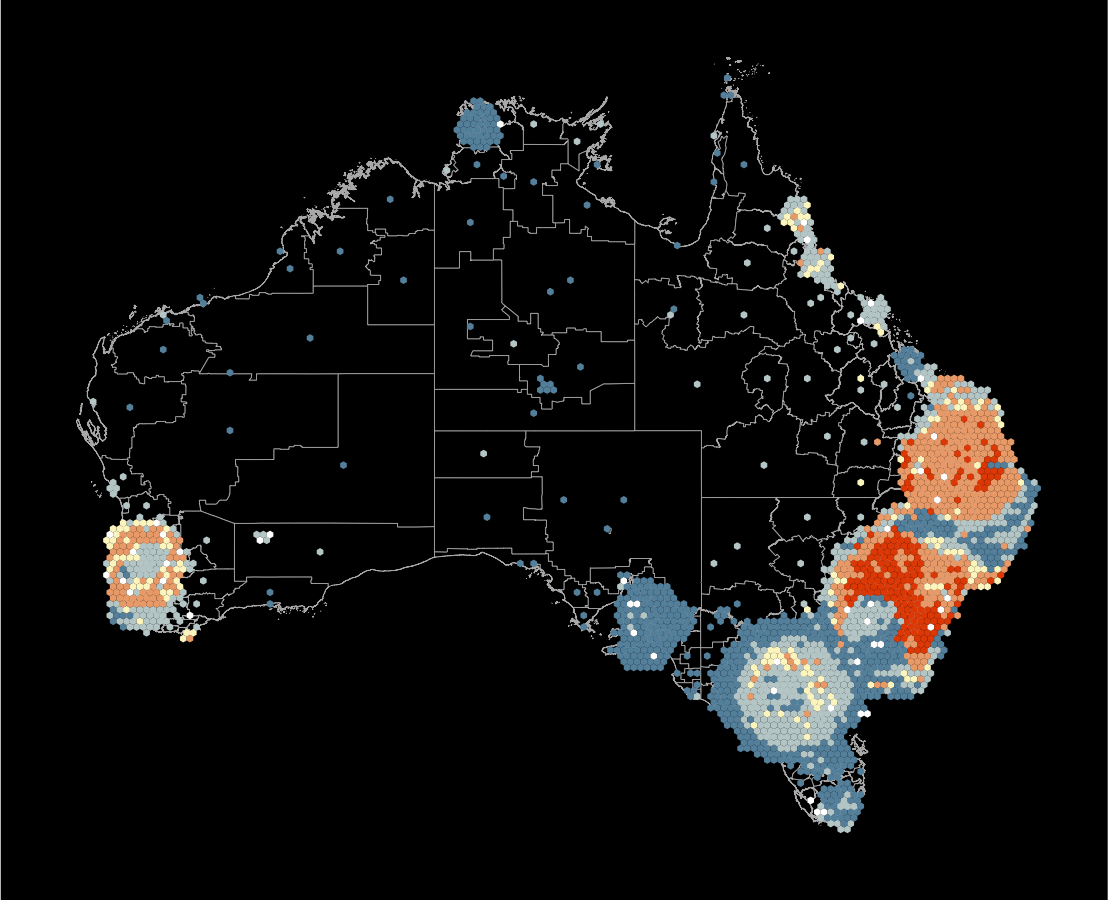
What’s the goal?
Reading data plots is subjective.
Making decisions based on data visualisations is common, where we need to be objective .
It is possible, and here is how we do that …
Outline
- Organising your data into tidy form
- Mapping the variables to elements of the plot
- Cognitive principles: briefly
- Testing the strength of patterns in the plot
- Testing which is the best design
These are the tools you need
space
Organising your data to enable mapping variables to graphical elements
Tidy data
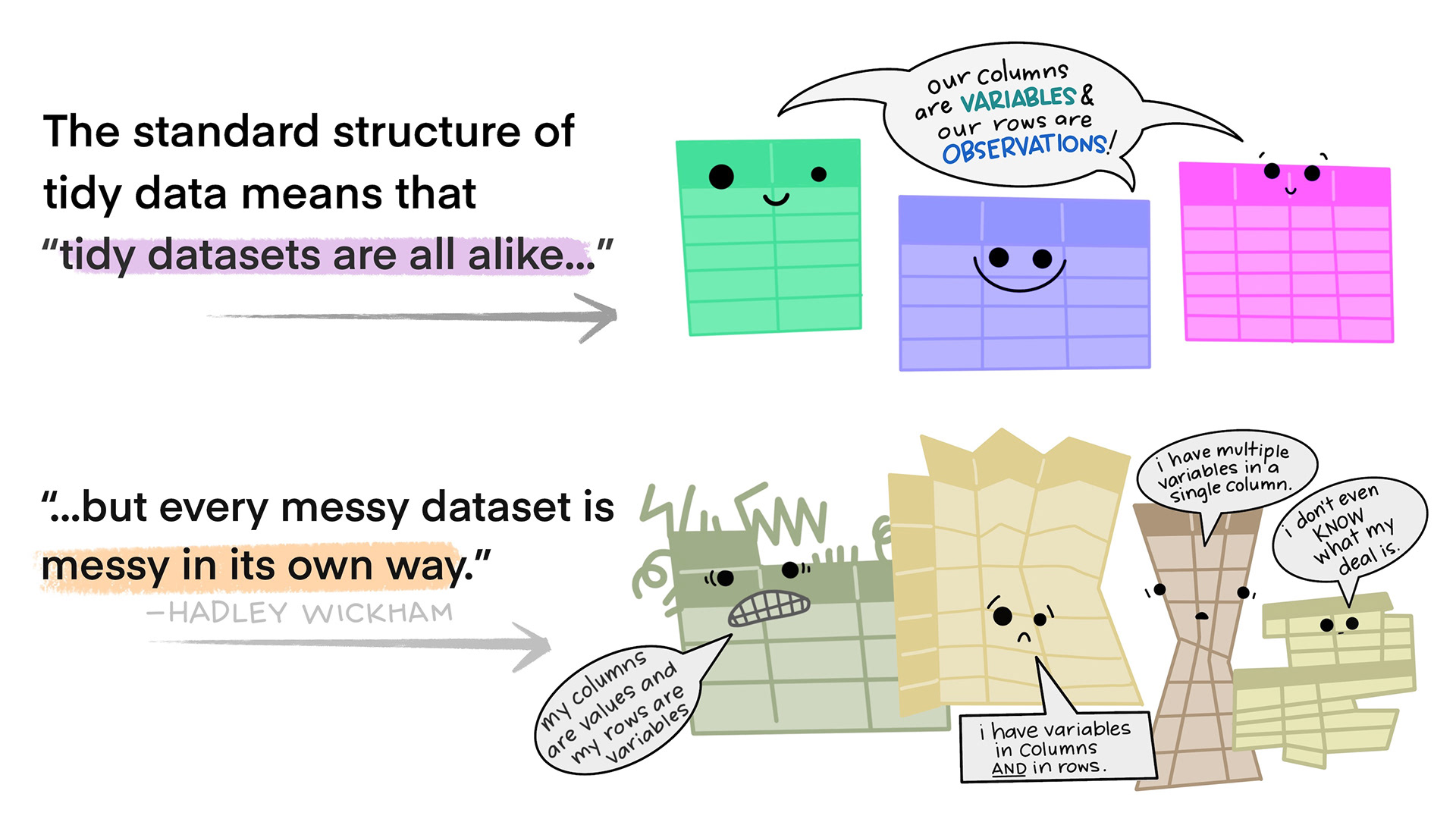
- Each variable forms a column
- Each observation forms a row
- Each type of observational unit forms a table. If you have data on multiple levels (e.g. data about houses and data about the rooms within those houses), these should be in separate tables.
Illustrations from the Openscapes blog Tidy Data for reproducibility, efficiency, and collaboration by Julia Lowndes and Allison Horst
QUESTION
How would you get this data into tidy form?
Tuberculosis from WHO
Tidying
First get the data in tidy form
tb_aus_sa <- tb_aus |>
  filter(year > 2012) |>
  select(iso3, year,
         newrel_f014:newrel_f65,
         newrel_m014:newrel_m65) |>
  pivot_longer(cols=newrel_f014:newrel_m65,
               names_to = "sex_age",
               values_to = "count") |>
  filter(!is.na(count)) |>
  separate(sex_age, into=c("stuff",
                           "sex_age")) |>
  mutate(sex = str_sub(sex_age, 1, 1),
         age = str_sub(sex_age, 2,
                       str_length(sex_age))) |>
  mutate(age = case_when(
    age == "014" ~ "0-14",
    age == "1524" ~ "15-24",
    age == "2534" ~ "25-34",
    age == "3544" ~ "35-44",
    age == "4554" ~ "45-54",
    age == "5564" ~ "55-64",
    age == "65" ~ "65")) |>
  select(iso3, year, sex, age, count)
Statistical data
\[X = \left[ \begin{array}{rrrr} X_{~1} & X_{~2} & ... & X_{~p} \end{array} \right] \\ = \left[ \begin{array}{rrrr} X_{~11} & X_{~12} & ... & X_{~1p} \\ X_{~21} & X_{~22} & ... & X_{~2p} \\ \vdots & \vdots & \ddots& \vdots \\ X_{~n1} & X_{~n2} & ... & X_{~np} \end{array} \right]\]
- This is tidy data!
- You might also make assumptions about the distribution of each variable, e.g. \(X_{~1} \sim N(0,1), ~~X_{~2} \sim \text{Exp}(1) ...\)
Mapping
In ggplot2, the variables from tidy data are explicitly mapped to elements of the plot, using aesthetics.
Basic Mappings
xandyto plot points in a two-dimensional spacecolor,fillto render as a color scalesizemaps variable to size of objectshapemaps variable to different shapes
Depending on the geom different mappings are possible, xmin, xend, linetype, alpha, stroke, weight …
Facets
Variables are used to subset (or condition)
Layers
Different data can be mapped onto the same plot, eg observations, and means
Common plot descriptions as scripts
Example 1A
Example 1B
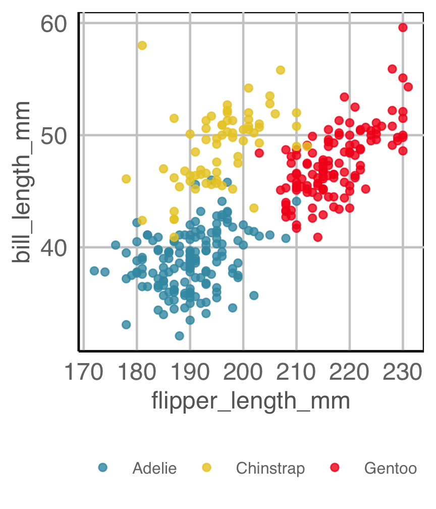
Example 2A
How are variables mapped to create this plot?
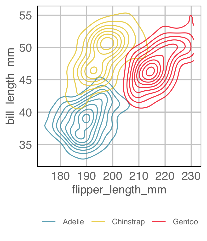
Example 2B
How are variables mapped to create this plot?
Easily re-plot different ways (1/2)
Code
ggplot(tb_aus_sa,
       aes(x=year,
           y=count,
           fill=sex)) +
  geom_col(position="fill") +
  facet_wrap(~age, ncol=7) +
  ylab("") +
  scale_fill_discrete_divergingx(palette="ArmyRose") +
  scale_x_continuous("year",
    breaks = seq(2013, 2021, 2),
    labels = c("13", "15", "17", "19", "21")) +
  theme(legend.position = "bottom",
        legend.direction = "horizontal",
        legend.title = element_blank(),
        axis.text = element_text(size="10"))
Observations: Relatively equal proportions, with more incidence among males in older population. No clear temporal trend.
Easily re-plot different ways (2/2)
Code
ggplot(tb_aus_sa,
       aes(x=year,
           y=count,
           colour=sex)) +
  geom_point() +
  geom_smooth(se=F, alpha=0.7) +
  facet_grid(sex~age, scales = "free_y") +
  ylab("count") +
  scale_colour_discrete_divergingx(palette="ArmyRose") +
  scale_x_continuous("year",
    breaks = seq(2013, 2021, 2),
    labels = c("13", "15", "17", "19", "21")) +
  theme(legend.position = "bottom",
        legend.direction = "horizontal",
        legend.title = element_blank(),
        axis.text = element_text(size="10"))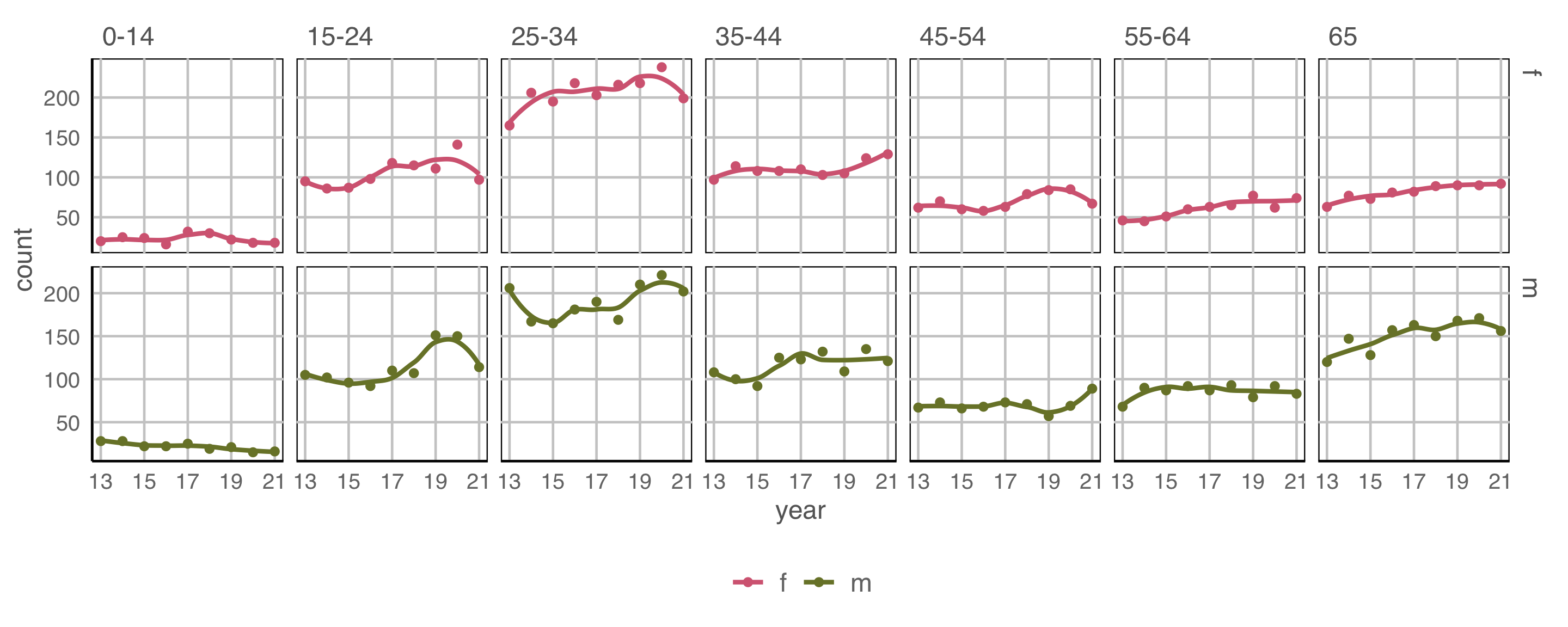
Small increasing temporal trend is present in early age groups, for both males and females. Also older groups, although numbers are much smaller.
Tidy data to plot descriptions allows quick re-arrangment, and clearly shows relationship between plots
Cognitive principles
Hierarchy of mappings
Cleveland and McGill (1984)
Illustrations made by Emi Tanaka
Hierarchy of mappings
- Position - common scale (BEST)
- Position - nonaligned scale
- Length, direction, angle
- Area
- Volume, curvature
- Shading, color (WORST)
- scatterplot, barchart
- side-by-side boxplot, stacked barchart
- piechart, rose plot, gauge plot, donut, wind direction map, starplot
- treemap, bubble chart, mosaicplot
- chernoff face
- choropleth map
Proximity
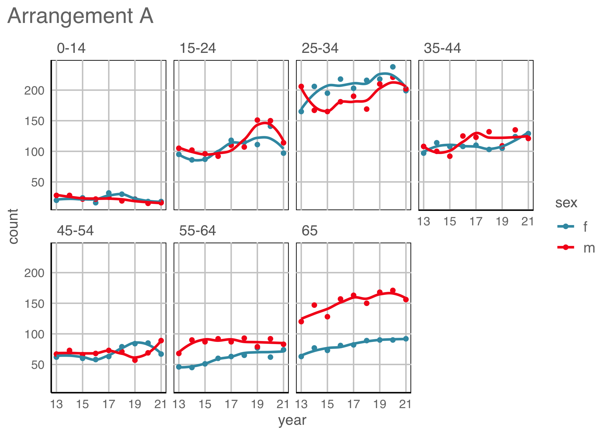
Place elements that you want to compare close to each other. If there are multiple comparisons to make, you need to decide which one is most important.
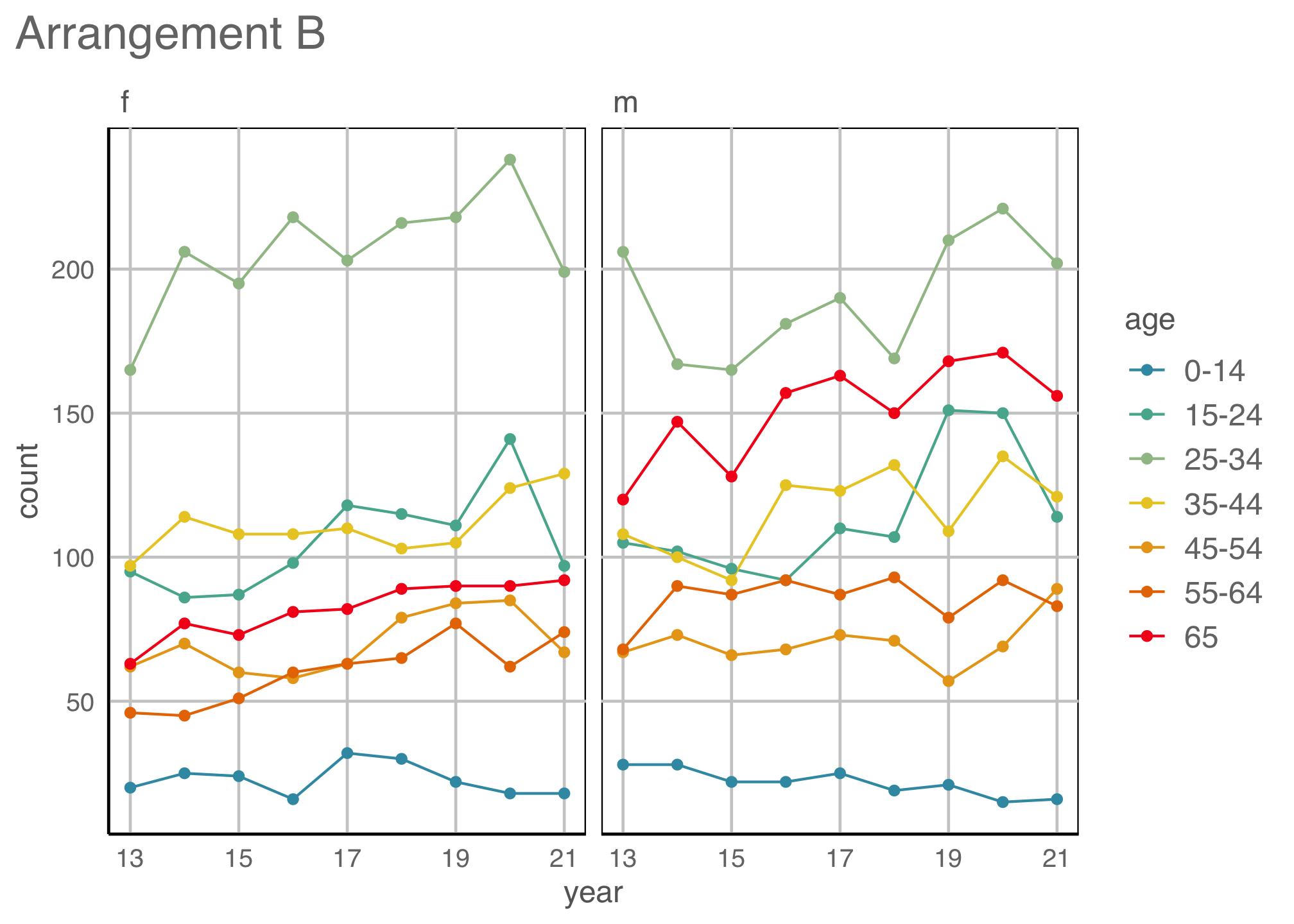
Change blindness
Making comparisons across plots requires the eye to jump from one focal point to another. It may result in not noticing differences.
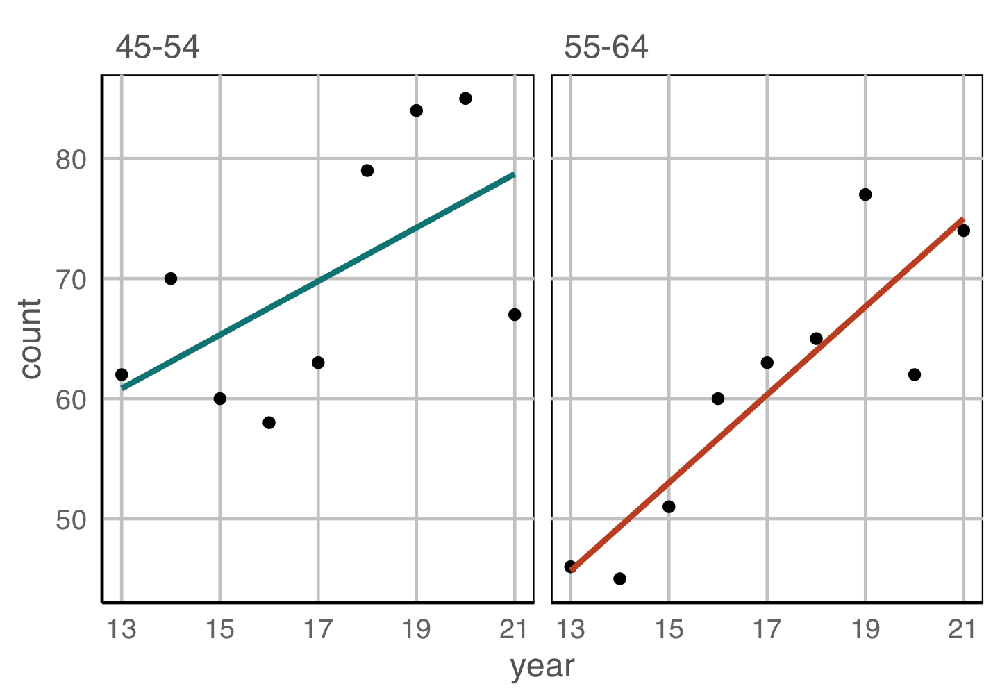

Scaling
For comparison of different patterns, consider the scale. Typically the scale should be the SAME in each plot.
Statistical thinking
Statistical thinking
- Because the plot is specified using a functional mapping of the variables, it is a statistic.
- The null and alternative hypotheses are indicated from the plot description.
- Applying the function to a dataset provides the observed value.
What is your plot testing? (1/3)
What is your plot testing? (1/3)

What do you see?
✗ non-linearity
✓ heteroskedasticity
✗ outliers/anomalies
✓ non-normality
✗ fitted value distribution is uniform
Are you sure?
What is your plot testing? (2/3)
What is your plot testing? (2/3)

What do you see?
There a difference between the groups
✓ location
✗ shape
✓ outliers/anomalies
Are you sure?
What is your plot testing? (3/3)
What is your plot testing? (3/3)
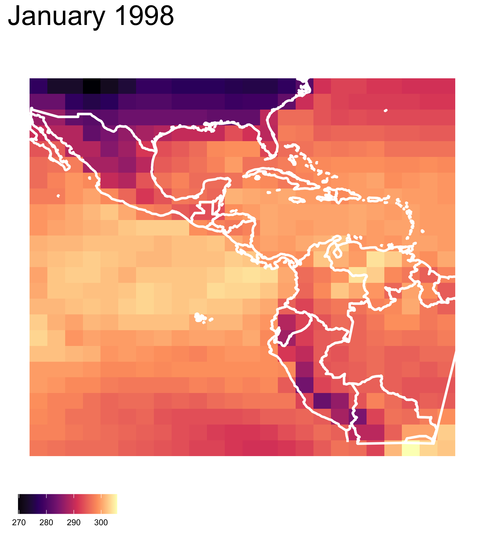
What do you see?
There are clusters of high and low temperature in different parts of the region.
✓ clusters
✓ outliers/anomalies
Are you sure?
Null hypothesis, example 1
What is the null hypothesis?
There is no relationship between residuals and fitted values. This is \(H_o\).
Alternative hypothesis, \(H_a\):
There is some relationship, which might be
- non-linearity
- heteroskedasticity
- outliers/anomalies
Null hypothesis, example 2
Creating null samples
Creating null samples, example 1
Creating null samples, example 2
\(H_o\): There is no relationship between residuals and fitted values.
How would you generate null samples?
Break any association by
- permuting residuals,
- or residual rotation,
- or simulate residuals from a normal distribution.
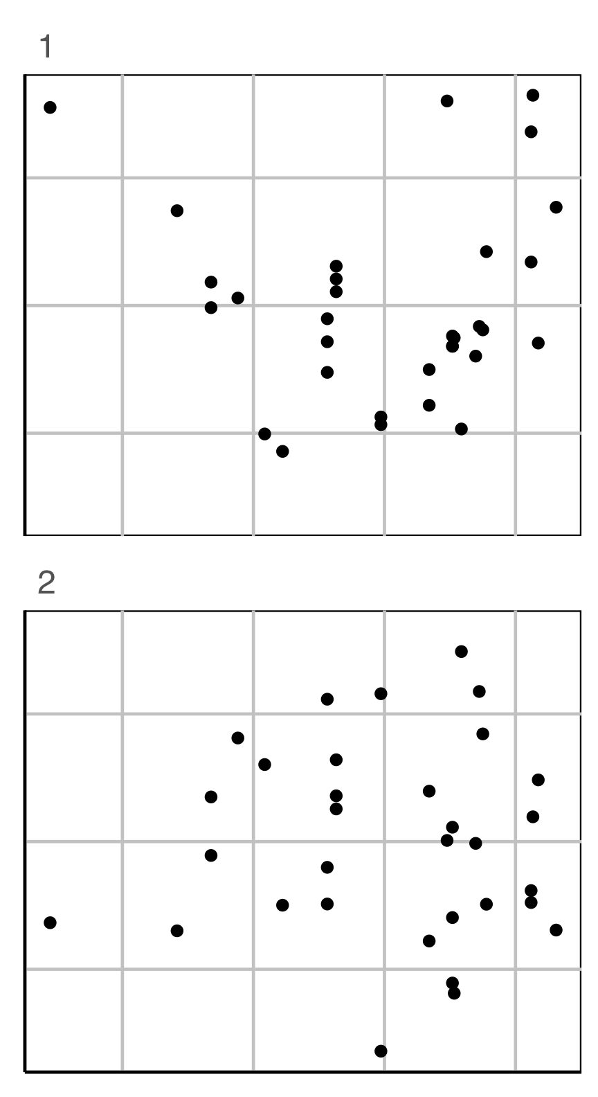
Conducting a lineup test
Steps
- Create a lineup of \(m-1\) null plots + 1 data plot, where the data plot is randomly placed among nulls. Remove any distracting information, like tick labels, titles.
- Ask uninvolved observer(s) to pick the plot that is most different. (May need to use a crowd-sourcing service.)
- Compute the probability that the data plot was chosen, assuming it is no different from the null plots. This is the \(p\)-value.
- Decide to reject or fail to reject the null.
Lineup example 1 (1/2)
Code
set.seed(241)
ggplot(lineup(null_permute("species"), penguins, n=15),
       aes(x=flipper_length_mm,
           y=bill_length_mm,
           color=species)) +
  geom_point(alpha=0.8) +
  facet_wrap(~.sample, ncol=5) +
  scale_color_discrete_divergingx(palette="Zissou 1") +
  theme(legend.position = "none",
        axis.title = element_blank(),
        axis.text = element_blank(),
        panel.grid.major = element_blank())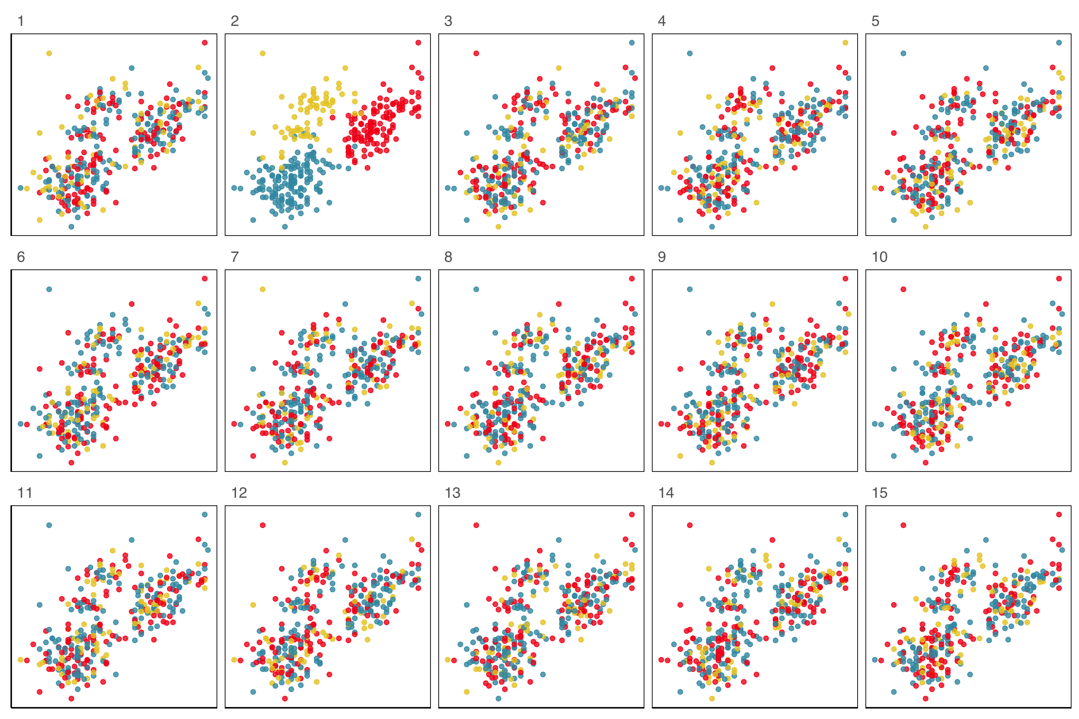
Lineup example 1 (2/2)
If 10 people are shown this lineup and all 10 pick plot 2, which is the data plot, the \(p\)-value will be 0.
Generally, we can compute the probability that the data plot is chosen by \(x\) out of \(K\) observers, shown a lineup of \(m\) plots, using a simulation approach that extends from a binomial distribution, with \(p=1/m\).
This means we would reject \(H_o\) and conclude that there is a difference in the distribution of bill length and flipper length between the species of penguins.
Lineup example 2 (1/2)
Code
data(wasps)
set.seed(258)
wasps_l <- lineup(null_permute("Group"), wasps[,-1], n=15)
wasps_l <- wasps_l |>
  mutate(LD1 = NA, LD2 = NA)
for (i in unique(wasps_l$.sample)) {
  x <- filter(wasps_l, .sample == i)
  xlda <- MASS::lda(Group~., data=x[,1:42])
  xp <- MASS:::predict.lda(xlda, x, dimen=2)$x
  wasps_l$LD1[wasps_l$.sample == i] <- xp[,1]
  wasps_l$LD2[wasps_l$.sample == i] <- xp[,2]
}
ggplot(wasps_l,
       aes(x=LD1,
           y=LD2,
           color=Group)) +
  geom_point(alpha=0.8) +
  facet_wrap(~.sample, ncol=5) +
  scale_color_discrete_divergingx(palette="Zissou 1") +
  theme(legend.position = "none",
        axis.title = element_blank(),
        axis.text = element_blank(),
        panel.grid.major = element_blank())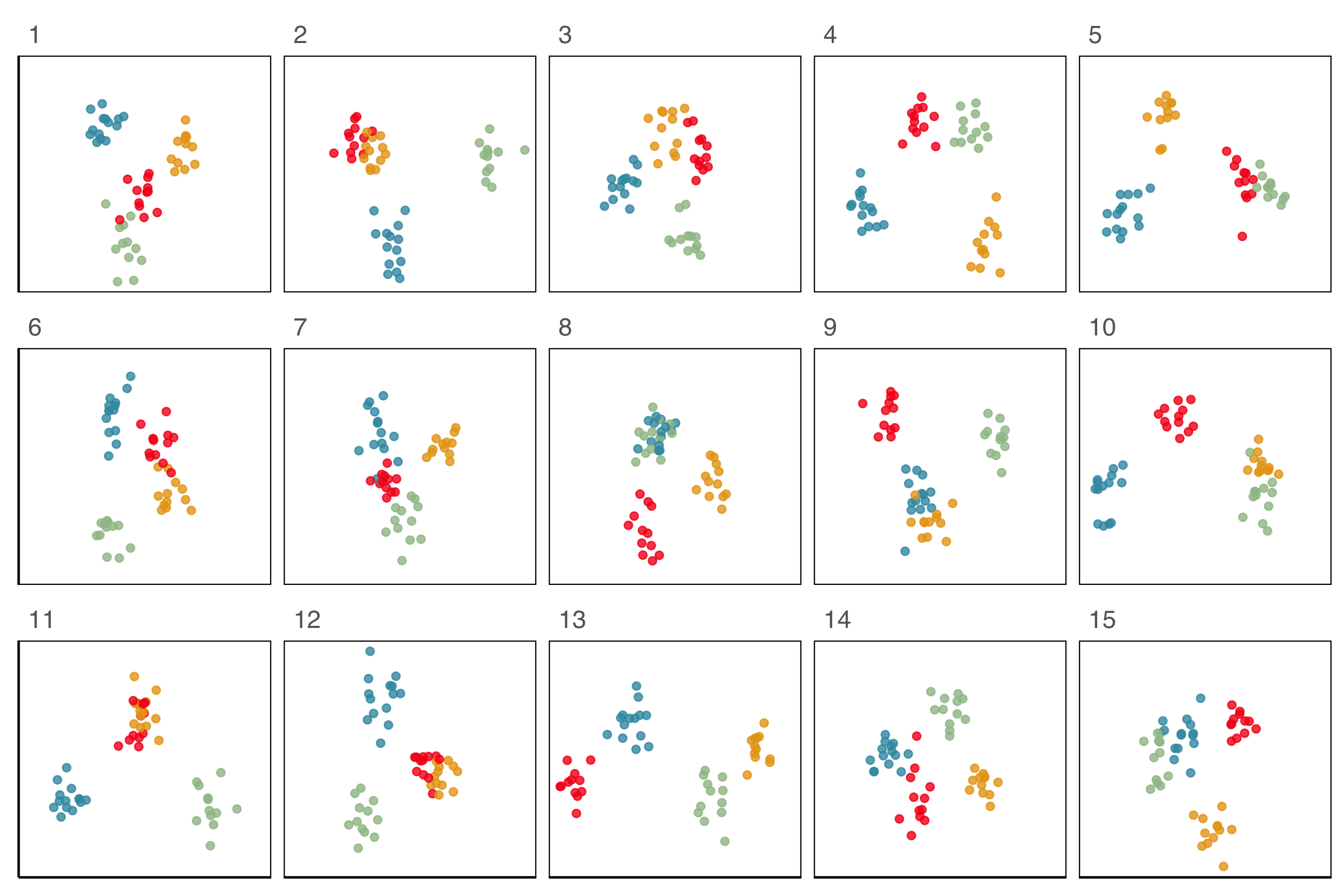
Lineup example 2 (2/2)
If 10 people are shown this lineup and 1 picked the data plot (position 6), which is the data plot, the \(p\)-value will be large.
This means we would NOT reject \(H_o\) and conclude that there is NO difference in the distribution of groups.
Lineup example 3 (1/2)
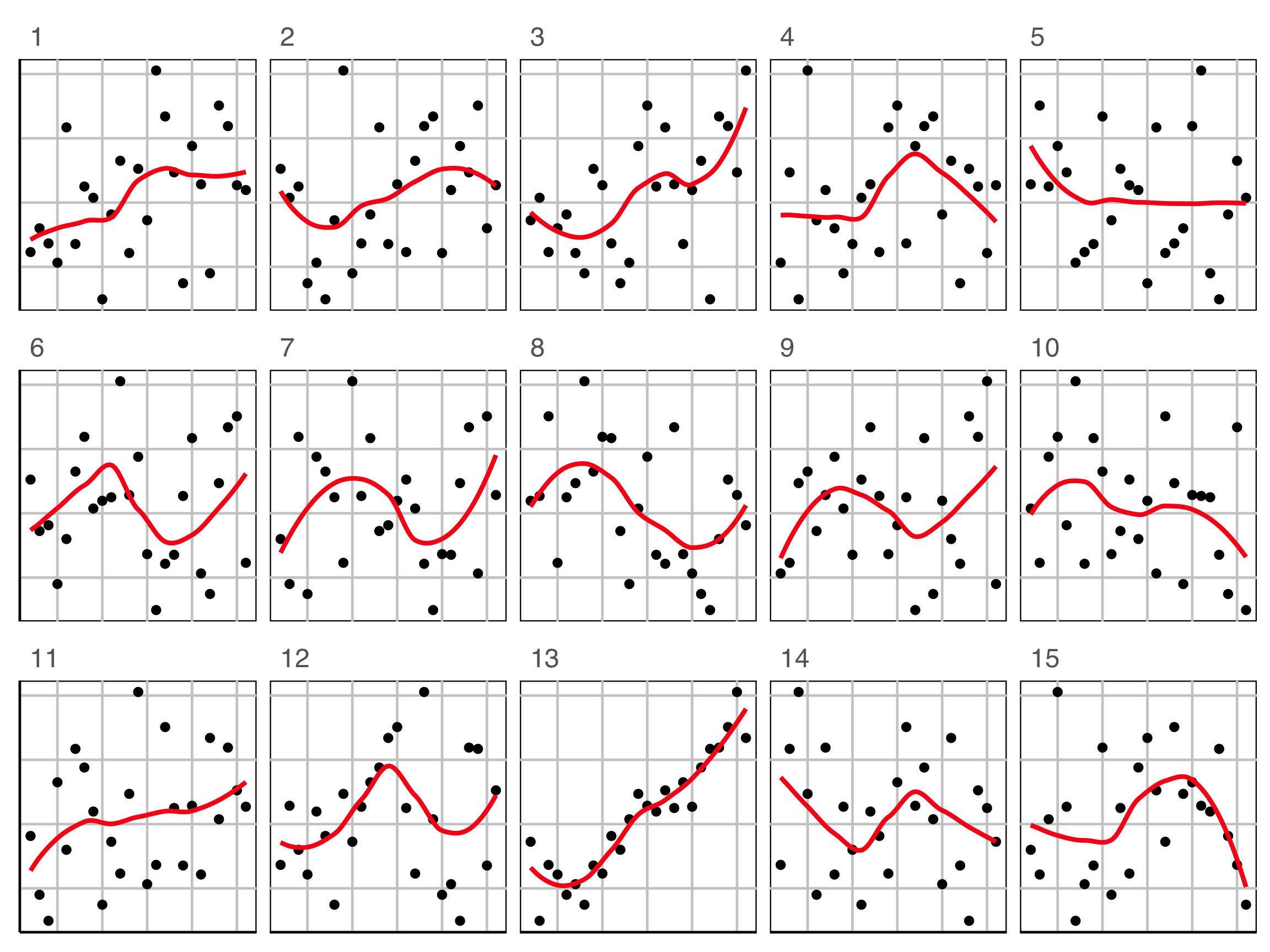
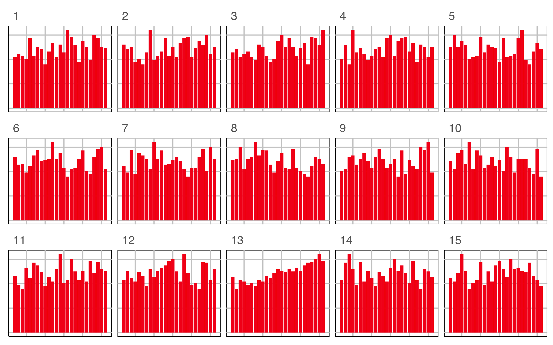
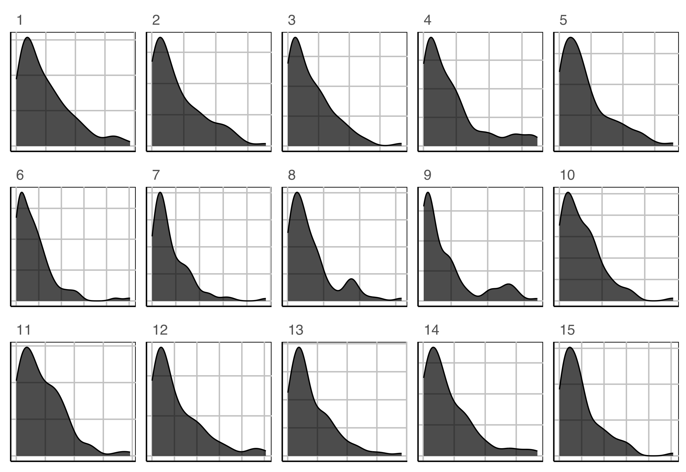
Which plot is the most different?
Lineup example 3 (2/2)
Plot description was:
In particular, the researcher is interested to know if star temperature is a skewed distribution.
\(H_o: X\sim exp(\widehat{\lambda})\)
\(H_a:\) it has a different distribution.
Testing for best plot design
Steps
- Decide on plot descriptions, say two possibilities.
- Using the same data, and same null data create lineups that only differ because of the plot description.
- Show each lineup to two samples of uninvolved observers (one observer cannot see both lineups).
- Compute the proportion of each sample who identified the data plot, this is the signal strength or statistical power of each plot design. Also can be evaluated on time to detect the data plot.
- The plot with the greater value (or shorter time) is the best design (for that problem).
If your birthday is between Jan 1 and Jun 30, CLOSE YOUR EYES NOW
No peeking!
Which plot is the most different?
Raise your hand when you have chosen.
00:20
Plot design example 1
This is the pair of plot designs we are evaluating.
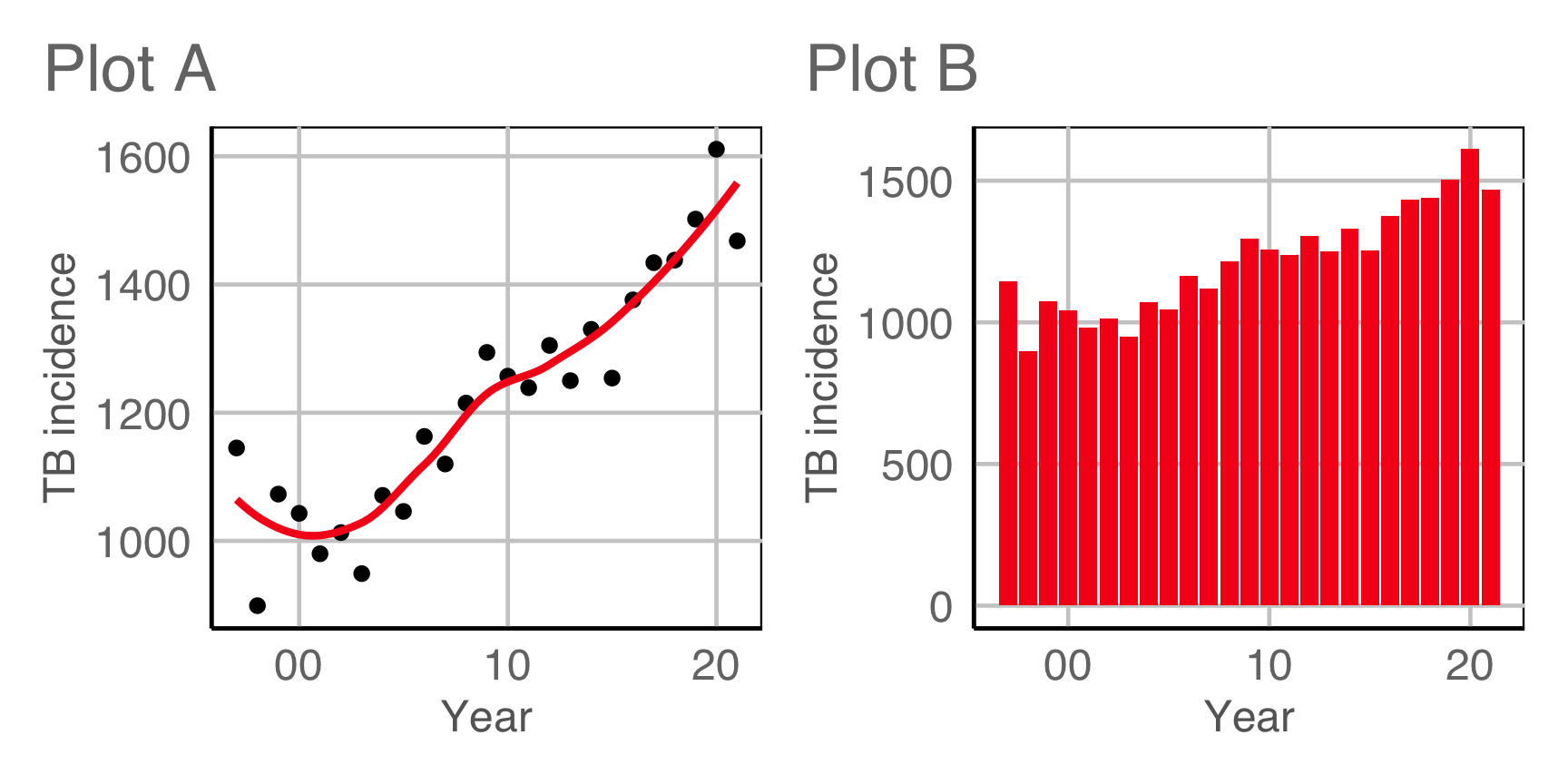
Compute signal strength:
If your birthday is between Jul 1 and Dec 31, CLOSE YOUR EYES NOW
No peeking!
Which plot is the most different?
Raise your hand when you have chosen.
00:20
Plot design example 2
This is the pair of plot designs we are evaluating. Comparing colour palettes used for the spatial distribution of temperature.

Compute signal strength:
Key take-aways
- Re-arrange your data into tidy form. Conceptually, even if it’s not feasible computationally.
- Define your plots using the grammar, conceptually even if the software you use doesn’t support it.
- Utilise valuable cognitive principles: appropriate mapping, proximity and scale.
- Make null plots for comparison, the same plot description applied to null data. Null data by construction has no interesting pattern.
To learn more
- Wickham, Cook, Hofmann, Buja (2010) Graphical Inference for Infovis, IEEE TVCG, https://doi.org/10.1109/TVCG.2010.161.
- Hofmann, Follett, Majumder, Cook (2012) Graphical Tests for Power Comparison of Competing Designs, IEEE TVCG, https://doi.org/10.1109/TVCG.2012.230.
- Buja, Cook, Hofmann, Lawrence, Lee EK, Swayne, Wickham (2009) Statistical inference for exploratory data analysis and model diagnostics, https://doi.org/10.1098/rsta.2009.0120.
- Majumder, Hofmann, Cook (2013) Validation of visual statistical inference, applied to linear models, https://doi.org/10.1080/01621459.2013.808157.
- VanderPlas, Rottger, Cook, Hofmann (2021) Statistical significance calculations for scenarios in visual inference, https://doi.org/10.1002/sta4.337.
Acknowledgements

This work is licensed under a Creative Commons Attribution-ShareAlike 4.0 International License.
