New tools for visualising high-dimensional data using linear projections
High-dimensional visualisation

Tours of high-dimensional data are like examining the shadows (projections)
(and slices/sections to see through a shadow)
High-dimensions in statistics
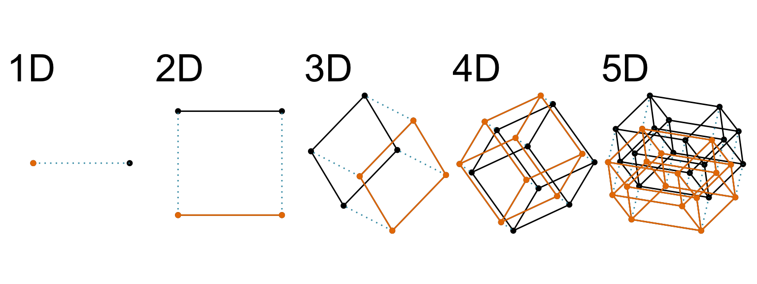
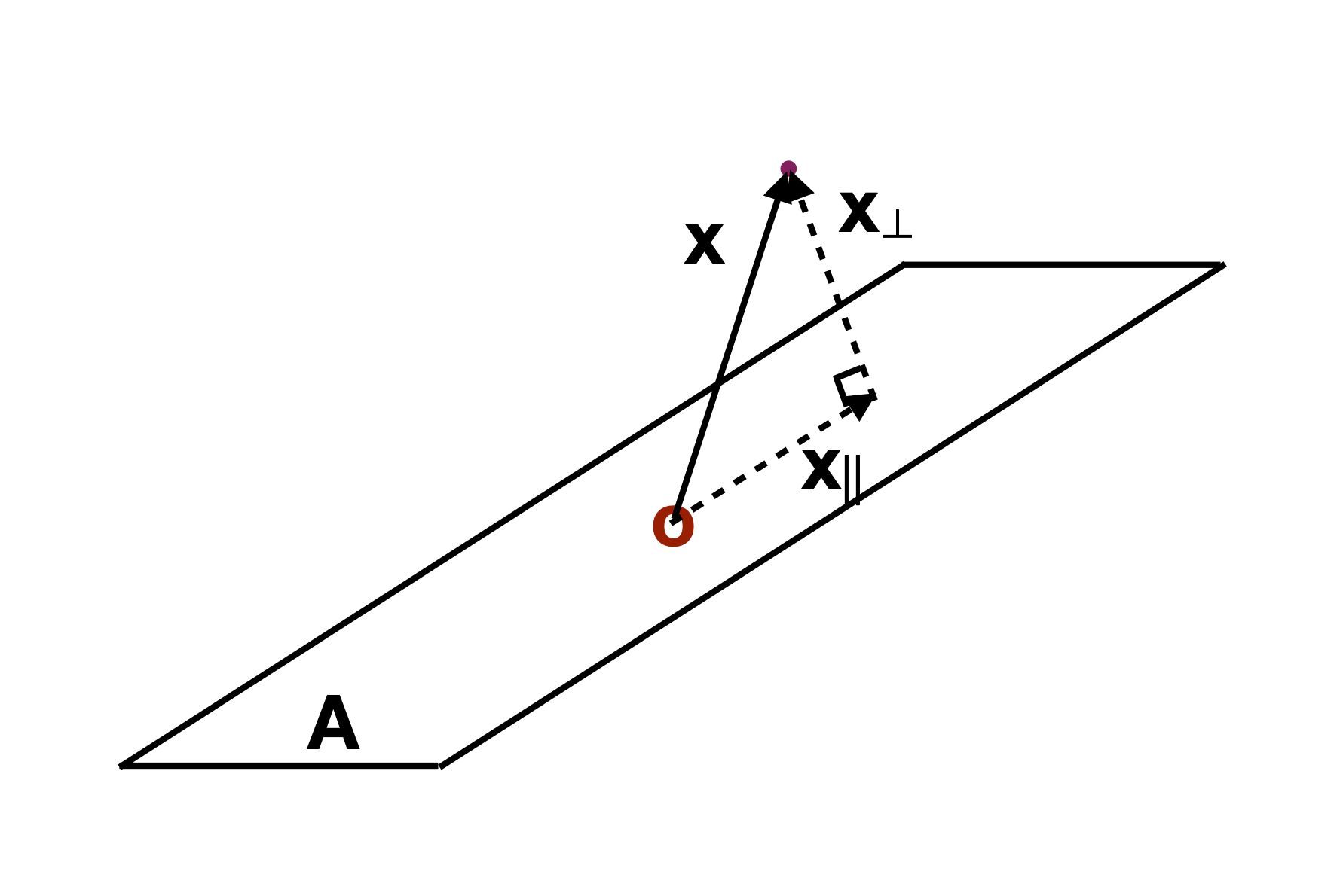
Increasing dimension adds an additional orthogonal axis.
If you want more high-dimensional shapes there is an R package, geozoo, which will generate cubes, spheres, simplices, mobius strips, torii, boy surface, klein bottles, cones, various polytopes, …
And read or watch Flatland: A Romance of Many Dimensions (1884) Edwin Abbott.
High-dimensional visualisation
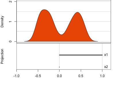
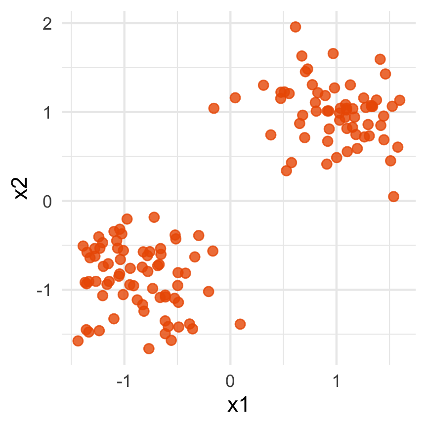
Data is 2D:
Projection is 1D:
Notice that the values of change between (-1, 1). All possible values being shown during the tour.


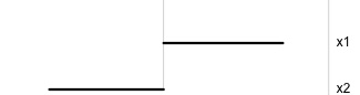
watching the 1D shadows we can see:
- unimodality
- bimodality, there are two clusters.
What does the 2D data look like? Can you sketch it?
High-dimensional visualisation
⟵
The 2D data
High-dimensional visualisation
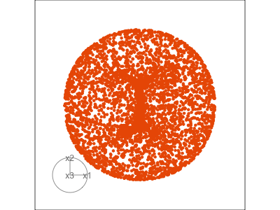
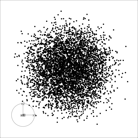
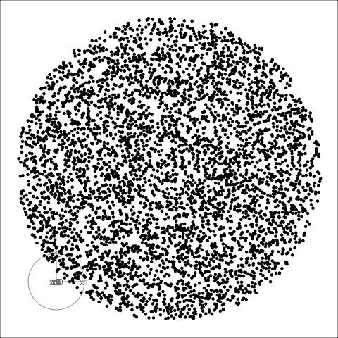
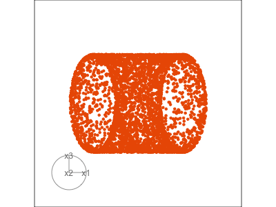
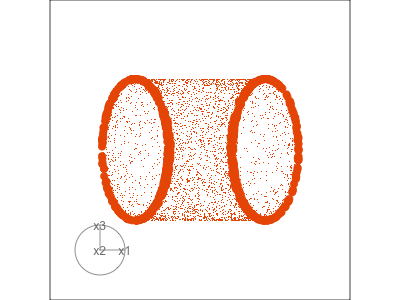
Data is 3D:
Projection is 2D:
Notice that the values of change between (-1, 1). All possible values being shown during the tour.
See:
- circular shapes
- some transparency, reveals middle
- hole in in some projections
- no clustering
High-dimensional visualisation
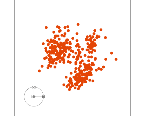
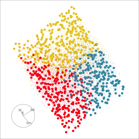
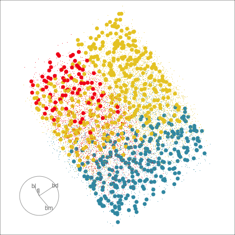
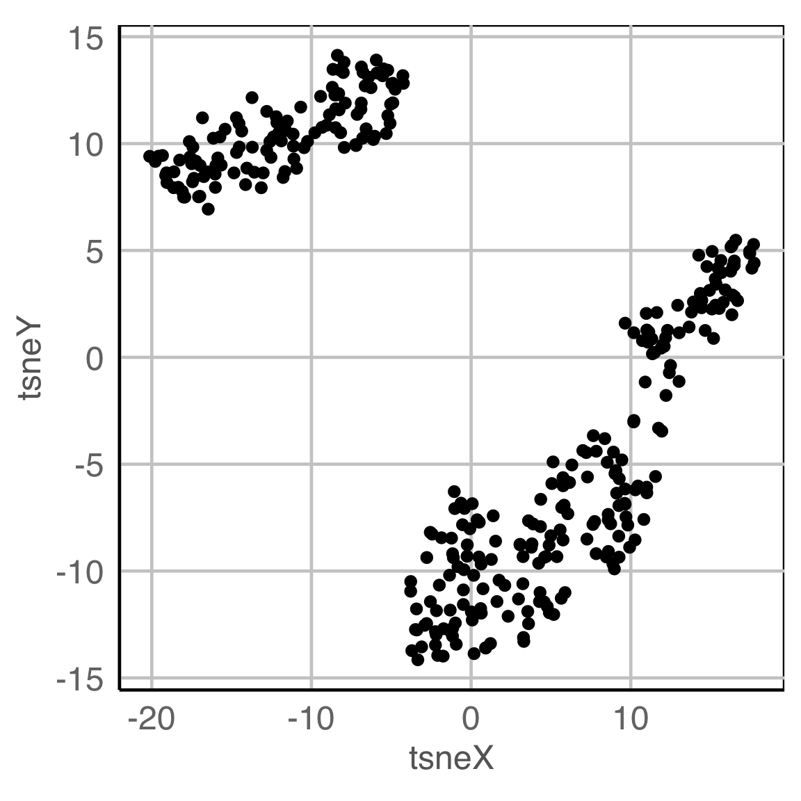
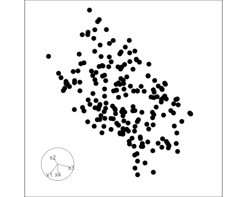
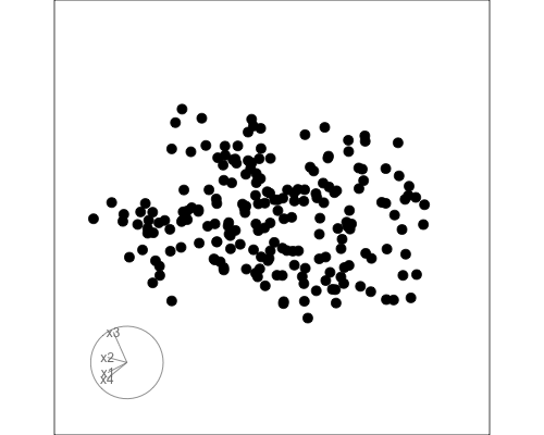
Data is 4D:
Projection is 2D:
How many clusters do you see?
- three, right?
- one separated, and two very close,
- and they each have an elliptical shape.
- do you also see an outlier or two?
Early tour algorithms
1D paths in 3D space

2D paths in 3D space
Early tour algorithms
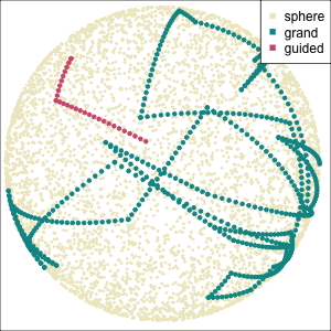
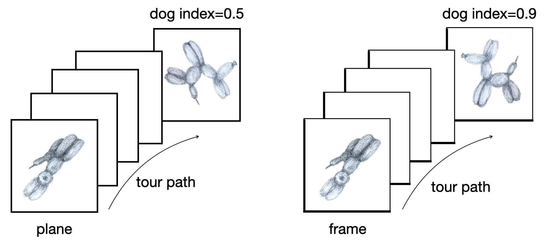
Grand tour: see from all sides
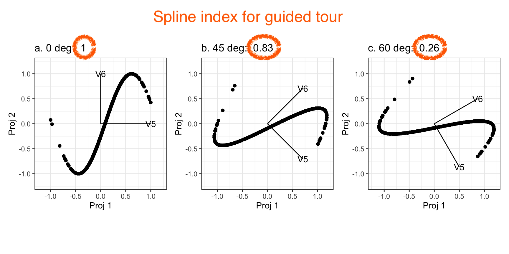
Guided tour: Steer towards the most interesting features.
Why? (Three cluster data)
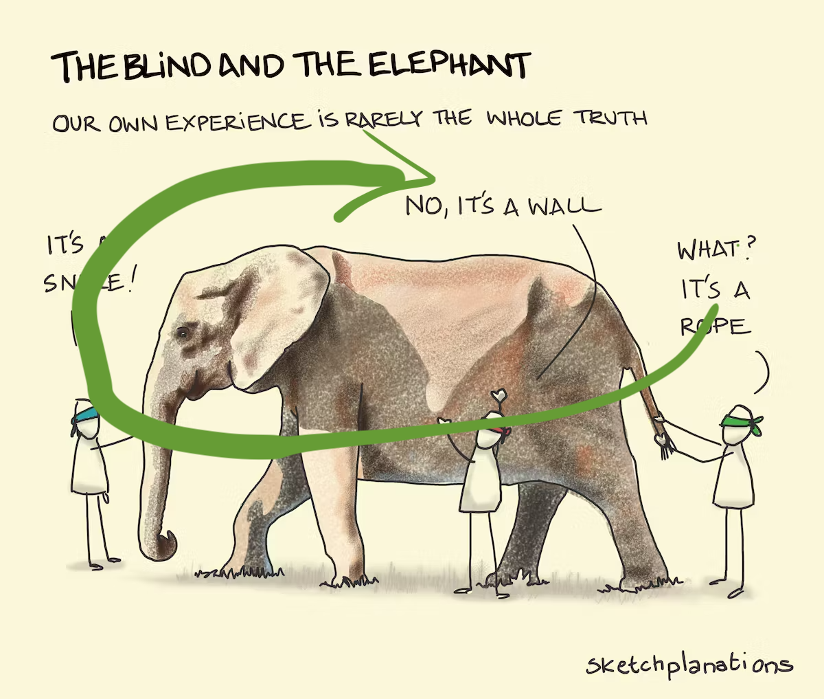
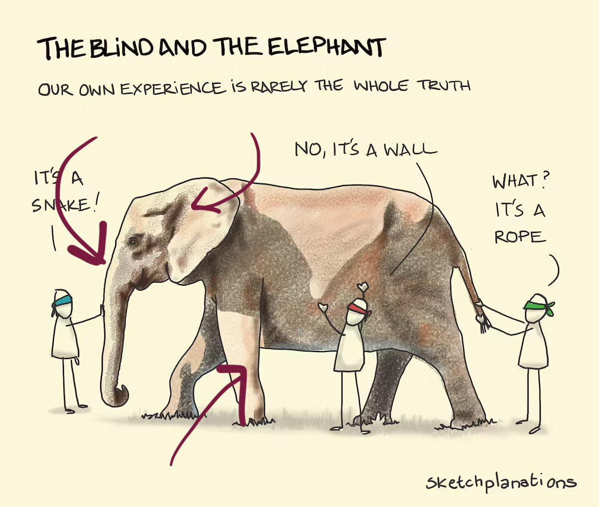
Avoid being a blind man inspecting the elephant
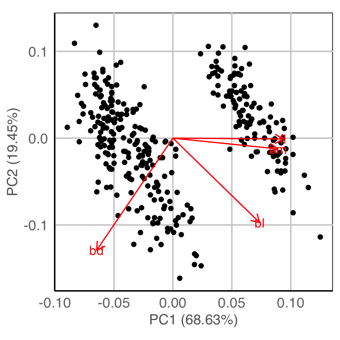
Principal component analysis

NLDR: t-Stochastic neighbourhood embedding

Algorithms in the tourr package
![]()
Movement
- choice of target planes
- grand: random
- guided: objective function
- local: nearby
- little: marginals
- manual/radial: specific variable
- interpolation between them
- geodesic: plane to plane
- Givens: frame/basis to frame/basis
Display
How should you plot your projected data?
- 1D: density, dotplot, histogram
- 2D: scatterplot, density2D, sage, pca, slice
- 3D: stereo
- kD: parallel coordinates, scatterplot matrix
- 1D+spatial: image
Slice
Utilise distance from the projection plane to make the slice, and shift centre of projection plane.
Sage transformation (1/2)
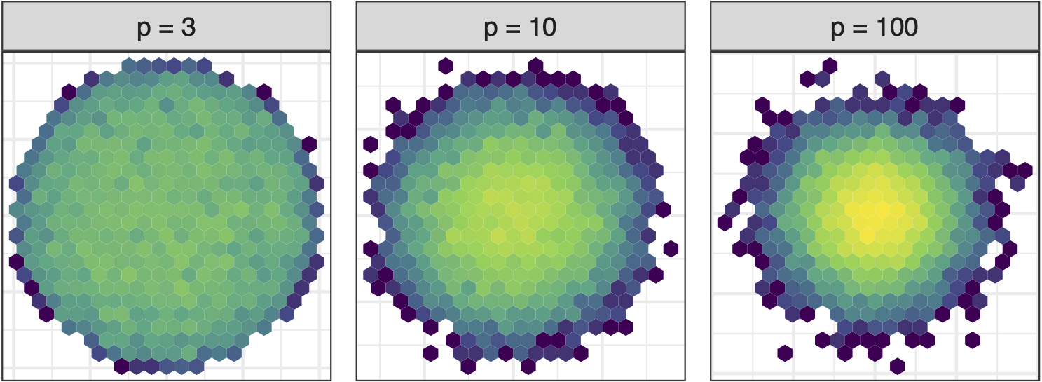
Increase variables, increase concentration, possibly obscuring important structure.
Sage transformation (2/2)
Transformation expands the centre to make a sage display.
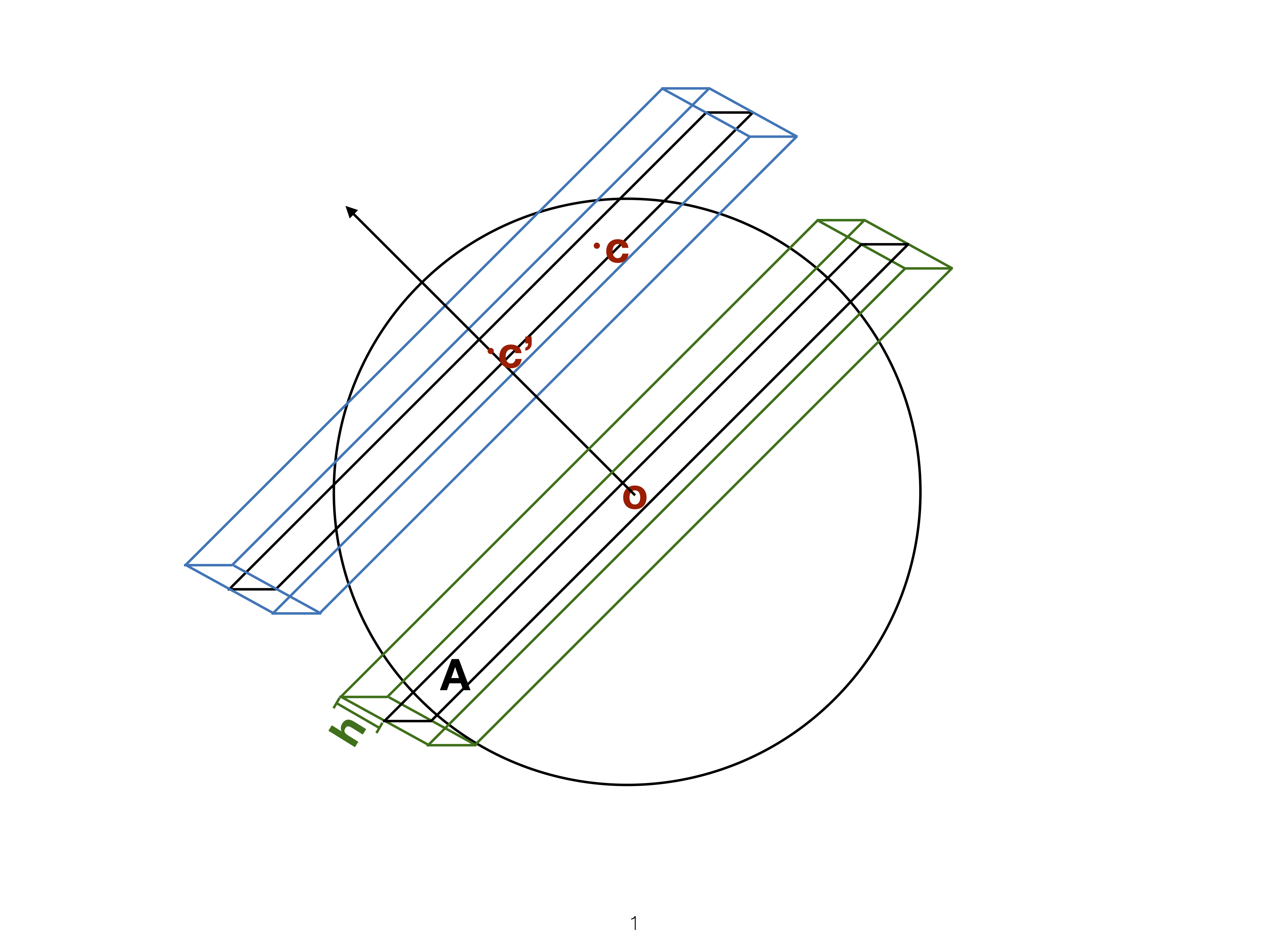
Givens (1/2)
![]()
Givens (2/2)

Givens interpolation ends at requested frame, but geodesic interpolation arrives at the plane, is frame-agnostic, and that is problematic for optimisation using the guided tour.
Manual/radial tour
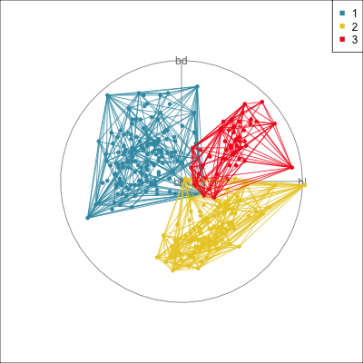
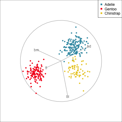
Best projection provided by the guided tour, separating three species.
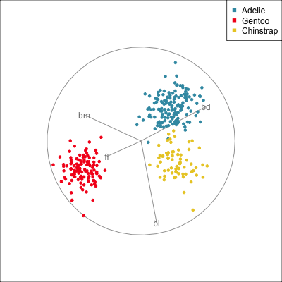
Removing flipper length
Removing bill length
Slice tour (1/2)
Projection
Slice
Slice tour (2/2)
This is especially useful for exploring classification models, comparing boundaries produced by different models. (The same penguins data used here.)
Linear discriminant analysis
Classification tree
Model in the data space (1/2)
Data in the model space 1
Model in the data space
Code
library(mulgar)

p_pca_m <- pca_model(p_pca, s=2.2)
p_pca_m_d <- rbind(p_pca_m$points, penguins_sub[,1:4])
animate_xy(p_pca_m_d, edges=p_pca_m$edges,
           axes="bottomleft",
           edges.col="#E7950F",
           edges.width=3)
render_gif(p_pca_m_d,
           grand_tour(),
           display_xy(half_range=4.2,
                      edges=p_pca_m$edges,
                      edges.col="#E7950F",
                      edges.width=3),
           gif_file="gifs/p_pca_model.gif",
           frames=500,
           width=400,
           height=400,
           loop=FALSE)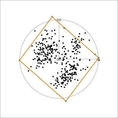
Model in the data space (2/2)
Data in the model space
Model in the data space
???
See Jayani Lakshika’s talk, Fri 11am: IPS12
Hiding in high-d (1/2)
Code
library(tidyverse)
library(tourr)
library(GGally)
set.seed(946)
d <- tibble(x1=runif(200, -1, 1),
            x2=runif(200, -1, 1),
            x3=runif(200, -1, 1))
d <- d %>%
  mutate(x4 = x3 + runif(200, -0.1, 0.1))
d <- bind_rows(d, c(x1=0, x2=0, x3=-0.5, x4=0.5))

d_r <- d %>%
  mutate(x1 = cos(pi/6)*x1 + sin(pi/6)*x3,
         x3 = -sin(pi/6)*x1 + cos(pi/6)*x3,
         x2 = cos(pi/6)*x2 + sin(pi/6)*x4,
         x4 = -sin(pi/6)*x2 + cos(pi/6)*x4)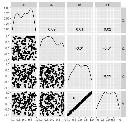
Hiding in high-d (2/2)
Code
library(tidyverse)
library(tourr)
library(GGally)
set.seed(946)
d <- tibble(x1=runif(200, -1, 1),
            x2=runif(200, -1, 1),
            x3=runif(200, -1, 1))
d <- d %>%
  mutate(x4 = x3 + runif(200, -0.1, 0.1))
d <- bind_rows(d, c(x1=0, x2=0, x3=-0.5, x4=0.5))

d_r <- d %>%
  mutate(x1 = cos(pi/6)*x1 + sin(pi/6)*x3,
         x3 = -sin(pi/6)*x1 + cos(pi/6)*x3,
         x2 = cos(pi/6)*x2 + sin(pi/6)*x4,
         x4 = -sin(pi/6)*x2 + cos(pi/6)*x4)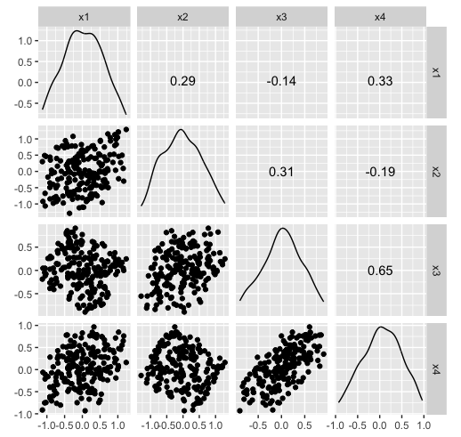
References and acknowledgements
- Cook and Laa (2023) Interactively exploring high-dimensional data and models in R
- Slides made in Quarto
- Get a copy of slides at
https://github.com/dicook/IASC-ARS-2023

This work is licensed under a Creative Commons Attribution-ShareAlike 4.0 International License.
Model-based - 2D (1/3)
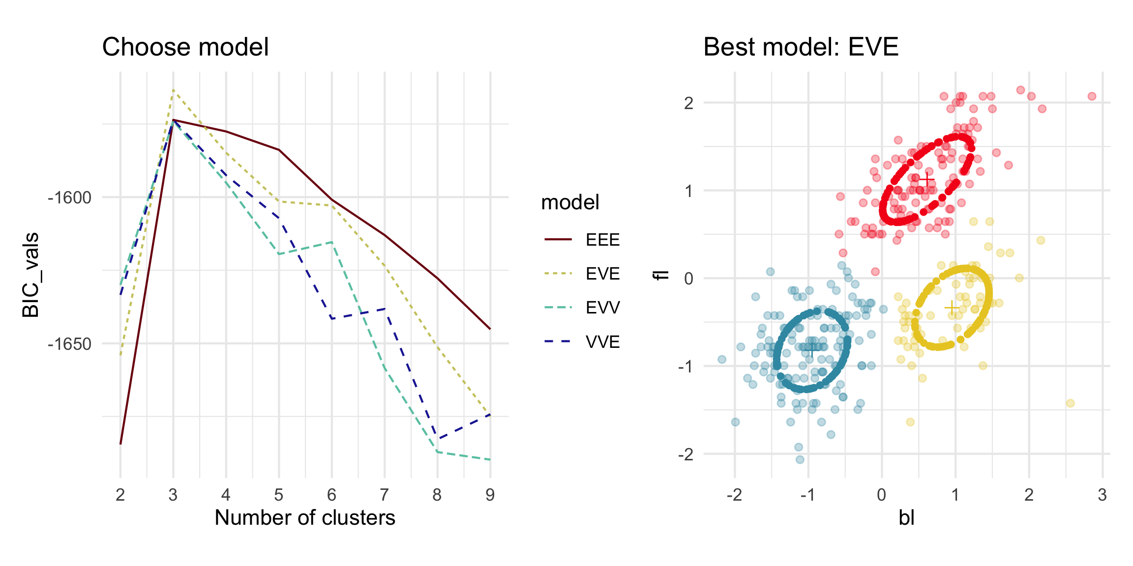
Model-based - 4D (2/3)
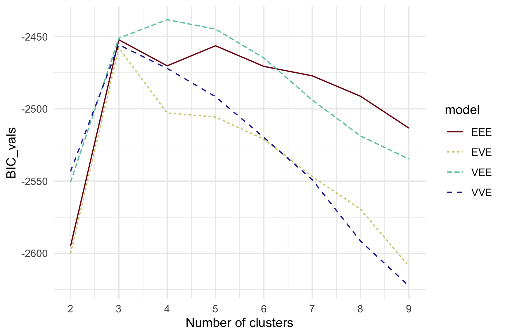
Model-based (3/3) ~~Which fits the data better?
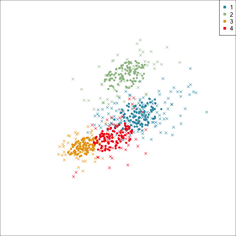
Best model: four-cluster VEE
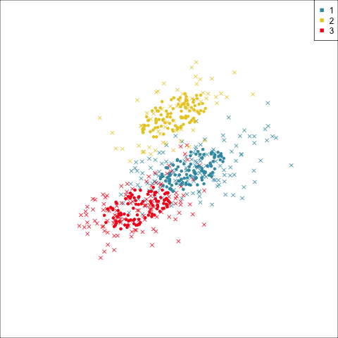
Three-cluster EEE
Summarising clusters
Convex hulls are often used to summarise clusters in 2D. It is possible to view these in high-d, too.