library(flexclust)
randomTour(iris[,1:4], axiscol=2:5)Interactively Visualizing Multivariate Market Segmentation Using the R Package Lionfish
Fritz’s work
It turns out that Fritz implemented a tour:
Today’s work extends it with better algorithms for choosing projections to show, and interactive graphics where plots are linked in python.

Motivation
“You can get any result you want when clustering data.”
Yes, and no, ideally no
Market segmentation tends to be carving a “blob” of data into chunks, using clustering algorithms. We argue that:
- Clustering follows the shape of the data along mathematical rules
- Algorithms have favourites and quirks, which is replicable and repeatable


Quick quiz
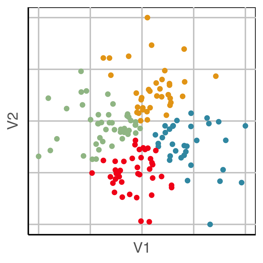
This is how we tend to visualise cluster results.
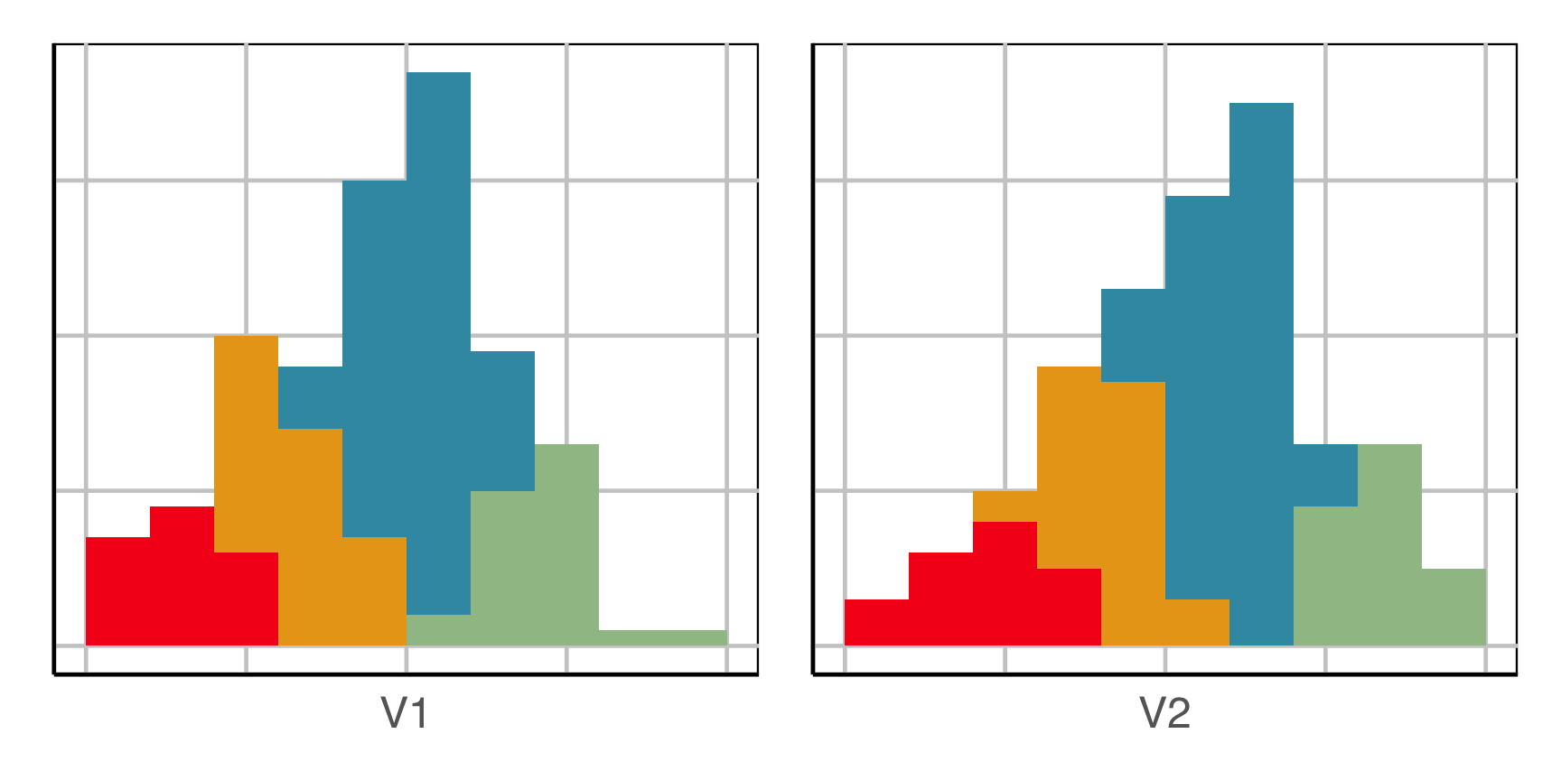
How does this clustering result carve up 2D data? What does the data look like?
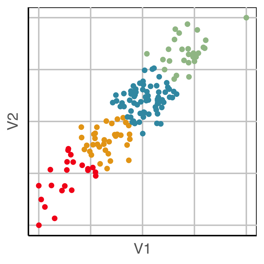
Now we can see the clustering has partitioned the blob.
Try again
This is how we tend to visualise cluster results.
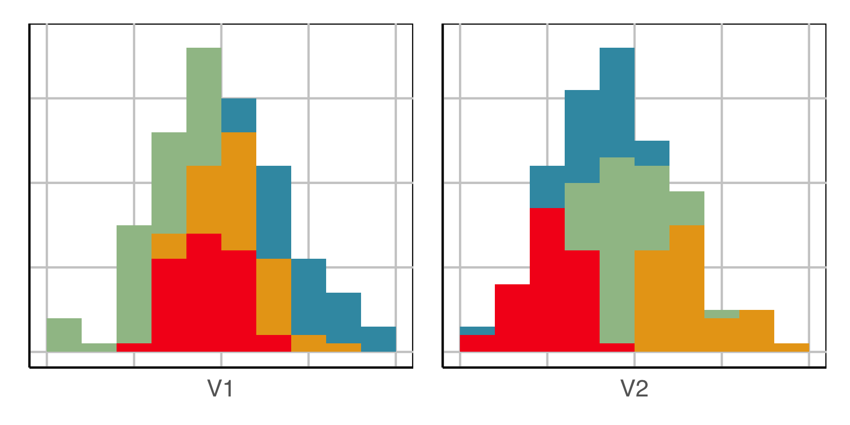
How does this clustering result carve up 2D data? What does the data look like?
Now we can see the clustering has partitioned the blob.
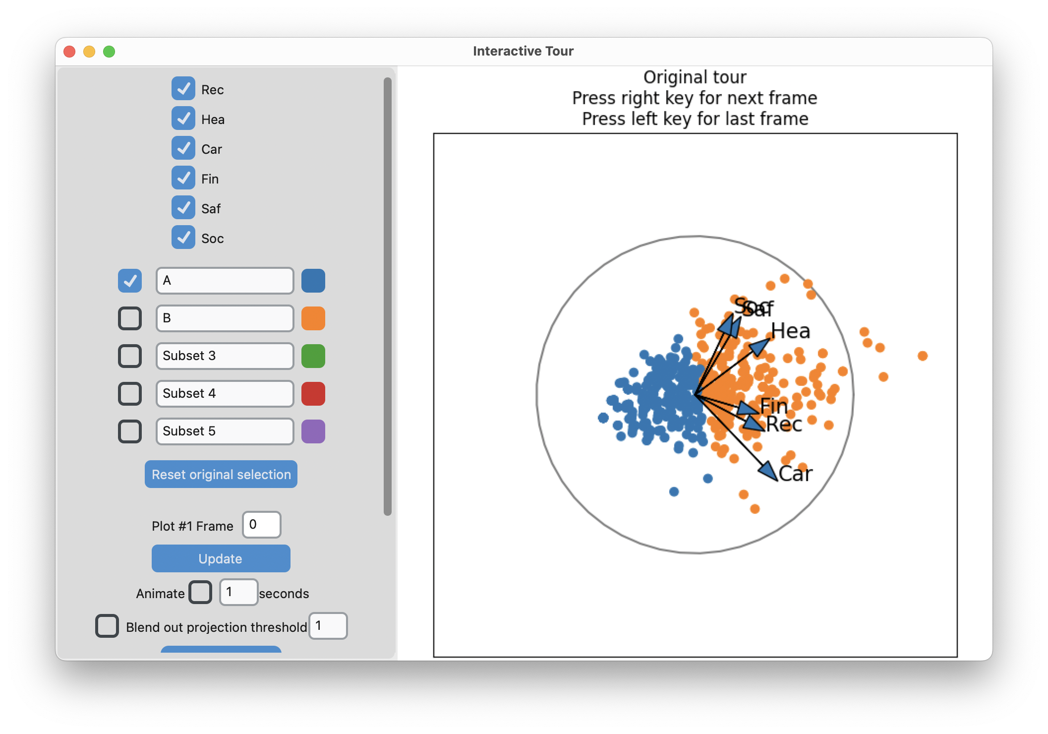
Example: Risk Taking
- Survey of 563 Australian tourists, see Dolnicar S, Grün B, Leisch F (2018)
- Six different types of risks: recreational, health, career, financial, social and safety
- Rated on a scale from 1 (never) to 5 (very often)
Step 1: understand the shape of the data
Code
# Step 1: get a sense of the data
library(lionfish)
data("risk")
colnames(risk) <- c("Rec", "Hea", "Car", "Fin", "Saf", "Soc")

animate_xy(risk)
set.seed(201)
render_gif(risk,
           grand_tour(),
           display_xy(col = "#6C26AC"),
           start = basis_random(6,2),
           gif_file = "gifs/risk_gt.gif",
           apf = 1/20,
           frames = 400,
           width = 400,
           height = 400)
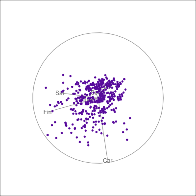
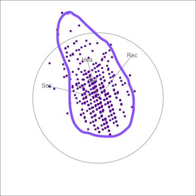 {fig-alt=“A single 2D projection of 6D data shown as a scatterplot of purple points. A purple sketch roughs out the shape, which is like a pear. The variables are mostly contributing to this projection Soc, Rec and Hea.”}
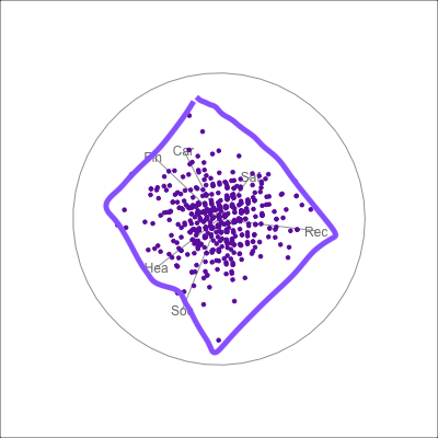 {fig-alt=“A single 2D projection of 6D data shown as a scatterplot of purple points. A purple sketch roughs out the shape, which is like a rhombus. All six variables contribute to this projection in different directions.”}
-means slices along main spread, and then middle
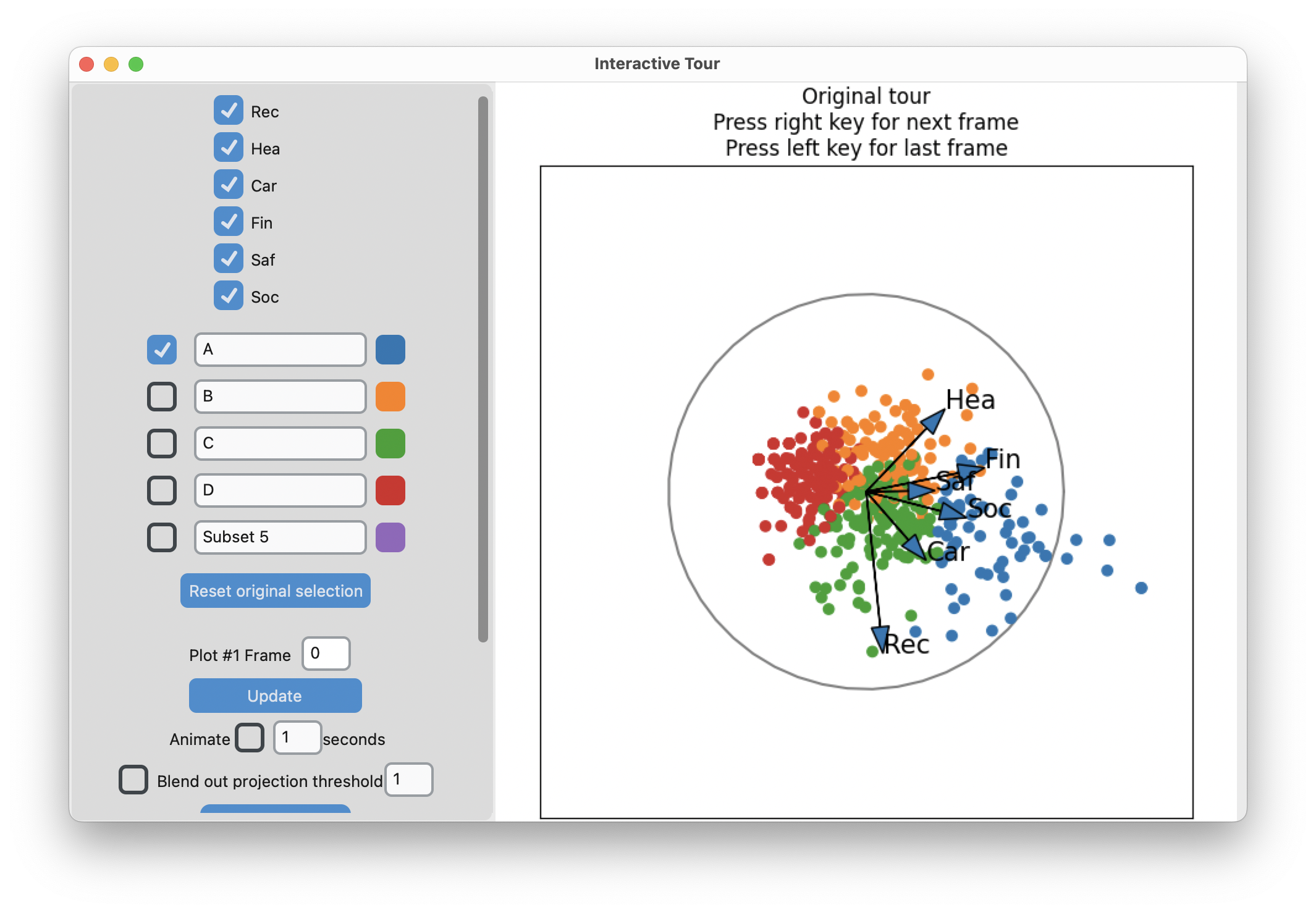
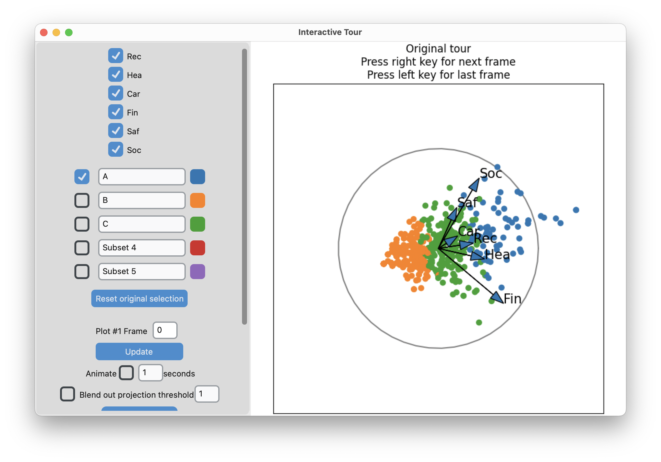
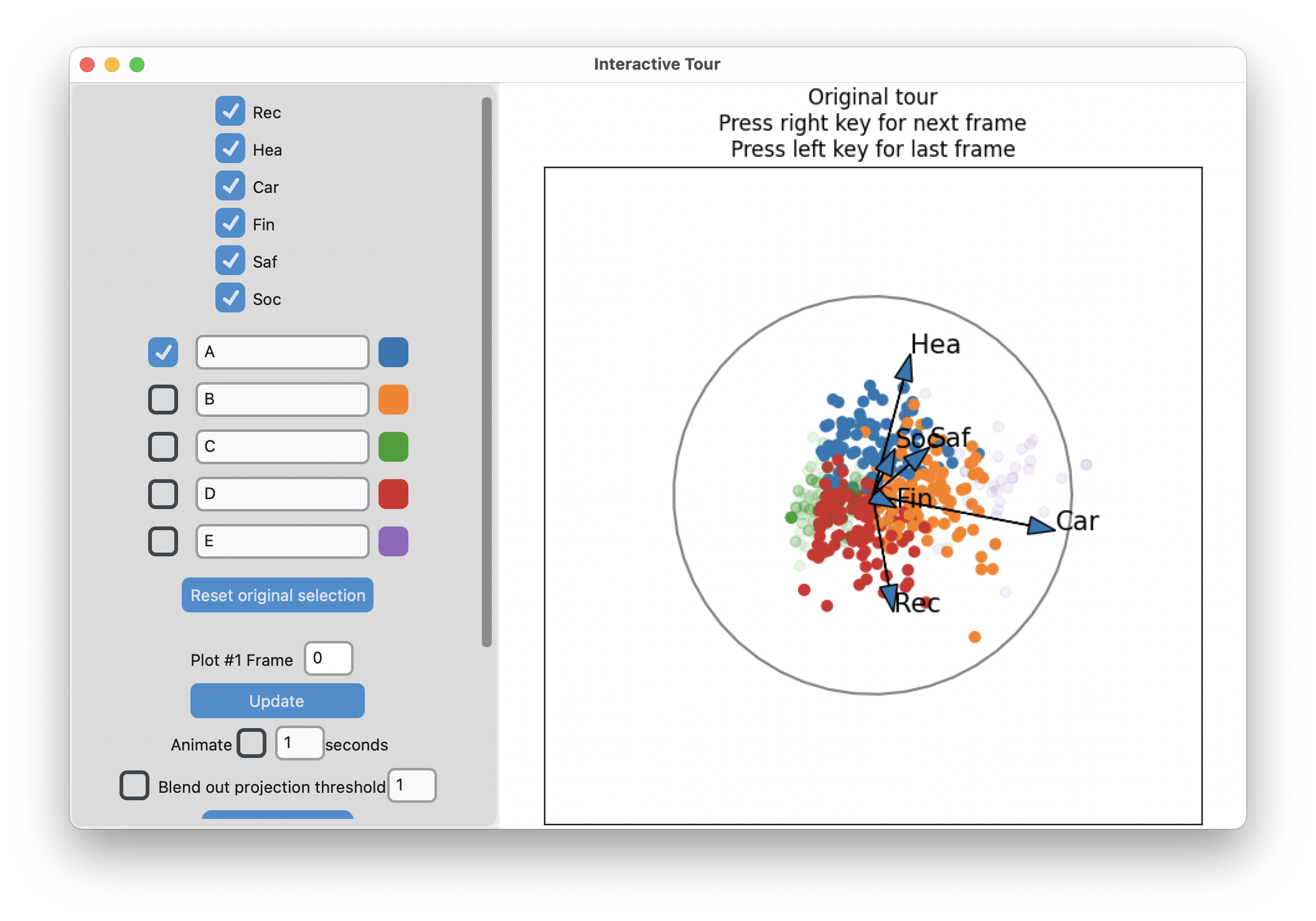
Search for meaning
Code
library(tibble)
library(dplyr)

risk_d  <- apply(risk, 2, function(x) (x-mean(x))/sd(x))

# Two clusters
nc <- 3
set.seed(1145)
r_km <- kmeans(risk_d, centers=nc,
               iter.max = 500, nstart = 5)

r_km_d <- risk |>
  as_tibble() |>
  mutate(cl = factor(r_km$cluster))

r_km_d |>
  pivot_longer(Rec:Soc, names_to = "var", values_to = "val") |>
  ggplot(aes(x=val, fill=cl)) +
    geom_bar() +
    facet_wrap(~var, ncol=3, scales="free_y") +
    scale_fill_manual(values = c("#377EB8", "#FF7F00", "#4DAF4A")) +
    xlab("") + ylab("") +
    theme_minimal() +
    theme(legend.position = "none",
          axis.text = element_blank())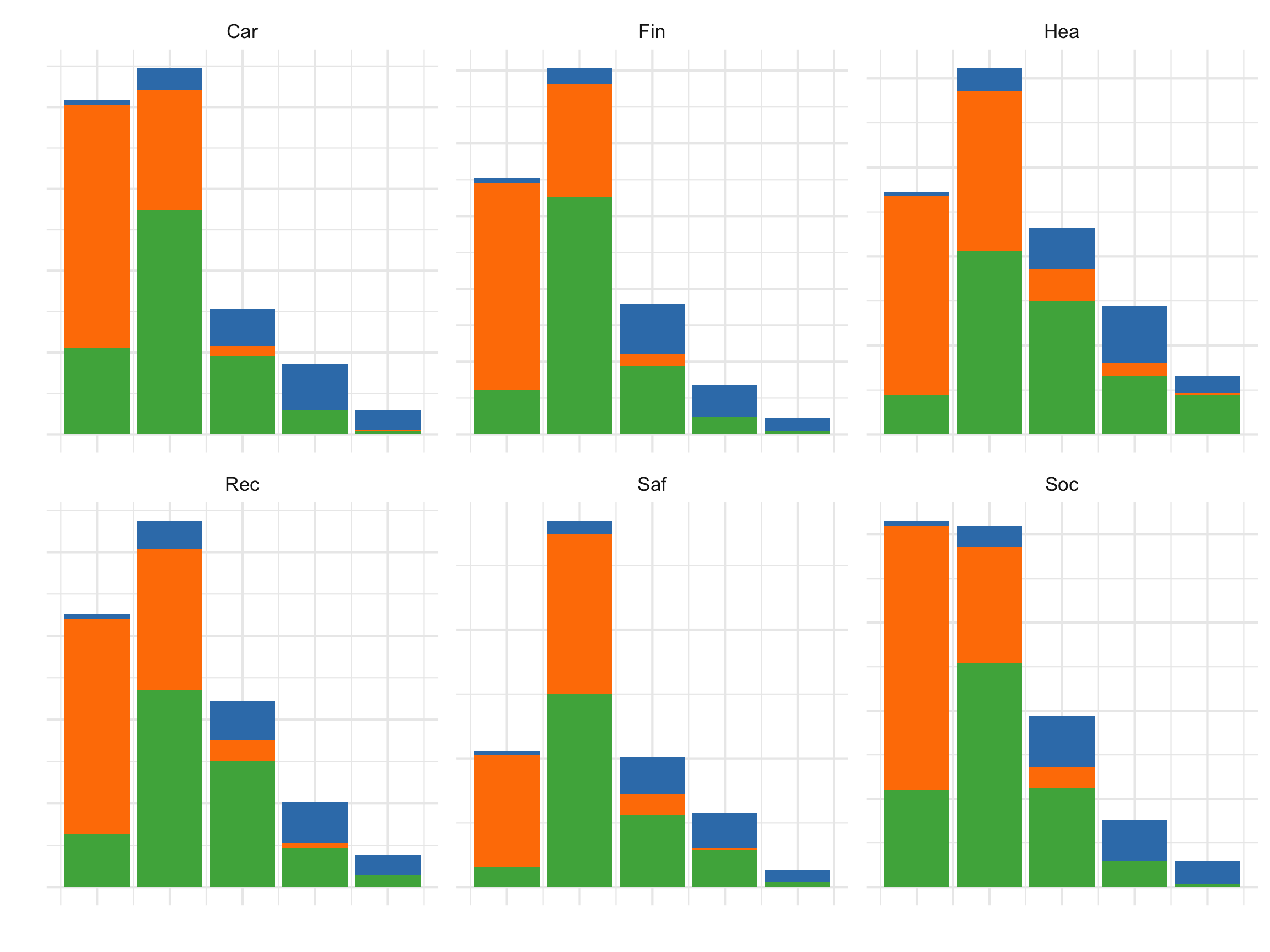
All the activities contribute to the segmentation into three clusters.
References and acknowledgements
- Medl, Cook, Laa (2025) Demonstrating the Capabilities of the Lionfish Software for Interactive Visualization of Market Segmentation Partitions
- Cook and Laa (2025) Interactively exploring high-dimensional data and models in R
- Wickham et al (2015) Visualizing statistical models: Removing the blindfold
- Flatland: A Romance of Many Dimensions (1884) Edwin Abbott
Slides made in Quarto, with code included.

This work is licensed under a Creative Commons Attribution-ShareAlike 4.0 International License.