| time | topic |
|---|---|
| 1:40-1:55 | Why, philosophy and benefits |
| 1:55-2:15 | Organising data to map variables to plots |
| 2:15-2:45 | Making a variety of plots |
| 2:45-3:10 | Do but don’t, and cognitive principles |
| 3:10-3:40 | COFFEE BREAK |
Creating data plots for effective decision-making using statistical inference with R
Why
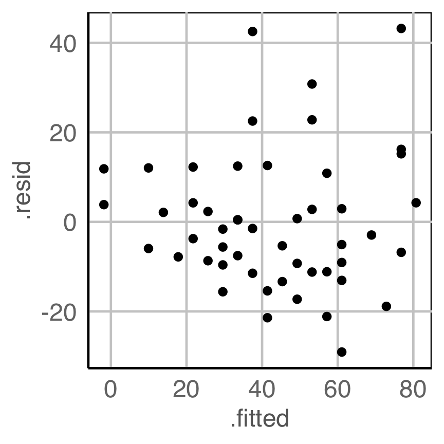
Is there any pattern in the residuals that indicate a problem with the model fit?
Why
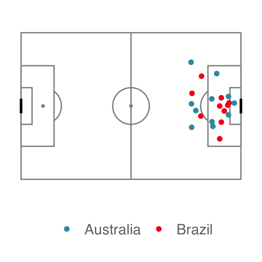
Do the teams have different shot styles?
(From the Women’s 2019 World Cup Soccer)
Why
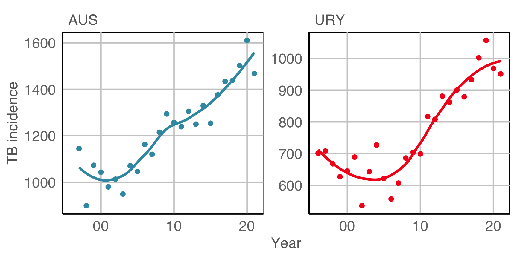
Is TB getting worse? (In Australia and Uruguay)
(From the World Health Organisation (WHO)]
Why
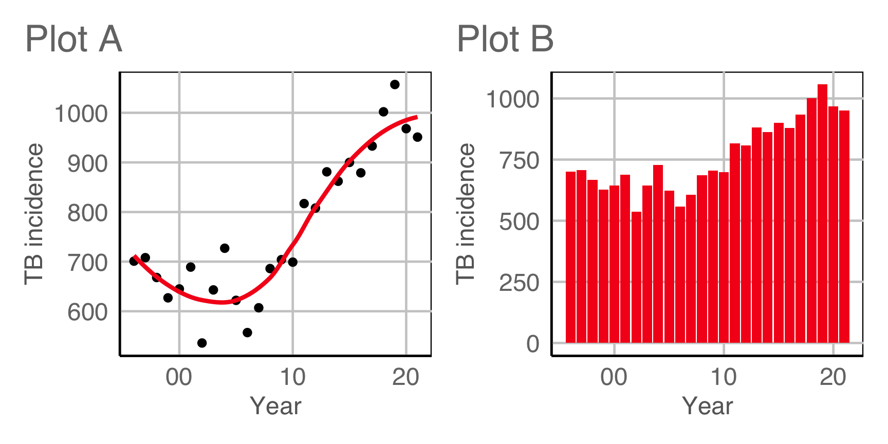
Which is the best display to answer the previous question?
These are the tools you need
![]()
install.packages("ggplot2")or better yet:
install.packages("tidyverse")- Define your plots using a grammar that maps variables in tidy data to elements of the plot.
- Wrangle your data into tidy form for clarity of plot specification.
space
install.packages("nullabor")- Compare your data plot to plots of null data.
- This checks whether what we see is real or spurious.
- Also allows for measuring the effectiveness of one plot design vs another.
Tidy data
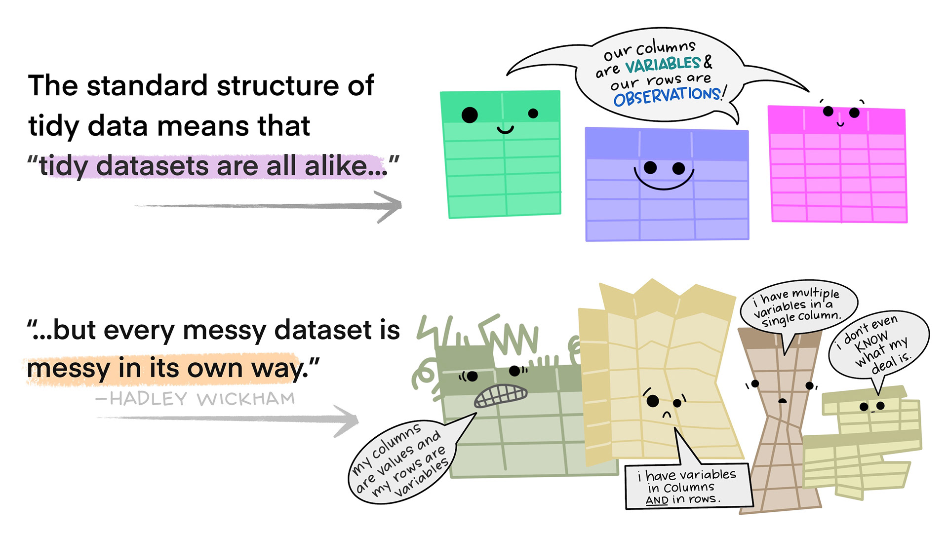
- Each variable forms a column
- Each observation forms a row
- Each type of observational unit forms a table. If you have data on multiple levels (e.g. data about houses and data about the rooms within those houses), these should be in separate tables.
Illustrations from the Openscapes blog Tidy Data for reproducibility, efficiency, and collaboration by Julia Lowndes and Allison Horst
Example 1A
How are variables mapped to create this plot?
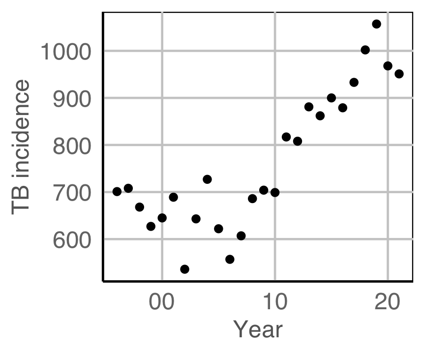
Code for URY TB plot
ggplot(tb_ury,
       aes(x=year,
           y=c_newinc)) +
  geom_point() +
  scale_x_continuous("Year",
    breaks = seq(1980, 2020, 10),
    labels = c("80", "90", "00", "10", "20")) +
  ylab("TB incidence")
Example 1B
How are variables mapped to create this plot?
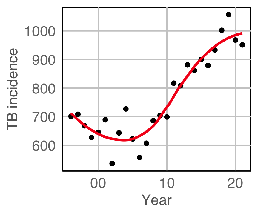
Code for URY TB plot
ggplot(tb_ury, aes(x=year, y=c_newinc)) +
  geom_point() +
  geom_smooth(se=F, colour="#F5191C") +
  scale_x_continuous("Year", breaks = seq(1980, 2020, 10), labels = c("80", "90", "00", "10", "20")) +
  ylab("TB incidence")
Example 2A
How are variables mapped to create this plot?
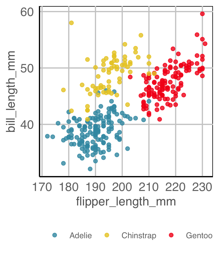
Code for penguins plot
ggplot(penguins,
       aes(x=flipper_length_mm,
           y=bill_length_mm,
           color=species)) +
  geom_point(alpha=0.8) +
  scale_color_discrete_divergingx(palette="Zissou 1") +
  theme(legend.title = element_blank(),
        legend.position = "bottom",
        legend.direction = "horizontal",
        legend.text = element_text(size="8"))
Example 2B
How are variables mapped to create this plot?
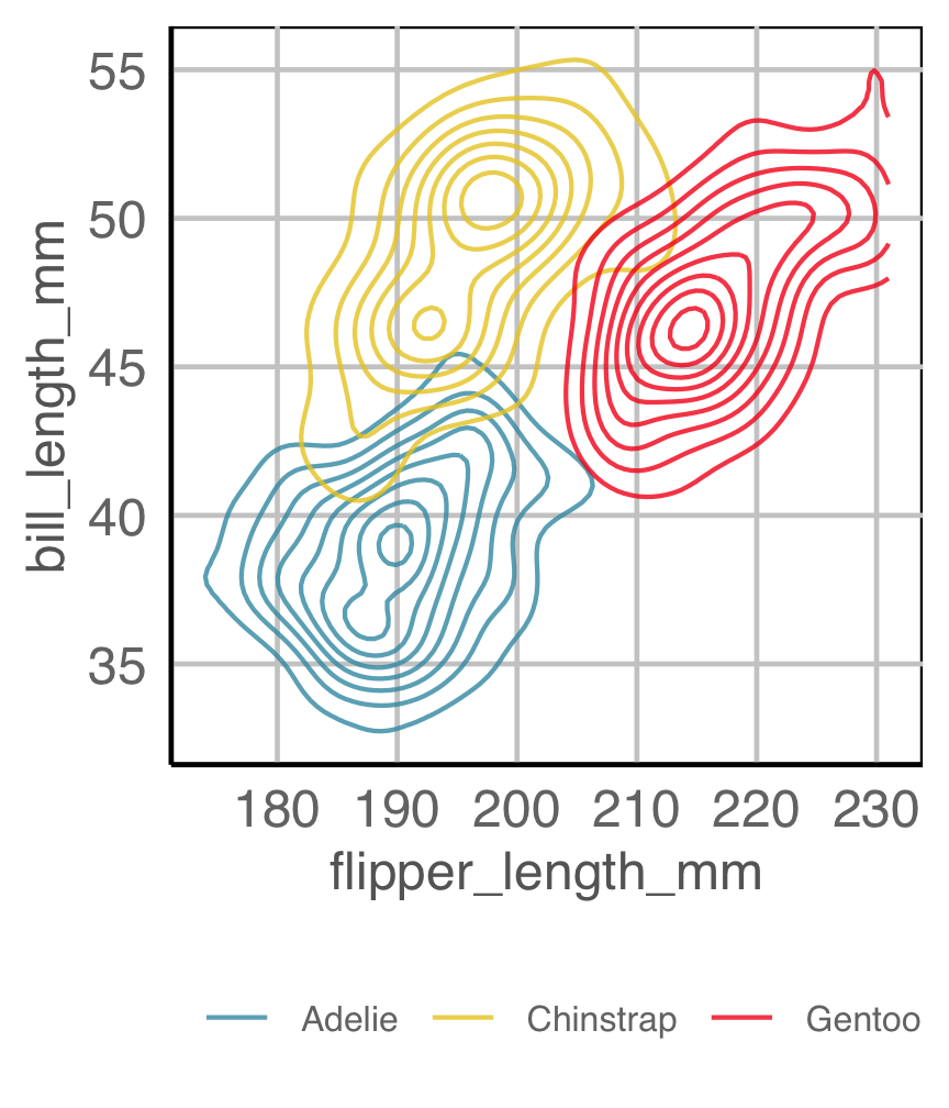
Code for penguins plot
ggplot(penguins,
       aes(x=flipper_length_mm,
           y=bill_length_mm,
           color=species)) +
  geom_density2d(alpha=0.8) +
  scale_color_discrete_divergingx(palette="Zissou 1") +
  theme(legend.title = element_blank(),
        legend.position = "bottom",
        legend.direction = "horizontal",
        legend.text = element_text(size="8"))
Example 3 (3/5)
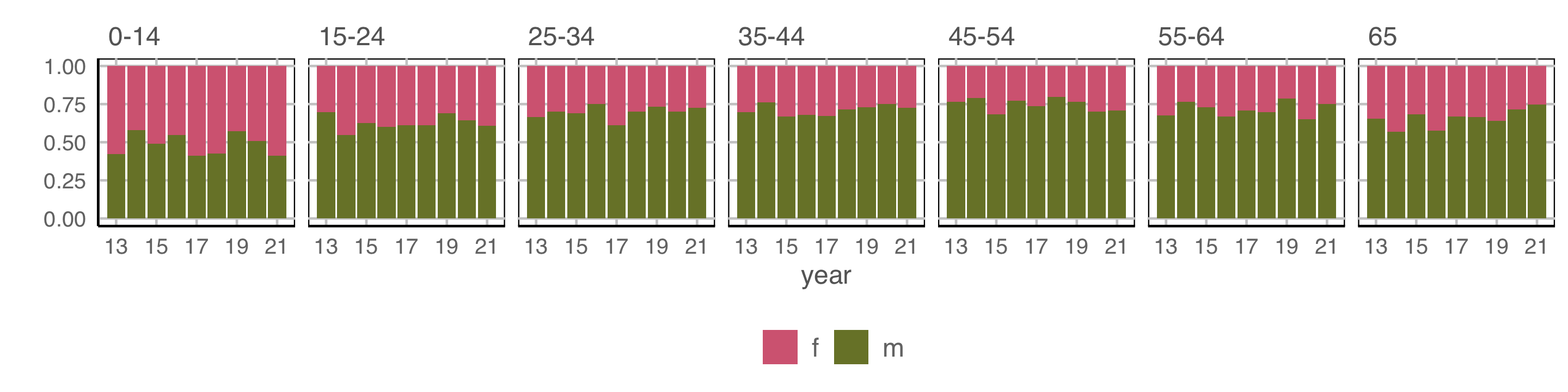
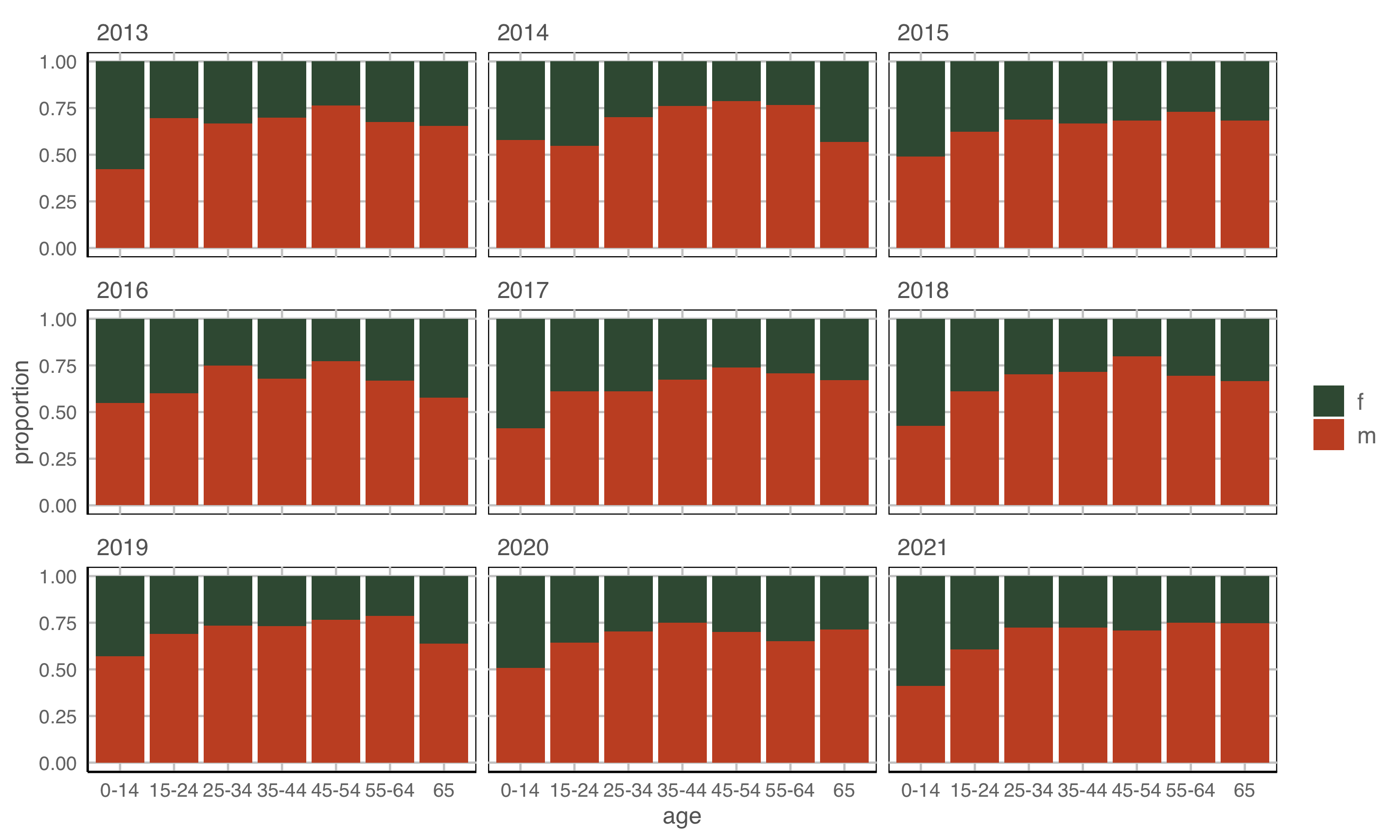
How are variables mapped to create this plot?
geom: bar/position=“fill”
year to x \(~~~~\) count to y \(~~~~\) fill to sex \(~~~~\) facet by age
Observations: More incidence among males, especially with age. No clear temporal trend.
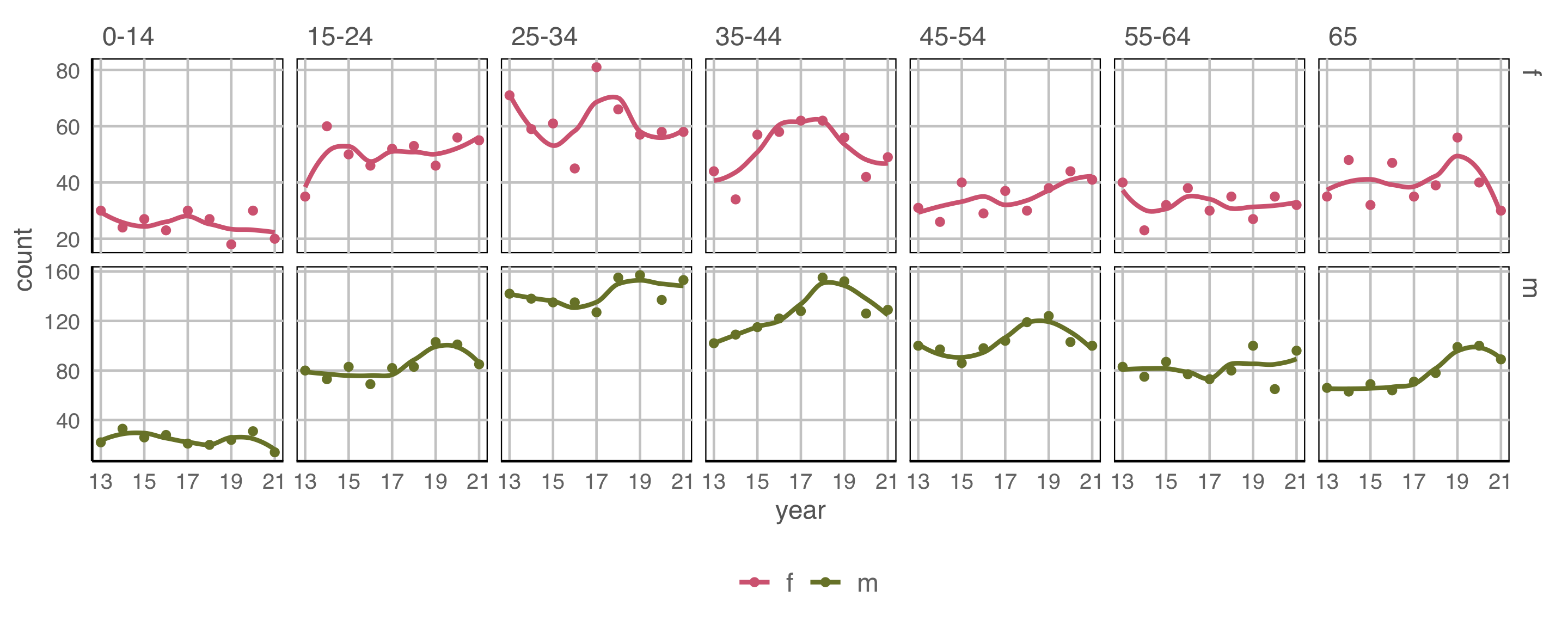
Example 3 (4/5)
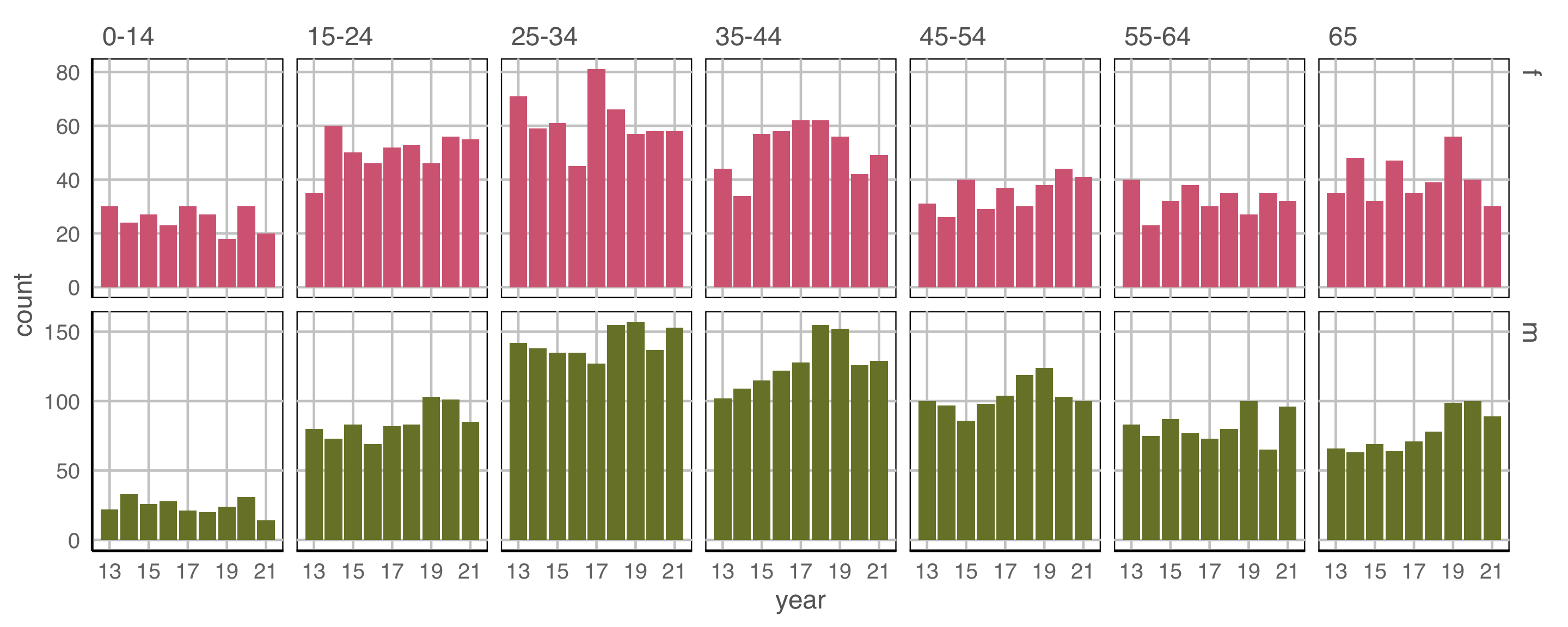
geom: bar
year to x \(~\) count to y \(~\) fill and facet to sex \(~\) facet by age
Incidence is higher in the middle age groups.
Where’s the temporal trend?
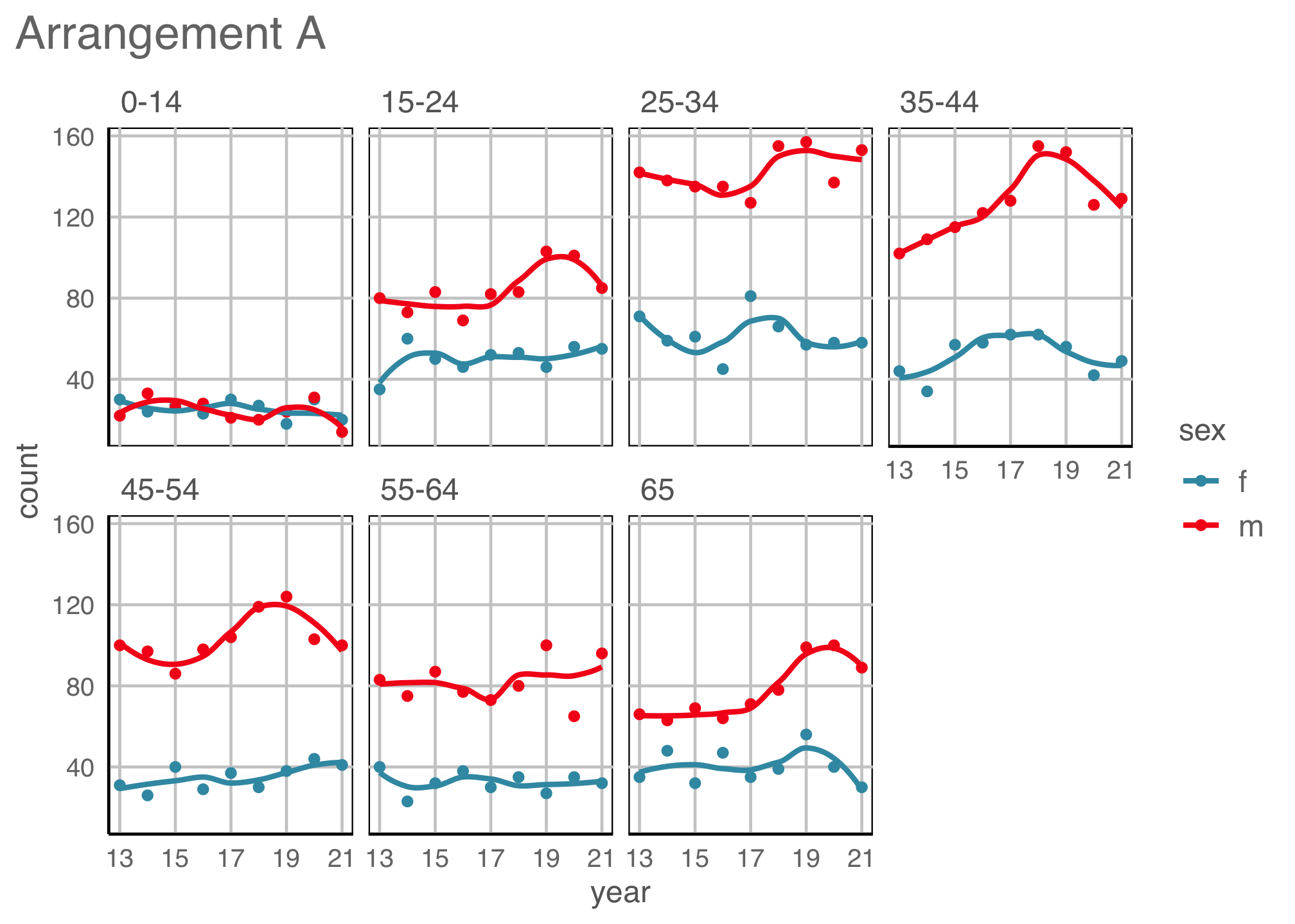
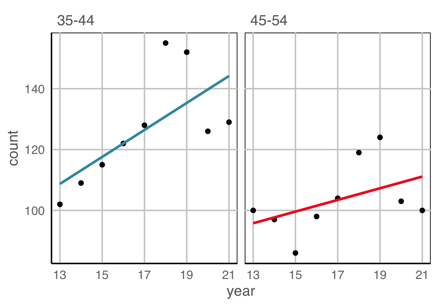
Example 3 (5/5)
geom: point, smooth
year to x \(~\) count to y \(~\) colour and facet to sex \(~\) facet by age
Temporal trend is mostly with males.
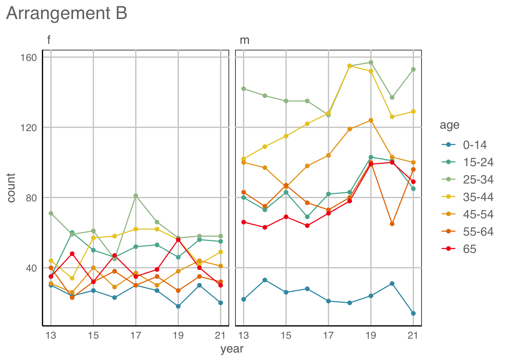
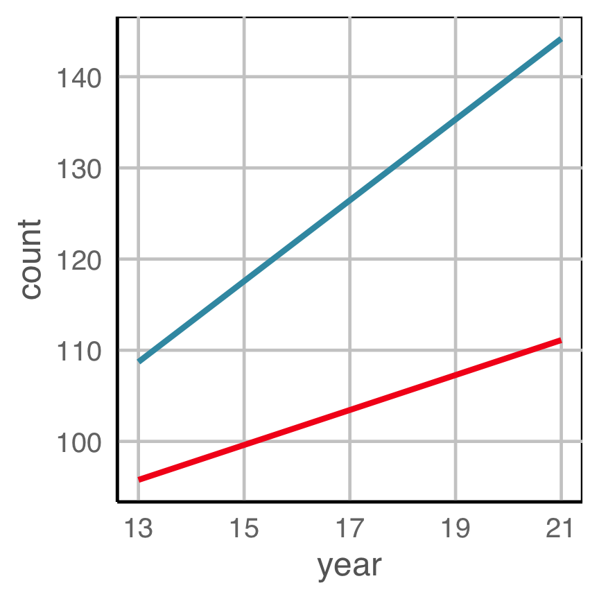
Re-arrangements
Hierarchy of mappings


Cleveland and McGill (1984)
Illustrations made by Emi Tanaka
Proximity
Place elements that you want to compare close to each other. If there are multiple comparisons to make, you need to decide which one is most important.
Change blindness
Making comparisons across plots requires the eye to jump from one focal point to another. It may result in not noticing differences.
YOUR TURN
Take the following plot, and make it more difficult to read.
library(nullabor)
data(electoral)
ggplot(electoral$polls,
       aes(x=Democrat,
           y=Margin)) +
  geom_boxplot()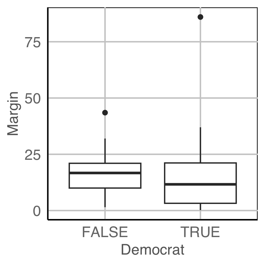
End of session 1

This work is licensed under a Creative Commons Attribution-ShareAlike 4.0 International License.