Working with big data

Session 3: Statistical modeling and machine learning

Professor Di Cook

Department of Econometrics and Business Statistics

Outline

  • Framing problems
  • Tidy models formulation
  • Case study: hotel bookings
  • Unsupervised learning
  • Temporal data and forecasting

Framing the problem

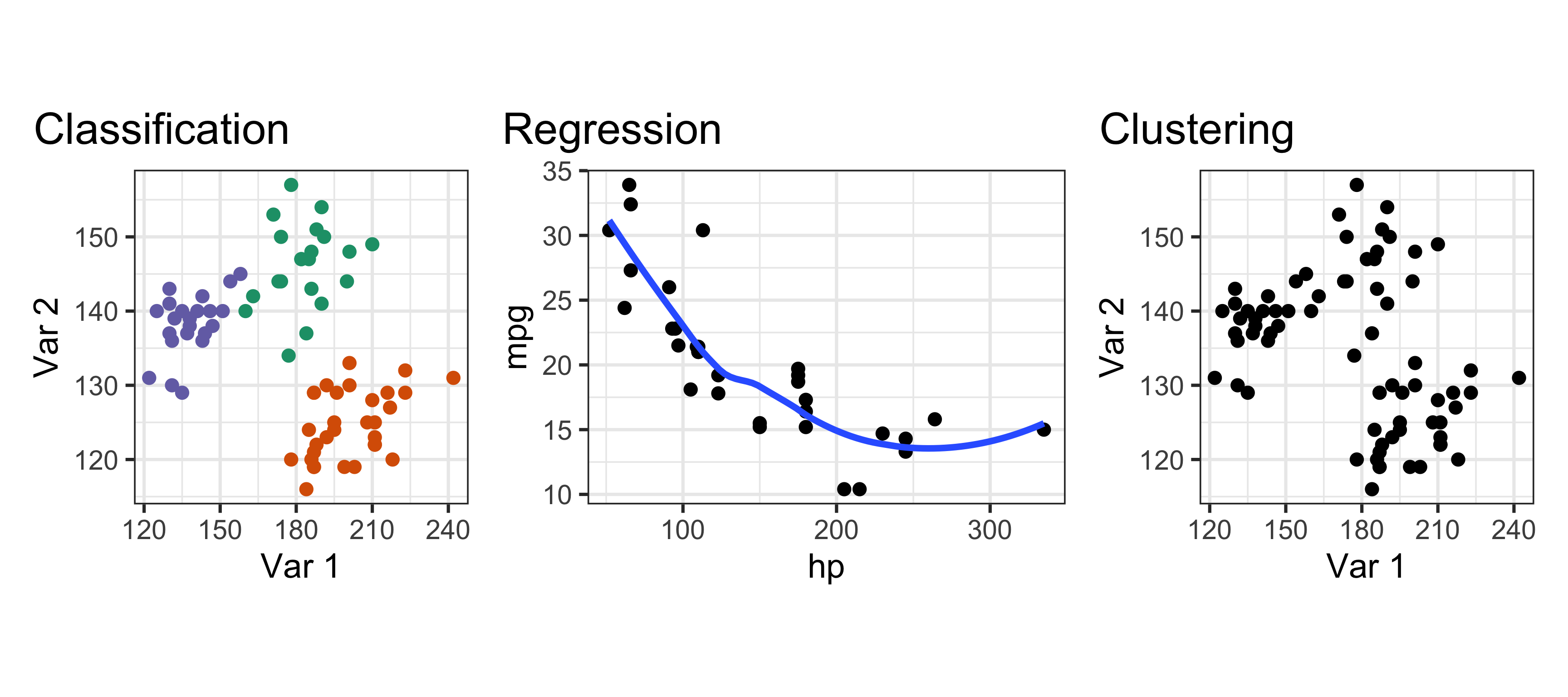
  1. Supervised learning
    1. classification: categorical \(y_i\) is available for all \(x_i\)
    2. regression: continuous \(y_i\) is available for all \(x_i\)
  2. Unsupervised learning: \(y_i\) unavailable for all \(x_i\)
What type of problem is this? (1/3)

Food servers’ tips in restaurants may be influenced by many factors, including the nature of the restaurant, size of the party, and table locations in the restaurant. Restaurant managers need to know which factors matter when they assign tables to food servers. For the sake of staff morale, they usually want to avoid either the substance or the appearance of unfair treatment of the servers, for whom tips (at least in restaurants in the United States) are a major component of pay.

In one restaurant, a food server recorded the following data on all customers they served during an interval of two and a half months in early 1990. The restaurant, located in a suburban shopping mall, was part of a national chain and served a varied menu. In observance of local law the restaurant offered seating in a non-smoking section to patrons who requested it. Each record includes a day and time, and taken together, they show the server’s work schedule.

What is \(y\)? What is \(x\)?

What type of problem is this? (2/3)

Every person monitored their email for a week and recorded information about each email message; for example, whether it was spam, and what day of the week and time of day the email arrived. We want to use this information to build a spam filter, a classifier that will catch spam with high probability but will never classify good email as spam.

What is \(y\)? What is \(x\)?

What type of problem is this? (3/3)

A health insurance company collected the following information about households:

  • Total number of doctor visits per year
  • Total household size
  • Total number of hospital visits per year
  • Average age of household members
  • Total number of gym memberships
  • Use of physiotherapy and chiropractic services
  • Total number of optometrist visits

The health insurance company wants to provide a small range of products, containing different bundles of services and for different levels of cover, to market to customers.

What is \(y\)? What is \(x\)?

Model form

All (data-centric) models have a fitted values and residuals.

\[y = f(x_1, x_2, ..., x_p) + \varepsilon\]

where \(y\) is the observed response, \(x_1, ..., x_p\) are the observed values of \(p\) predictors and \(\varepsilon\) is the error. We conventionally use \(n\) to specfify the sample size.

  • We might not be able to exactly specify \(f\) in some forms
  • The residuals have some ideal properties, such as uniform over data space, symmetric around the fitted value, and some models impose a distribution.

Accuracy vs interpretability

Predictive accuracy

The primary purpose is to be able to predict \(\widehat{Y}\) for new data. And we’d like to do that well! That is, accurately.
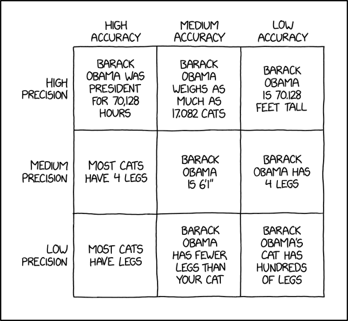
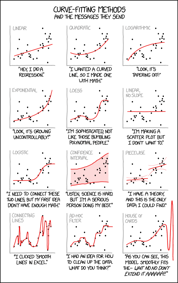
From XKCD

Interpretability

Almost equally important is that we want to understand the relationship between \({\mathbf X}\) and \(Y\). The simpler model that is (almost) as accurate is the one we choose, always.

Person: Why did you predict 42 for this value?

Computer: Awkward silence
From Interpretable Machine Learning

Parametric vs non-parametric

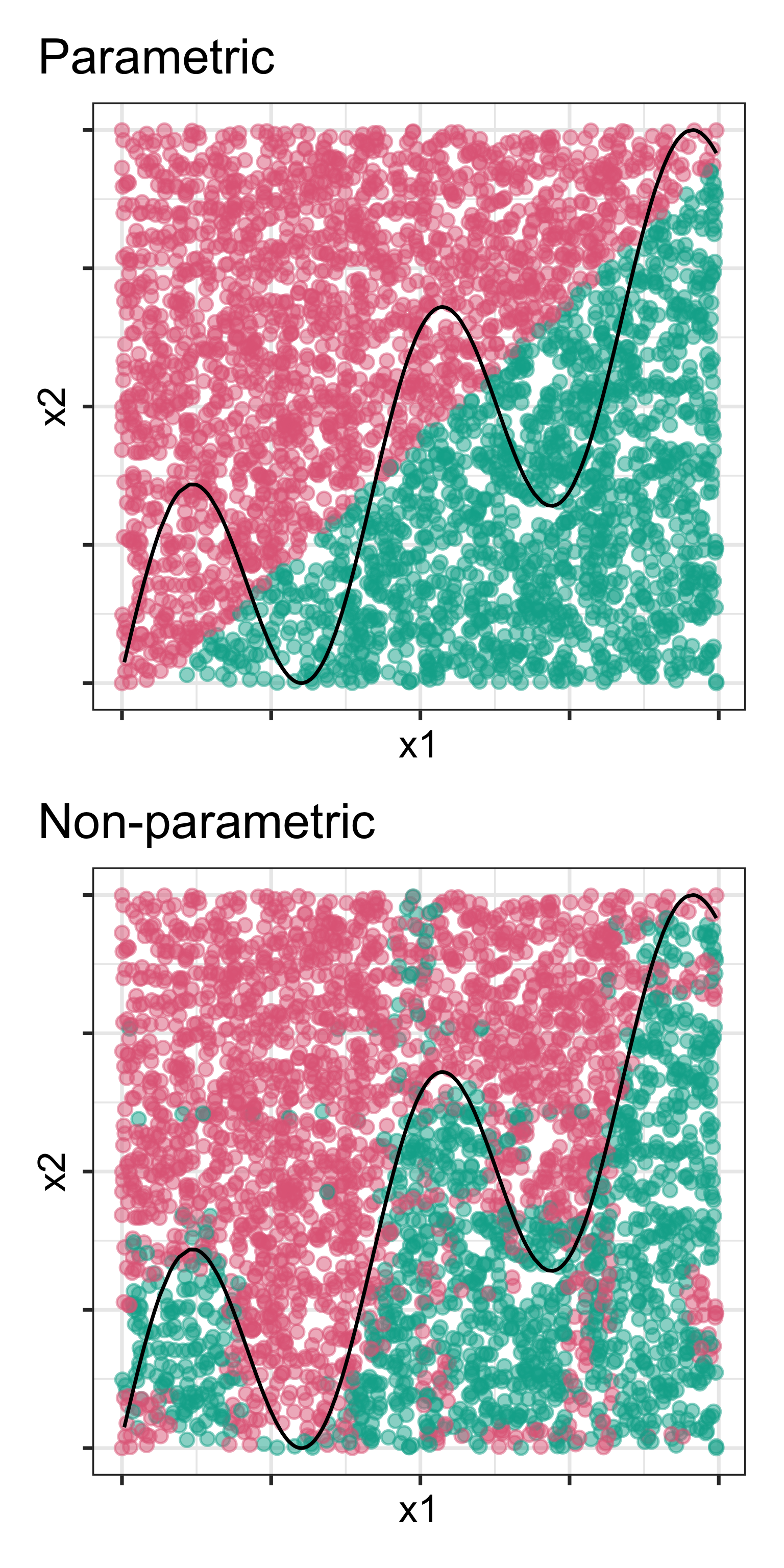
Parametric methods

  • Assume that the model takes a specific form
  • Fitting then is a matter of estimating the parameters of the model
  • Generally considered to be less flexible
  • If assumptions are wrong, performance likely to be poor

Non-parametric methods

  • No specific assumptions
  • Allow the data to specify the model form, without being too rough or wiggly
  • More flexible
  • Generally needs more observations, and not too many variables
  • Easier to over-fit

From XKCD

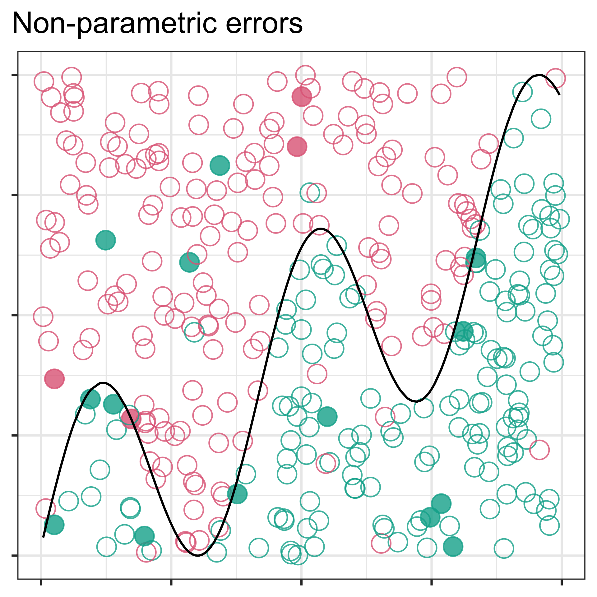
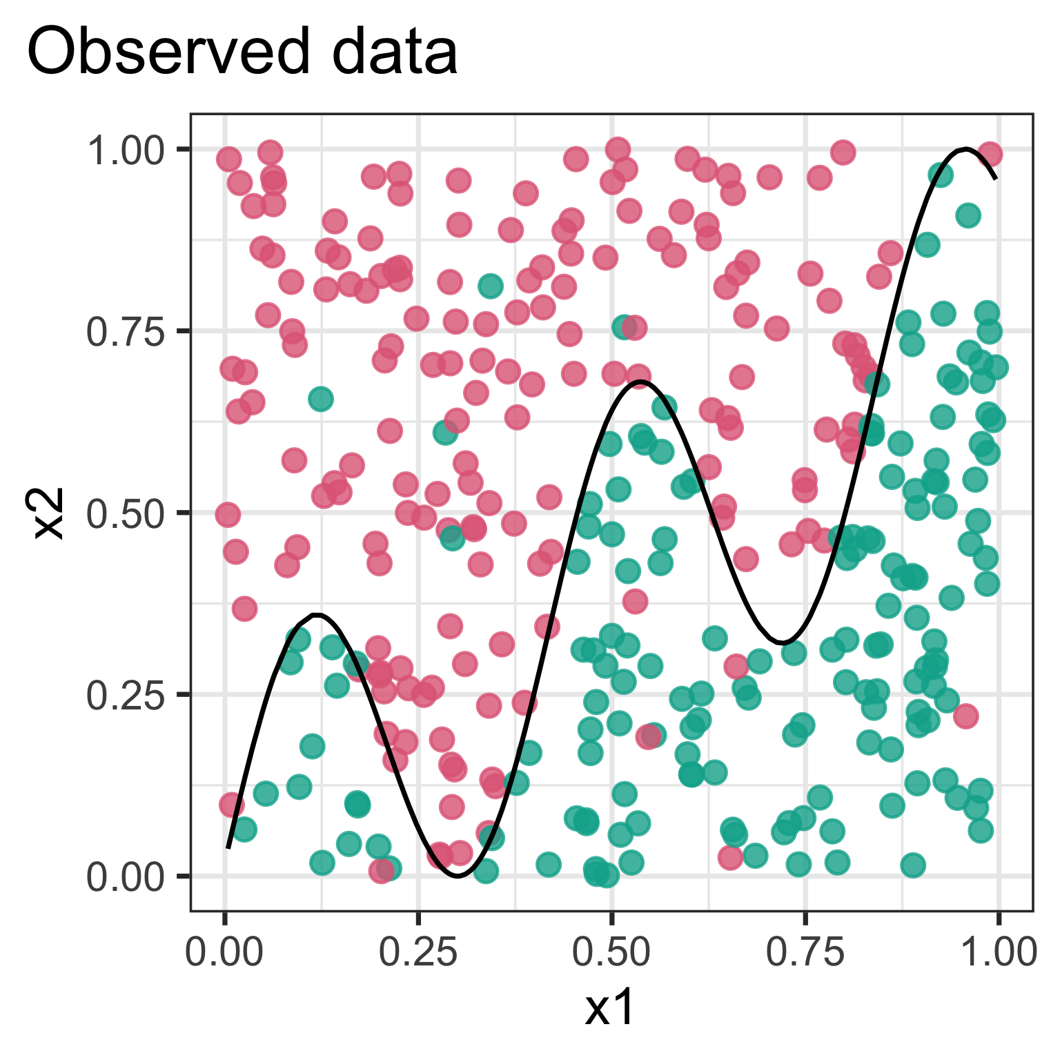
Black line is true boundary.


Grids (right) show boundaries for two different models.
Reducible vs irreducible error
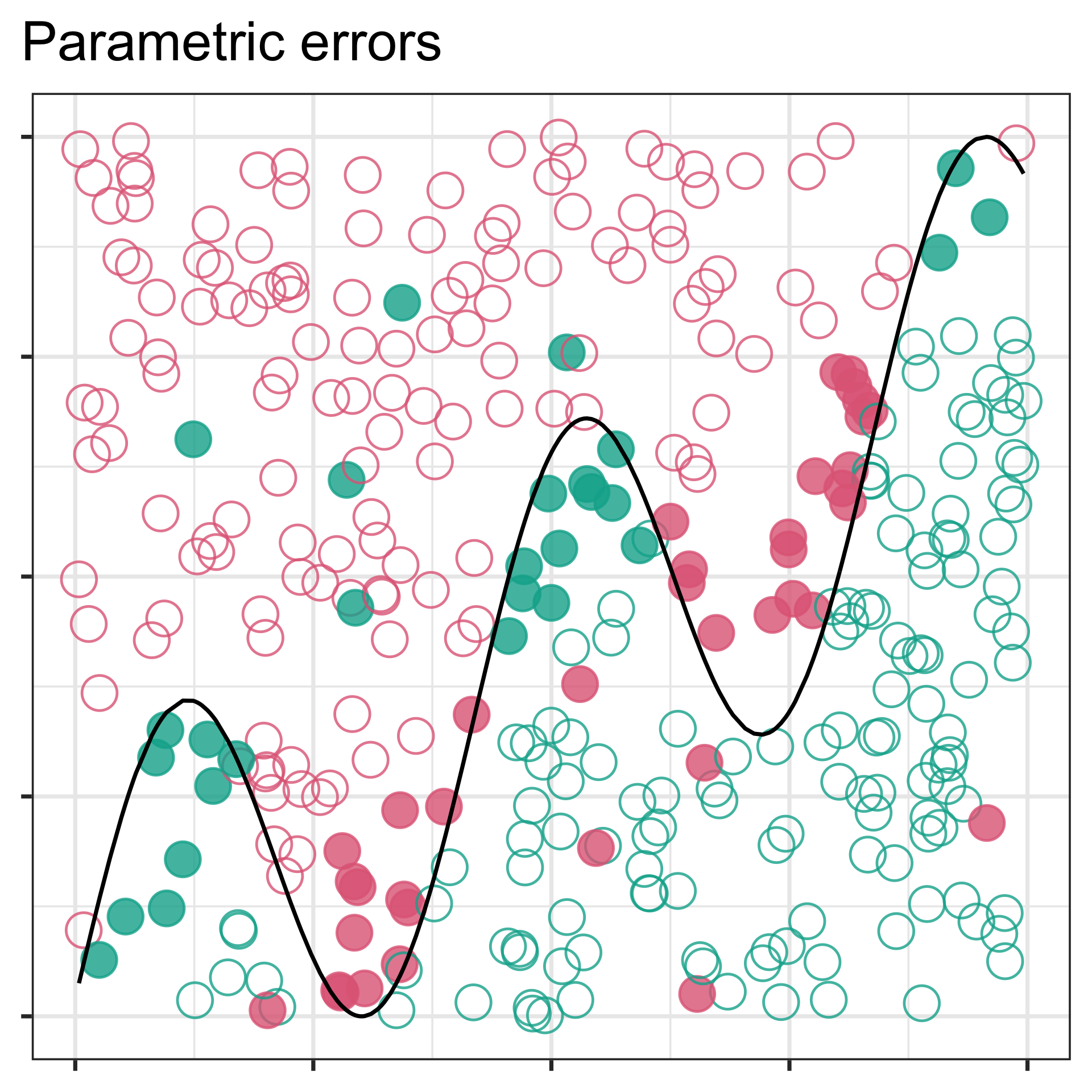
If the model form is incorrect, the error (solid circles) may arise from wrong shape, and is thus reducible. Irreducible means that we have got the right model and mistakes (solid circles) are random noise.

Flexible vs inflexible
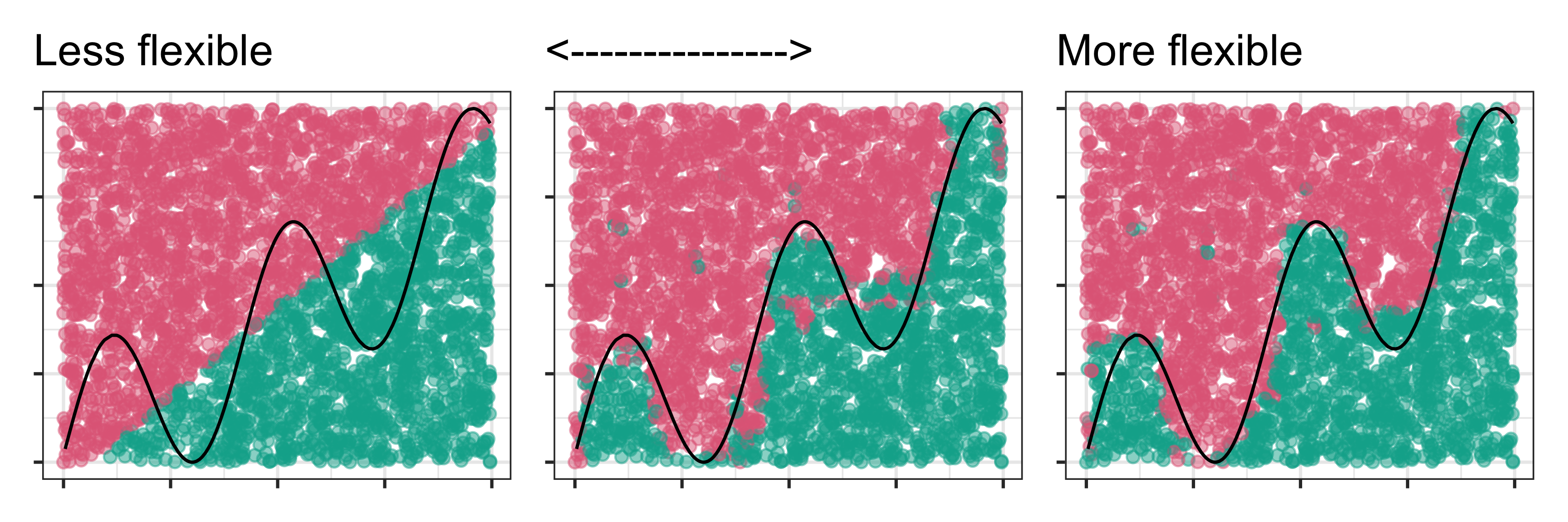
Parametric models tend to be less flexible but non-parametric models can be flexible or less flexible depending on parameter settings.

Bias vs variance
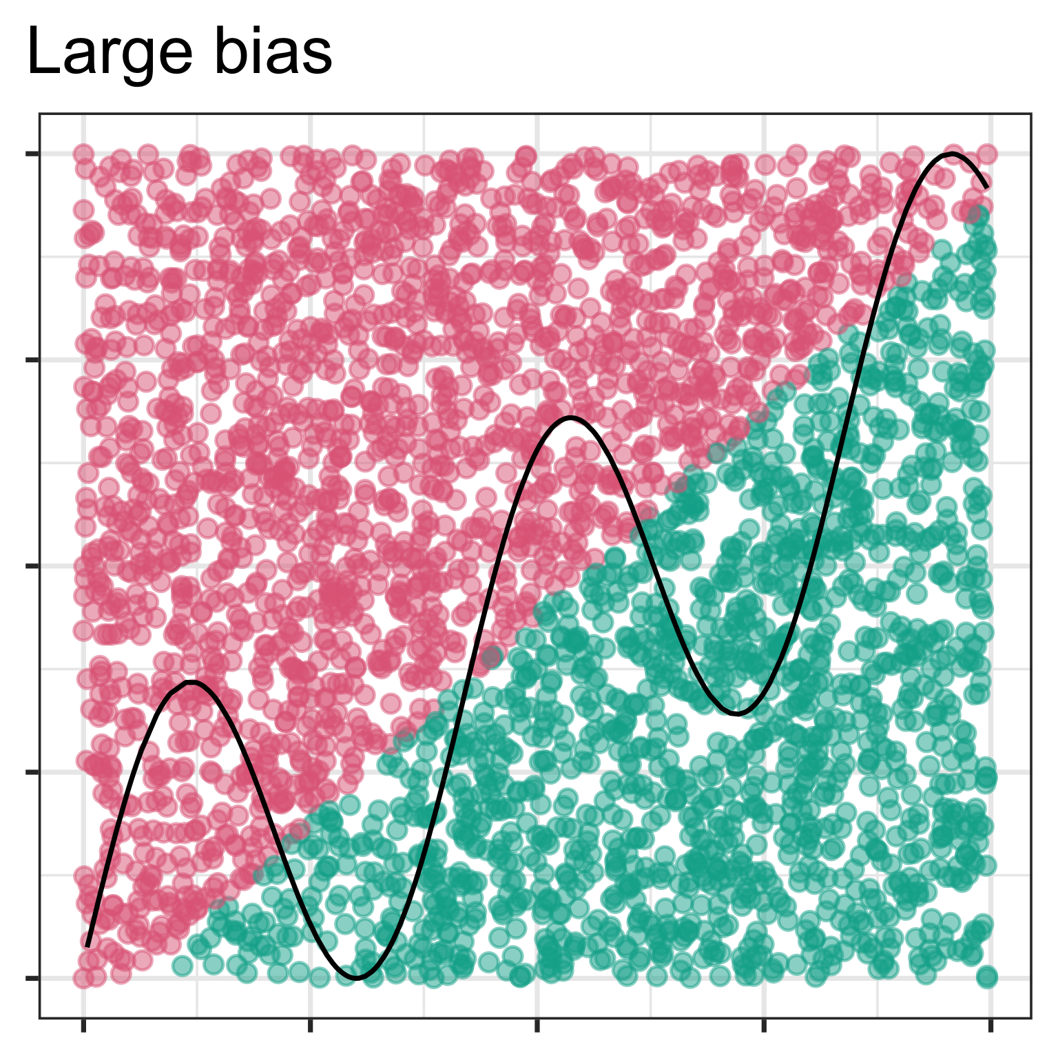
Bias is the error that is introduced by modeling a complicated problem by a simpler problem.

  • For example, linear regression assumes a linear relationship and perhaps the relationship is not exactly linear.
  • In general, but not always, the more flexible a method is, the less bias it will have because it can fit a complex shape better.

Variance refers to how much your estimate would change if you had different training data. Its measuring how much your model depends on the data you have, to the neglect of future data.

  • In general, the more flexible a method is, the more variance it has.
  • The size of the training data can impact on the variance.

Bias

When you impose too many assumptions with a parametric model, or use an inadequate non-parametric model, such as not letting an algorithm converge fully.
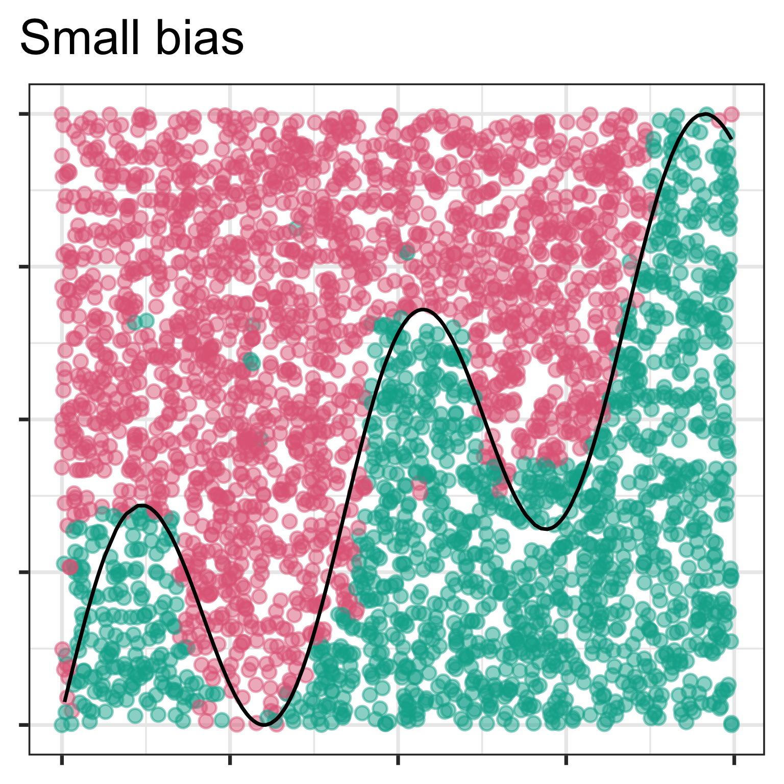
When the model closely captures the true shape, with a parametric model or a flexible model.

Variance
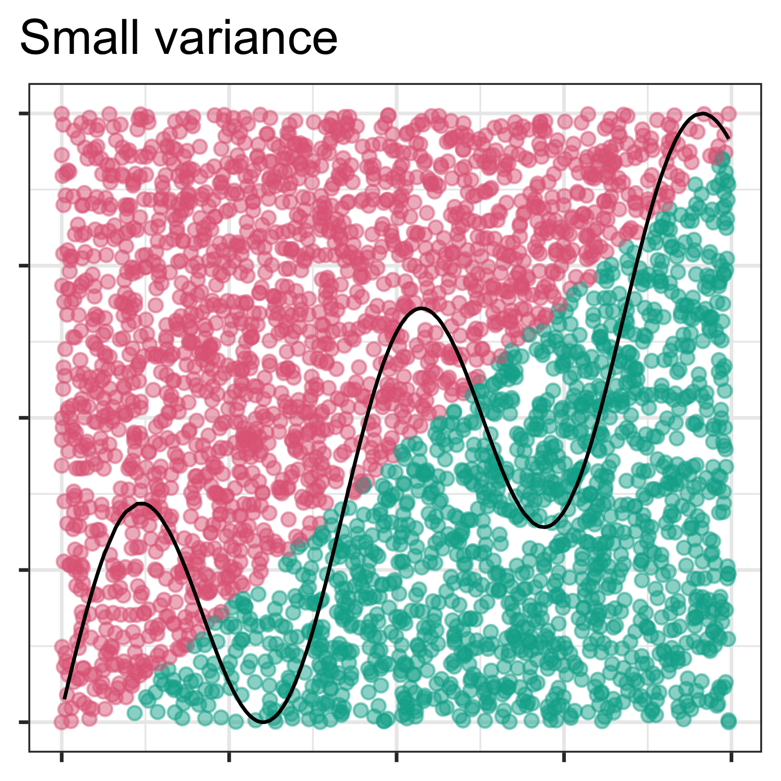
This fit will be virtually identical even if we had a different training sample.
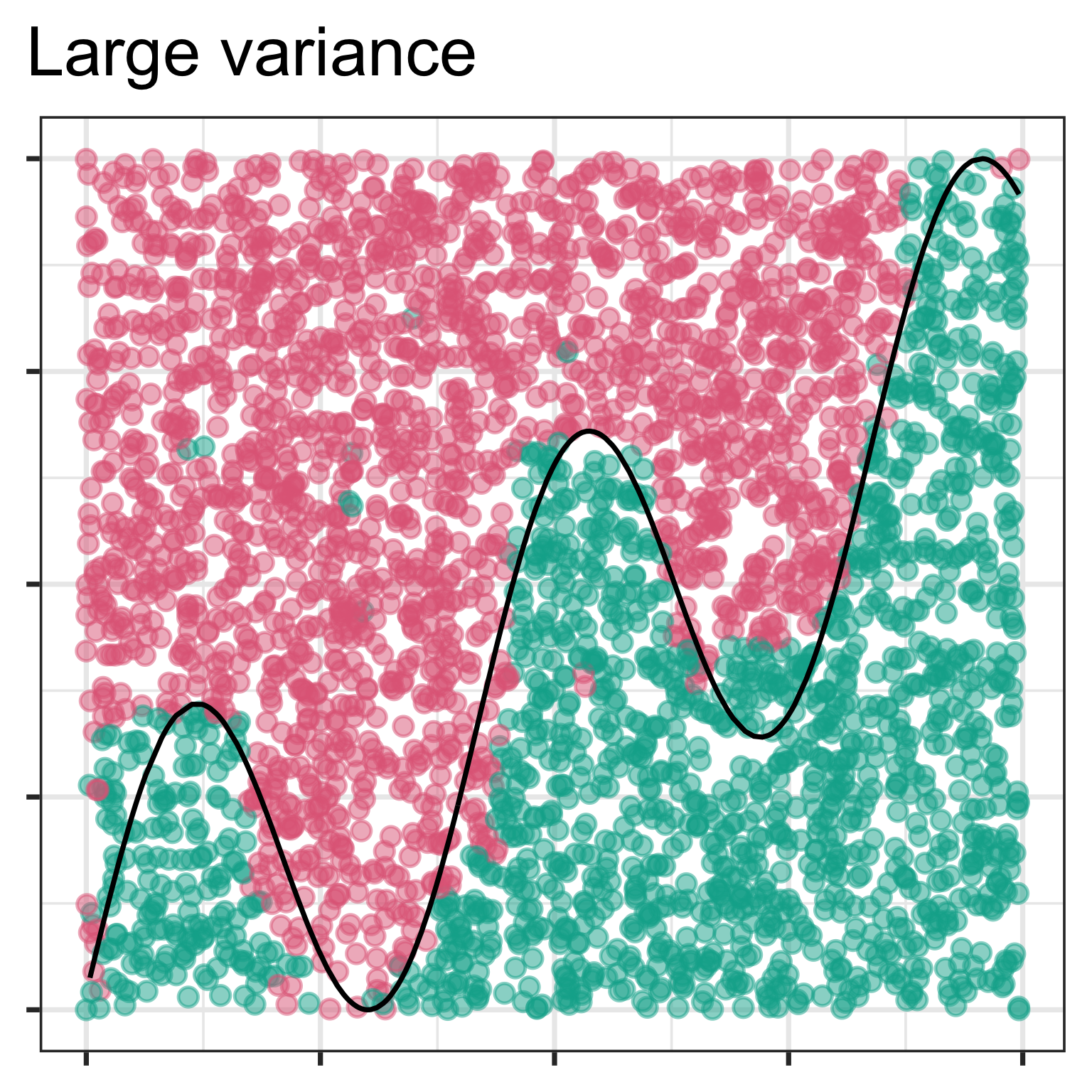
Likely to get a very different model if a different training set is used.

Training vs test splits

When data are reused for multiple tasks, instead of carefully spent from the finite data budget, certain risks increase, such as the risk of accentuating bias or compounding effects from methodological errors. Julia Silge

  • Training set: Used to fit the model, might be also broken into a validation set for frequent assessment of fit.
  • Test set: Purely used to assess final models performance on future data.

Training vs test splits

d_bal <- tibble(y=c(rep("A", 6), rep("B", 6)),
                x=c(runif(12)))
d_bal$y
 [1] "A" "A" "A" "A" "A" "A" "B" "B" "B" "B" "B" "B"
set.seed(130)
d_bal_split <- initial_split(d_bal, prop = 0.70)
training(d_bal_split)$y
[1] "A" "A" "B" "A" "B" "A" "B" "A"
testing(d_bal_split)$y
[1] "A" "B" "B" "B"
d_unb <- tibble(y=c(rep("A", 2), rep("B", 10)),
                x=c(runif(12)))
d_unb$y
 [1] "A" "A" "B" "B" "B" "B" "B" "B" "B" "B" "B" "B"
set.seed(132)
d_unb_split <- initial_split(d_unb, prop = 0.70)
training(d_unb_split)$y
[1] "B" "B" "A" "B" "B" "A" "B" "B"
testing(d_unb_split)$y
[1] "B" "B" "B" "B"

Always stratify splitting by sub-groups, especially response variable classes.

d_unb_strata <- initial_split(d_unb, prop = 0.70, strata=y)
training(d_unb_strata)$y
[1] "A" "B" "B" "B" "B" "B" "B" "B"
testing(d_unb_strata)$y
[1] "A" "B" "B" "B"

Measuring accuracy for categorical response

Compute \(\widehat{y}\) from training data, \(\{(y_i, {\mathbf x}_i)\}_{i = 1}^n\). The error rate (fraction of misclassifications) to get the Training Error Rate

\[\text{Error rate} = \frac{1}{n}\sum_{i=1}^n I(y_i \ne \widehat{y}({\mathbf x}_i))\]

A better estimate of future accuracy is obtained using test data to get the Test Error Rate.


Training error will usually be smaller than test error. When it is much smaller, it indicates that the model is too well fitted to the training data to be accurate on future data (over-fitted).

Confusion (misclassification) matrix

predicted
1 0
true 1 a b
0 c d

Consider 1=positive (P), 0=negative (N).

  • True positive (TP): a
  • True negative (TN): d
  • False positive (FP): c (Type I error)
  • False negative (FN): b (Type II error)
  • Sensitivity, recall, hit rate, or true positive rate (TPR): TP/P = a/(a+b)
  • Specificity, selectivity or true negative rate (TNR): TN/N = d/(c+d)
  • Prevalence: P/(P+N) = (a+b)/(a+b+c+d)
  • Accuracy: (TP+TN)/(P+N) = (a+d)/(a+b+c+d)
  • Balanced accuracy: (TPR + TNR)/2 (or average class errors)

Confusion (misclassification) matrix: computing

Two classes

# Write out the confusion matrix in standard form
#| label: oconfusion-matrix-tidy
cm <- a2 |> count(y, pred) |>
  group_by(y) |>
  mutate(cl_acc = n[pred==y]/sum(n)) 
cm |>
  pivot_wider(names_from = pred, 
              values_from = n) |>
  select(y, bilby, quokka, cl_acc)
# A tibble: 2 × 4
# Groups:   y [2]
  y      bilby quokka cl_acc
  <fct>  <int>  <int>  <dbl>
1 bilby      9      3  0.75 
2 quokka     5     10  0.667
accuracy(a2, y, pred) |> pull(.estimate)
[1] 0.7
bal_accuracy(a2, y, pred) |> pull(.estimate)
[1] 0.71
sens(a2, y, pred) |> pull(.estimate)
[1] 0.75
specificity(a2, y, pred) |> pull(.estimate)
[1] 0.67

More than two classes

# Write out the confusion matrix in standard form
cm3 <- a3 |> count(y, pred) |>
  group_by(y) |>
  mutate(cl_err = n[pred==y]/sum(n)) 
cm3 |>
  pivot_wider(names_from = pred, 
              values_from = n, values_fill=0) |>
  select(y, bilby, quokka, numbat, cl_err)
# A tibble: 3 × 5
# Groups:   y [3]
  y      bilby quokka numbat cl_err
  <fct>  <int>  <int>  <int>  <dbl>
1 bilby      9      3      0  0.75 
2 numbat     0      2      6  0.75 
3 quokka     5     10      0  0.667
accuracy(a3, y, pred) |> pull(.estimate)
[1] 0.71
bal_accuracy(a3, y, pred) |> pull(.estimate)
[1] 0.78

Receiver Operator Curves (ROC)

The balance of getting it right, without predicting everything as positive.

From wikipedia

Need predictive probabilities, probability of being each class.
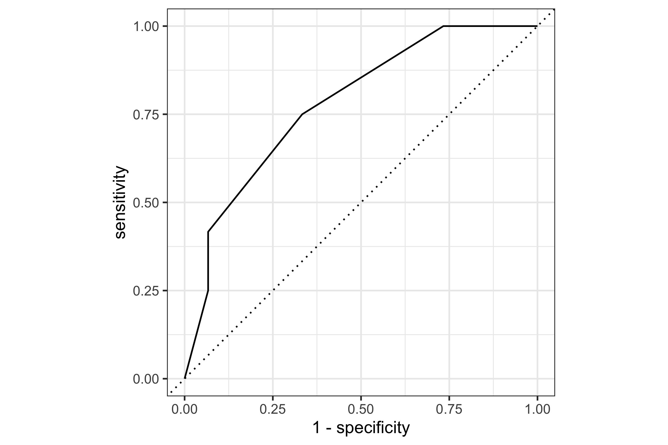
a2 |> slice_head(n=3)
# A tibble: 3 × 4
  y     pred  bilby quokka
  <fct> <fct> <dbl>  <dbl>
1 bilby bilby   0.9    0.1
2 bilby bilby   0.8    0.2
3 bilby bilby   0.9    0.1
roc_curve(a2, y, bilby) |>
  autoplot()

Preparing to fit model: IDA


The first thing to do with data is to look at them …. usually means tabulating and plotting the data in many different ways to see what’s going on. With the wide availability of computer packages and graphics nowadays there is no excuse for ducking the labour of this preliminary phase, and it may save some red faces later.

Crowder, M. J. & Hand, D. J. (1990) “Analysis of Repeated Measures”

Pre-processing steps

  • Handle missing values: most modeling methods require complete data.
  • Decide on an appropriate model type: Explore relationships between response and predictors: nonlinear, clustered. Different shapes indicate which model will likely fit better
  • Check model assumptions
  • Feature engineering: Do you have the predictors needed, or could you create better predictors? Should some variables be transformed.
  • Check for anomalies: Are there some observations that are unusal and might affect the fit? (We’ll do this at the end, too.)
  • Split data: Decide on how much of the data should be used for training a model, validation, and testing.
  • Reduce the number of predictors: Too many predictors can result in over-fitting the training data.

Check model assumptions

  • Statistical models tend to be less flexible. They impose strict assumptions, such as linear form, and Gaussian errors. Check by plotting response vs predictors to check the relationship is what is assumed, and spread is uniform.
  • Non-parametric models, and algorithms, don’t explicitly impose assumptions, but the process imposes constraints, that means fit will fail if not satisfied. For example, tree-based methods mostly use a single variable for any split. If the relationship with the response is best explained by a combination of variables, this will result in a poor fit.

Feature engineering

Creating new variables to get better fits is a special skill! Sometimes automated by the method. All are transformations of the original variables. (See tidymodels steps.)

  • scaling, centering, sphering (step_pca)
  • log or square root or box-cox transformation (step_log)
  • ratio of values (step_ratio)
  • polynomials or splines: \(x_1^2, x_1^3\) (step_ns)
  • dummy variables: categorical predictors expanded into multiple new binary variables (step_dummy)
  • Convolutional Neural Networks: neural networks but with pre-processing of images to combine values of neighbouring pixels; flattening of images

After fitting: diagnostics

Diagnosing the fit

Compute and examine the usual diagnostics, some methods have more

  • fit statistics: accuracy, sensitivity, specificity
  • errors/misclassifications
  • variable importance
  • plot residuals, examine the misclassifications
  • check test set is similar to training

Go beyond … Look at the data and the model together!

Wickham et al (2015) Removing the Blindfold

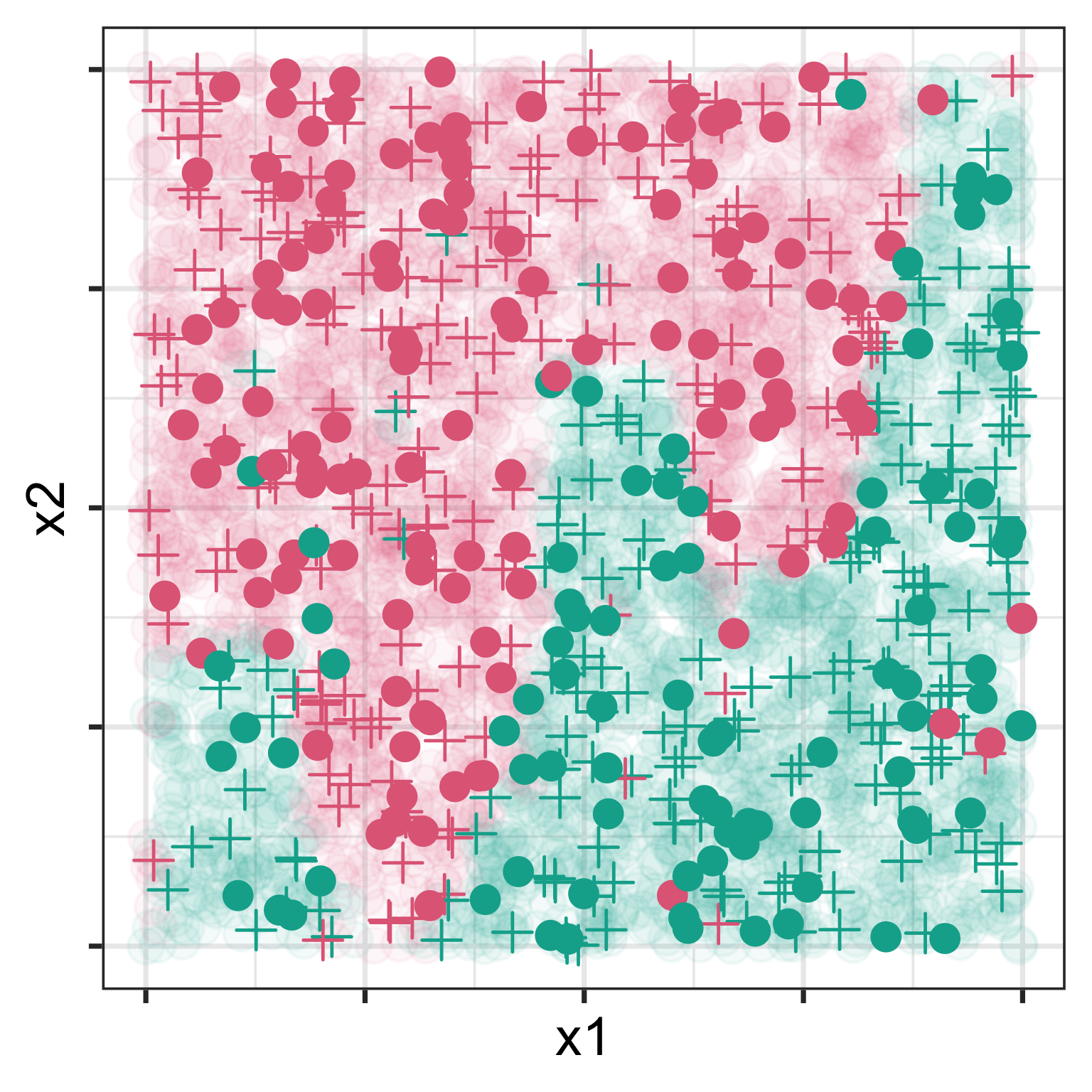
Training - plusses; Test - dots

Model-in-the-data-space

From XKCD


We plot the model on the data to assess whether it fits or is a misfit!


Doing this in high dimensions is considered difficult!

So it is common to only plot the data-in-the-model-space.

NOTE, WE CAN PLOT THESE THINGS IN HIGH DIMENSIONS. But this is for another day.

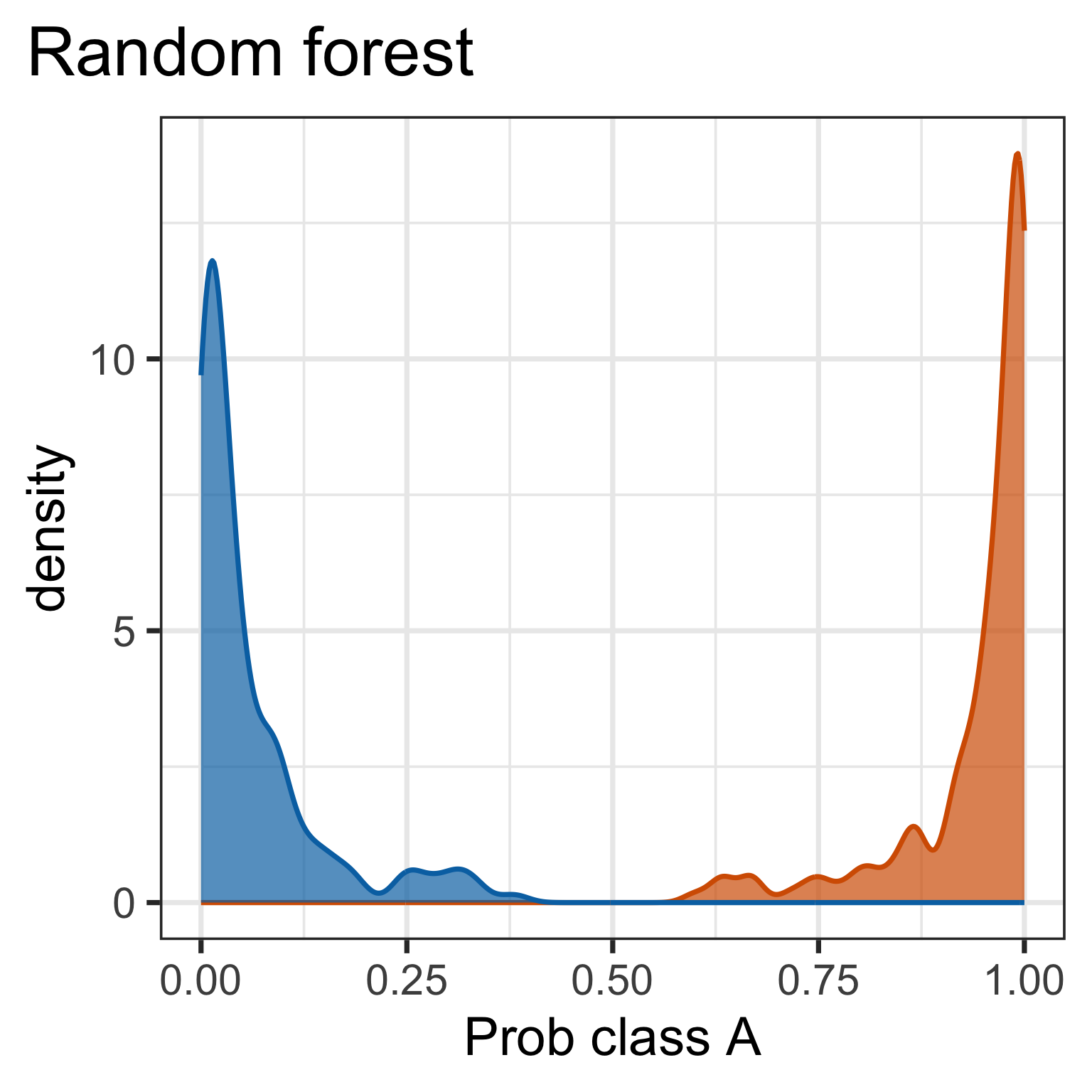
Data-in-the-model-space

Code
w <- read_csv("data/sine-curve.csv") |>
  mutate(cl = factor(cl))
w_rf <- randomForest(cl~x1+x2, data=w, ntree=200)
w_rf_pred <- predict(w_rf, w, type="prob") |>
  as_tibble(.name_repair="unique")
w_rf_pred |> 
  bind_cols(w) |>
  select(`A`, cl) |>
  ggplot(aes(x=`A`, colour=cl, fill=cl)) + 
    geom_density(alpha=0.7) +
    xlab("Prob class A") +
    ggtitle("Random forest") + 
    theme(legend.position="none")
Code
w_lda <- lda(cl~x1+x2, data=w)
w_lda_pred <- predict(w_lda, w, method="predictive")$posterior |>
  as_tibble(.name_repair="unique")
w_lda_pred |> 
  bind_cols(w) |>
  select(`A`, cl) |>
  ggplot(aes(x=`A`, colour=cl, fill=cl)) + 
    geom_density(alpha=0.7) +
    xlab("Prob class A") +
    ggtitle("Linear DA") + 
    theme(legend.position="none")
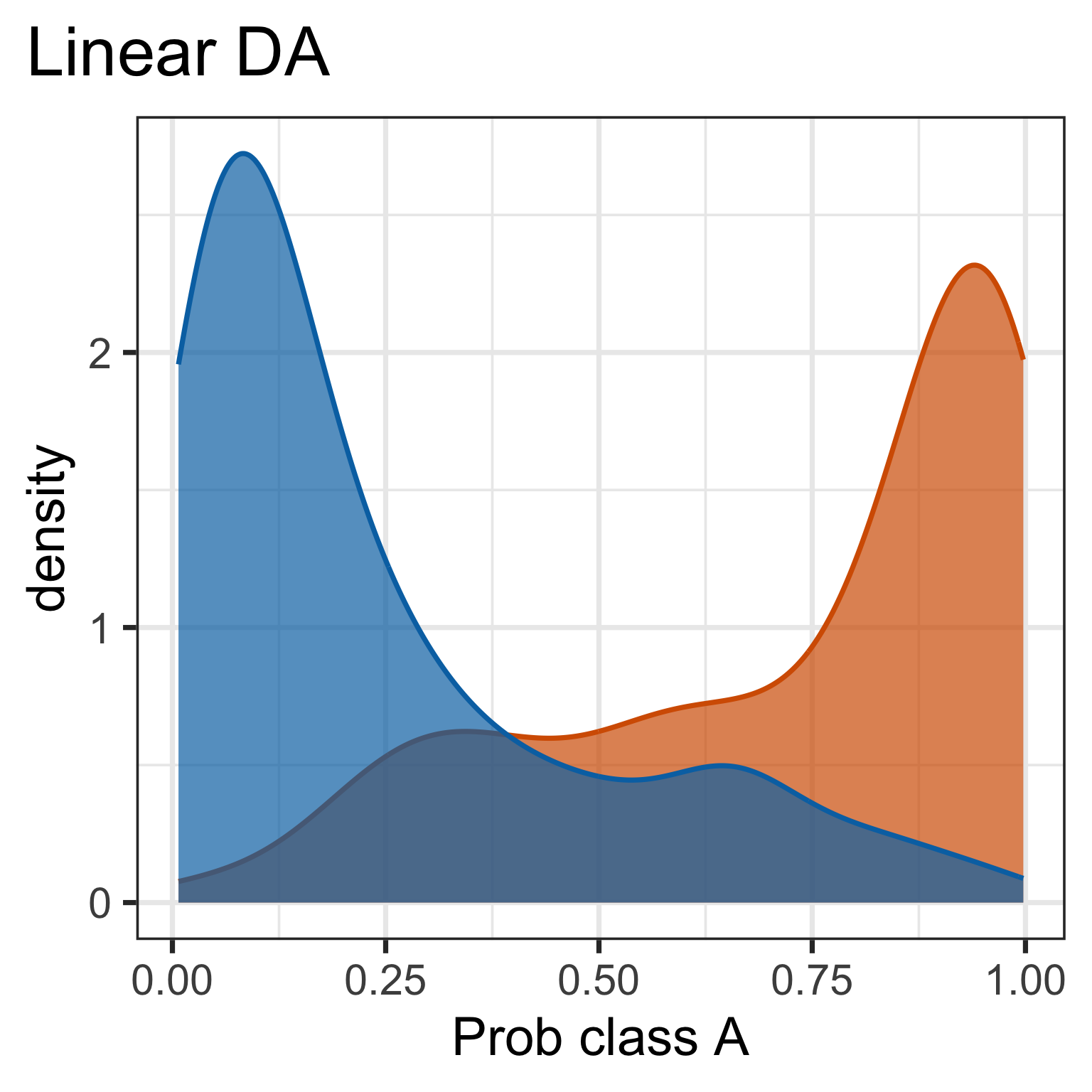
Predictive probabilities are aspects of the model. It is useful to plot. What do we learn here?

But it doesn’t tell you why there is a difference.

Model-in-the-data-space
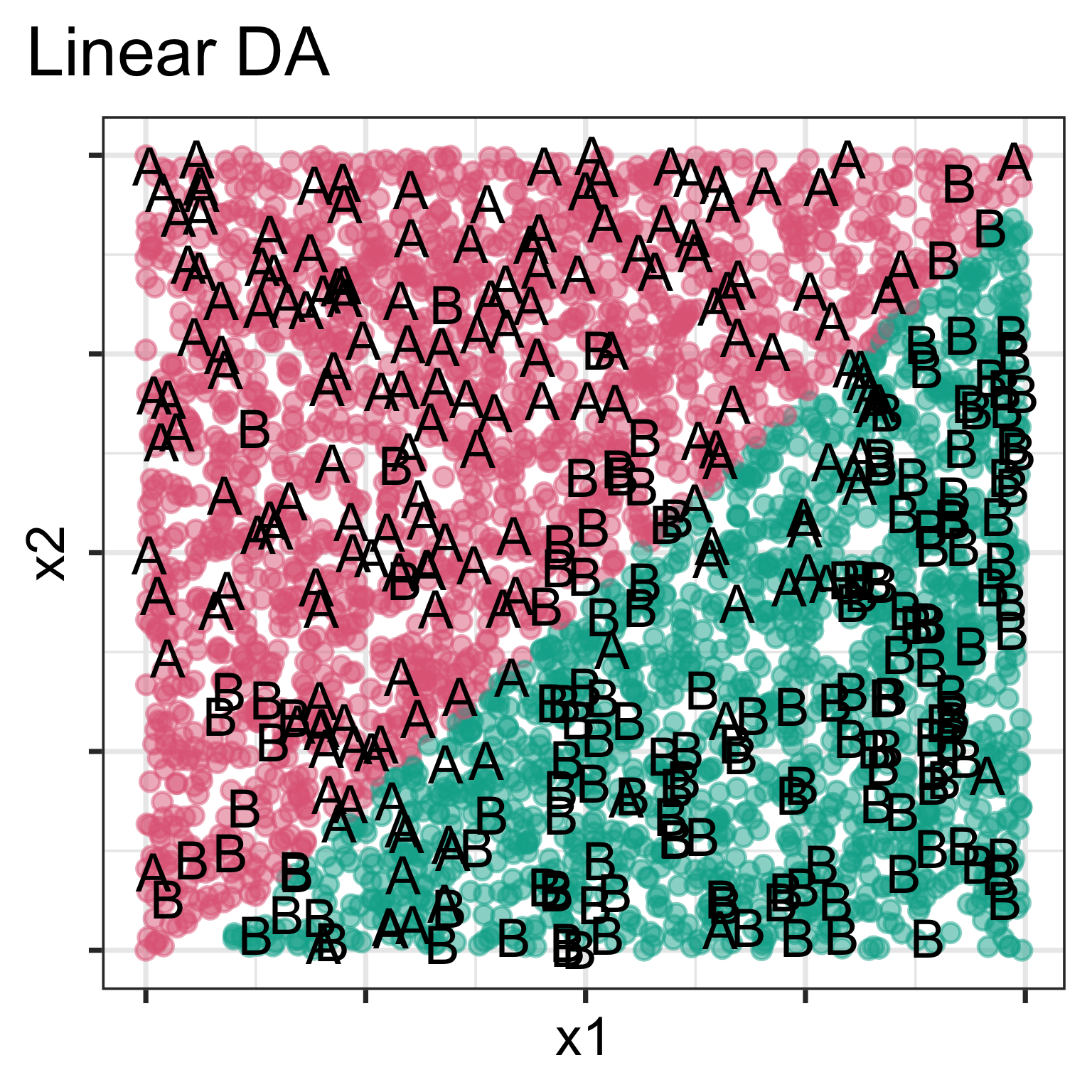
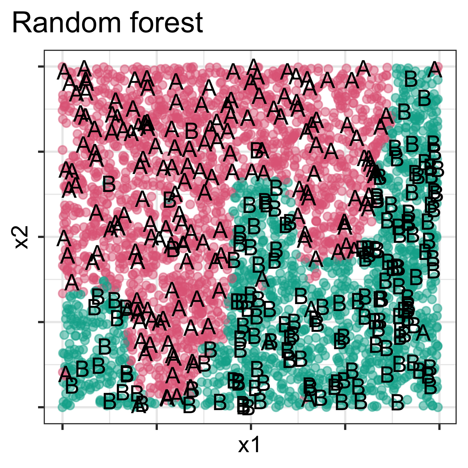
Model is displayed, as a grid of predicted points in the original variable space. Data is overlaid, using text labels. What do you learn?

One model has a linear boundary, and the other has the highly non-linear boundary, which matches the class cluster better. Also …

Plotting residuals

Code
# Load the Jack-o'-Lantern data
d <- jackolantern_surreal_data[sample(1:5395, 2000),]

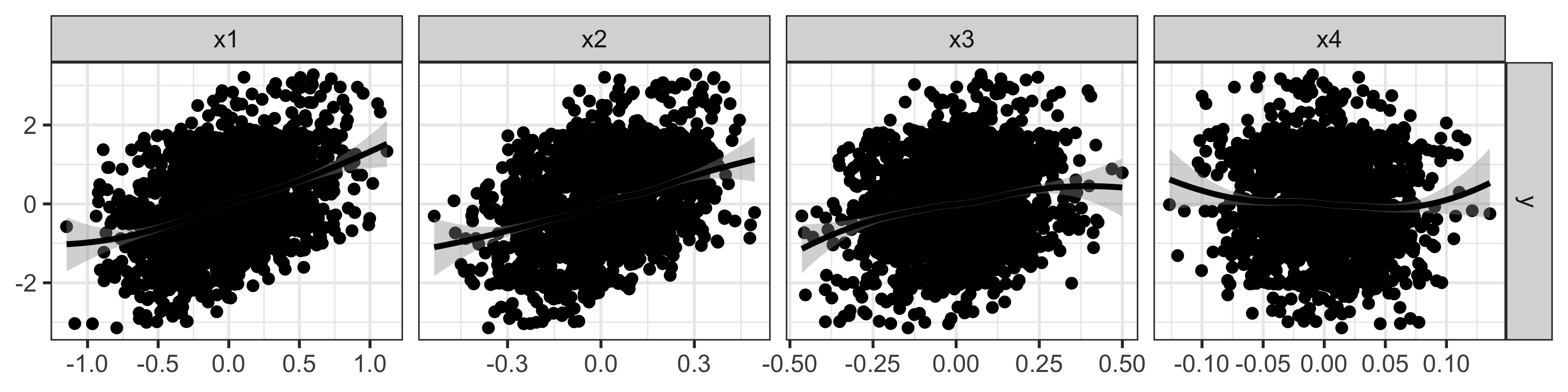
ggduo(d, c("x1", "x2", "x3", "x4"), "y")

Data looks uninteresting: weak linear relationships between response and predictors.
Code
# Fit a linear model to the surreal Jack-o'-Lantern data
d_lm <- lm(y ~ ., data = d)

# Plot the residuals to reveal the hidden image
d_all <- augment(d_lm, d)
ggplot(d_all, aes(x=.fitted, y=.resid)) +
  geom_point() +
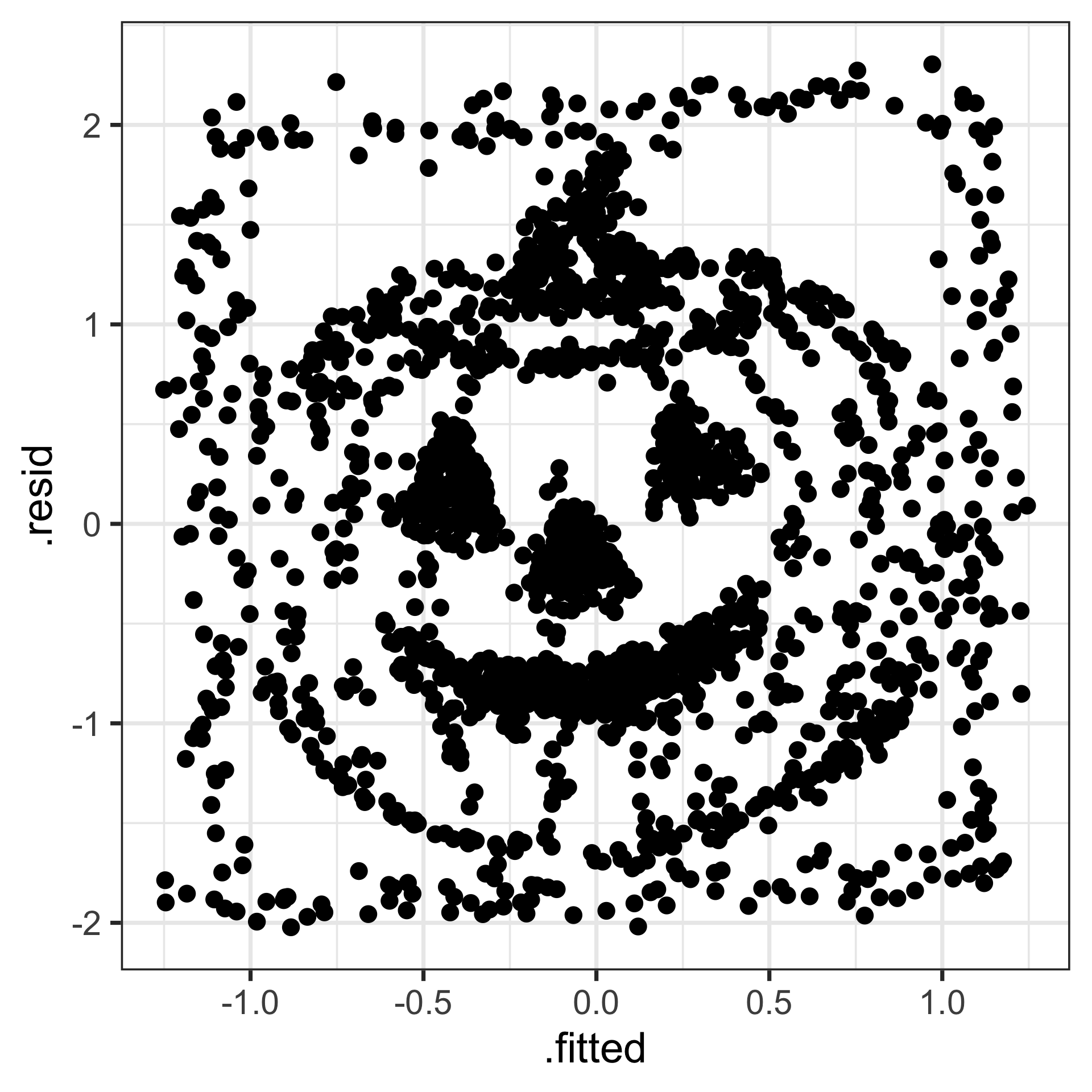
  theme(aspect.ratio=1)

Residuals have a spooky pattern!

Reading residual plots using a lineup

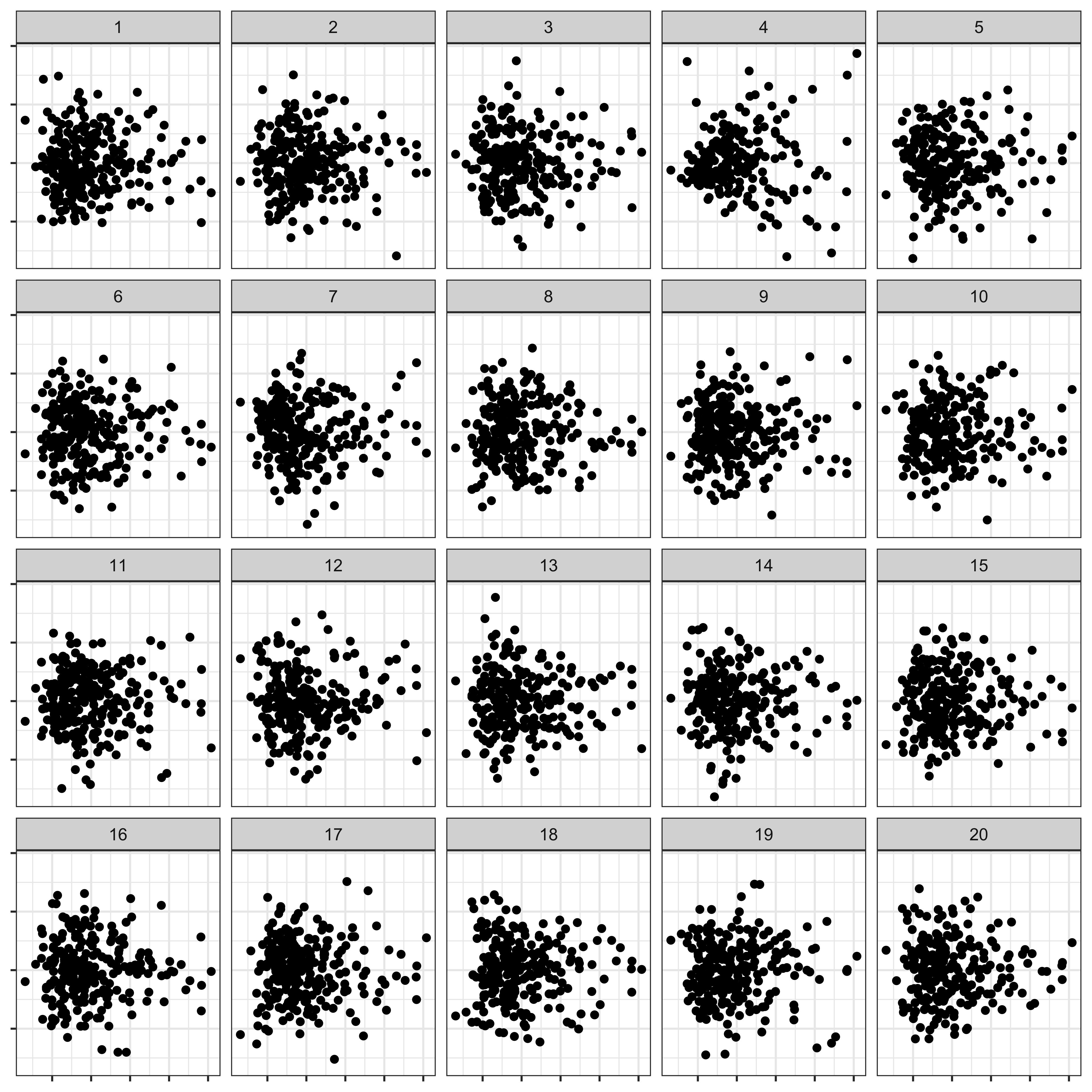
  • Reading residual plots can be extremely hard!
  • You have to decide whether there is NO PATTERN.
  • This is a good place to use the lineup developed to do inference for data visualisation.
Code
x <- lm(tip ~ total_bill, data = tips)
tips.reg <- data.frame(tips, .resid = residuals(x), 
                       .fitted = fitted(x))
library(ggplot2)
ggplot(lineup(null_lm(tip ~ total_bill, 
                      method = 'rotate'), 
              tips.reg)) +
  geom_point(aes(x = total_bill, 
                 y = .resid)) +
  facet_wrap(~ .sample) +
  theme(axis.text = element_blank(),
        axis.title = element_blank())
Re-sampling statistics

Techniques for assessing behaviour with new samples, and measuring the variability of models and predictions.

  • Leave-one-out (algebraic measures typically) - outmoded
  • Cross-validation: Multiple splits to repeatedly use one for training and the other for testing, to decide on best model parameters.
  • Bootstrap: sample the sample with replacement. Mostly used to compute confidence intervals for estimates.
  • Permutation: sample the values on one variable to break associations with other variables while keeping marginals fixed. Mostly used for conducting hypothesis tests.
  • Simulation: sample from know distribution, or a fitted model. Used to check goodness-of-fit.

Tidy models

Tidying model output

The package broom gets model results into a tidy format at different levels. (And broom.mixed does this for mixed models.)

  • model level: broom::glance (values such as AIC, BIC, model fit, …)
  • coefficients in the model: broom::tidy (estimate, confidence interval, significance level, …)
  • observation level: broom::augment (fitted values, residuals, predictions, influence, …)
Code
glance(d_lm)
# A tibble: 1 × 12
  r.squared adj.r.squared sigma statistic   p.value    df
      <dbl>         <dbl> <dbl>     <dbl>     <dbl> <dbl>
1     0.220         0.218  1.00      93.8 5.52e-104     6
# ℹ 6 more variables: logLik <dbl>, AIC <dbl>, BIC <dbl>,
#   deviance <dbl>, df.residual <int>, nobs <int>
Code
tidy(d_lm)
# A tibble: 7 × 5
  term        estimate std.error statistic  p.value
  <chr>          <dbl>     <dbl>     <dbl>    <dbl>
1 (Intercept)  -0.0125    0.0224    -0.555 5.79e- 1
2 x1            1.03      0.126      8.17  5.59e-16
3 x2            0.460     0.268      1.72  8.58e- 2
4 x3            0.622     0.232      2.69  7.29e- 3
5 x4            0.965     0.820      1.18  2.39e- 1
6 x5            0.968     0.192      5.05  4.81e- 7
7 x6            0.930     0.117      7.94  3.40e-15

tidymodels

tidymodels is a set of R packages that make it easier to build, tune, and evaluate statistical and machine learning models — all using the same consistent, tidyverse-style syntax. It provides a framework for the modeling workflow in R:

  1. Preprocess data (with recipes)
  2. Specify models (with parsnip)
  3. Resample or cross-validate (with rsample)
  4. Tune hyperparameters (with tune)
  5. Evaluate and compare models (with yardstick, workflows, broom)

Case study: hotel bookings (1/10)

Source: A predictive modeling case study

About the data: The hotel bookings data from Antonio, Almeida, and Nunes (2019) to predict which hotel stays included children and/or babies, based on the other characteristics of the stays such as which hotel the guests stay at, how much they pay, etc.

Model: We will build a model to predict which actual hotel stays included children and/or babies, and which did not. Our outcome variable children is a factor variable with two levels.

Code
library(tidymodels)
load("data/hotels.rda")
glimpse(hotels)
Rows: 50,000
Columns: 23
$ hotel                          <fct> City_Hotel, City_Ho…
$ lead_time                      <dbl> 217, 2, 95, 143, 13…
$ stays_in_weekend_nights        <dbl> 1, 0, 2, 2, 1, 2, 0…
$ stays_in_week_nights           <dbl> 3, 1, 5, 6, 4, 2, 2…
$ adults                         <dbl> 2, 2, 2, 2, 2, 2, 2…
$ children                       <fct> none, none, none, n…
$ meal                           <fct> BB, BB, BB, HB, HB,…
$ country                        <fct> DEU, PRT, GBR, ROU,…
$ market_segment                 <fct> Offline_TA/TO, Dire…
$ distribution_channel           <fct> TA/TO, Direct, TA/T…
$ is_repeated_guest              <dbl> 0, 0, 0, 0, 0, 0, 0…
$ previous_cancellations         <dbl> 0, 0, 0, 0, 0, 0, 0…
$ previous_bookings_not_canceled <dbl> 0, 0, 0, 0, 0, 0, 0…
$ reserved_room_type             <fct> A, D, A, A, F, A, C…
$ assigned_room_type             <fct> A, K, A, A, F, A, C…
$ booking_changes                <dbl> 0, 0, 2, 0, 0, 0, 0…
$ deposit_type                   <fct> No_Deposit, No_Depo…
$ days_in_waiting_list           <dbl> 0, 0, 0, 0, 0, 0, 0…
$ customer_type                  <fct> Transient-Party, Tr…
$ average_daily_rate             <dbl> 81, 170, 8, 81, 158…
$ required_car_parking_spaces    <fct> none, none, none, n…
$ total_of_special_requests      <dbl> 1, 3, 2, 1, 4, 1, 1…
$ arrival_date                   <date> 2016-09-01, 2017-0…
Code
hotels |> 
  count(children) |>
  mutate(prop = n/sum(n))
# A tibble: 2 × 3
  children     n   prop
  <fct>    <int>  <dbl>
1 children  4038 0.0808
2 none     45962 0.919 

Case study: hotel bookings (2/10)

Data splitting and re-sampling

Reserve 25% of the stays to the test set. The outcome variable children is pretty imbalanced so use a stratified random sample.

Code
set.seed(656)
splits      <- initial_split(hotels, strata = children)

hotel_other <- training(splits)
hotel_test  <- testing(splits)

# training set proportions by children
hotel_other |> 
  count(children) |> 
  mutate(prop = n/sum(n))
# A tibble: 2 × 3
  children     n   prop
  <fct>    <int>  <dbl>
1 children  3046 0.0812
2 none     34454 0.919 
Code
# test set proportions by children
hotel_test  |> 
  count(children) |> 
  mutate(prop = n/sum(n))
# A tibble: 2 × 3
  children     n   prop
  <fct>    <int>  <dbl>
1 children   992 0.0794
2 none     11508 0.921 

Case study: hotel bookings (3/10)

Data splitting and re-sampling

The “other” set is further divided into training and validation sets. These two are used to build the model.

The test set is only used when the final model is decided.

Code
set.seed(703)
hotel_val_set <- validation_split(hotel_other, 
                            strata = children, 
                            prop = 0.80)
hotel_val_set
# Validation Set Split (0.8/0.2)  using stratification 
# A tibble: 1 × 2
  splits               id        
  <list>               <chr>     
1 <split [30000/7500]> validation

Case study: hotel bookings (4/10)

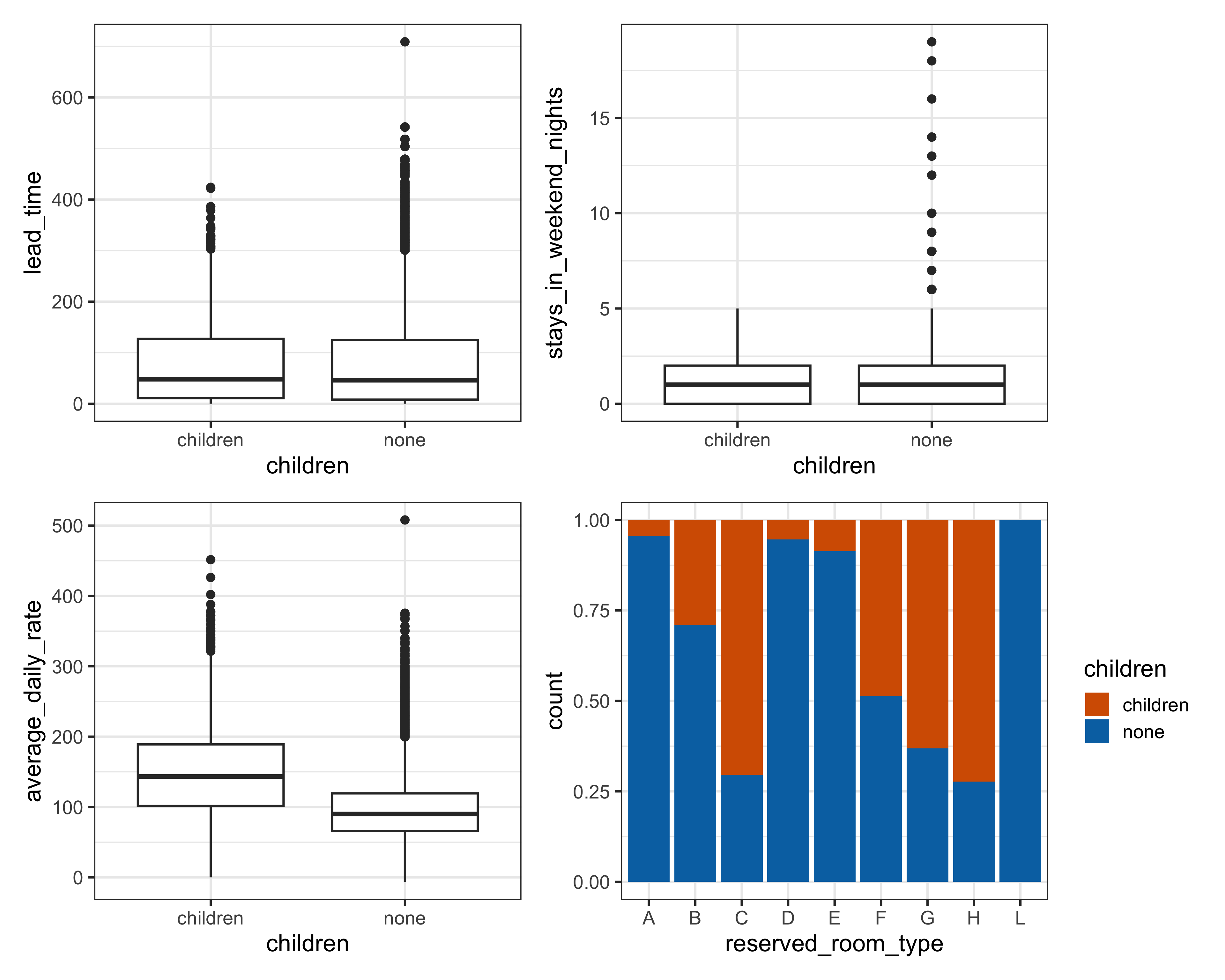
IDA

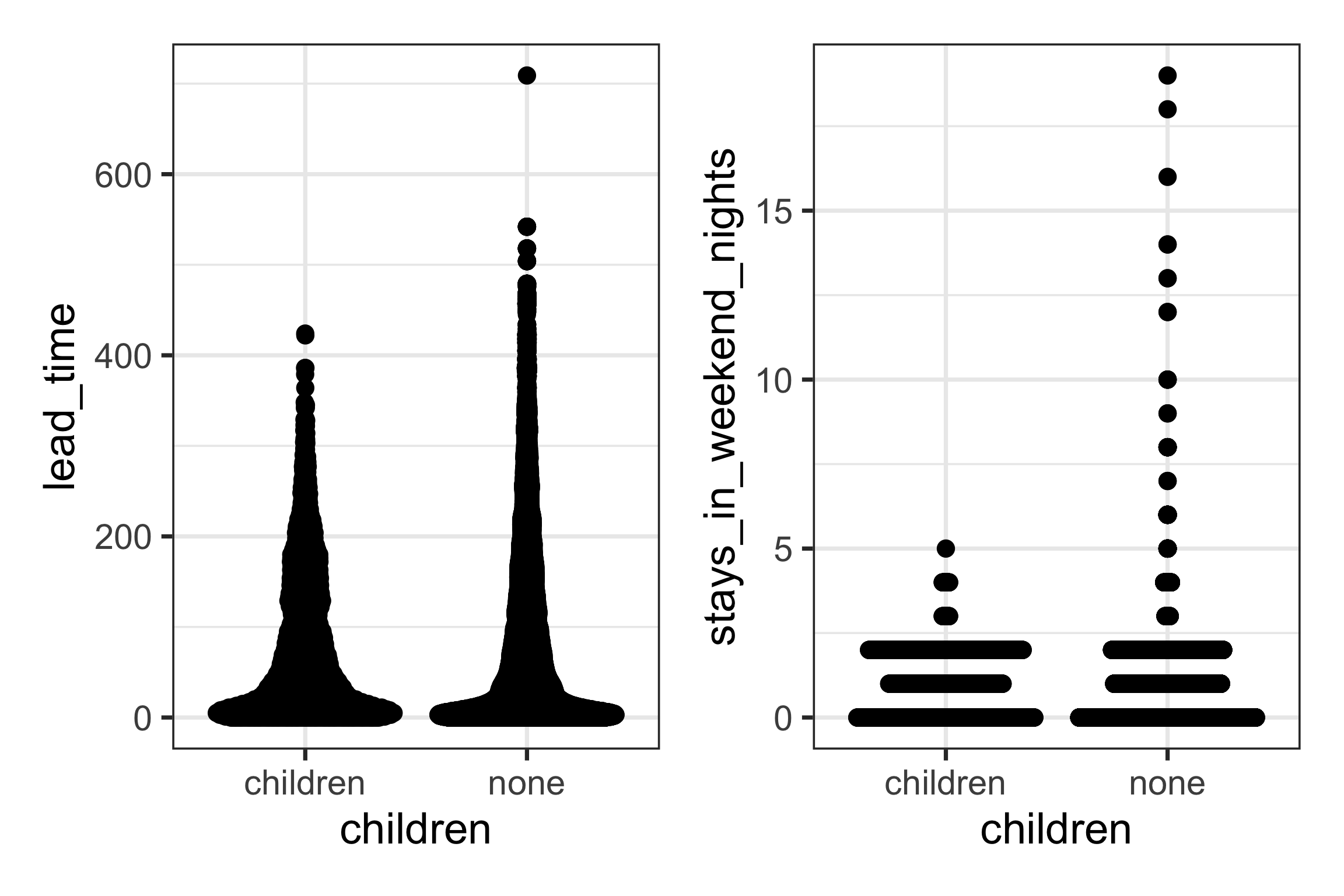
  • Check for distribution of each variable
  • Check association between predictors
Code
p1 <- ggplot(hotel_other, aes(x=children, y=lead_time)) +
  geom_quasirandom()
p2 <- ggplot(hotel_other, aes(x=children, y=stays_in_weekend_nights)) +
  geom_quasirandom()
p1 + p2 + plot_layout(ncol=2)

Case study: hotel bookings (5/10)

IDA

  • Check for distribution of each variable
  • Check association between predictors
Code
p1 <- ggplot(hotel_other, aes(x=children, y=lead_time)) +
  geom_boxplot()
p2 <- ggplot(hotel_other, aes(x=children, y=stays_in_weekend_nights)) +
  geom_boxplot()
p3 <- ggplot(hotel_other, aes(x=children, y=average_daily_rate)) +
  geom_boxplot()
p4 <- ggplot(hotel_other, 
             aes(x=reserved_room_type, 
                 fill=children)) +
  geom_bar(position="fill") 
p1 + p2 + p3 + p4 + plot_layout(ncol=2)
Case study: hotel bookings (6/10)

Model setup

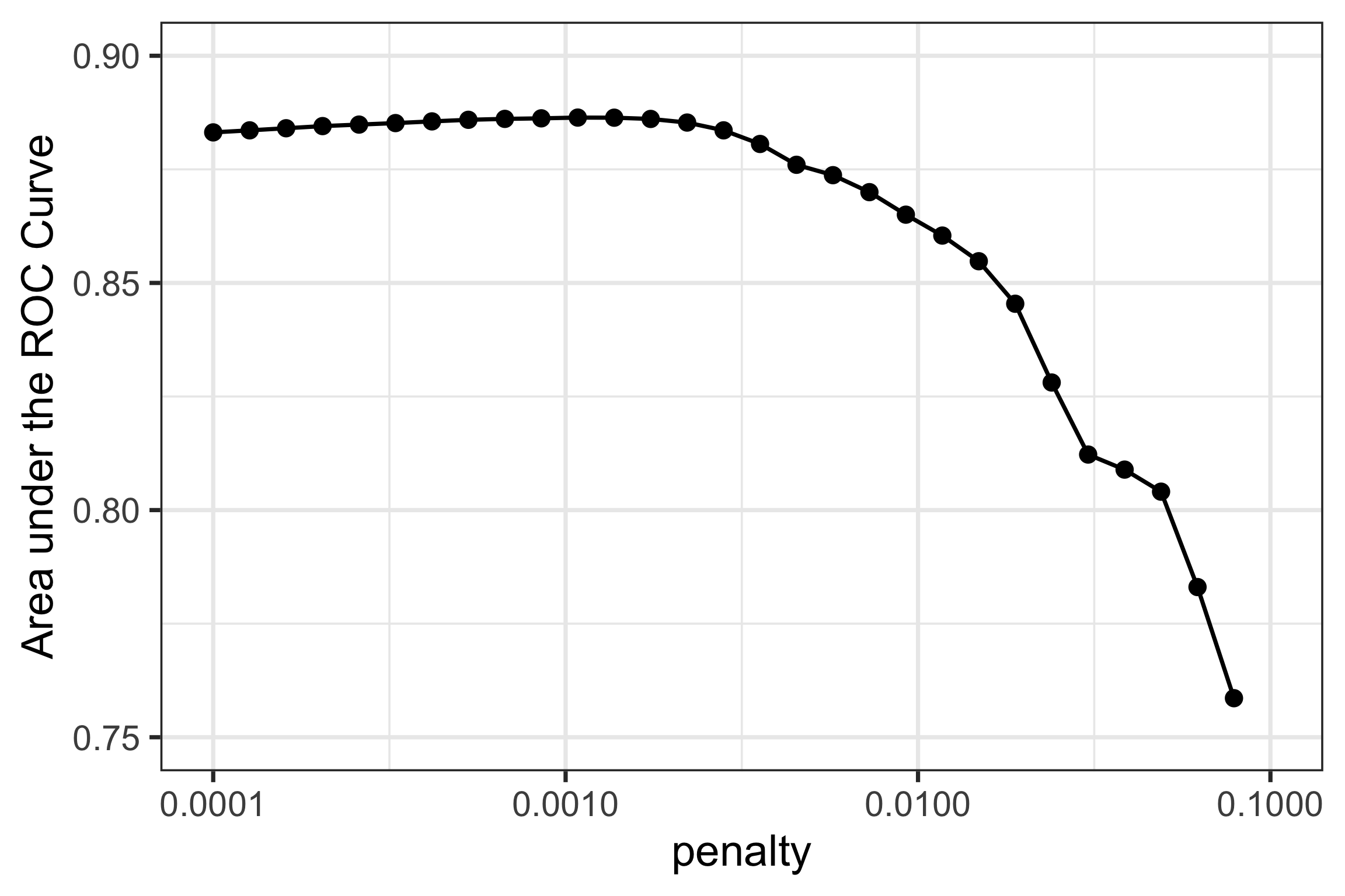
Since the outcome variable is categorical, logistic regression is a reasonable choice. This fits an S-curve which essentially models proportion of classes (children v none) for different values of the predictors. Using glmnet allows for feature selection while training the model.

Code
lr_mod <- 
  logistic_reg(penalty = tune(), mixture = 1) |> 
  set_engine("glmnet")
Code
holidays <- c("AllSouls", "AshWednesday", "ChristmasEve", "Easter", 
              "ChristmasDay", "GoodFriday", "NewYearsDay", "PalmSunday")

lr_recipe <- 
  recipe(children ~ ., data = hotel_other) |> 
  step_date(arrival_date) |> 
  step_holiday(arrival_date, holidays = holidays) |> 
  step_rm(arrival_date) |> 
  step_dummy(all_nominal_predictors()) |> 
  step_zv(all_predictors()) |> 
  step_normalize(all_predictors())
Code
lr_workflow <- 
  workflow() |> 
  add_model(lr_mod) |> 
  add_recipe(lr_recipe)
Code
lr_reg_grid <- tibble(penalty = 10^seq(-4, -1, length.out = 30))

lr_reg_grid |> top_n(-5) # lowest penalty values
# A tibble: 5 × 1
   penalty
     <dbl>
1 0.0001  
2 0.000127
3 0.000161
4 0.000204
5 0.000259
Code
lr_reg_grid |> top_n(5)  # highest penalty values
# A tibble: 5 × 1
  penalty
    <dbl>
1  0.0386
2  0.0489
3  0.0621
4  0.0788
5  0.1   

Case study: hotel bookings (7/10)

Model training

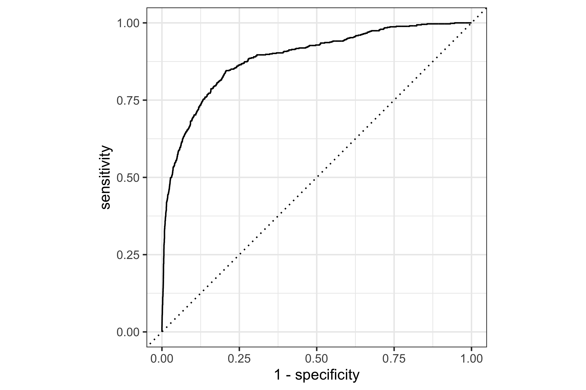
Better performance for smaller penalty, means that all predictors have some importance for the model fit.
Code
lr_res <- 
  lr_workflow |> 
  tune_grid(hotel_val_set,
            grid = lr_reg_grid,
            control = control_grid(save_pred = TRUE),
            metrics = metric_set(roc_auc))
Code
lr_plot <- 
  lr_res |> 
  collect_metrics() |> 
  ggplot(aes(x = penalty, y = mean)) + 
  geom_point() + 
  geom_line() + 
  ylim(c(0.75, 0.9)) +
  ylab("Area under the ROC Curve") +
  scale_x_log10(labels = scales::label_number())

lr_plot 

Code
lr_best <- 
  lr_res |> 
  collect_metrics() |> 
  arrange(penalty) |> 
  slice(12)
lr_best
# A tibble: 1 × 7
  penalty .metric .estimator  mean     n std_err .config    
    <dbl> <chr>   <chr>      <dbl> <int>   <dbl> <chr>      
1 0.00137 roc_auc binary     0.886     1      NA Preprocess…
Code
lr_auc <- 
  lr_res |> 
  collect_predictions(parameters = lr_best) |> 
  roc_curve(children, .pred_children) |> 
  mutate(model = "Logistic Regression")

autoplot(lr_auc)

Case study: hotel bookings (8/10)

Alternative model

Random forest models are generalist fits. It combines the predictions from many trees, each one fitted with a random selection of variables (features) and a random sample of observations.

Because each tree splits on single variables, it is also robust to missing values by using the complete data efficiently. It also handles the predictors as factors easily.

Code
cores <- parallel::detectCores()
cores
[1] 8
rf_mod <- 
  rand_forest(mtry = tune(), min_n = tune(), trees = 1000) |> 
  set_engine("ranger", num.threads = cores) |> 
  set_mode("classification")
rf_recipe <- 
  recipe(children ~ ., data = hotel_other) |> 
  step_date(arrival_date) |> 
  step_holiday(arrival_date) |> 
  step_rm(arrival_date) 
Code
rf_workflow <- 
  workflow() |> 
  add_model(rf_mod) |> 
  add_recipe(rf_recipe)
Code
rf_mod
Random Forest Model Specification (classification)

Main Arguments:
  mtry = tune()
  trees = 1000
  min_n = tune()

Engine-Specific Arguments:
  num.threads = cores

Computational engine: ranger 
Code
extract_parameter_set_dials(rf_mod)
Code
# This takes a while so the results are saved
set.seed(1012)
rf_res <- 
  rf_workflow |> 
  tune_grid(hotel_val_set,
            grid = 25,
            control = control_grid(save_pred = TRUE),
            metrics = metric_set(roc_auc))
save(rf_res, file="data/rf_res.rda")
Code
load("data/rf_res.rda")
rf_res |> 
  show_best(metric = "roc_auc")
# A tibble: 5 × 8
   mtry min_n .metric .estimator  mean     n std_err .config
  <int> <int> <chr>   <chr>      <dbl> <int>   <dbl> <chr>  
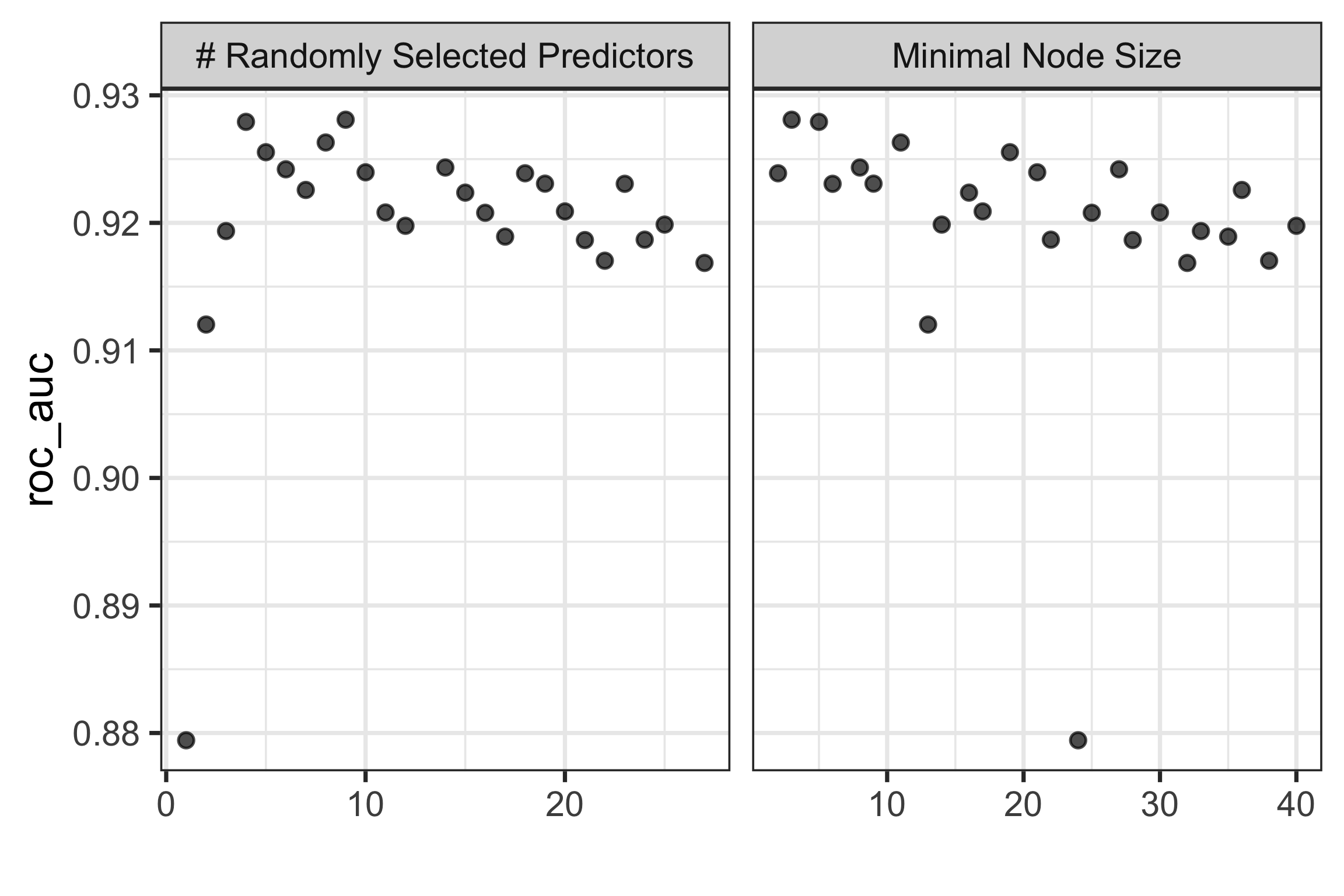
1     9     3 roc_auc binary     0.928     1      NA Prepro…
2     4     5 roc_auc binary     0.928     1      NA Prepro…
3     8    11 roc_auc binary     0.926     1      NA Prepro…
4     5    19 roc_auc binary     0.926     1      NA Prepro…
5    14     8 roc_auc binary     0.924     1      NA Prepro…
Code
autoplot(rf_res)

Code
rf_best <- 
  rf_res |> 
  select_best(metric = "roc_auc")
rf_best
# A tibble: 1 × 3
   mtry min_n .config              
  <int> <int> <chr>                
1     9     3 Preprocessor1_Model09
Code
rf_res |> 
  collect_predictions()
# A tibble: 187,500 × 8
   .pred_children .pred_none id          .row  mtry min_n
            <dbl>      <dbl> <chr>      <int> <int> <int>
 1         0.118       0.882 validation     2     1    24
 2         0.224       0.776 validation     6     1    24
 3         0.0703      0.930 validation     7     1    24
 4         0.0364      0.964 validation    10     1    24
 5         0.0698      0.930 validation    12     1    24
 6         0.0531      0.947 validation    13     1    24
 7         0.0584      0.942 validation    16     1    24
 8         0.0500      0.950 validation    22     1    24
 9         0.0575      0.942 validation    27     1    24
10         0.0721      0.928 validation    35     1    24
# ℹ 187,490 more rows
# ℹ 2 more variables: children <fct>, .config <chr>
Code
rf_auc <- 
  rf_res |> 
  collect_predictions(parameters = rf_best) |> 
  roc_curve(children, .pred_children) |> 
  mutate(model = "Random Forest")

Case study: hotel bookings (9/10)

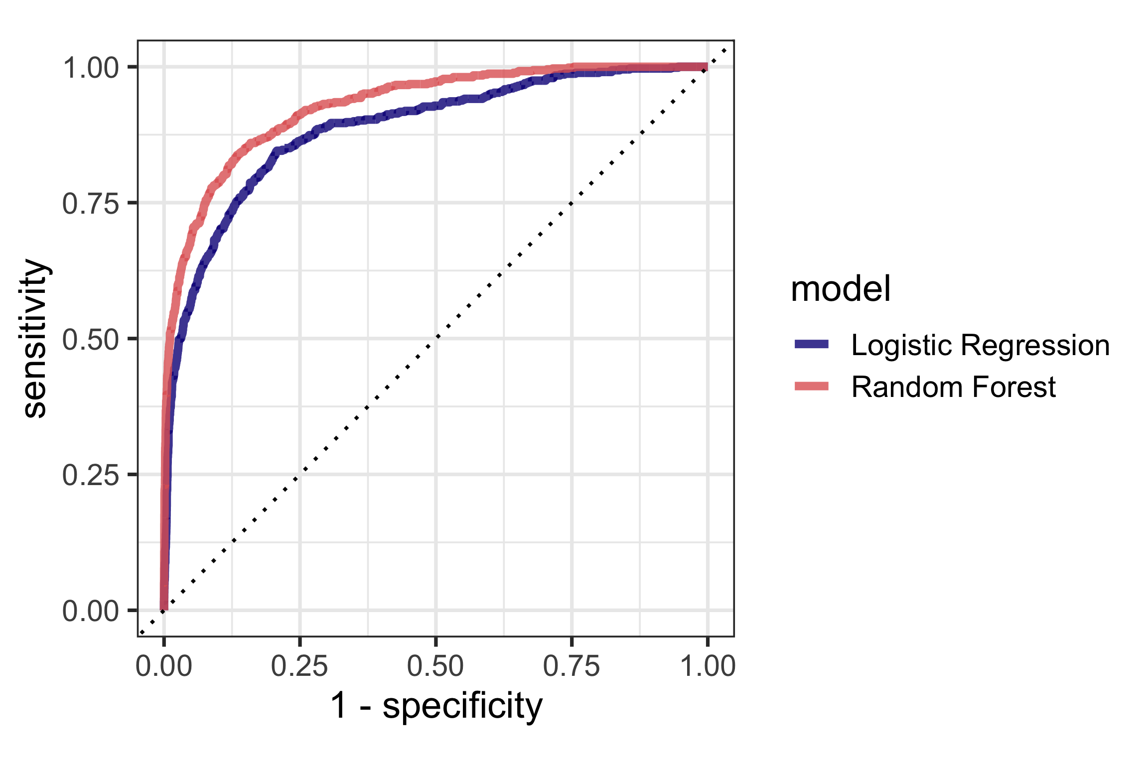
Choose the best model

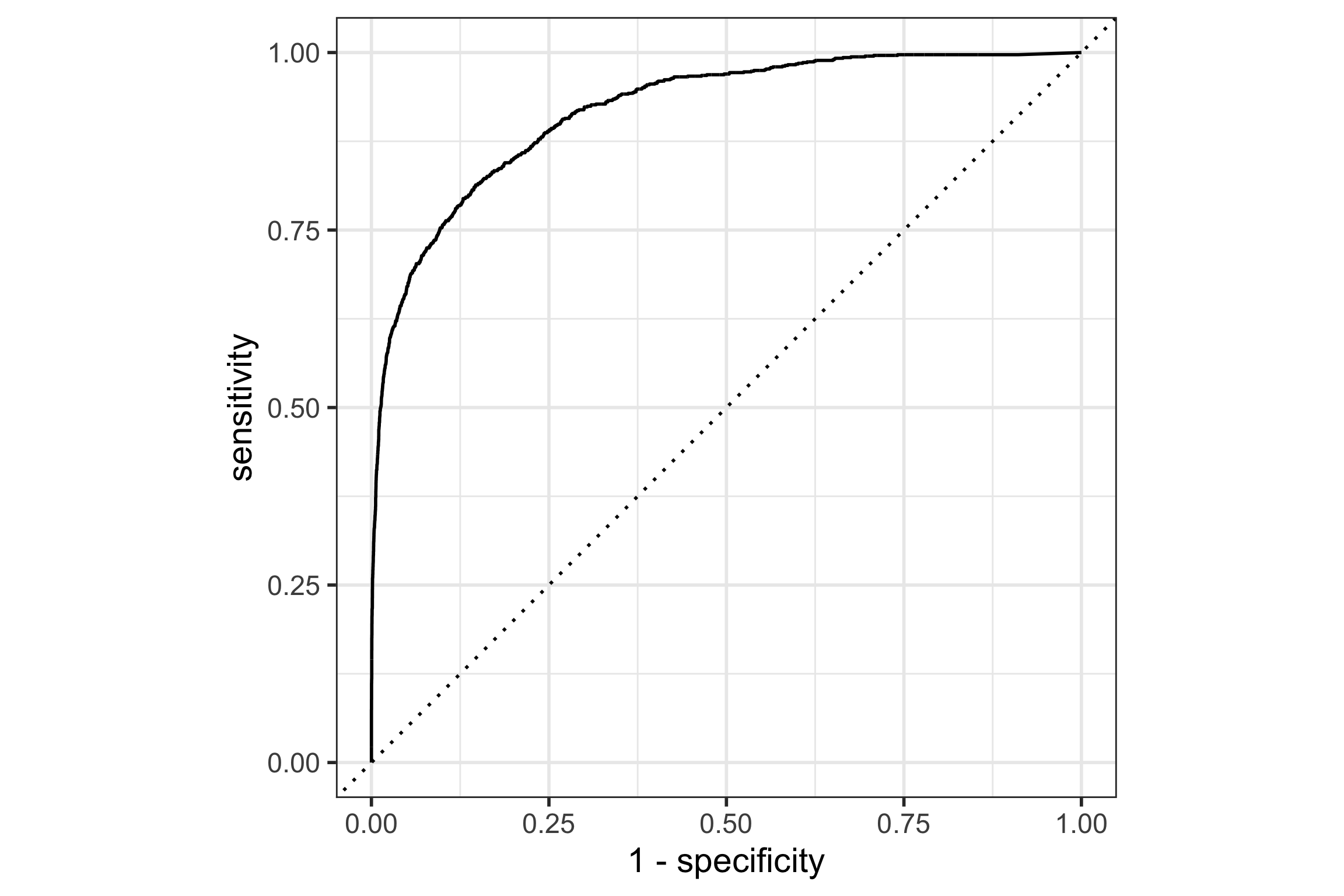
For the same false positive rate (predicting the observation to the target class, incorrectly), the random forest model has a higher true positive rate (correctly predicting the target class) than the logistic regression model.

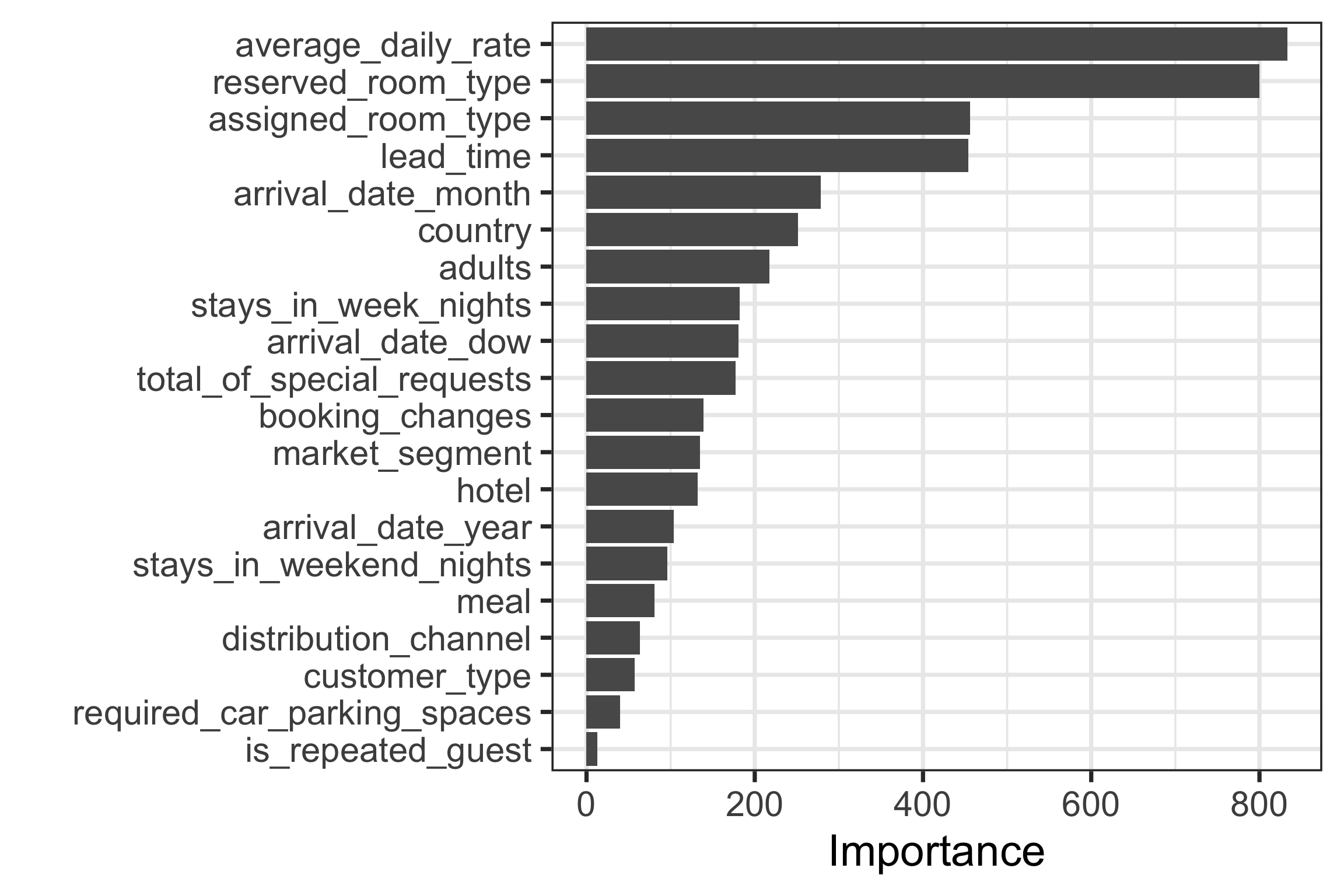
Most important variables are average_daily_room_rate, reserved_room_type, assigned_room_type, lead_time.
Code
bind_rows(rf_auc, lr_auc) |> 
  ggplot(aes(x = 1 - specificity, y = sensitivity, col = model)) + 
    geom_path(lwd = 1.5, alpha = 0.8) +
    geom_abline(lty = 3) + 
    coord_equal() + 
    scale_color_viridis_d(option = "plasma", end = .6)

Code
# the last model
last_rf_mod <- 
  rand_forest(mtry = 8, min_n = 7, trees = 1000) |> 
  set_engine("ranger", num.threads = cores, importance = "impurity") |> 
  set_mode("classification")

# the last workflow
last_rf_workflow <- 
  rf_workflow |> 
  update_model(last_rf_mod)
Code
# the last fit
set.seed(345)
last_rf_fit <- 
  last_rf_workflow |> 
  last_fit(splits)

last_rf_fit
save(last_rf_fit, file="data/last_rf_fit.rda")
Code
load("data/last_rf_fit.rda")
last_rf_fit |> 
  collect_metrics()
# A tibble: 3 × 4
  .metric     .estimator .estimate .config             
  <chr>       <chr>          <dbl> <chr>               
1 accuracy    binary        0.947  Preprocessor1_Model1
2 roc_auc     binary        0.919  Preprocessor1_Model1
3 brier_class binary        0.0422 Preprocessor1_Model1
Code
last_rf_fit |> 
  extract_fit_parsnip() |> 
  vip(num_features = 20)

Code
last_rf_fit |> 
  collect_predictions() |> 
  roc_curve(children, .pred_children) |> 
  autoplot()

Case study: hotel bookings (10/10)

Diagnostics and summaries

  • Plot the training data to understand the model fit. (Not done here)
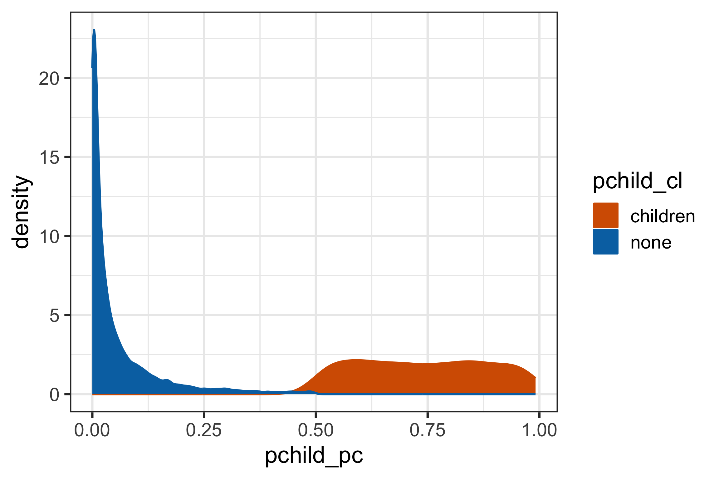
  • Plot the test data to understand where it likely errs on new data.
  • Examine where the model misclassified the observation, to check if there is anything systematic.
Code
hotel_test_pred <- tibble(hotel_test) |>
  mutate(
    pchild_cl = last_rf_fit$.predictions[[1]]$.pred_class,
    pchild_pc = last_rf_fit$.predictions[[1]]$.pred_children,
    pchild_pn = last_rf_fit$.predictions[[1]]$.pred_none)
hotel_test_pred |>
  select(pchild_pc, pchild_pn, pchild_cl) |>
  ggplot(aes(x=pchild_pc, 
             fill=pchild_cl, 
             colour=pchild_cl)) +
    geom_density()
Code
hotel_test_pred <- hotel_test_pred |>
  mutate(error = if_else(children != pchild_cl,
                         "yes", "no")) 
ggplot(hotel_test_pred, aes(x=children, 
                            y=average_daily_rate,
                            colour = children)) +
  geom_boxplot() + 
  scale_x_discrete("", labels = c("C", "N")) +
  facet_grid(error~reserved_room_type) +
  theme(legend.position = "none")
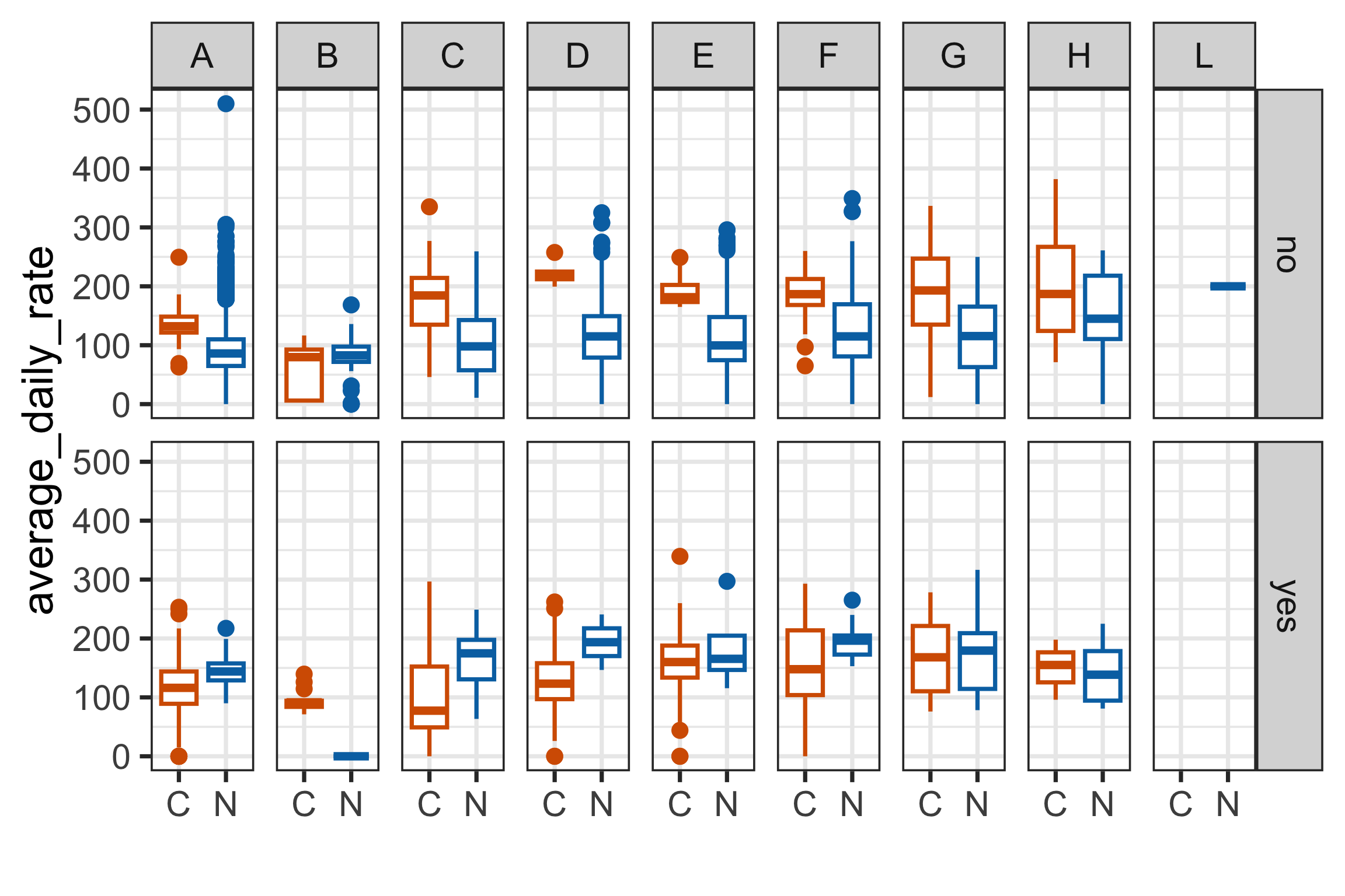
Tidy models makes it easy to compare and contrast fits, and to follow all the steps in pre-processing and fitting. Many case studies and examples to follow on the web site.

More work is needed to check assumptions, and to summarise the fit well.

Unsupervised learning

Dimension reduction

  1. Decide on necessary variables to keep, and unusable variables to drop. (All variables have to be numeric.)
  2. Handle missing values - all methods require complete data.
  3. Possibly transform variables to symmetric. Outliers can affect dimension reduction. (Similarly, clusters and nonlinear relationships can affect dimension reduction.)
  4. Choose method, typically principal component analysis for simplicity and interpretability.

Principal component analysis (PCA) produces a low-dimensional representation of a dataset. It finds a sequence of linear combinations of the variables that have maximal variance, and are mutually uncorrelated. It is an unsupervised learning method.

Use it, when:

  • You have too many predictors for a regression. Instead, we can use the first few principal components.
  • Need to understand relationships between variables.
  • To make plots summarising the variation in a large number of variables.

Make sure you use standardised variables!

Principal component analysis (PCA) (1/3)

  • new variables: principal components are linear combinations (eigenvectors) of the original variables
  • summary of variance: total variance, variance of new variables (eigenvalues), proportion of total variance
  • choosing number of new variables
  • summary of new variables
  • checking what is left over

hotels data:

Code
glimpse(hotels)
Rows: 50,000
Columns: 23
$ hotel                          <fct> City_Hotel, City_Ho…
$ lead_time                      <dbl> 217, 2, 95, 143, 13…
$ stays_in_weekend_nights        <dbl> 1, 0, 2, 2, 1, 2, 0…
$ stays_in_week_nights           <dbl> 3, 1, 5, 6, 4, 2, 2…
$ adults                         <dbl> 2, 2, 2, 2, 2, 2, 2…
$ children                       <fct> none, none, none, n…
$ meal                           <fct> BB, BB, BB, HB, HB,…
$ country                        <fct> DEU, PRT, GBR, ROU,…
$ market_segment                 <fct> Offline_TA/TO, Dire…
$ distribution_channel           <fct> TA/TO, Direct, TA/T…
$ is_repeated_guest              <dbl> 0, 0, 0, 0, 0, 0, 0…
$ previous_cancellations         <dbl> 0, 0, 0, 0, 0, 0, 0…
$ previous_bookings_not_canceled <dbl> 0, 0, 0, 0, 0, 0, 0…
$ reserved_room_type             <fct> A, D, A, A, F, A, C…
$ assigned_room_type             <fct> A, K, A, A, F, A, C…
$ booking_changes                <dbl> 0, 0, 2, 0, 0, 0, 0…
$ deposit_type                   <fct> No_Deposit, No_Depo…
$ days_in_waiting_list           <dbl> 0, 0, 0, 0, 0, 0, 0…
$ customer_type                  <fct> Transient-Party, Tr…
$ average_daily_rate             <dbl> 81, 170, 8, 81, 158…
$ required_car_parking_spaces    <fct> none, none, none, n…
$ total_of_special_requests      <dbl> 1, 3, 2, 1, 4, 1, 1…
$ arrival_date                   <date> 2016-09-01, 2017-0…

Usable variables: lead_time, stays_XXX, adults, is_repeated_guest, previous_XXX, booking_changes, days_in_waiting_list, average_daily_rate, total_of_special_requests.

Code
hotels_dr <- hotels |>
  select(lead_time:adults, 
         is_repeated_guest:previous_bookings_not_canceled,
         booking_changes, days_in_waiting_list,
         average_daily_rate, total_of_special_requests)

Principal component analysis (PCA) (2/3)
Code
hotels_pca <- prcomp(hotels_dr, scale=TRUE)
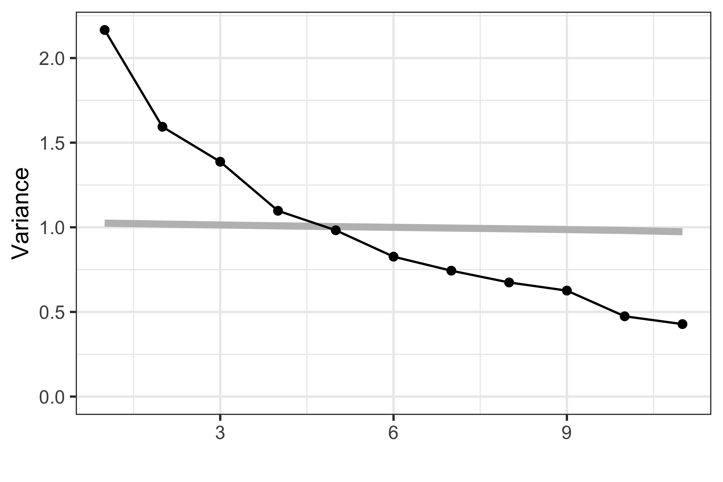
hotels_pca$sdev^2
 [1] 2.17 1.59 1.39 1.10 0.98 0.83 0.74 0.67 0.63 0.47 0.43
Code
mulgar::ggscree(hotels_pca, q=11)

Code
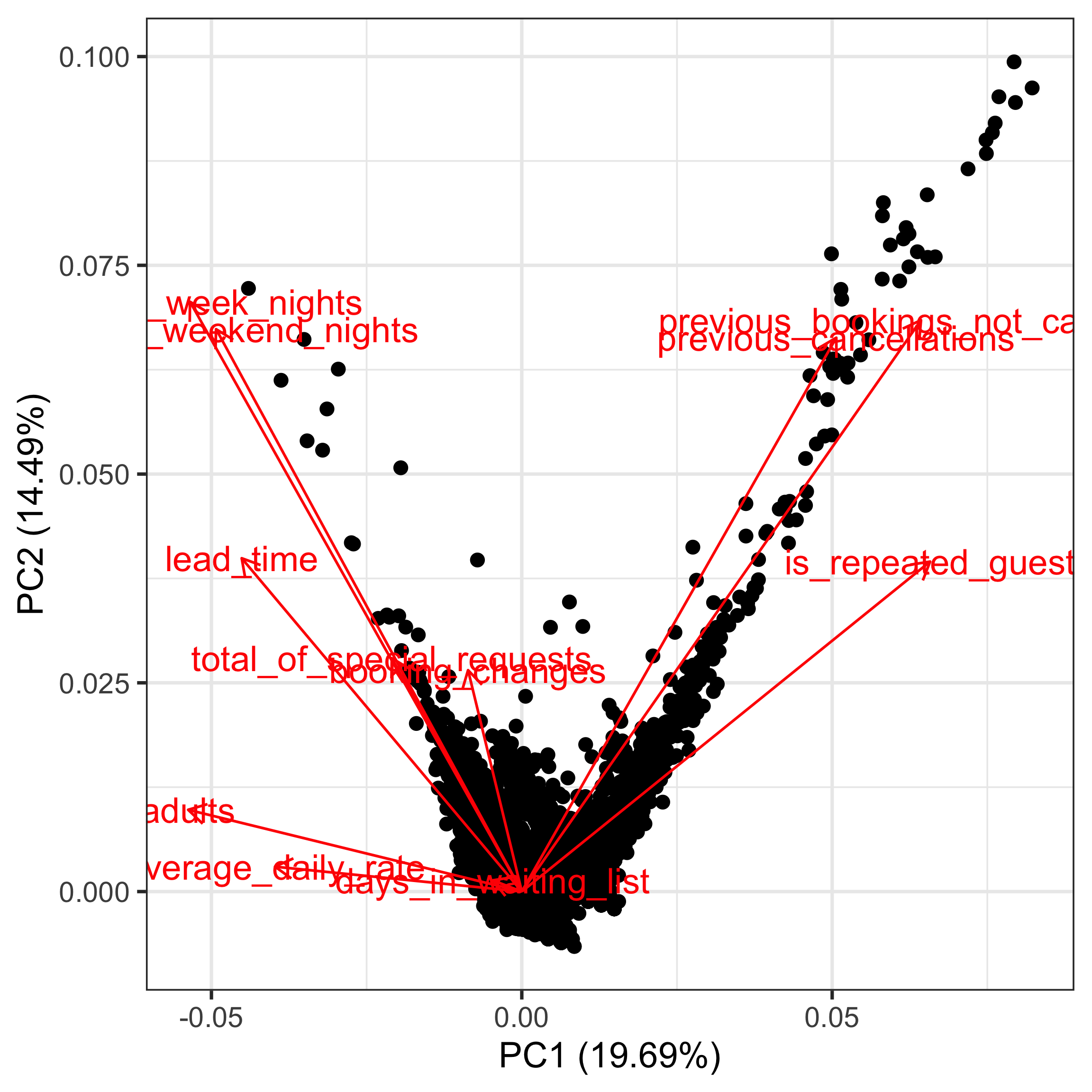
ggfortify:::autoplot.prcomp(hotels_pca, 
                            loadings = TRUE,
                            loadings.label = TRUE)

Principal component analysis (PCA) (3/3)
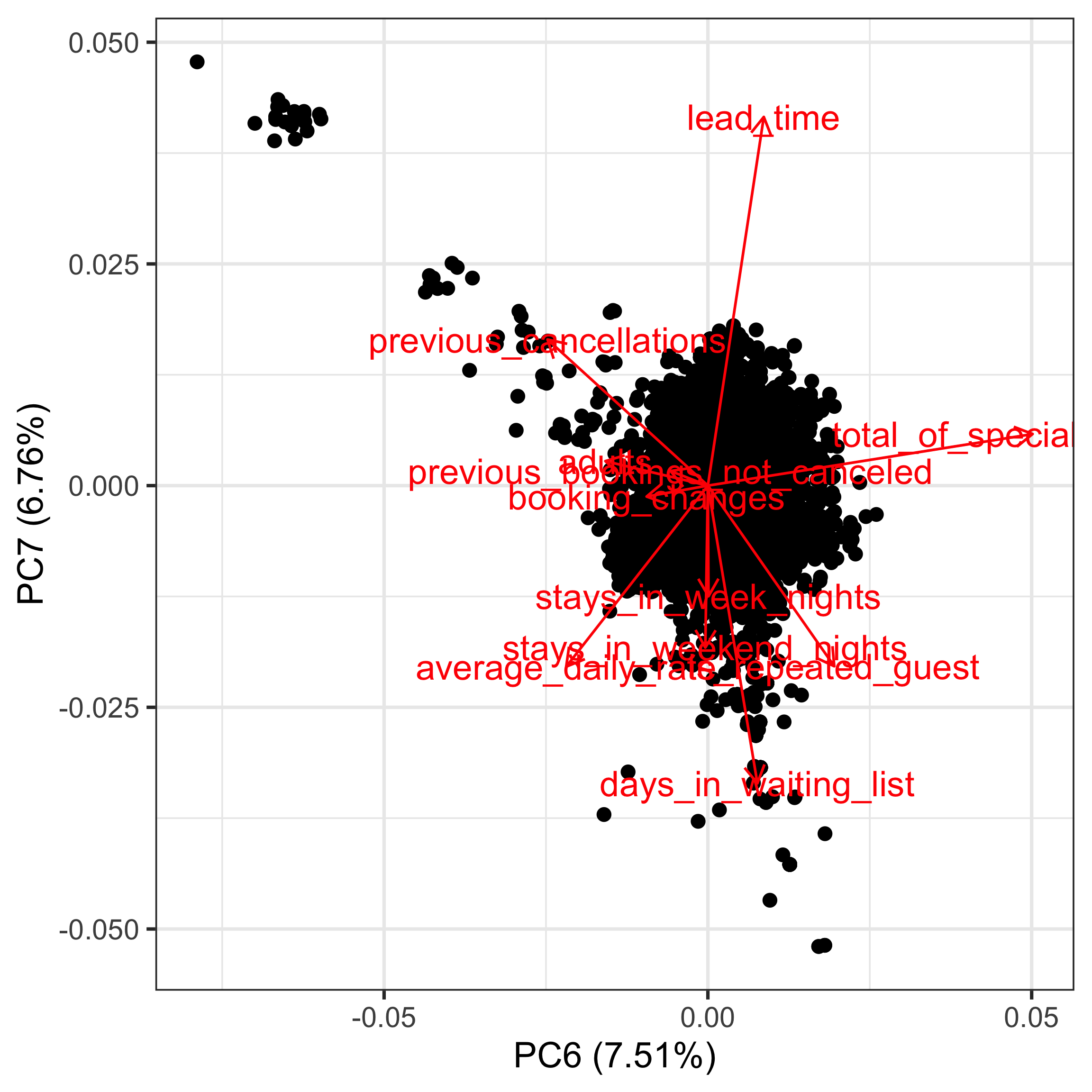
PCA doesn’t help to reduce dimension for the hotels data.

However, it could be helpful to understand some of the other patterns in the data, e.g. outliers, clusters.

Code
ggfortify:::autoplot.prcomp(hotels_pca, x=6, y=7,
                            loadings = TRUE,
                            loadings.label = TRUE)

Cluster analysis

  • The aim of cluster analysis is to group cases (objects) according to their similarity on the variables. It is also often called unsupervised classification, meaning that classification is the ultimate goal, but the classes (groups) are not known ahead of time.
  • Hence the first task in cluster analysis is to construct the class information. To determine closeness we start with measuring the interpoint distances.

Common methods:

  • Hierarchical clustering, summarised by a dendrogram
  • \(k\)-means clustering
  • Model-based clustering

and many variations.

Clustering is one of the hardest analytical methods because there is no known truth. Deciding on a solution requires external knowledge and understanding of geometry.

Case study: Australian tourism (1/3)

  • Survey of 563 Australian tourists, see Dolnicar S, Grün B, Leisch F (2018)
  • Six different types of risks: recreational, health, career, financial, social and safety
  • Rated on a scale from 1 (never) to 5 (very often)

Here we will use \(k\)-means, and examine solutions for \(k=2,3,4,5\) clusters. We will use the lionfish R package, that is mostly written in python for highly reactive interactive graphics.

Clustering tends to break up data according to it’s shape.

Whole apple and knife on cutting board. Apple in two halves and knife on cutting board. Apple sliced into eighths and knife on cutting board.

Whole banana and knife on cutting board. Banana in half and knife on cutting board. Banana cut into eight coin-shaped pieces and knife on cutting board.

Case study: Australian tourism (2/3)
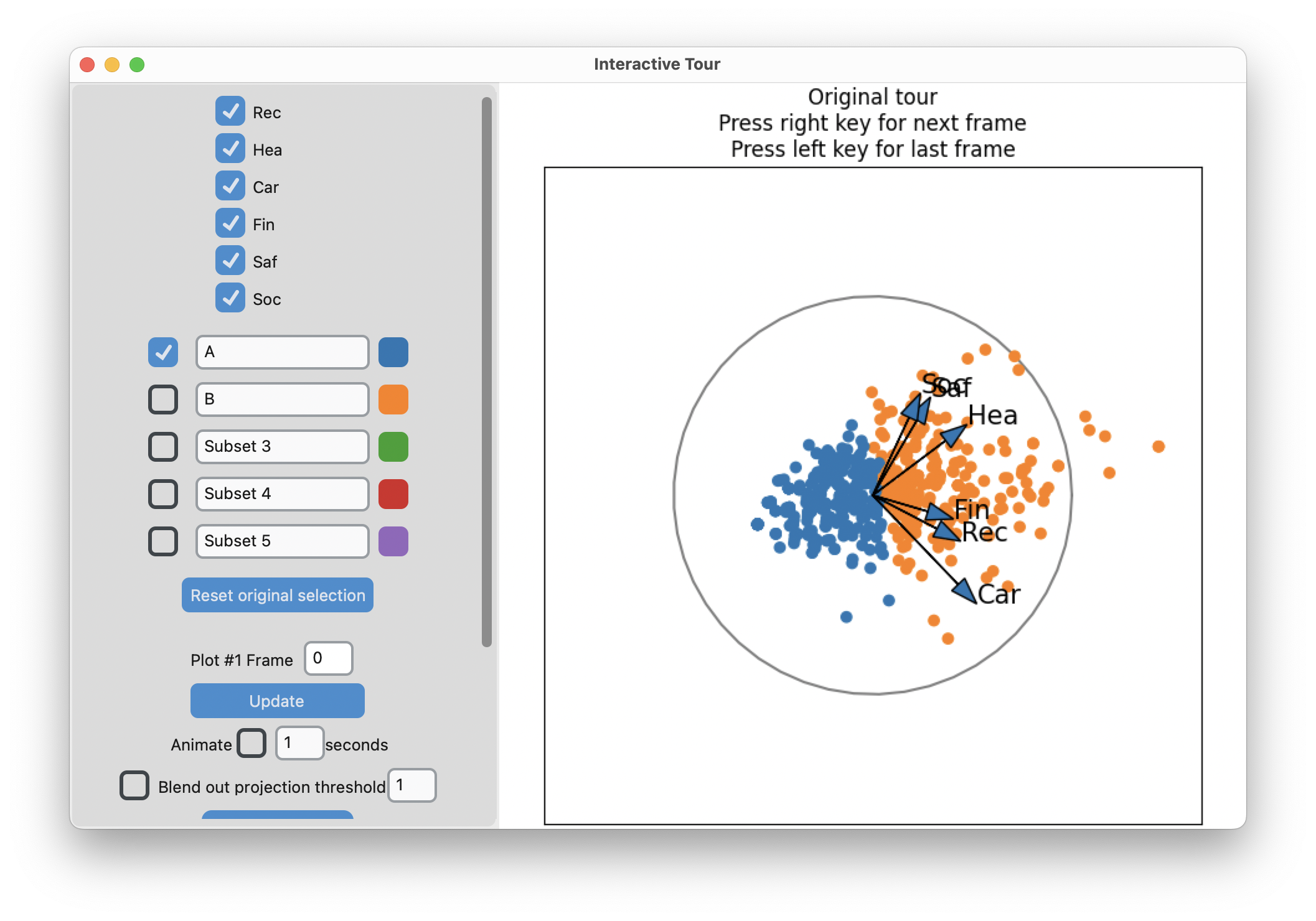
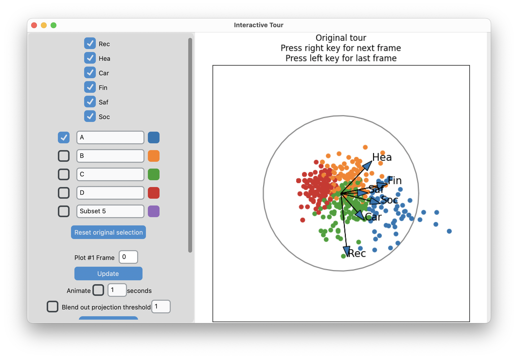
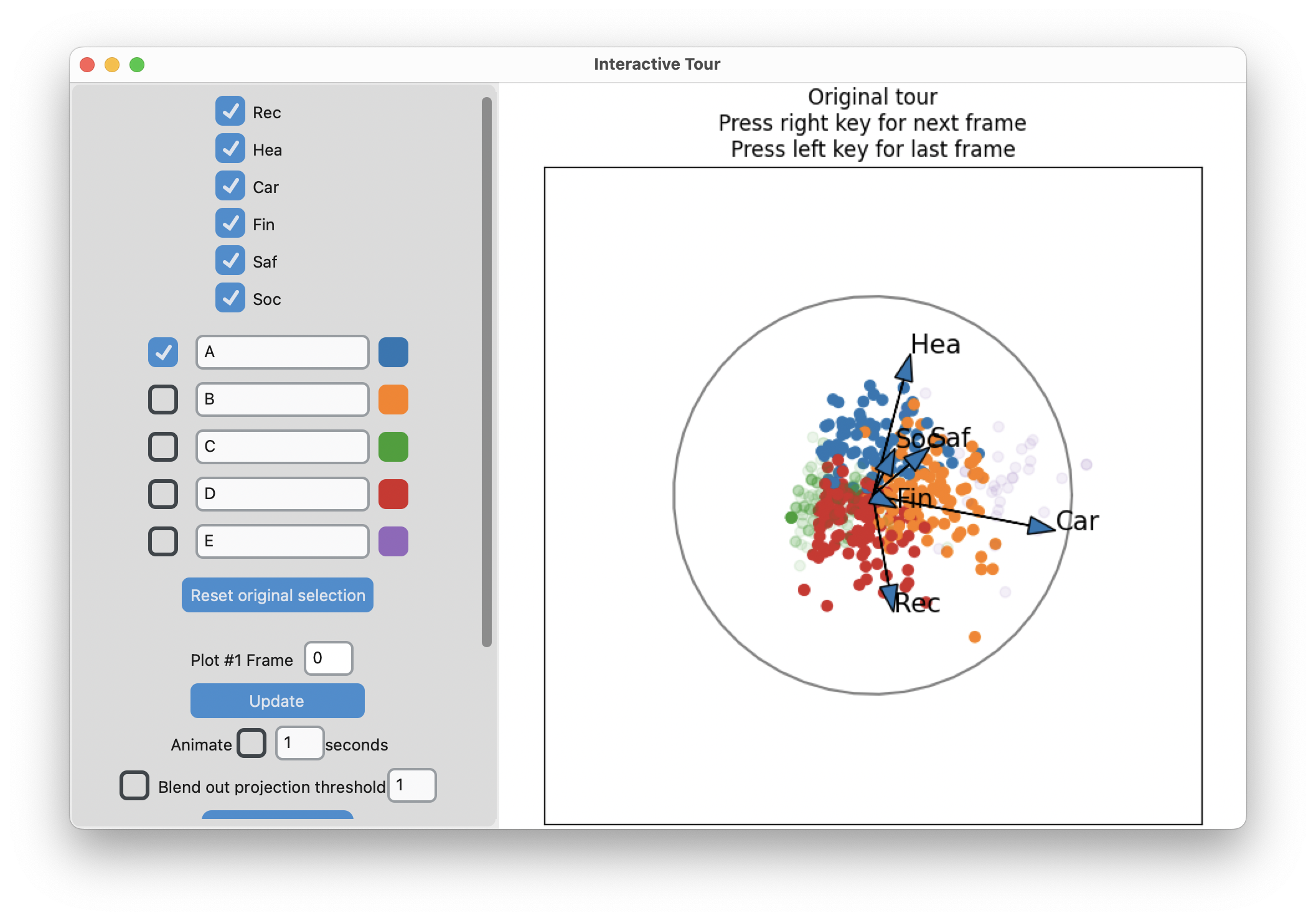
Screenshot of the lionfish interface showing the two cluster result. The projection shown is where there is a fairly clean line separating the two clusters.

Screenshot of the lionfish interface showing the four cluster result. The projection shown is where there is a fairly clear separation the four clusters, along the direction of the largest spread of points, but the fattest part of the pear shape has been divided into two. So the four clusters are spread along the main direction of spread, with two side-by-side in the fat part of the pear.

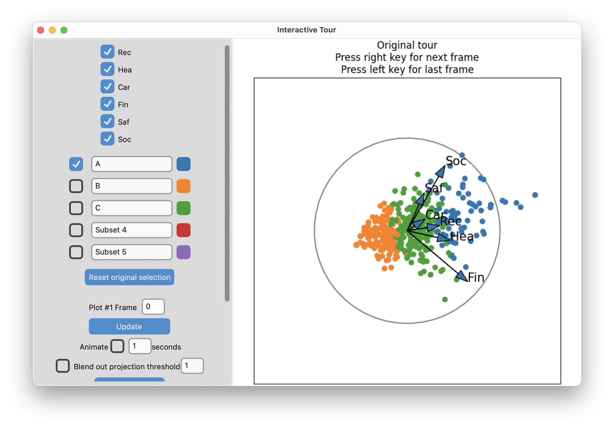
Screenshot of the lionfish interface showing the three cluster result. The projection shown is where there is a fairly clear separation the three clusters, along the direction of the largest spread of points.

Screenshot of the lionfish interface showing the five cluster result. The projection shown is where there is a fairly clear separation the four clusters, along the direction of the largest spread of points, but the fattest part of the pear shape has been divided into three. The clusters at the bottom and the top of the pear shape have been faded so we can focus on the three clusters in the fat part of the pear.

  • Up to 3 clusters, clustering is along the main axis of variation (i.e. PC 1), which includes most of the different types of risks.
  • With 4-5 clusters it divides up medium values of some activities.

Case study: Australian tourism (3/3)

Code
library(lionfish)
data("risk")
colnames(risk) <- c("Rec", "Hea", "Car", "Fin", "Saf", "Soc")
risk_d  <- apply(risk, 2, function(x) (x-mean(x))/sd(x))

# Two clusters
nc <- 3
set.seed(1145)
r_km <- kmeans(risk_d, centers=nc,
               iter.max = 500, nstart = 5)

r_km_d <- risk |>
  as_tibble() |>
  mutate(cl = factor(r_km$cluster))

r_km_d |> 
  pivot_longer(Rec:Soc, names_to = "var", values_to = "val") |>
  ggplot(aes(x=val, fill=cl)) +
    geom_bar() +
    facet_wrap(~var, ncol=3, scales="free_y") +
    scale_fill_manual(values = c("#377EB8", "#FF7F00", "#4DAF4A")) +
    xlab("") + ylab("") +
    theme_minimal() +
    theme(legend.position = "none",
          axis.text = element_blank())
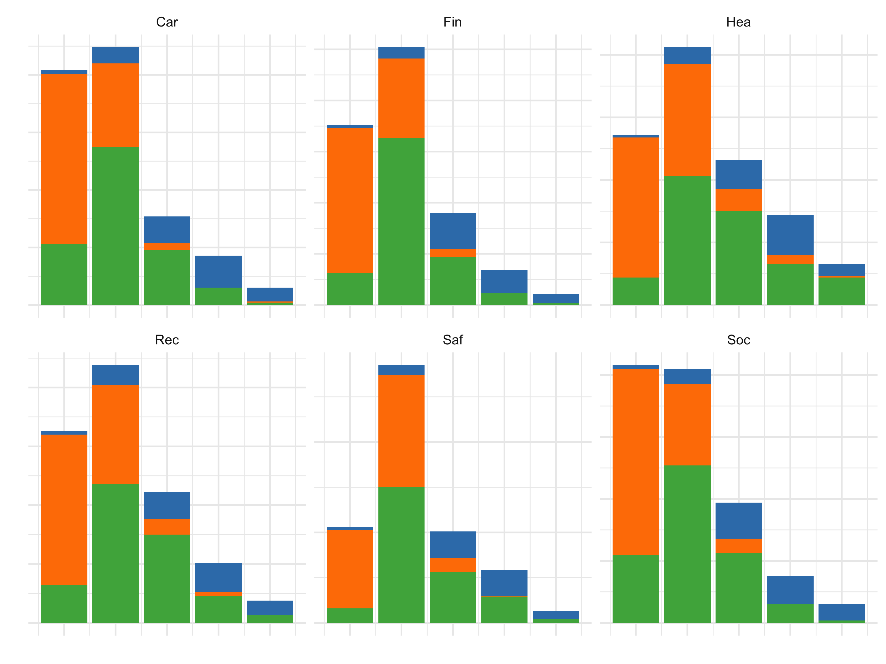


All the activities contribute to the segmentation into three clusters.

Unsupervised learning provides a way to organise observations or variables into smaller sets. It can help to make big noisy data more digestible - if done well.

Temporal data

tsibble: R temporal object


The tsibble package provides a data infrastructure for tidy temporal data with wrangling tools. Adapting the tidy data principles, tsibble is a data- and model-oriented object. In tsibble:

  • Index is a variable with inherent ordering from past to present.
  • Key is a set of variables that define observational units over time.
  • Each observation should be uniquely identified by index and key.
  • Each observational unit should be measured at a common interval, if regularly spaced.

Regular vs irregular

The Melbourne pedestrian sensor data has a regular period. Counts are provided for every hour, at numerous locations.

options(width=55)
pedestrian 
# A tsibble: 66,037 x 5 [1h] <Australia/Melbourne>
# Key:       Sensor [4]
   Sensor    Date_Time           Date        Time Count
   <chr>     <dttm>              <date>     <int> <int>
 1 Birrarun… 2015-01-01 00:00:00 2015-01-01     0  1630
 2 Birrarun… 2015-01-01 01:00:00 2015-01-01     1   826
 3 Birrarun… 2015-01-01 02:00:00 2015-01-01     2   567
 4 Birrarun… 2015-01-01 03:00:00 2015-01-01     3   264
 5 Birrarun… 2015-01-01 04:00:00 2015-01-01     4   139
 6 Birrarun… 2015-01-01 05:00:00 2015-01-01     5    77
 7 Birrarun… 2015-01-01 06:00:00 2015-01-01     6    44
 8 Birrarun… 2015-01-01 07:00:00 2015-01-01     7    56
 9 Birrarun… 2015-01-01 08:00:00 2015-01-01     8   113
10 Birrarun… 2015-01-01 09:00:00 2015-01-01     9   166
# ℹ 66,027 more rows

In contrast, the US flights data, below, is irregular.

options(width=55)
flights_ts <- flights |>
  mutate(dt = ymd_hm(paste(paste(year, month, day, sep="-"), 
                           paste(hour, minute, sep=":")))) |>
  as_tsibble(index = dt, key = c(origin, dest, carrier, tailnum), regular = FALSE)
flights_ts 
# A tsibble: 336,776 x 20 [!] <UTC>
# Key:       origin, dest, carrier, tailnum [52,807]
    year month   day dep_time sched_dep_time dep_delay
   <int> <int> <int>    <int>          <int>     <dbl>
 1  2013     1    30     2224           2000       144
 2  2013     2    17     2012           2010         2
 3  2013     2    26     2356           2000       236
 4  2013     3    13     1958           2005        -7
 5  2013     5    16     2214           2000       134
 6  2013     5    30     2045           2000        45
 7  2013     9    11     2254           2159        55
 8  2013     9    12       NA           2159        NA
 9  2013     9     8     2156           2159        -3
10  2013     1    26     1614           1620        -6
# ℹ 336,766 more rows
# ℹ 14 more variables: arr_time <int>,
#   sched_arr_time <int>, arr_delay <dbl>,
#   carrier <chr>, flight <int>, tailnum <chr>,
#   origin <chr>, dest <chr>, air_time <dbl>,
#   distance <dbl>, hour <dbl>, minute <dbl>,
#   time_hour <dttm>, dt <dttm>

Is pedestrian traffic really regular?

Getting started

Wrangling prior to analysing temporal data includes:

  • aggregate by temporal unit.
  • construct temporal units to study seasonality, such as month, week, day of the week, quarter, …
  • checking and imputing missings.


For the airlines data, you can aggregate by multiple quantities, eg number of arrivals, departures, average hourly arrival delay and departure delays.

Aggregating

The US flights data already has some temporal components created, so aggregating by these is easy. Here is departure delay.

Code
flights_mth <- flights_ts |> 
  as_tibble() |>
  group_by(month, origin) |>
  summarise(dep_delay = mean(dep_delay, na.rm=TRUE)) |>
  as_tsibble(key=origin, index=month)
ggplot(flights_mth, aes(x=month, y=dep_delay, colour=origin)) +
  geom_point() +
  geom_smooth(se=F) +
  scale_x_continuous("", breaks = seq(1, 12, 1), 
                     labels=c("J","F","M","A","M","J",
                              "J","A","S","O","N","D")) +
  scale_y_continuous("av dep delay (mins)", limits=c(0, 25)) +
  theme(aspect.ratio = 0.5)
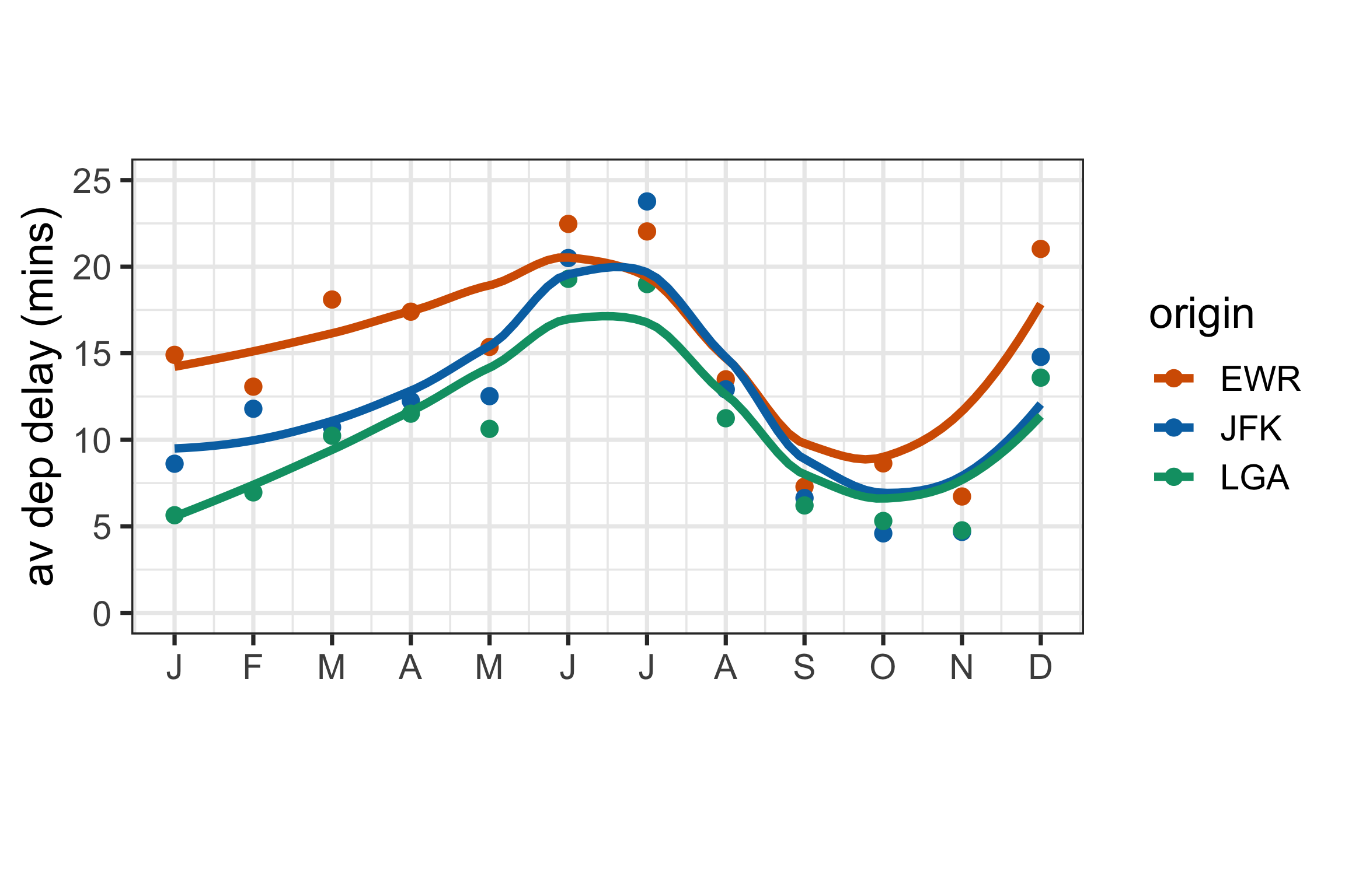
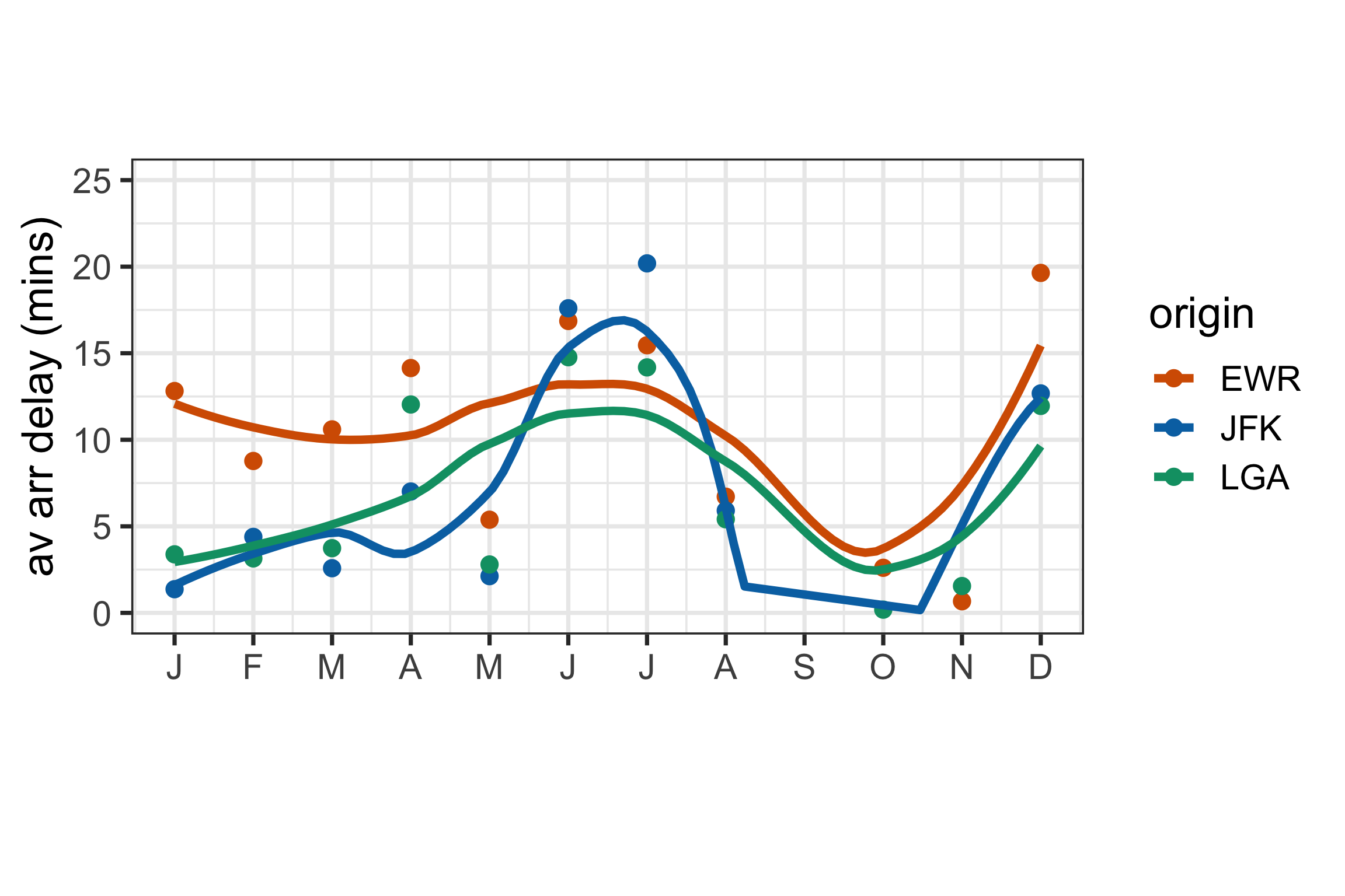
Aggregate by month, but examine arrival delays.

Code
flights_mth_arr <- flights_ts |> 
  as_tibble() |>
  group_by(month, origin) |>
  summarise(arr_delay = mean(arr_delay, na.rm=TRUE)) |>
  as_tsibble(key=origin, index=month)
ggplot(flights_mth_arr, aes(x=month, y=arr_delay, colour=origin)) +
  geom_point() +
  geom_smooth(se=F) +
  scale_x_continuous("", breaks = seq(1, 12, 1), 
                     labels=c("J","F","M","A","M","J",
                              "J","A","S","O","N","D")) +
  scale_y_continuous("av arr delay (mins)", limits=c(0, 25)) +
  theme(aspect.ratio = 0.5)
Constructing temporal units

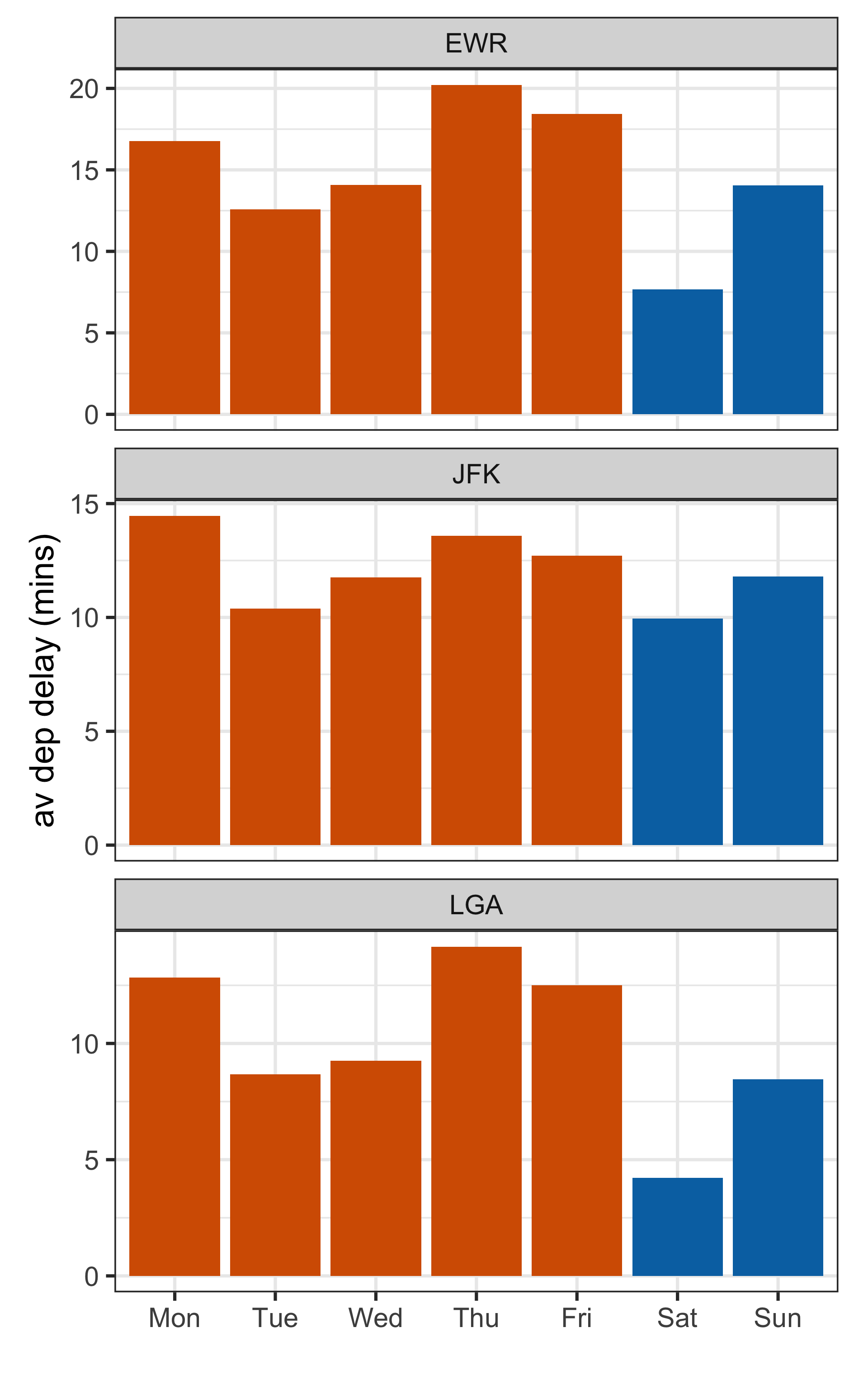
Week day vs weekend would be expected to have different patterns of delay, but this is not provided.

Code
flights_wk <- flights_ts |> 
  as_tibble() |>
  mutate(wday = wday(dt, label=TRUE, week_start = 1)) |>
  group_by(wday, origin) |>
  summarise(dep_delay = mean(dep_delay, na.rm=TRUE)) |>
  mutate(weekend = ifelse(wday %in% c("Sat", "Sun"), "yes", "no")) |>
  as_tsibble(key=origin, index=wday)
ggplot(flights_wk, aes(x=wday, y=dep_delay, fill=weekend)) +
  geom_col() +
  facet_wrap(~origin, ncol=1, scales="free_y") +
  xlab("") +
  ylab("av dep delay (mins)") +
  theme(aspect.ratio = 0.5, legend.position = "none")
Be careful of times!

Code
flights_airtm <- flights |>
  mutate(dep_min = dep_time %% 100,
         dep_hr = dep_time %/% 100,
         arr_min = arr_time %% 100,
         arr_hr = arr_time %/% 100) |>
  mutate(dep_dt = ymd_hm(paste(paste(year, month, day, sep="-"), 
                           paste(dep_hr, dep_min, sep=":")))) |>
  mutate(arr_dt = ymd_hm(paste(paste(year, month, day, sep="-"), 
                           paste(arr_hr, arr_min, sep=":")))) |>
  mutate(air_time2 = as.numeric(difftime(arr_dt, dep_dt)))

fp <- flights_airtm |> 
  sample_n(3000) |>
  ggplot(aes(x=air_time, y=air_time2, label = paste(origin, dest))) + 
    geom_abline(intercept=0, slope=1) +
    geom_point()
ggplotly(fp, width=500, height=500)

Why is this not what we expect?

Checking and filling missings (1/4)

set.seed(328)
harvest <- tsibble(
  year = c(2010, 2011, 2013, 2011, 
           2012, 2013),
  fruit = rep(c("kiwi", "cherry"), 
              each = 3),
  kilo = sample(1:10, size = 6),
  key = fruit, index = year
)
harvest
# A tsibble: 6 x 3 [1Y]
# Key:       fruit [2]
   year fruit   kilo
  <dbl> <chr>  <int>
1  2011 cherry     2
2  2012 cherry     7
3  2013 cherry     1
4  2010 kiwi       6
5  2011 kiwi       5
6  2013 kiwi       8
has_gaps(harvest, .full = TRUE) 
# A tibble: 2 × 2
  fruit  .gaps
  <chr>  <lgl>
1 cherry TRUE 
2 kiwi   TRUE 


Can you see the gaps in time?

Both levels of the key have missings.

Checking and filling missings (2/4)

# A tsibble: 6 x 3 [1Y]
# Key:       fruit [2]
   year fruit   kilo
  <dbl> <chr>  <int>
1  2011 cherry     2
2  2012 cherry     7
3  2013 cherry     1
4  2010 kiwi       6
5  2011 kiwi       5
6  2013 kiwi       8
count_gaps(harvest,  .full=TRUE)
# A tibble: 2 × 4
  fruit  .from   .to    .n
  <chr>  <dbl> <dbl> <int>
1 cherry  2010  2010     1
2 kiwi    2012  2012     1


One missing in each level, although it is a different year.


Notice how tsibble handles this summary so neatly.

Checking and filling missings (3/4)

# A tsibble: 6 x 3 [1Y]
# Key:       fruit [2]
   year fruit   kilo
  <dbl> <chr>  <int>
1  2011 cherry     2
2  2012 cherry     7
3  2013 cherry     1
4  2010 kiwi       6
5  2011 kiwi       5
6  2013 kiwi       8

Make the implicit missing values explicit.

harvest <- fill_gaps(harvest, 
                     .full=TRUE) 
harvest 
# A tsibble: 8 x 3 [1Y]
# Key:       fruit [2]
   year fruit   kilo
  <dbl> <chr>  <int>
1  2010 cherry    NA
2  2011 cherry     2
3  2012 cherry     7
4  2013 cherry     1
5  2010 kiwi       6
6  2011 kiwi       5
7  2012 kiwi      NA
8  2013 kiwi       8

Checking and filling missings (4/4)

# A tsibble: 6 x 3 [1Y]
# Key:       fruit [2]
   year fruit   kilo
  <dbl> <chr>  <int>
1  2011 cherry     2
2  2012 cherry     7
3  2013 cherry     1
4  2010 kiwi       6
5  2011 kiwi       5
6  2013 kiwi       8

We have already seen na_ma() function, that imputes using a moving average. Alternatively, na_interpolation() uses the previous and next values to impute.

harvest_nomiss <- harvest |> 
  group_by(fruit) |> 
  mutate(kilo = 
    na_interpolation(kilo)) |> 
  ungroup()
harvest_nomiss 
# A tsibble: 6 x 3 [1Y]
# Key:       fruit [2]
   year fruit   kilo
  <dbl> <chr>  <int>
1  2011 cherry     2
2  2012 cherry     7
3  2013 cherry     1
4  2010 kiwi       6
5  2011 kiwi       5
6  2013 kiwi       8

Case study: pedestrian sensors (1/3)

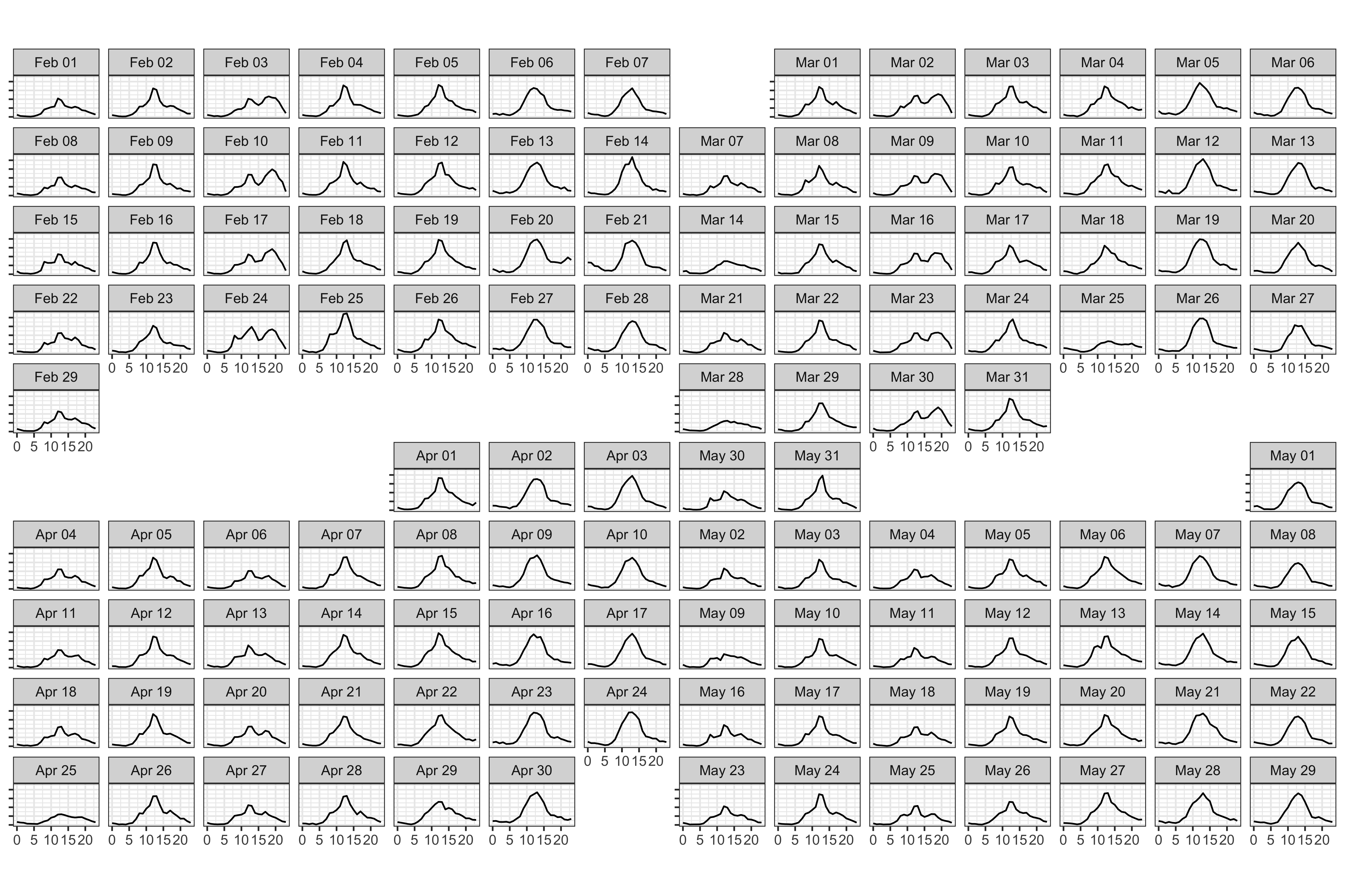
Code
ped_QV <-  pedestrian |>
  mutate(year = year(Date),
         month = month(Date)) |>
  dplyr::filter(Sensor == "QV Market-Elizabeth St (West)",
                year == 2016, month %in% c(2:5))
ggplot(ped_QV) +   
    geom_line(aes(x=Time, y=Count)) +
    facet_calendar(~Date) +
  theme(axis.title = element_blank(),
        axis.text.y = element_blank(),
        aspect.ratio = 0.5) 
Case study: pedestrian sensors (2/3)

Code
has_gaps(pedestrian, .full = TRUE)
# A tibble: 4 × 2
  Sensor                        .gaps
  <chr>                         <lgl>
1 Birrarung Marr                TRUE 
2 Bourke Street Mall (North)    TRUE 
3 QV Market-Elizabeth St (West) TRUE 
4 Southern Cross Station        TRUE 
Code
ped_gaps <- pedestrian |> 
  dplyr::filter(Sensor == "QV Market-Elizabeth St (West)") |>
  count_gaps(.full = TRUE)
ped_gaps
# A tibble: 3 × 4
  Sensor  .from               .to                    .n
  <chr>   <dttm>              <dttm>              <int>
1 QV Mar… 2015-04-05 02:00:00 2015-04-05 02:00:00     1
2 QV Mar… 2015-12-31 00:00:00 2015-12-31 23:00:00    24
3 QV Mar… 2016-04-03 02:00:00 2016-04-03 02:00:00     1
Code
ped_qvm_filled <- pedestrian |> 
  dplyr::filter(Sensor == "QV Market-Elizabeth St (West)") |>
  fill_gaps(.full = TRUE) |>
  mutate(Date = as.Date(Date_Time, tz="Australia/Melbourne"),
         Time = hour(Date_Time)) |>
  mutate(year = year(Date),
    month = month(Date)) 

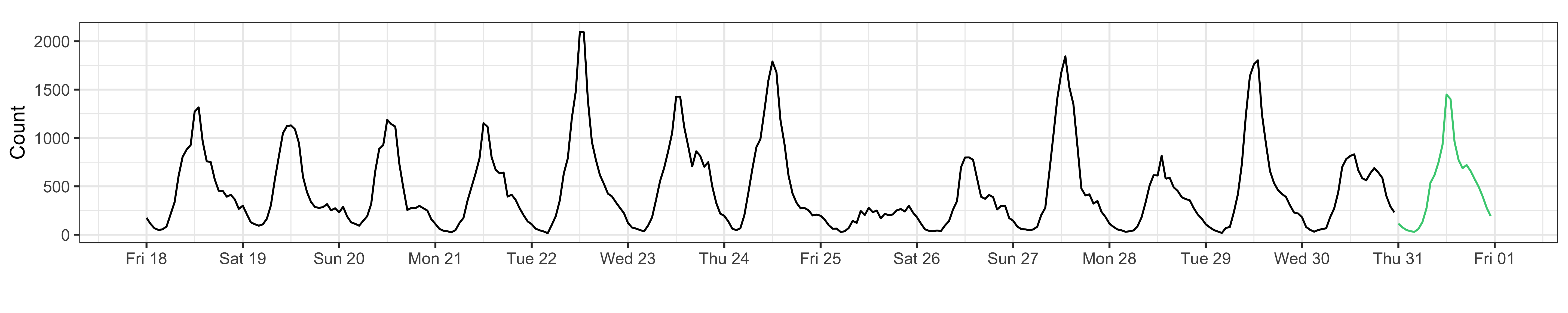
There is a block of missing values on the last day of 2015. The other two missings correspond to an hour in April, when the clocks change from summer to regular time.

Case study: pedestrian sensors (3/3)

Code
# Which days are holidays
hol <- holiday_aus(2015:2016, state = "VIC")
ped_qvm_filled <- ped_qvm_filled |> 
  mutate(hol = is.weekend(Date)) |>
  mutate(hol = if_else(Date %in% hol, TRUE, hol)) |>
  mutate(Time = factor(Time))

# Fit linear model to inpute missings
ped_qvm_lm <- lm(Count~Time*hol, data=ped_qvm_filled)
ped_qvm_filled <- ped_qvm_filled |>
  mutate(pCount = predict(ped_qvm_lm, ped_qvm_filled))

# Select subset and plot results
ped_qvm_sub <- ped_qvm_filled |>
  filter(Date > ymd("2015-12-17"), Date < ymd("2016-01-01")) 
ggplot(ped_qvm_sub) +   
    geom_line(aes(x=Date_Time, y=Count)) +
    geom_line(data=filter(ped_qvm_sub, is.na(Count)), 
                      aes(x=Date_Time, 
                          y=pCount), 
                      colour="seagreen3") +
  scale_x_datetime("", date_breaks = "1 day", 
                   date_labels = "%a %d") +
  theme(aspect.ratio = 0.15)
The resources at Forecasting: Principles and Practice (3e) explains how to effectively do forecasting.

Resources